Eating donuts, burning calories, and raising money for a good cause -- that's what the annual Krispy Kreme Challenge is all about. If this intrigues you, read on to find out more...
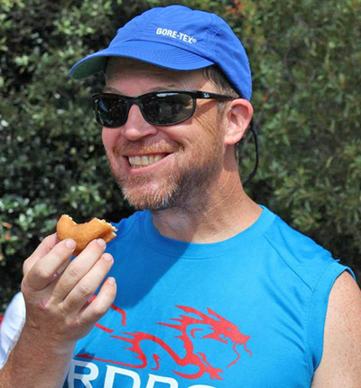
But first, here's a picture of me eating a donut, preparing for a race. I bet you didn't know I was such a hardcore athlete (I'm kinda like John Belushi in that regard!)
In 2004, a handful of students from NC State University (my alma mater) got together and ran the first Krispy Kreme Challenge. It was more of a 'dare' than a race event. Run from the bell tower to the donut shop (about 2.5 miles away), eat a dozen donuts, and run back. This race equation is quirky enough that it has grown in popularity, with over 60,000 runners having participated over the years, raising almost a million dollars for North Carolina Children's Hospital.
With the race coming up this Saturday, I decided to use this topic for some graphical analytics. I found a sharp-looking infographic on the NC State website, summarizing data about all of the races. That was pretty cool, but I decided to dive into more detailed data for one specific race. I found a page containing the race results, but unfortunately they don't provide a way to download all the data for a race. I noticed that the older race results are in pdf documents ... and I was able to copy-n-paste the data from the 2012 pdf into a text file, and then import it into SAS (with not too much 'extra work').
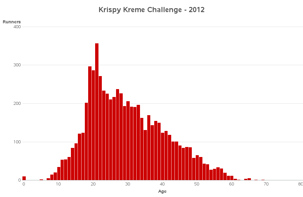
I then created a few graphs that I think summarize the data well. For example, here's a bar chart showing the age distribution of the race participants. Notice there is a slight 'spike' for the age=21 -- I wonder if that might be people just indicating that they are "21 or older", or perhaps some students have fake ID that says they are 21(?)
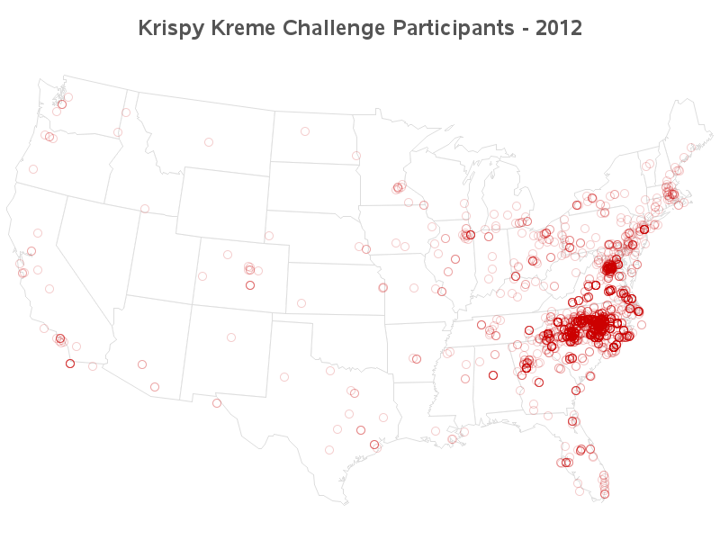
Here's a map showing where the runners are from. Of course, most of them are from North Carolina ... but it's interesting that there is also a high concentration from around Washington, DC.
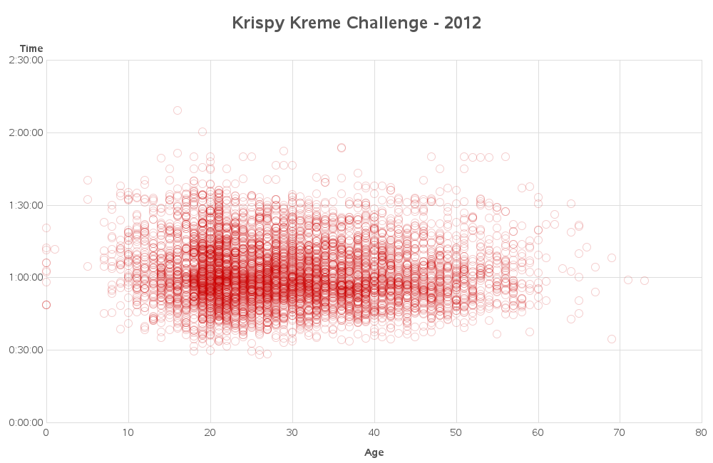
And, of course, the thing that everyone is interested in ... the race results. I thought it might be interesting to plot the race times against the ages, to see if there were any trends. At first I thought maybe older people would run slower ... but when I think more about it, I guess older people who still run are serious runners (assuming you can use the word 'serious' when the race involves eating a dozen donuts, hahaha!)
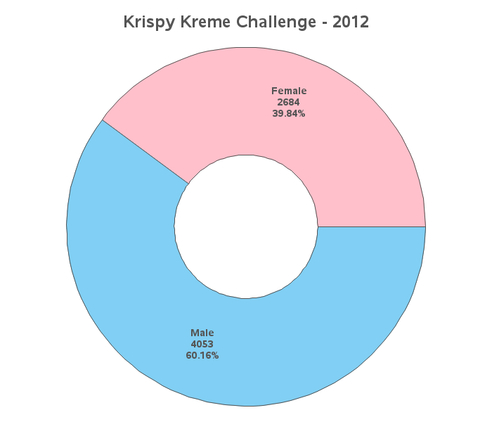
And, being that this race involves donuts, I had to find a way to include a donut chart! So, here it is ... a donut chart, showing the number of participants by gender:
Speaking of strange races, what's the craziest race you've been in?
How to eat 724,548 donuts and burn 138 million calories! #analytics Click To Tweet


2 Comments
Nicely done! If you'd like to see how donut eating cyclists stack up against donut eating runners, let me know. I have some data from our annual Tour de Donut Austin. http://tourdedonutaustin.com/
Interesting!