Are you from Yankeedom, The Far West, or somewhere in between? In this blog, I use SAS maps to explore some fun data about regional cultures in the U.S.
I recently ran across an interesting article about Colin Woodward's book "American Nations: A History of the Eleven Rival Regional Cultures in North America." The article contained a map showing what culture was dominant in each geographical area, and then contained a paragraph describing each culture in the body of the article. But the map was very small, and it was difficult to read the labels. And I had to skim the whole article to find a specific culture's description.
Therefore I created my own map, to try to overcome these two problems, and make it easy (and fun) to explore this interesting data!
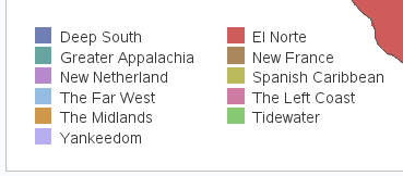
Here's a snapshot of my map (you can click it to see the full-size interactive version). Note that my version is a bit larger, and I've simplified it a bit by leaving out the county outlines - in my opinion it's just too cluttered trying to show three levels of borders in a map. When viewing the interactive map, you can hover over each county to see the county names, if you're interested in that information. It is very challenging to place labels on a map with irregularly shaped regions, therefore I used a color legend instead (and you can also see the culture names in the hover-text).
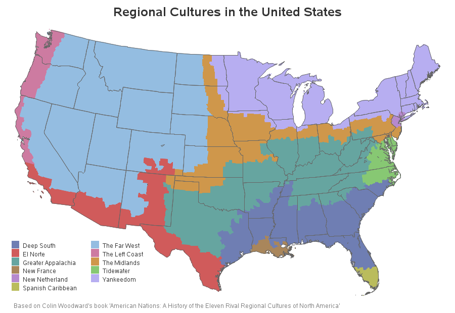
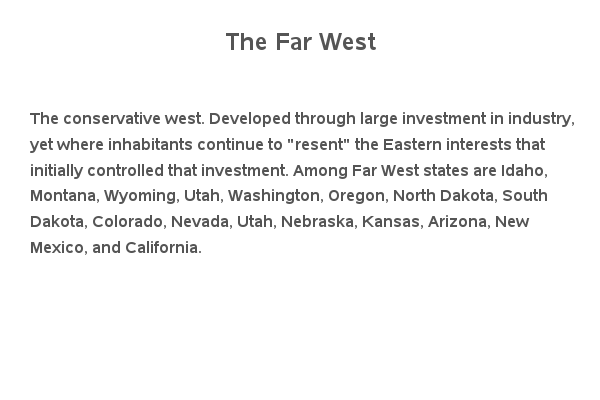
In the article, you had to scroll up/down through the article looking for the paragraph describing each culture. In my map, you can click the colored regions in the map (or the color chips in the legend), and easily drill-down to see the description. Then you can click the browser's Back button (or the Backspace key on the keyboard) to return to the map. I think this is much simpler, and more intuitive. Here's an example of one of the drill-down descriptions:
Analysis of regional cultures in the US #SASgraph #analytics Click To TweetTechnical Details:
I used Proc Gmap to draw the map, and the html= option to control the hover-text and drill-down links. The drill-down links go to ods html anchors on the same page, the anchors are named using the name of the cultures such as '#Yankeedom'.
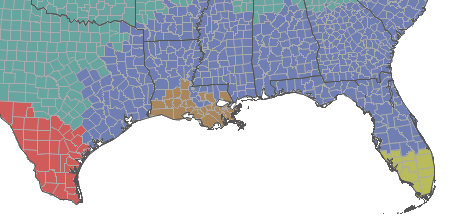
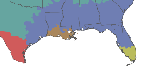
I used Gmap's coutline=same so the county outlines are not visible, and I annotated the state outlines on the map. Here are two screen captures comparing what the SAS map looks like with and without the county outlines:
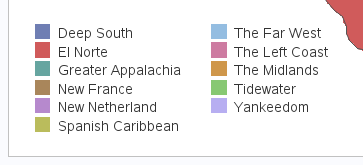
The default legend arranges the names alphabetically by row, which causes you to have to read left/right many times to read the culture names in order. I thought it would make more sense to arrange them alphabetically in columns, therefore I used the legend statement's colmajor option (which was added in SAS 9.2). The two screen captures below show the difference in rowmajor and colmajor legend sorting:
Here's a link to the SAS code, if you would like to download it and experiment.
So, which of the cultural regions have you lived in, and do you agree with Colin's cultural descriptions?


6 Comments
This graphic is for the United States so international locations like Alaska aren't included. I suspect that we would be another area unto ourselves - we think that we are anyway. ;-)
I've been watching several of the TV 'reality' shows about people in Alaska lately (Buying Alaska, etc). There certainly do seem to be many interesting people there! :)
Great map but yeah …
No I live in South Carolina only Pickens & Oconee county are Appalachia(maybe even Greenville county but just maybe it could go either way) , every other county is Deep South.. there you go but Anderson county is definitely not Appalachia at all lol no mountain terrains really and the culture/demographics etc drastically change becoming more diverse once you get into Anderson coming out of Pickens or oconee county by far it’s noticeable.
As only someone raised in New France would feel compelled to point out, those aren't counties in Louisiana, they're parishes. ;-)
Fun post!! I've got to get Woodward's book.
Error
The file us.counties
not found
Which version of SAS are you using, and do you have SAS/Graph?
This example uses the mapsgfk.us_counties dataset, which ships with SAS/Graph in recent releases of SAS.