Here in the US, we've got the Thanksgiving holiday coming up soon. And the keystone of this holiday is a big dinner, with lots of traditional Thanksgiving foods. But where does all this food come from, and which farmers should we thank for which of the food items? I use SAS analytics to answer those questions!
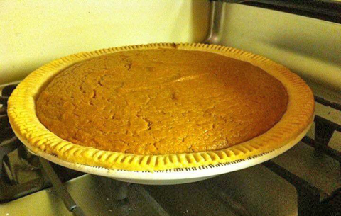
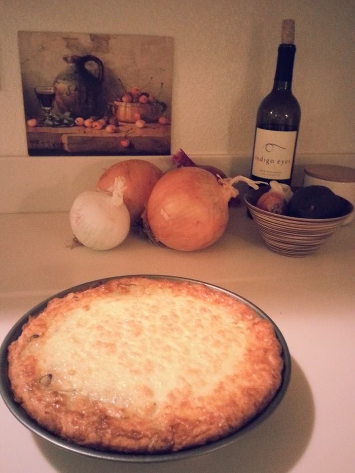
Let's start with sweet potatoes... My friend Reggie is a huge fan of sweet potato pies (not pumpkin, but sweet potato). It doesn't matter whether they're homemade, store bought, or even the fast-food variety from BoJangles - they all make him happy. Here's a picture of a sweet potato pie from my friend Beth - yum, yum!
But where do sweet potatoes come from? I found a neat Web page set up to answer that question for most all the traditional Thanksgiving foods! They had a huge infographic that showed all the foods together (note that the pdf is a bit overwhelming to try to look at on a computer screen - it's more of a wall/poster thing), and they also let you look at one food item at a time. Here's a snapshot of their sweet potato map:
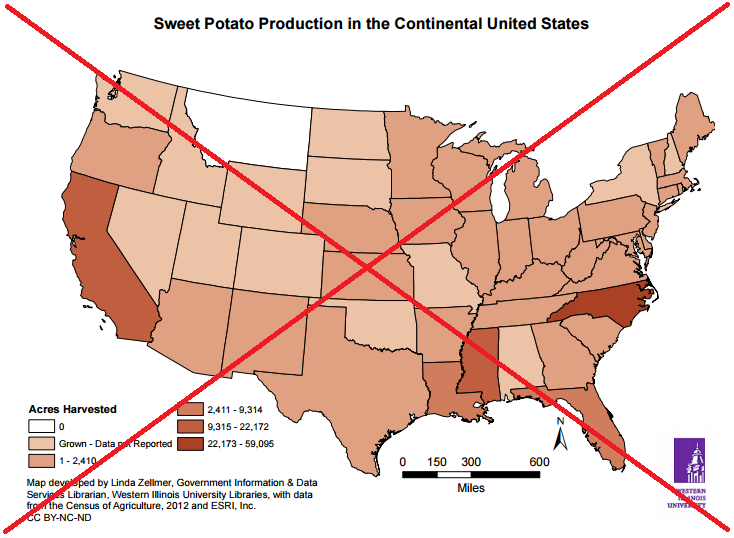
It's a good/informative map, but there are a few details I would change. The miles scale and north arrow are very prominent, and draw the eye ... but yet they aren't really needed in this map. The legend looks a bit odd, with the 2nd column being raised one position higher than the first column. And it's difficult to quickly determine which state is the largest producer of sweet potatoes.
So I found the raw data (no pun intended!), imported it into SAS, and created my own map. I simplified it a bit, used shades/colors that were a bit easier to distinguish, and annotated a star on the state that produces the most. If you click the image below, you can see the interactive version, with html hover-text that allows you to easily see the exact data values for each state.
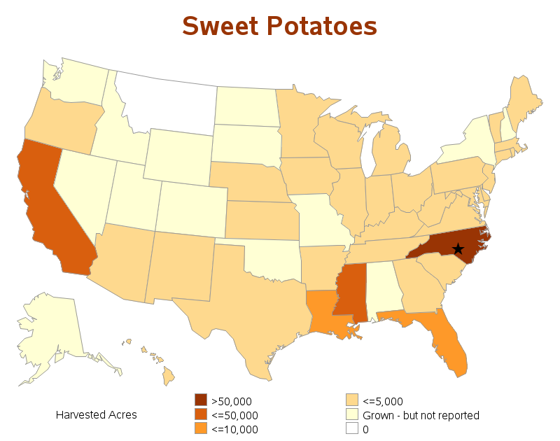
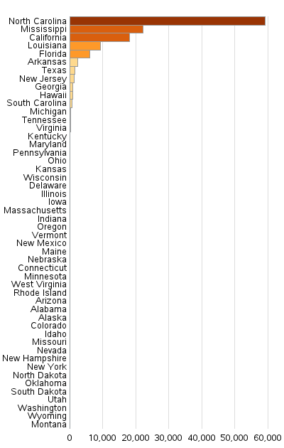
I really like my SAS map, and I think it provides a lot more analytic insight into the data ... but I still didn't feel like it was answering a fundamental question about the data. Being from North Carolina, I was proud to see that we were the #1 producer of sweet potatoes, but I also wanted to know just how badly we had beaten all the other states. And perhaps people from the other states would want to know how they ranked against all the other states. What we need, to augment the map, is a visualization to show the ranking! What we need is a horizontal bar chart, sorted by bar height (and shaded the same as the map, for consistency!) I think this bar chart tells a powerful story - when you're eating sweet potatoes at Thanksgiving, make sure to give a big thanks to the North Carolina farmers who probably grew them! :)
And to make it even better, I used SAS' ods htmlpanel to position the map and bar chart side-by-side:
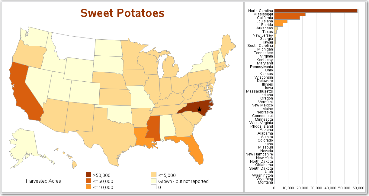
I think the combined map & bar chart is a great way to visually analyze this data! And here are links to the graphs for several other traditional Thanksgiving foods: Turkey, Green Beans, Carrots, Celery, Sweet Corn, Onions, Potatoes, Wheat, Pumpkin, Squash, Cranberries, and Pecans.
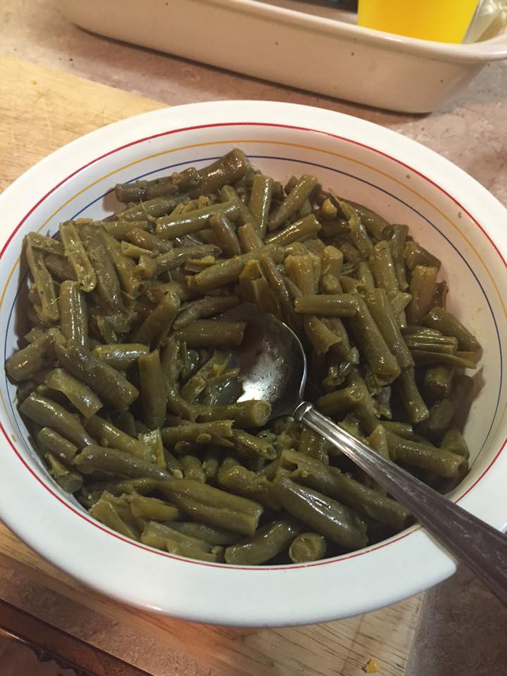
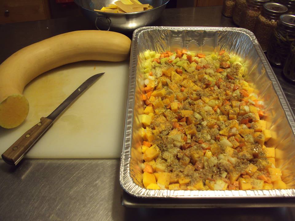
And I'll leave you with a few pictures of some of these foods, cooked by my friends... Simone's onion quiche, Paula's green beans, and Will's roasted Italian trumpet squash ...


4 Comments
Wow! Amazing improvements and analytics. Thank you! I learned much from your work.
Pingback: Where is your favorite wine made? | SAS Learning Post
Such a cool blog, Bob! Thanks for the info and fun graphs. I'm an NC girl so I'm proud to see how much produce comes from North Carolina.
Glad to hear it! :)