With a major election coming next year, I was wondering if there have been any shifts & changes in the voters in my state. This seems like an interesting opportunity for some data analysis, eh!?!
To get you into the spirit of elections, here's an "I Voted" sticker from my friend Dee:
I've lived in North Carolina most all my life, and have seen it go through lots of changes as it shifted from being a textile & tobacco state, to being the Silicon Valley of the East Coast. With cities such as Raleigh, Apex, and Cary placing highly on national "best of" lists, and companies like SAS appearing on the "best places to work" lists, lots of new people have been moving to North Carolina from other states. I'm curious how these changes might affect voting preferences, and I thought a good place to start might be the voter registration data.
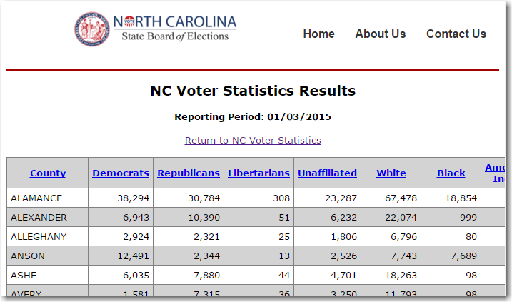
After a bit of searching I found the NC voter registration data online. Luckily the data was accessible through simple URLs and html pages (rather than an interactive system that lets you view the data through an interface, but just one url to the interface). For example, here is the page for the Jan 3, 2015 data. The data was not available in a simple format such as csv, but at least it was in straightforward html tables that I could write some SAS code to scrape the data from the web pages.
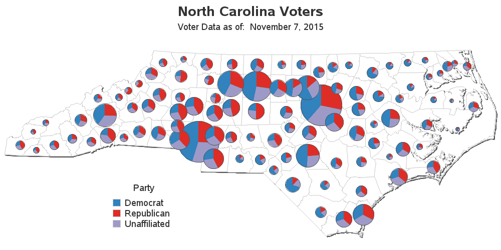
I first wrote some code to read in the most recent data, and plotted it on a map, in several different ways. I generated a choropleth map showing the main political party in each county, and then separate heat maps for each political party ... but the one I liked best was a custom map with a pie chart on each county. I expected the pies to show a 2-way split between Republicans and Democrats, but I was surprised to see it was a 3-way split with Unaffiliated being a significantly large slice.
The map was interesting, but I wondered how the political composition had changed over time. Therefore I enhanced my code to read in the data for each year, and generated a time series plot for each county. With 100 counties, it was a bit cumbersome to scroll through the entire list to find a certain county, therefore I set up html an anchor for each county, and added drill down links from the counties in the map to jump right to the time series plot of the clicked-on county. (Note that the first time you view the time series plots, it will need to cache all 100 county graphs to your browser, which is about 6.5MB. On my home computer, this took about 30 seconds. After they're all cached, your response time should be very quick!)How to build a customized voter registration data viewer #sastip Click To Tweet
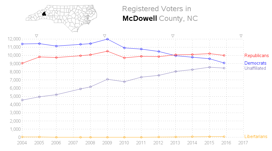
Here is (non-interactive) snapshot for Mc Dowell county, for example:
I invite you to view the pie map, and click on several counties ... and then come up with theories about how & why the data has been changing (or not changing) over time. This will be a good warm-up for the upcoming elections!


12 Comments
Where is the code for the heat map?
The choropleth, heatmaps, and pie maps are all created by the same code (see link in the paragraph that mentions the maps). Here is that link again :)
http://robslink.com/SAS/democd60/nc_voter_registration.sas
I am not familiar with heat maps. I see proc gmap used 5 times. Which one does the heat map?
Thanks
There are several things people call "heat maps". In this case, I'm referring to a geographic choropleth map that uses gradient shading as a heat map. Of the 5 gmaps the example creates, I would consider the last 3 to be this kind of heat maps.
THANKS!
Robert,
Interesting presentation. Is there some way to add in the population gain in the county? Reason I ask is that is was obvious (to me) that Unaffiliated voters gained significantly in EVERY county, but was that at the expense of another party, or were there population gains that keep the percentages in check?
I also found it interesting that in two or three counties, Unaffiliated voters were the largest group.
I'll let the political junkies discuss how or why that is important!
-Kevin
Good question/suggestion. I haven't found a good/graceful way to integrate county population into the graph yet.
And I guess my main question about the increase in "Unaffiliated" is ... were these people switching from another party to Unaffiliated, or were these people that moved in from another area, or were they young people registering to vote for the first time?
Secondary questions ... Are people switching to Unaffiliated because they are not happy with either party? Or are they switching to Unaffiliated so they can vote in either primary (perhaps for nefarious reasons, rather than voting for the candidate they want). Do the Unaffiliated tend to lean towards one party or another?
I think that understanding the "Unaffiliated" will be key to predicting the upcoming elections.
Interesting. In Florida, in the 60's and 70's every new voter was encouraged to register as a Democrat so that "you could have a vote". Then, and I think it is now, in Florida, only party members can vote in party elections. This prevented Nefarious intentions. Since racism was part of our life back then, disenfranchised people became Republicans so that they could have a voice in government. Today, our state is discombobulated between Liberals and Conservatives and both parties have both Conservatives and Liberals. I would like to see a chart that ranks voters by Conservative, Middle and Liberal.
Robert,
Just wonder who you are going to vote for ? Trump or Hilary ?
The following is trying to make importing data simpler.
options errors=0;

filename x url 'http://vt.ncsbe.gov/Voter_Stats/results.aspx?date=11-14-2015';

data x;

infile x recfm=n dsd dlm='';

input @'' County : $100.

@'' Democrats : $100.

@'' Republicans : $100.

@'' Libertarians : $100.

@'' Unaffiliated : $100.

@'' White : $100.

@'' AmericanIndian : $100.

@'' Other : $100.

@'' Hispanic : $100.

@'' Male : $100.

@'' Female : $100.

@'' Total : $100.

@@;

run;
Hmm ... does your code read in the data cleanly for you?
When I tried running it, I get both data & non-data lines, with a bunch of html code in the character variables (and of course they would need to be numeric rather than character to plot).
Yeah. It is clean for me. I think this forum eat my some code to make it nonsense. Whatever . My point is who you are going to vote for ? Trump or Hilary ?
That's the beauty of secret-ballot! :)