More and more of my friends seem to be eating less and less meat, for various reasons (such as religious, health, social conscience, weight loss, personal preference, cost savings, etc). So I thought I would put together a graph to help them find alternate sources of protein.
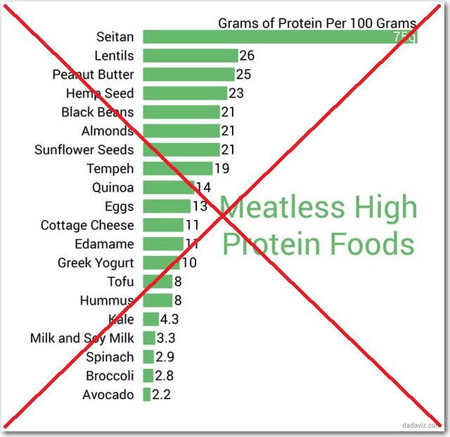
While searching for data, I found a really nice article on bemu.com that listed 20 meatless high protein foods. I especially liked the article because it provided quantitative data (grams of protein per 100 grams). One thing the article lacked, though, was a way to 'see' all the data, such as a graph. A neat website called dadaviz.com came to the rescue and provided a fairly nice graph of the data:
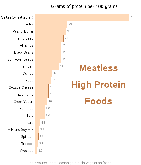
I liked the way their graph was laid out, but I decided to create my own SAS version with a few small changes ... hopefully improvements!
I removed the space between the bars, making it easier to compare adjacent bars. I used slightly smaller/lighter text for the values at the ends of the bars (so they don't visually overpower the bars), and also added a footnote so people would know where the data came from. I added html hover-text to each bar, which is a good idea in general, and especially helps visually impaired users who are relying on audio screen-readers to help them 'see' what is on the page. And last, but not least, I added html drill down links to each bar, so you can click to launch a Google search for that food item. (Click the snapshot below to see the interactive graph with the html hover-text and drill downs.)
And now for a bit of fun! ...
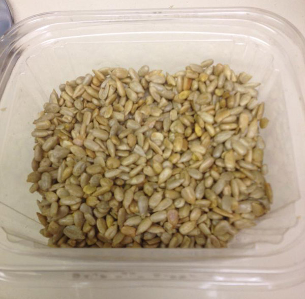
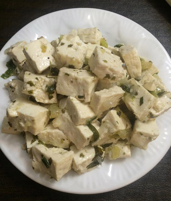
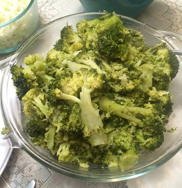
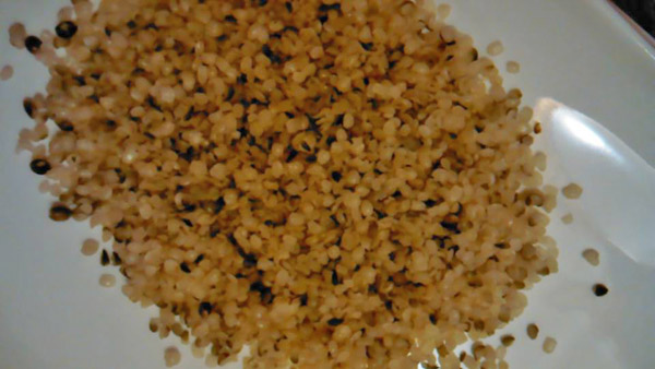
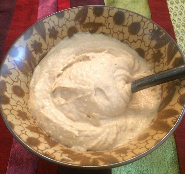
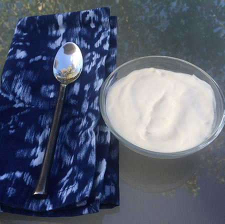
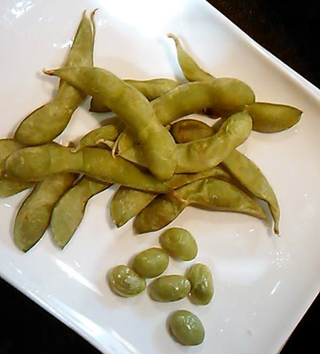
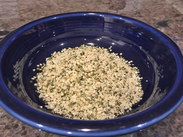
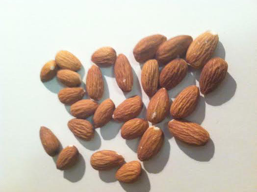
Here are some photographs provided by various friends of mine, showing some of the foods in the graph. How many of these foods can you identify/name? (feel free to leave a comment with your guesses!)
#1 (Dee)
#8 (Joy)
#9 (Kurt)
I hope you enjoyed the blog - feel free to share it with your vegetarian friends! :)


6 Comments
Pingback: Plant Powered Protein - SAS Life
Great Blog Robert! It would be even better if you added fat and calorie content to the visualizations to help guide us on making good choices that meet dietary fat and calorie intake goals. Thank you! Annette
A chart showing grams of protein per 100 calories might be a good addition to this post.
Another improved data visualization!
Some tasty looking food... My identification guesses:
#1 - Sunflower Seeds
#2 - Tofu
#3 - Broccoli
#4 - Lentils
#5 - Hummus
#6 - Greek Yoghurt
#7 - Edamame
#8 - Quinoa
#9 - Almonds
Pretty close ... but at least 1 guess is wrong! :)
#5 Surely looks like HUMMUS. Yummy!