I hear a lot of talk about income inequality in the US ("the rich get richer..." and such) - especially as elections approach. I also see a lot of graphs, and they all seem to define their numbers slightly differently. I'm not in a position to improve the way income is defined (that's up to the people working with the raw data), but I think I can make some improvements in how the data is graphed!
For example, I recently saw this graph in a Forbes article.
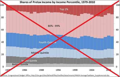
At first I thought it was interesting and fairly well laid out ... but after studying it, there were several things I realized that I didn't like. The biggest problem was that each color did not represent a quintile. The lower 4 each represented quintiles, but the top quintile had the "Top 1%" split out separate. The article also points out that the top quintile's share of the income had recently risen to over 50% ... but yet there wasn't an axis label at 50% to make this easy to see. It was also difficult to see whether the values were changing over time, with the gradual yearly changes. And the title of the graph didn't make it clear whether this data represented households or families.
So I found the Census page for historical income data, and created my own SAS graph. I chose the H-2 table "Share of Aggregate Income Received by Each Fifth of Households" (as opposed to the F-2 table, shows similar data for Families). I imported the Excel spreadsheet into SAS, and after a little experimentation came up with the following graph:
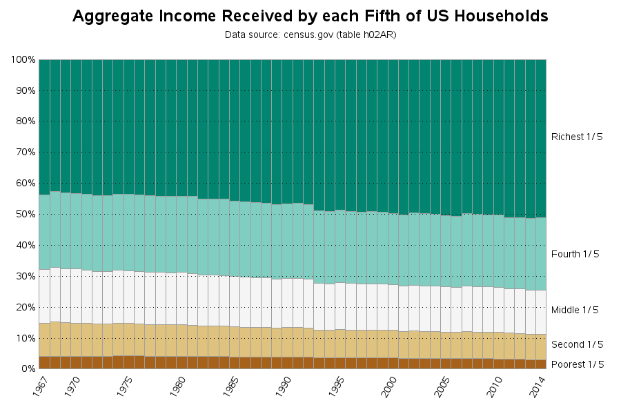
Notice that the title clearly explains this is Household income, and that I chose y-axis labels such that 50% is clearly marked. I also added reference lines, so it is easier to see that there is a gradual downward trend for all the groups except the richest quintile. Also, rather than using a color scheme that includes red and blue (which might be mistakenly associated with Republican and Democrat), I chose more neutral colors from colorbrewer.
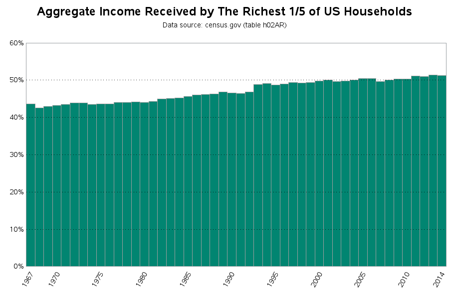
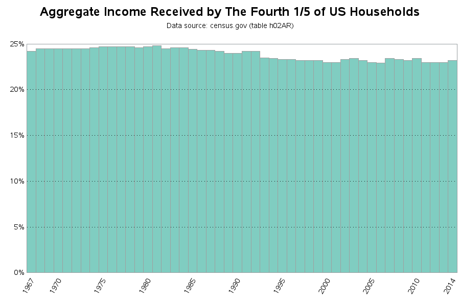
If you click the snapshot of my graph above, you can see the full size interactive version, with html hover-text & drill downs. Click any quintile to drill down and see a graph of just that quintile's data, so you can more easily view that quintile's trend. Here are snapshots of the drill down graphs (notice that I use the same color in the drill down graphs as I used in the main graph):
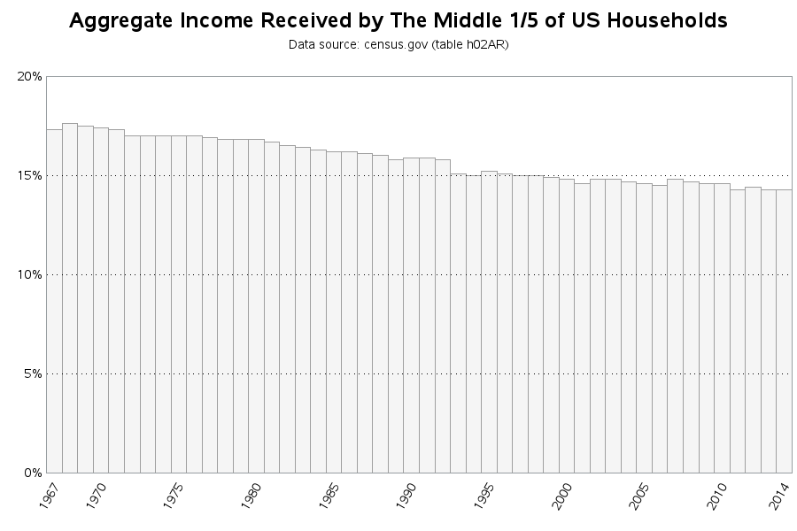
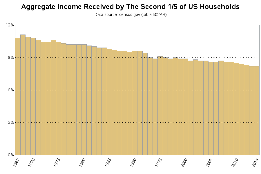
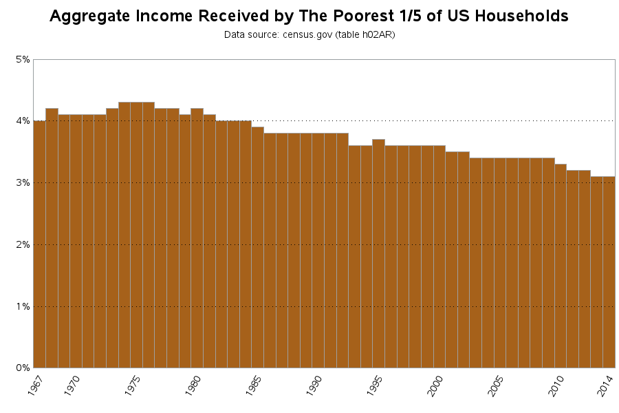
To more fully understand the above graphs, be sure to read the Census' about page. Here are a few bits of information I found interesting/useful:
"Census money income is defined as income received on a regular basis (exclusive of certain money receipts such as capital gains) before payments for personal income taxes, social security, union dues, medicare deductions, etc. Therefore, money income does not reflect the fact that some families receive part of their income in the form of noncash benefits, such as food stamps, health benefits, subsidized housing, and goods produced and consumed on the farm. [...] Moreover, users should be aware that for many different reasons there is a tendency in household surveys for respondents to underreport their income. Based on an analysis of independently derived income estimates, the Census Bureau determined that respondents report income earned from wages or salaries much better than other sources of income [...]"
Now that we have a nice graph, what does this data mean? Are there any experts out there who might can explain it? :)


4 Comments
https://reason.com/blog/2015/09/21/if-pope-francis-wants-to-help-the-poor-h
Skip the politics in this article but it does discuss the impact of "... like government-supplied welfare/food/housing/medical assistance" impact on the "... poorest quintile".
Nice presentation, Robert. Definitely better than the original. I found it interesting that income does not include capital gains. My knee-jerk reaction is that including capital gains would further shift the income towards the top quintile. Also, the census is relying on voluntarily reporting? I wonder if this data is available from the IRS? That might be a better, more accurate picture of wealth distribution.
What do you think?
-Kevin
Good points! - I would like to see the capital gains included (which probably would mainly affect the richest quintile), and also things like government-supplied welfare/food/housing/medical assistance (which probably would mainly affect the poorest quintile).
An example of visualization bias that can be easily overlooked - attention in the detail. Or in this case the "quintiles". I prefer your more representative analysis and data visualization. I'd be interested to hear if there are any subject matter experts in this area that can shed their views on the trends.