I've heard lots of people quote statistics about marriage & divorce, but the experts don't always agree on what the data means. So I decided to run the data through a SAS graphical analysis, and see what the numbers say ...
Before we get into the numbers though, let's have a little non-scientific fun. I asked my friends to submit their 'interesting' wedding photos, and I have selected 2 to include in my blog. Based on your keen powers of observation, which wedding do you think ended in divorce, and which do you think the couple is still happily married?!? (Thanks Holly & Patricia, for providing these great photos!)


And now, on with the simpler task - analyzing the numeric data!
I spent some time on Google searching for graphs and analyses that were already out there. In one NY Times article, they claim that the "divorce surge is over, but the myth (of a 50% divorce rate) lives on". An article on prospect.org showed a nice graph of marriage & divorce rates per 1000 population, going back to 1867. (I found this especially interesting, because it let me know that such data exists!)
After a bit of searching, I found a table of the divorce & marriage data from 1867-1967 at the US CDC website. I had to look in several different places to get the data for more recent years.
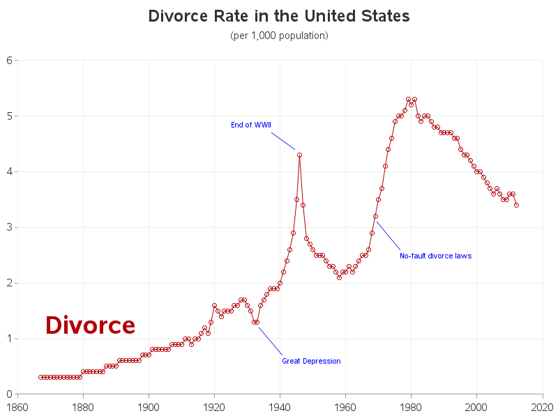
With the data finally in hand, I first plotted the divorce rate (per 1000 population), and it does indeed show that this "rate" had a big jump in the 1970s, but then peaked and has been dropping since about 1980. I used annotate to label some of the events that might have influenced prominent features in the graph.
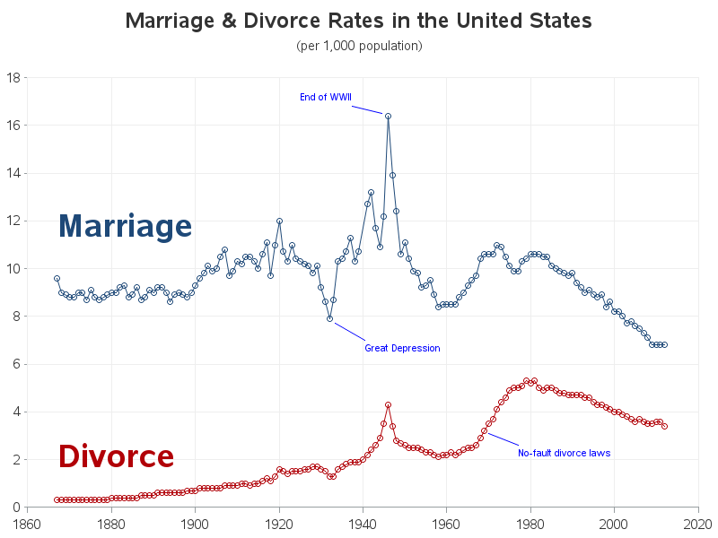
But, you know ... one graph seldom tells the whole story. How can you analyze divorce rates, without also looking at marriage rates? So I added the marriage rate (per 1000 population) to the graph, and it looks like the marriage rate has also been dropping since 1980 (perhaps fewer people are getting divorced because fewer people are getting married?) Also note that although the divorce rate climbed at the end of WWII, the marriage rate climbed much higher. So, I think this graph gives a much more complete picture, than the first graph.
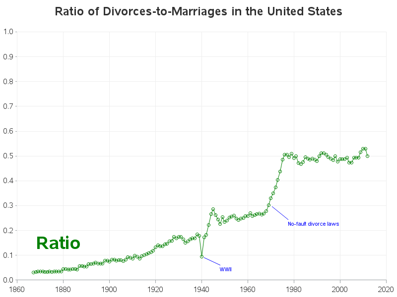
It's interesting seeing the marriage & divorce rate lines plotted side-by-side, but I find that my eyes sometimes play tricks on me, and it is often better to mathematically combine the two line's values, so I only have to visually look at one line. In this case, I calculated the ratio of divorces-to-marriages each year, and plotted that value. And although the first 2 graphs showed the number of divorces per 1000 population have been decreasing since 1980, the number of divorces per marriage have been consistently hanging around 50%.
What factors do you think influenced these rates in the past, and do you foresee the current trend changing in the future? What other data associated with marriage & divorce do you think would be interesting to plot? Do you think the Dr. Phil show could use a graph guy?!? ;-)


10 Comments
Tantalizingly informative article. Unfortunately you failed to cite where you got your more recent data from. “several different places” doesn’t really cut it. :-(
Fair enough :)
Here's a more complete list (which I squirreled away in the comments in my code)...
Using data copy-n-pasted from:
1867-1967
http://www.cdc.gov/nchs/data/series/sr_21/sr21_024.pdf
1920-1957
http://origin.glb.cdc.gov/nchs/data/vsus/VSUS_1957_1.pdf
2000-2012
http://www.cdc.gov/nchs/nvss/marriage_divorce_tables.htm
1996-1998
http://www.cdc.gov/nchs/data/nvsr/nvsr47/nvs47_21.pdf
1997-1999
http://www.cdc.gov/nchs/data/nvsr/nvsr48/nvs48_19.pdf
various individual years from separate reports here:
http://www.cdc.gov/nchs/products/mvsr.htm
I wonder if the number of divorces will go up, after the Ashley Madison member database was hacked & released to the public?!?
I guess if I update the graph a few years from now, that's another label I might need to add to it!
Happy to report that flying bride is my daughter, Holly. Holly and Dave now have twin daughters age, 22 months!
well, some of this data is likely skewed. for instance, I have been married for over 40 years, so I only got married once. I know several people that have gotten married and divorced several times.
Not sure how to reconcile that factor.
I know that these rate numbers do show good data.
YAY! You took my idea! Those articles had some good break downs of how the factors can vary widely based on demographics such as education level, income level and race. Thanks, Robert!
If the data set had couple's marriage and divorce year, I would like to a vintage graph (since I don't know how to do that in SAS)
It would be interesting to know how the length of marriage has changed over time.
That would be interesting, but that info is not in the data I found!
OMG, the bride jumping in the top photo looks exactly like someone I went to high school with (although the groom looks nothing like her husband)! There was an interesting documentary last year called 112 Weddings where a wedding videographer tracked down some of the couples he had filmed to see how they were doing.
I am guessing the smiling couple is still married... unless this is a trick question. I definitely think the Dr. Phil show could use THE graph guy!