When I was a kid, I remember a motivational poster on my dentist's wall that said "You don't have to brush all your teeth -- only the ones you want to keep." That poster really made me think, and brush my teeth! And now that I'm a data-analyst adult, I think I've found an even scarier motivational poster ... graphs showing the percentage of senior citizens who have lost all their natural teeth!
Before we get to the scary data though, here's a picture of my friend Becky's daughter, who pulled her first tooth while performing on-stage in the Sword of Peace outdoor drama. Hopefully once all her permanent teeth come in, she'll keep them for a very long time!

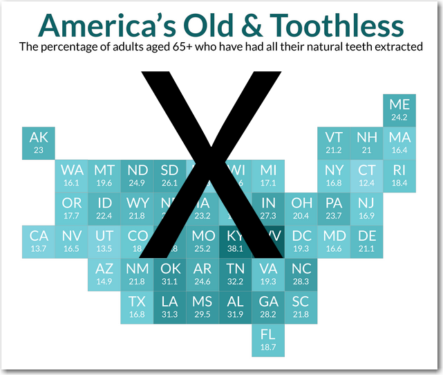
I first saw the seniors' tooth-loss data mapped by Leon Markovitz on dadaviz.com. But Leon used an equal-area map to show the data, and with that kind of map I find it difficult to identify the states I'm interested in. For example, the states are often not in their correct geographical position (for example, the map shows North Dakota to the west of South Dakota, and Virginia to the west of North Carolina). Here's a screen-capture of his map:
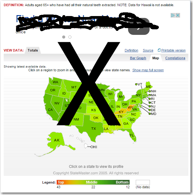
While looking for the actual data values, I found yet another map on the statemaster.com website. This one used a traditional geographical map, but the color ramp they used didn't help me see much about the data. And although the color scale went from bright red to dark green, none of the states in the map seemed to have colors close to either extreme. I found it really difficult to distinguish one shade from another, and intuit the state values. I also didn't really like the layout, with the definition/title way at the top (separated by an advertisement), and the color legend way at the bottom (outside of the map area). Here's a screen-capture of their map:
Now, for *my* graphs!...
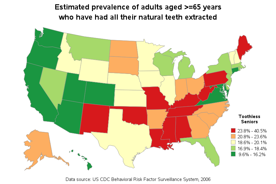
I eventually found the source data on the CDC website, imported it into a SAS dataset, and created my own map. I used quantile binning so 1/5 of the states would be in each color range. I picked a diverging color scheme from colorbrewer.org (with 5 colors, red-to-green), and assigned those colors to the map via pattern statements. If you click the image of my map below, you can see the full size version with html hover-text showing the values for each state.
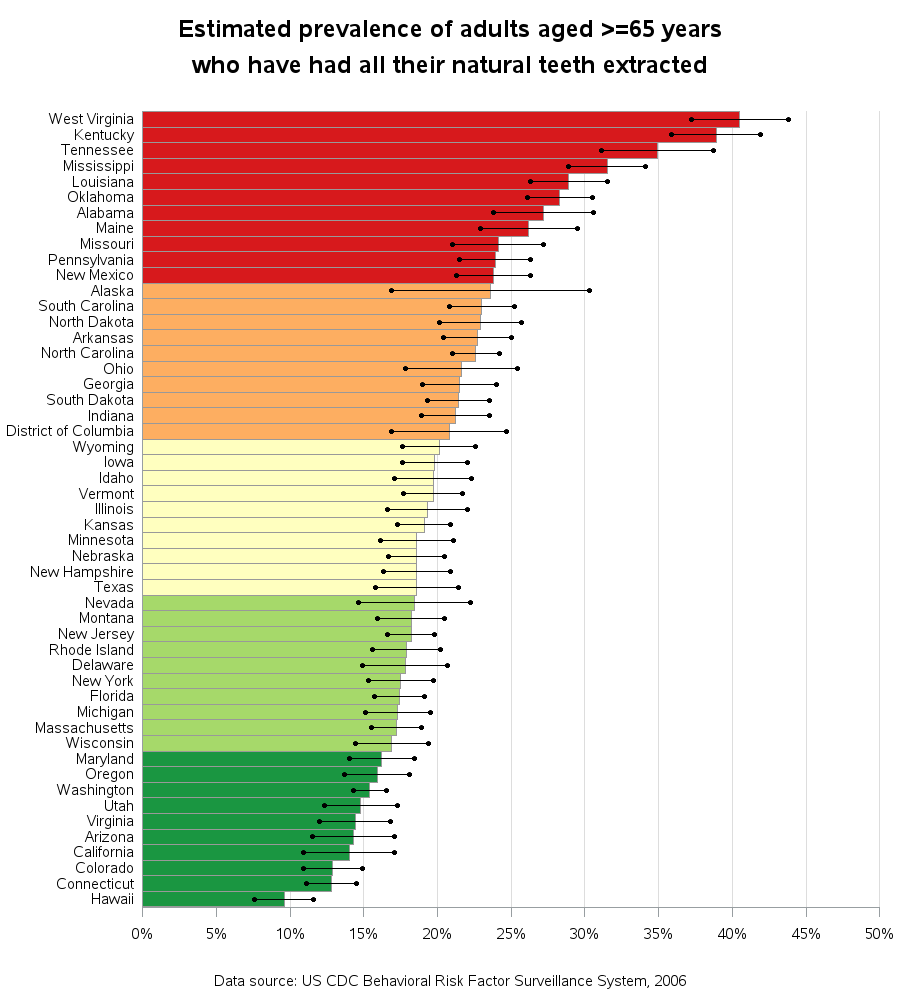
A map is good for showing the geographical distribution and trends in data, but with a list like this I often want to compare and rank the values. So I also created a bar chart. I colored the bars the same as the states in the map (for easy cross-comparison), and since the source data provided confidence interval values, I annotated those onto the bar chart also.
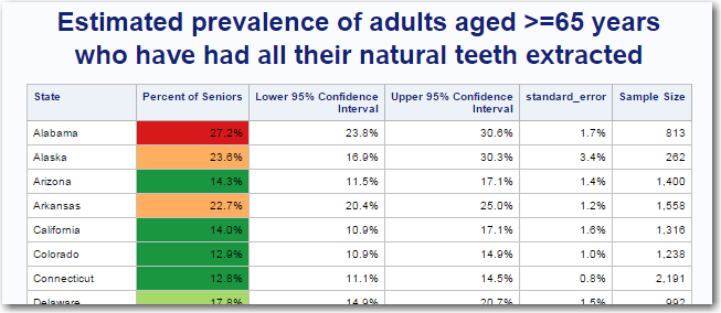
And finally, I also added a text table below the graphs. The text table allows people to easily do a string-search (ctrl+F) for the state name they're interested in, and also allows people to copy-and-paste the data (for further analysis). For continuity, I colored values in the table the same as the map and bar chart. Here's a screen-capture of a portion of the table (click on it to see the full table).
Question: What's your strategy for keeping your teeth, well into your senior years?


14 Comments
Why didn't you include Puerto Rico? Is a Commonwealth of the USA and I would love to see where they fall in the chart.
The data source has data in the table for Puerto Rico and US Virgin Islands, if you'd like to see the numeric values:
https://www.cdc.gov/mmwr/preview/mmwrhtml/ss5707a1.htm#tab7
Not a perfect correlation, and I still remember that one shouldn't imply causality from observed relationships, but here is a hypothesis based on the following map: Voting republican is bad for your teeth!
https://www.google.ca/url?sa=i&rct=j&q=&esrc=s&source=images&cd=&cad=rja&uact=8&ved=0CAcQjRxqFQoTCLyW1uGS9MYCFUGRDQodJgYO3Q&url=http%3A%2F%2Ffreedomslighthouse.net%2F2012-presidential-election-electoral-vote-map%2F&ei=SGKyVbzSOcGiNqaMuOgN&bvm=bv.98476267,d.eXY&psig=AFQjCNFEwLYxyD3Lu00VOfk5-tzndWqANw&ust=1437840328151440
Nice approach but how would you optimize so you would not exclude people with the most prevalent from of color blindness (red-green), which affects at least 5% of the male population and about 1% of the female population.
Additionally, this approach has potential. In your 'spare' time you could create a drill-down map with layers covering income, educational level etc. I bet that there will be some 'nice' relationships there.
See Rick Wicklin's blog for some additional analyses, and some that don't rely on color! :)
http://blogs.sas.com/content/iml/2015/07/24/income-vs-toothless.html
Movin' to Hawaii soon, gonna be a dental floss tycoon
I'm sure Fixodent and Poligrip have a field-day in those red states.
I bet there's definitely some targeted-marketing going on!
Pingback: The relationship between toothlessness and income - The DO Loop
upper_confidence_interval=scan(translate(trim(left(scan(scan(whole_line,2,':'),4,' '))),'','()'),2,'-')/100;
That is a very interesting way of reading in data! Never seen anything like that before.
Brute force! :)
It would seem the best strategy is to avoid the Appalachian Trail!
Hmm ... you just might have something there! :)
It's not so much geography as it is poverty (and probably education, which is associated with poverty). See my analysis of toothlessness versus income, which builds on Rob's data.