I saw an interesting graph on dadaviz.com that claimed Italians had gone from drinking twice as much as Americans in 1970, to less than Americans in recent years. The data analyst in me just had to "independently verify" this factoid ...
But before I get into the technical part of this blog, I want to show the results of a little 'contest'. I asked my friends to submit their pictures they thought would best go with this blog. There were a *lot* of great entries! And the winner is Stuart - it appears he single-handedly brings up the per-capita average wherever he drinks!

And now, on with the blog! Here's a snapshot of the original graph I saw on dadaviz.com. It is a visually dramatic graph, and makes it seem like alcohol consumption in several countries has dropped like a rock since the 1970s. But is it a true representation of the data?...
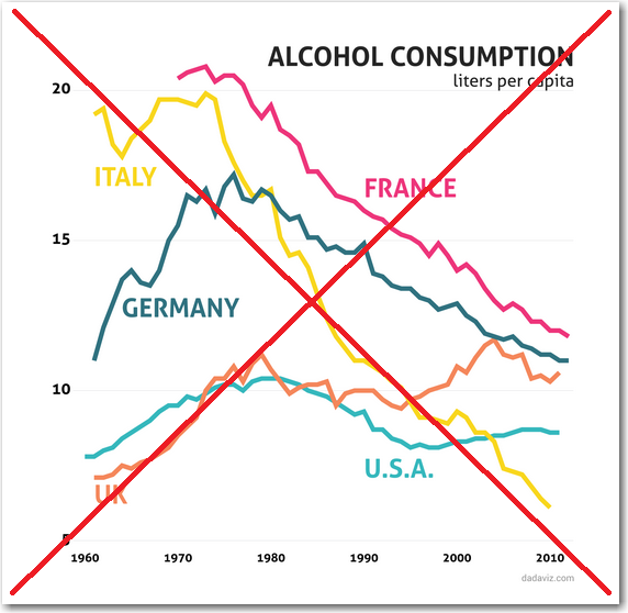
As I looked more closely, a couple of things made me distrust their graph ... I thought it odd that the y-axis started at 5 instead of zero, and that they would pick this proportion (taller than wide) for a time-series graph. Both of these techniques can be used to create deceptive graphs.
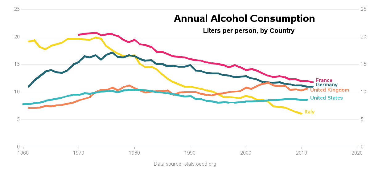
So I set about making my own SAS version of the graph to correct those two problems, and also make a few other improvements. I found the data on the oedc.org website and downloaded it in Excel spreadsheet format. I imported the spreadsheet into a SAS dataset, transposed it (so the years were values rather than columns), and then plotted it with Proc Gplot. Since this is a long time series, I made the proportions much wider than tall (specifying goptions xpixels and ypixels). I started the y-axis at zero (using the order= option on an axis statement). I placed the country labels at the end of each line (using annotated text labels). And I included an extra y-axis on the right of the graph, so you don't have to look way to the left axis to see the values (using a plot2 statement). Here's how my final graph came out - I think it's very nice looking, and represents the data well. (click the image below to see the full-size graph):
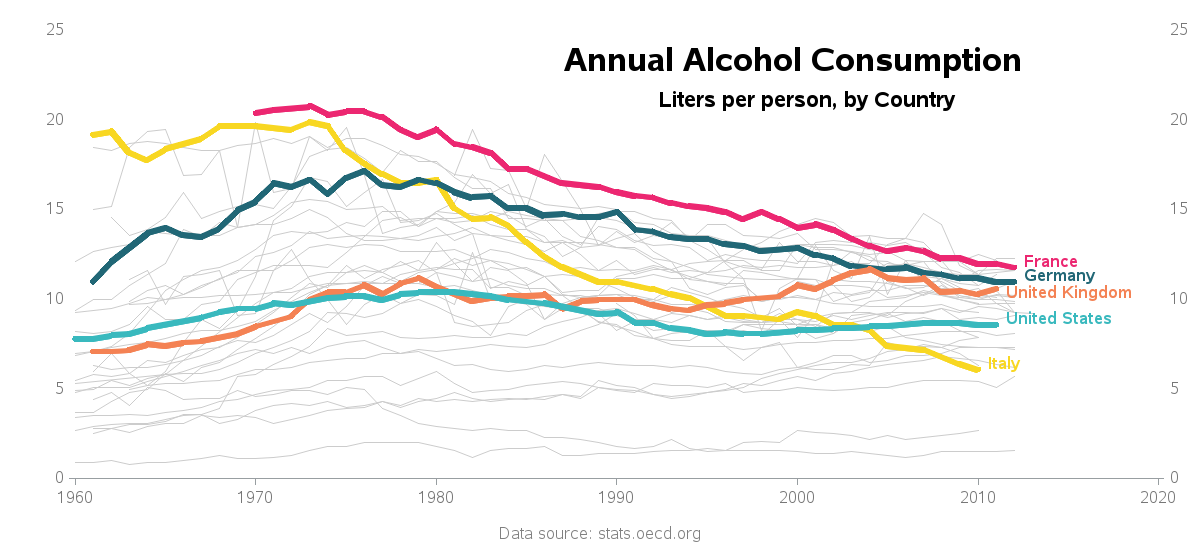
But there was one thing still lacking, from an analytic point of view. The spreadsheet also contained data for several other countries, so I thought it would be useful to show them too (as light gray lines in the background). This allows you to see the 5 countries 'in context' with the other countries. It's not as pretty a graph, but I think it's a good additional way to look at the data.
So, what's your theory as to why the alcohol consumption in some countries has been changing over time (at least, according to this data)? Do you have any special insight or inside-information you can share?


11 Comments
One thing that comes to mind is that people maybe drinking the same amount of fliuds but the alcohol content is less. For example, in the 1970's you would have two beers after your curling game and the alcohol content would be 6%. Now after your curling game you have two beers, but now the alcohol content is 3%. Thus the amount of fluid that one drinks is the same but the alcohol density is lower.
There has also been a movement away from hard liquor to coolers and "lite" wines; drinks with lower alcohol content. Same volume but lower density.
Ahh - that sounds plausible!
I agree with the your "new" way to plot the data - the former way made the data look too steep and deceives the eye. (But nice trick to keep in your back pocket.)
As to why the Italians are lagging ... I would suspect it might be related to Italy's population decline or maybe their money troubles.
Yes, Italians really drink less, thanks for repeating and remixing the original graph. There's nothing wrong with truncating the y-axis on this line graph.
In my view there are 2 points missing here. First, the strength of the alcohol. Wouldn’t you agree that 1 Liter of 96% pure ethanol is somewhat more effective (in making people drunk) than 1 Liter of 6% alcoholic beer? Therefore, when we compare alcohol consumption by volume only it might be that we compare apples to oranges (or grapes to grains). Shouldn’t we compare Liters*Strength/Person ? Secondly, where are other alcohol-consuming countries? Russia, Ukraine or Moldova for example. I suspect that bringing them into the picture would dwarf Italy and USA altogether and make their difference statistically insignificant. It’s just a hypothesis.
Leonid - I believe the data here is referring to 'pure alcohol' (where they factor in the different alcohol content of beer, wine, liquor). On the oedc page where I got the data, here is their document explaining the methodology behind how the data are collected for each country - probably more details than you'd ever want to know! :) http://stats.oecd.org/wbos/fileview2.aspx?IDFile=92937318-d21d-4310-b2c7-ef5adae2242c
Thanks, Robert! Then the first point is mute. Number 2 though still stays. Interestingly, none of the countries I listed as potentially higher alcohol consumers are listed in the document you reference. This is like comparing Business Analytics companies without SAS...
Yep - it would be nice if they had the data for all countries, rather than just this select few. But, even so, it is still kinda interesting to compare the countries for which there is data :)
Btw, related, I brought this trophy back from PharmaSUG 2015 in Orlando: https://instagram.com/p/23Hbp6mUXb/
Nice graphs. I would be interested to see how the Dutch and U.S. graphs compare.
Especially, before and after 2004.
Oh, by the way. I migrated to the U.S. in 2004.
Lex - Netherlands is in the data, so it would indeed be possible to create such a graph. And indeed it might be interesting to see how your move affected the national average! ;)