I was surprised to find that the size of the U.S. federal government is smaller today, than in the past many decades - let's graph it out, so it's easy to analyze...
The way I got started on this little adventure was via Jishai's graph on dadaviz.com. Here's a snapshot of it:
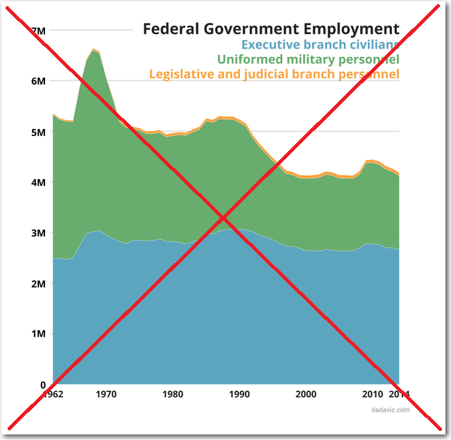
It was an interesting graph, but I had a few ideas about ways to change it, so that it would be better for analytics. So I found the data, copied-n-pasted it into an Excel spreadsheet, imported it into SAS, and created my own version (click this graph to see the interactive version with html hover-text).
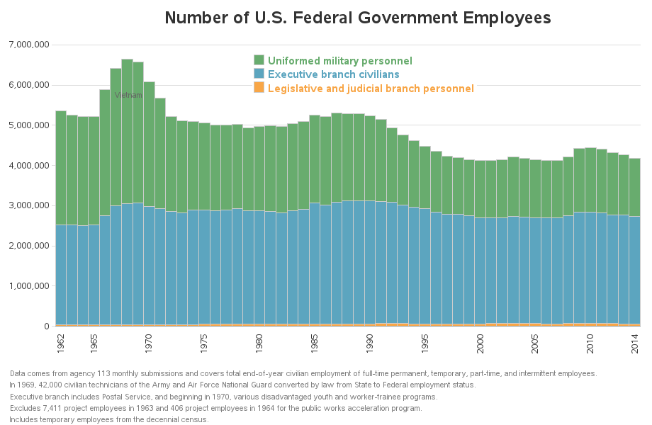
First I changed the proportions, because I think a time-series graph better represents the data when it stretches out across the page. I decided to use a stacked bar chart, rather than line/area chart, so you are visually seeing the exact yearly data, rather than interpolated lines and curves joining one year to the next - the bar chart also allows html hover-text for each bar segment so you can easily see the exact yearly values. I also changed the stacking order of the bars, so that the small (orange) legislative and judicial bar was at the bottom instead of the top. Note that the order of the colors in the legend are the same as the order of the stacked bar segments (top-to-bottom). I used the actual number of employees on the response axis (such as 5,000,000 rather than '5M') in hopes that users will grasp the magnitude more quickly. I added several footnotes at the bottom of the page to help explain the data, and labeled the 'bump' in the graph so people would know that the increase in soldiers was due to the Vietnam War.
Now that you can see the data clearly, what factors do you think impacted the reduction in the number of federal employees over the years? (feel free to leave a comment!)


10 Comments
Take a look at http://www.prepareandprosper.net/how-many-americans-work-in-government-would-you-believe-40-million/
"Nevertheless, Professor Light was able to come up with some useful estimates by using the federal government’s procurement database. When he added up all the numbers, he found that the true size of the federal government was about 11 million: 1.8 million civil servants, 870,000 postal workers, 1.4 million military personnel, 4.4 million contractors, and 2.5 million grantees."
Interesting!
The federal government is using a lot of contractors in place of employees.
Kind of interesting that you see a spike in military personnel during the Vietnam War but not during the Iraq/Afghanistan wars. Maybe these "reductions" are due to outsourcing/contracting?
I think the Vitenam war was a lot more labor-intensive, with lots of "boots on the ground". Or, at the very least, there were lots more US soldiers killed in the Vietnam war (which would require a fresh supply of replacements, and therefore higher numbers of total soldiers employed during that period). Here is a graph comparing the number of US soldiers killed in Vietnam versus Iraq wars:
http://robslink.com/SAS/democd33/war.htm
If you have time, you should show the size of the government as a percentage of the total US population.
Automation? (I would love to see a federal spending overlay and/or size- of -state government overlay!)
Hmm ... so, perhaps they're replacing people with computers/money?
Yes, that was my first thought. (It seems like automation has had its way in many other business sectors with a similar outcome.)
Budget cuts. Attrition.