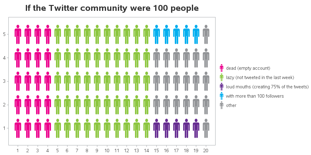
One of our customers asked if I could show him how to reproduce a stickman graph that David McCandless (ala, Information is Beautiful) had created - see screen capture below. I'm not sure that it's the best kind of graph for the occasion, but of course SAS can be used to create it! ...

David's graph uses 100 stickmen to represent all the Twitter users, and divides them into 5 categories. Each category is represented by a color. In the SAS dataset, I represent each stickman by an X and Y pair (for the position on the grid), and Color_value (1-5, for the 5 color categories), using the following code:
data my_data; retain x y; input color_value @@; if x=. then y=5; x+1; if x=21 then do; x=1; y=y-1; end; datalines; 1 1 1 1 2 2 2 2 2 2 2 2 2 2 4 4 4 4 4 5 1 1 1 1 2 2 2 2 2 2 2 2 2 2 5 5 5 5 5 5 1 1 1 1 2 2 2 2 2 2 2 2 2 2 5 5 5 5 5 5 1 1 1 1 2 2 2 2 2 2 2 2 2 2 5 5 5 5 5 5 1 1 1 1 2 2 2 2 2 2 2 2 2 2 3 3 3 3 3 5 ; run; |
I create a user-defined format so that the numeric Color_values (1-5) print in the graph legend as the desired text descriptions, and then plot the points with SAS/Graph Proc Gplot using plot y*x=color_value, and the following symbol statements (the '80'x character of the Webdings font is the stickman figure).
symbol1 font='webdings' value='80'x height=15 color=cxec008c; symbol2 font='webdings' value='80'x height=15 color=cx8cc63f; symbol3 font='webdings' value='80'x height=15 color=cx662d91; symbol4 font='webdings' value='80'x height=15 color=cx00aeef; symbol5 font='webdings' value='80'x height=15 color=cx939598; |
The graph came out like this, which is almost what we want:
I then used axis statements to suppress the axis tick marks, numeric values, and lines (axis1 label=none style=0 value=none major=none minor=none), and have the following plot which is a much 'cleaner' version:
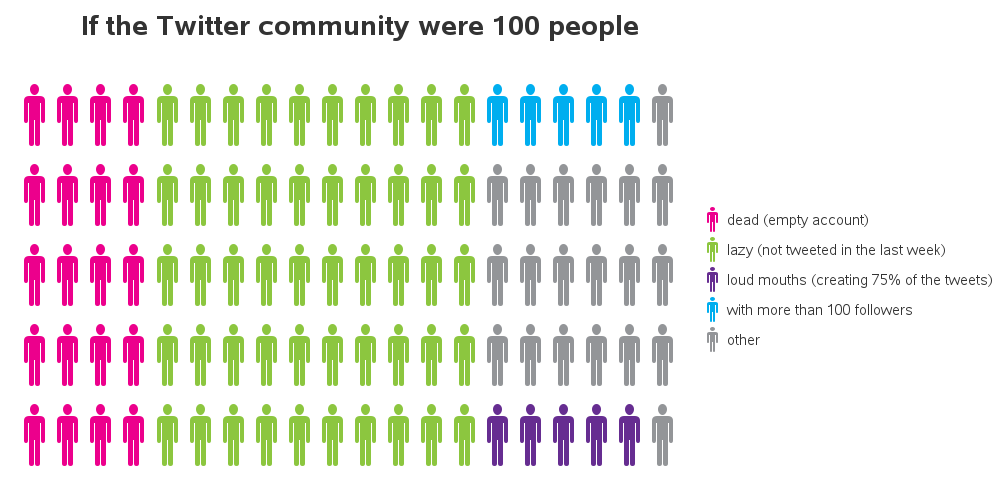 At this point, I would have "called it a day" and been done. But McCandless' version was a little more "politically correct" and had both stickmen and stickwomen ... which makes creating the graph a bit more complex. The technique I was using only allows you to have 1 color and marker shape per each category. Therefore I changed techniques, and used gplot to create a blank graph, and then used annotate to programmatically draw the stickpeople (annotate always gives you total control).
data anno_markers; set my_data; length function color $8; xsys='2'; ysys='2'; hsys='3'; when='a'; function='label'; style='webdings'; position='+'; size=15; color='black'; if color_value=1 then color='cxec008c'; if color_value=2 then color='cx8cc63f'; if color_value=3 then color='cx662d91'; if color_value=4 then color='cx00aeef'; if color_value=5 then color='cx939598'; /* make even x-values the female stick-figure, and odd ones the male */ if mod(x,2)=0 then text='80'x; else text='81'x; run; |
Add to that a few carefully placed (annotated) text labels that explain what the colors mean, and we have a graph very much like McCandless' beautiful version:

What are the pros & cons of these stickman graphs, and what other graph might better represent this data?


12 Comments
I tried to run this using SAS EG 7.1 running on UNIX, but got the Warning: WARNING: Font webdings could not be used.
Do you know if webdings are not available in UNIX? If not what could be used?
I believe Webdings is a Windows font.
Maybe you can find a font on your Unix system that has stick-people, or an alternative might be to use the old SAS/Graph marker (or markere) font, but the stick-people won't look smooth/anti-aliased like a modern font would. Here's a short example that will show you the old SAS stick-figures...
symbol1 font=markere value=R height=4pct interpol=none color=pink;
symbol2 font=markere value=Q height=4pct interpol=none color=blue;
proc gplot data=sashelp.class;
plot height*age=sex;
run;
Thanks for the help. I ran your example and I got a circle and a plus sign. Not as a cool as a stickman! I will look into the Unix fonts.
LOL - thanks heaps! Could you take this one step further and put an image behind one of the colours?
You could use annotate to put an image behind any portion(s) of the graph ... but unless it adds to the meaning, or the aesthetics, I would not encourage doing it (if the image doesn't have a specific purpose, it's just visual clutter that distracts the user's attention from the rest of the graph).
Cool - thanks!! I spent the last few days working this infographic out - your code was so helpful! (Thanks again).
Now I'm going to turn my attention to a half ellipse pie type graph. Any pointers will be GREATLY appreciated. (I'm imagining a rainbow shape, but with each segment of the rainbow (going from left to right) a different color, representing a different demographic (example, Aboriginal / Disability).
Hmm ... ellipses might be a little tougher. SAS/Graph has a pie function you can use to annotate custom pies, but nothing for ellipses (that I know of). To do it with SAS/Graph, you'd need to calculate x/y points along the desired ellipse edges, and then use the annotate poly/polycont functions. Perhaps there's a different way to plot the data, not using a half ellipse pie :)
Could you use the concept of a map shape to create the rainbow arc?
Hello Robert,
I know people who would love these graphs. And they pay me. So I ran the code, but the final step is missing. Could you provide the final proc too? I tried proc ganno but the figure is shrinked to the bottom left part of the results tab (I am running EG).
Thanks in advance, Eric
Hi Eric - glad you like the example!
I only put subsets of the code in the blog (above), but here is a link to the complete SAS code: http://www.robslink.com/SAS/democd77/twitter_as_100_people_info.htm
Thanks! HTML is not working but regular output is fine.
And watch out for a typo where you write "goptins".
Thanks again!
Cheers, Eric
Haha - thanks for pointing out the typo! SAS is so good about 'intuiting' what I meant to type, that I sometimes get a bit lazy. Here's what SAS does with that particular typo:
WARNING 14-169: Assuming the symbol GOPTIONS was misspelled as goptins.