The topic of fracking has been in the news a lot lately - this blog post explores some of the finer points of plotting opinion data related to fracking ...
I recently saw the following graph on dadaviz.com. It showed some interesting data, and presented the data in a way that I almost approved of. Give it a quick look, and see if you can guess the things that bothered me (before I elaborate on them):
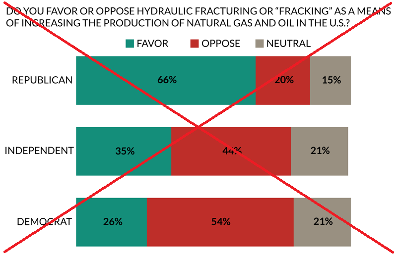
Here is a list of the things I didn't like about their graph:
- The long all-caps title was a bit overbearing.
- The source of the data wasn't listed in the graph itself (you have to look in the dadaviz side-bar).
- The bar segments aren't in a logical order (I think neutral should be in the middle).
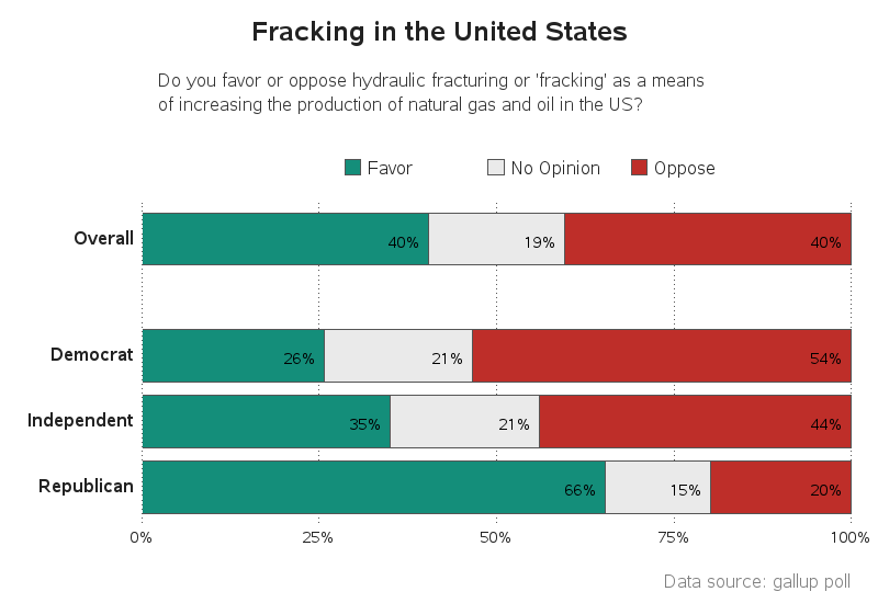
As you've seen in the past, I don't complain about a graph without trying my hand at creating a better one. I found the Gallup article and entered the data into a SAS dataset. I noticed that the article also listed the 'Overall' opinion statistics - I think that's very important to help understanding the data, so I added that to the graph. I used Proc Transpose to get the data structured in a way that it could be easily plotted by Proc Gchart, and then created a grouped horizontal bar chart (similar to the original one, but with an extra group to show the overall statistics), with the 'neutral' segment in the middle (the Gallup article called it 'no opinion' therefore that's what I called it). I made the title mixed-case, and added a footnote at the bottom of the graph to let readers know that it was based on Gallup data.
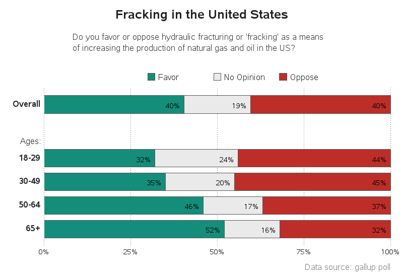
The Gallup article also had fracking opinion data by age group, so I created a graph for that as well:
 Let's not get into a discussion about whether fracking is good or bad. But I invite you to leave a comment on why you think the opinions differ by political party and age group.

19 Comments
Thanks very much, it's very helpful!
Can I ask how to show the percetage in the bar?
Best regards
In this particular case, I annotated the percent values. Here's the code I used: http://robslink.com/SAS/democd77/fracking_opinion_political.sas
Have you done any analysis on fracking sites and associated increase in earthquake activities(more than usual) ?
Just got this post on about Oklahoma having a 4.0 today (4/23/2015)
http://dutchsinse.com/4232015-4-0-magnitude-fracking-earthquake-strikes-oklahoma-global-unrest-underway/
(click on picture for get close up on frack sites locations)
http://i1.wp.com/dutchsinse.com/wp-content/uploads/2015/04/4.0m-fracking-earthquake-april-23-2015-oklahoma.jpg
I've helped someone create animations of earthquake data in the US over time, and there definitely seems to be an increase in earthquakes in Oklahoma in the past few years.
As regards the color choice of not pure green and not pure red, on the assumption that it would avoid the problem of the commonest form of color blindness, the whole problem could have been definitely avoided by any color pair not known to be involved in color blindness.
For me, with no color blindness (that I am aware of), a helpful way to improve these bar charts would be to use white text when annotating the green and red bars.
Text readability is not a problem for the first set of three bars where the text is not only larger, but also bold face. On the sets of four and five bars, the text is not only smaller, but also normal (not bold) face.
When using colored text on a colored background, you always need to maximize contrast.
When using text, lines, plot markers, or legend samples of various colors, if you want the colors to be reliably distinguishable, you need thick enough text, thick enough lines, big enough markers, and big enough legend samples.
Small black text on the green used here, on the red used here, or on any other non-bright color is hard to read.
I am not surprised by the age breakdown. Those most likely to be affected by long-term consequences seem most opposed to the risk.
Because we're looking at percentages rather than absolute numbers, I would want to see number of responses in the categories.
I think that including the OVERALL graphics is important as the three bars do not show proportional relationships between the political parties. In other words, the bars are a little misleading that there might be equal number of republicans, independents and democrats. Perceptually, people might even think independent, oh they are small, therefore, the republican and democrats are probably of be equal sizes... but it could have easily been 60% independent and 20% of the two major parties.
Which leads to the age groups charts, how are we to know that 50% of the sample might have been over 60? Percentages of a percentage... well, I'm not a big fan of proportionally sized pies charts which can often be displayed with a heat map. But, would a heat map have been appropriate for the three bar for each party? For the age distribution, I think a heat map might have been appropriate (the data is not made available)
Myself, I would have liked to seen something different with the party decompositions. For instance, of those approving, what percentage were republicans, independent, and democrats. However, this would not make good bar to bar comparison as relative sizes would likely not be proportional. With that said, I think a heat map tiled by agree, neutral, and oppose and then decomposed by parties would make a good heat map. Which might make the graphic a little less politically polarizing.
And yes, I would agree we need the source, Gallup and maybe how. Myself, I often start by looking to see where sample bias could have entered (like who paid for the survey). At first glance, 50% cell and 50% landline that might seem fair as many young people are more likely to have cellphones than landlines. However, that's no guarantee that the survey included 50% young people. If nothing else 50% landlines, is likely to bias the sample to an older population.
So the two heat maps that I would have wished, had the data been made available...(1) Agreed, tiled by party and decomposed to age group. (2) Oppose, tiled by party and decomposed by age group. (3) Overall, Response/Party tiles (9), decomposed by age groups.
Roger - thanks for the in-depth thoughts on the graph. I'd definitely like to get ahold of the raw data for this survey (rather than just the overall summary results), and then I could factor things such as the number of respondents in each category, into the visualization!
Robert,
I found the code but when I run it the colors don't show up in the legend or the bars. I'm running 9.3. Is there something in your code that is specific to the latest release?
Thanks,
Hmm - that's strange. They're just simple pattern statements with colors specified.
Maybe kill & restart your sas session, or maybe try a "goptions reset=patterns;"
What happened to the twenty-somethings? Are they the Lost Generation? Or is that supposed to be 29 rather than 19? Is the code posted yet?
Thanks,
Thanks for the sharp eye Brian! You are correct - it should be 18-29 (rather than 18-19). The original data table was a png image, therefore I had to type the data by hand (rather than copy-n-paste), and I made a typo on this one. I have corrected it now.
Love your blogs, they're always interesting, current and tutorial.
At first glance, looking for things to pick on, I thought the original was fine, drab but fine.
After seeing your graphs, I started to notice some things.
In short, I think the underlying difference in graphical presentations is the difference between making a point, i.e. presenting an agenda, and pointing to what the data makes. To explain, the original clearly seems in favor of fracking. The columns are in descending alphabetical order. The big green band is top left for viewers to see first. In fact, the top row adds to 101%. I assumed a rounding liberty within 1%. But then the middle row adds to 100%, while the bottom row adds to 101%. So sceptic in me wonders if the top row green rounded up to stand out more and bottom row rounded up to hide bias :-)
So clearly the original appears to me at first glance in favor of fracking, but your graphs point out it's clearly more equally divided. I further find interesting the age range breakdown of opinions. For example, the parental demographic, ages 30-49, the folks concerned with child welfares and futures, most notably oppose fracking. And, the 50+ crowd, the folks having least future remaining, oppose least ;-)
Sorry for my lengthy-ness.
Peace,
Paul
Good insights, Paul - lots to think about!
(Per the rounding - that's not the graph-author's fault, since the rounded values came from the original data table. I think they should have shown the table values out to 1 decimal place, rather than rounding to integers.)
Re: Per rounding
Forgot to mention, I noticed too that unlike the original graph, your ages graph rows add up to 100%. But, if I average each row by each opinion, overall favor is more like 42.33% and 41.25%, overall no opinion 19% and 19.25%, and overall oppose 39.33% and 39.25%. So by this little exercise you can see the no opinion rows and oppose rows are within rounding tolerance but the in favor row is off by more than 1.25% and 2.33%. When I see things like this, I wonder about the data, not your graphical abilities :-) I know all to well garbage in garbage out!
BUT, your graphs made this a realization which is very important. All too easily do we, (perhaps just me), assume that data collection is accurate.
Again I'm a fan, and I think your posts/work is fascinating!
Thanks
I do like yours better, but I have a feeling anyone with red/green color blindness is going to have major issues with either the original or yours! What are your thoughts on color in these sorts of graphs?
Hi Elizabeth. Good question, but I don't think it is a problem in this graph ... I have laid out the legend color chips and labels right above their respective bar segments, so I think it should be easy to tell which is which (even if the graph were printed on a black-and-white printer). Also, I checked this graph to see what it would look like to a red-green colorblind person using the vischeck.com website, and the 'red' and 'green' I used are easily discernible (note that I didn't use pure red & green, but instead used cxbe2e29 and cx148e7a).
It would be interesting to have a color-blind person comment, and let us know whether or not they have trouble reading this graph! :)
I'll have a friend of mine check! He likes to tell stories of the fabulous "grey" suit he bought once that he found out much later was a delightful kelly green.