Having spent many years in graduate school, and living in the Research Triangle Park (RTP) in North Carolina, I have a lot of friends from other countries. Therefore when I recently saw some stories & graphs about EB-5 visas (where you invest a cool half-million US $ to bypass the long lines) they caught my attention...
The EB-5 Immigrant Investor Program was created in 1990 to stimulate the U.S. economy through job creation and capital investment by foreign investors. EB-5 investors must invest in a new commercial enterprise, which creates at least 10 full-time jobs, and make a capital investment of $1,000,000 ... or $500,000 in a high-unemployment or rural area (which is usually the case).
And now for the big question - who paid $500k for these EB-5 visas last year?!?
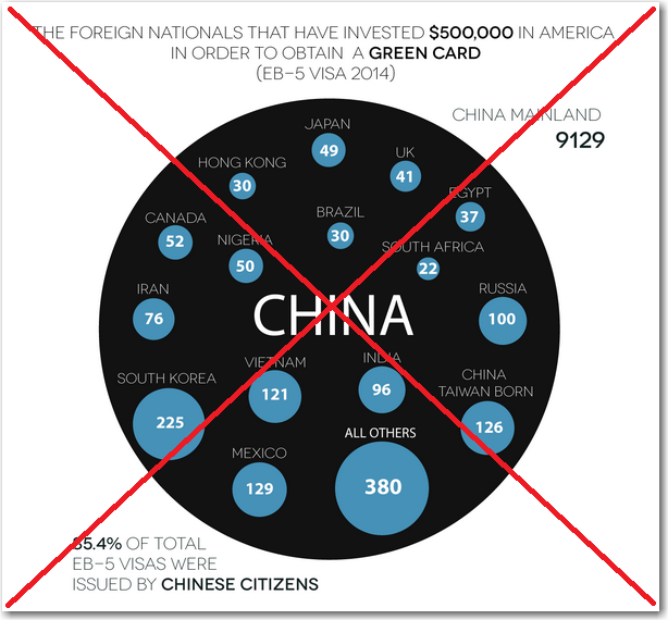
I thought I had found the answer in an infographic on dadaviz.com where they showed a custom chart made up of bubbles (see below). It was an interesting graphic, but a little confusing. Were all the blue dots sub-regions within China? I guess Taiwan and Hong Kong might be, but definitely not Japan, etc. What countries were represented by the 'Other' bubble? Did China really have an order of magnitude more than any other country, or was that just a quirk of the way I was interpreting the graphic? I had more questions than answers...
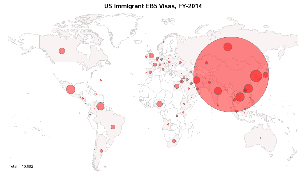
I did some digging and found the raw data on the Department of State's web page, and finagled it into a SAS dataset (it was in a pdf file rather than simple text, therefore I couldn't import it directly). I then experimented with several different ways to plot the data, such as a bar chart - but there were just too many countries, and too big a spread from the minimum to the maximum values, for traditional graphs to work well and show all the data.
What I finally came up with was a SAS bubble map, followed by a simple sorted table. The map allows me to represent both the quantities and the geographic locations, and the table allows me to quickly see the actual values and determine which countries have higher/lower values than the others.
Click the map below to see the full-size version, with html hover-text for each country. With this map, you can easily see which countries the people getting EB-5 visas were from, and that China had way more than any other country (so many, that they actually reached the limit before the end of FY-2014).
If you were going to invest $500,000 for a US EB-5 visa, what enterprise would you invest in, and where would you locate?


1 Comment
Interesting map (and I agree much more consumable than the original). If the data are available it would be interesting to be able to drill/link to further charts or maps showing where the investments from the various countries were ultimately made. Are more on the west coast vs east coast, big cities vs small towns, "rust belt" vs "middle America", etc.