Everyone loves a good conspiracy theory - hopefully you'll enjoy mine about the number of US E1 visas!
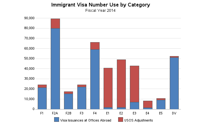
I was perusing some of the US government charts, and found one on US immigration visas that caught my attention. It was a 3D bar chart, and since I always mistrust 3D charts, I immediately assumed there was something misleading about it. I noticed that the number of E1 visas was very close to the 40,000 reference line (see circled in red below), and I wondered whether it was in fact above or below the line. It looked like it was below the line, but you know how 3D graphs are difficult to read when you're looking at them from 3D perspective angle.
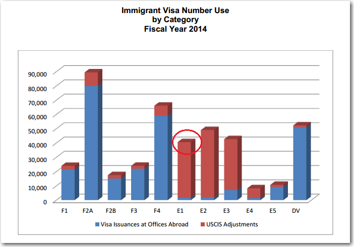
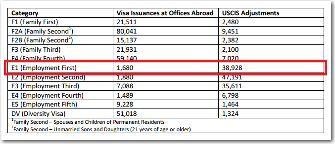
Luckily their chart had a table below it, so in theory I could just easily glance at the table to see the exact number of E1 visas, and know whether or not they were above or below 40,000. But I was thwarted again! The table showed the number of E1 visas broken down into 2 groups (corresponding to the red & blue bar segments), but not the total! See the E1 row marked in the table below.
I decided to use SAS to get to the bottom of this!
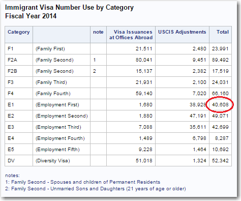
I entered the data table into a SAS dataset, and programmatically calculated an extra column with the total value in it. With my SAS table, you can definitively tell at-a-glance that there were indeed more than 40,000 E1 visas (40,608).
And of course, being a graph guy, I also decided to create a non-deceptive version of their graph (click here to see the sas code). Although I'm not a fan of using 3D graphs for 2D data, I wanted to show how SAS' 3D graph can represent this data in a non-deceptive way. Notice that there's no gap/space/offset between the bars and the backplane of the graph, and therefore the 3D perspective (angled) view does not make the E1 bar look like it's below the 40,000 line.
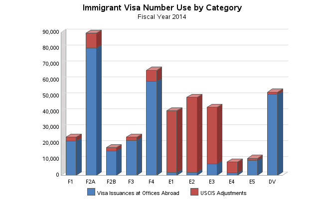
But even with SAS' non-deceptive 3D chart, the 3D effect really adds nothing beneficial to the graph - it just makes it look more visually cluttered and more difficult to read. Therefore I created a 2D version, which is what I would recommend using:
OK - so you've probably realized that it is a bit of a stretch to call this a 'conspiracy' or a government cover-up ... but it is a good example of how charts and tables can be designed in a way that can help, or hinder, the users.
While we're on this topic - have you ever encountered a chart where you thought someone was trying to deceive you, or cover-up the truth? Tell us your chart-based conspiracy theory! :-)

1 Comment
If the choice of explanation is either incompetence or conspiracy, incompetence is a much safer bet. As far as 3-D graphs are concerned, they should be banned for two reasons, viz. (1) most data they are used for are 2-D in nature and (2) 3-D graphs are too hard to read.