The best graphs are both beautiful and informative - a smooth blend of art and analytics. But more often than not, the two collide rather than blending smoothly...
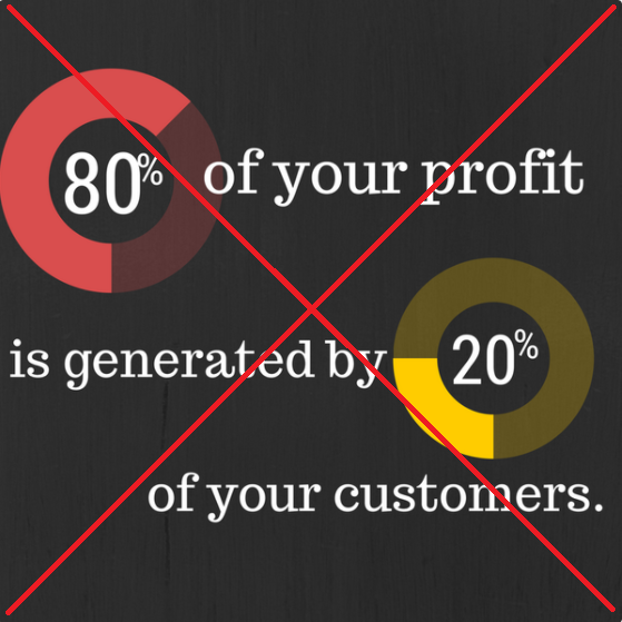
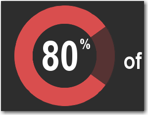
Here is a link to a artistic infographic I recently saw posted by Vendavo on twitter. Their message (80% of your profit is generated by 20% of your customers) seemed 'plausible' ... but something just didn't seem quite right about their infographic. Upon closer scrutiny, I noticed that the slices in their pie charts did not seem to accurately represent the numbers (80% and 20%) in the text.
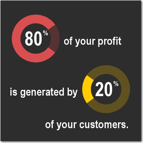
So, of course, I decided to make a SAS version that was both beautiful and informative (... with correctly sized pie slices!) Here's what I came up with, to show that an infographic can be both artistic and accurate!
Technical Details:
For most infographics, I like to use SAS' annotate feature. Annotate allows me to programmatically place custom graphics and text anywhere on the page, and do so in a data-driven way (that way, I can make sure my 80% and 20% pie slices occupy 80 and 20 percent of their respective pies, for example).
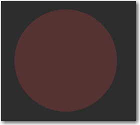
To produce the donut pies, I first created a full/solid pie of the non-slice color:
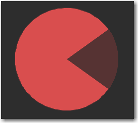
And then added a bright slice of the desired percent (with the angle calculated using a data-driven equation, of course!):
And then overlay a smaller solid pie, the same color as the background:

And, for the finishing touch, I added the text labels:
If you'd like to create a similar infographic, here's a link to the exact SAS code I used.
Now it's your turn - what's the worst clash of art and analytics you've seen? :)


6 Comments
Brilliant article, Robert! Congrats!
HI there, I ran your code, parts of text "is" is cut off by the edge.
I changed this line "goptions xpixels=600 ypixels=600; " to "goptions xpixels=800 ypixels=600;".
Problem solved.
Thought maybe you should know it.
Really enjoy your post.
Have a good weekend.
You'll find a few classics here http://www.businessinsider.com/the-27-worst-charts-of-all-time-2013-6?op=1&IR=T
Good stuff! ... And by "good stuff" I mean good *bad* stuff! :)
A better scaled donut pie chart...
Love the power and beauty SAS Annotate offers for custom graphs!
On the topic of misrepresentation, here is an interesting collection of posts on "mistaken data" and visualizations that may be of interest, http://flowingdata.com/category/statistics/mistaken-data/
Wow - that's an interesting link!