As a blogger, I often wonder whether my blog posts are 'successful' - and being a graph guy, I like to visually analyze the data, to try to answer that question.
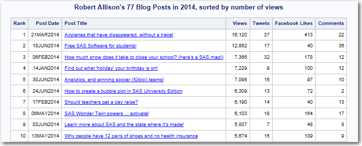
The most common measure of a blog post is probably the number of times it was viewed, so I guess the simplest approach would be to rank your blogs by the number of views and look at the top 'n'. Here's a list of the Top 10 most viewed blogs that I posted in 2014 (you can click the image below to see the interactive list, with drilldown links):
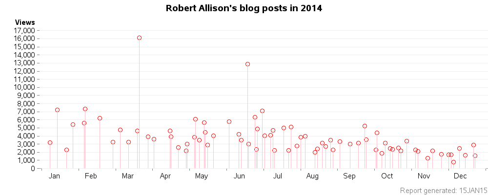
Such a list seems like a good metric, but it doesn't factor in time. The longer a blog post is out on the Web, the more views it's likely to accumulate ... which means it's not really fair to compare posts I made in January to posts I made in December. Therefore I prefer to graph the data, and then look for the 'outliers'. Click the snapshot below, and you can see the interactive version, with hover-text and drilldown for the plot markers (each marker represents a blog post). This plot shows the two posts that stood out most in 2014 were the ones on Disappearing Airplanes and Free SAS Software.
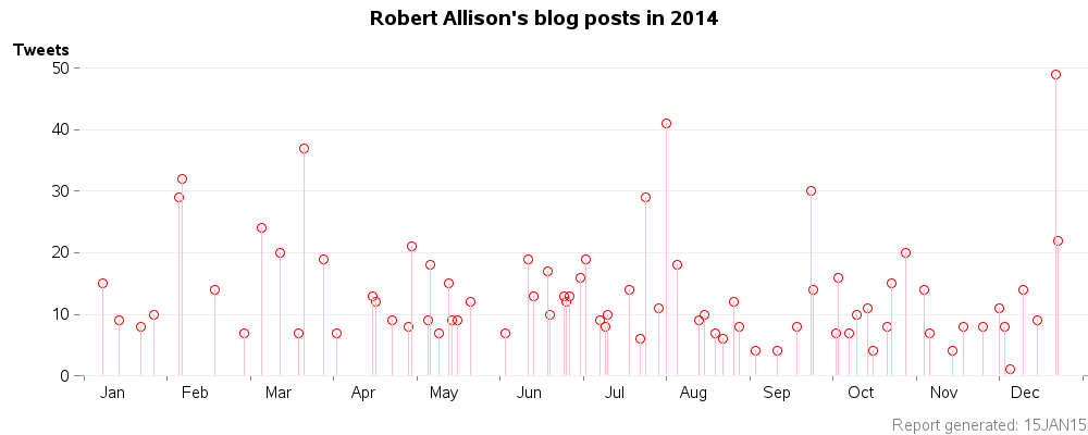
What about other metrics? - Well, there are the number of times a blog post has been tweeted about. Hopefully the people who tweet about your blog are promoting/sharing it (as opposed to making fun of it, or pointing out how bad it is, LOL), therefore let's assume that "more is better" when it comes to tweets. Looks like my blog posts on Shark Week and Santa's Dashboard got the most tweets.
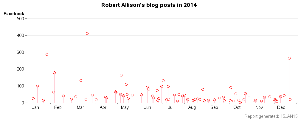
Another metric is the number of Facebook 'Likes' a blog post receives. I pretty much take this at face value - the reader has a Facebook account, and they actually liked the blog post enough that they felt compelled to click the 'Like' button. My most-Liked posts in 2014 were Disappearing Airplanes, Mead, and Santa's Dashboard:
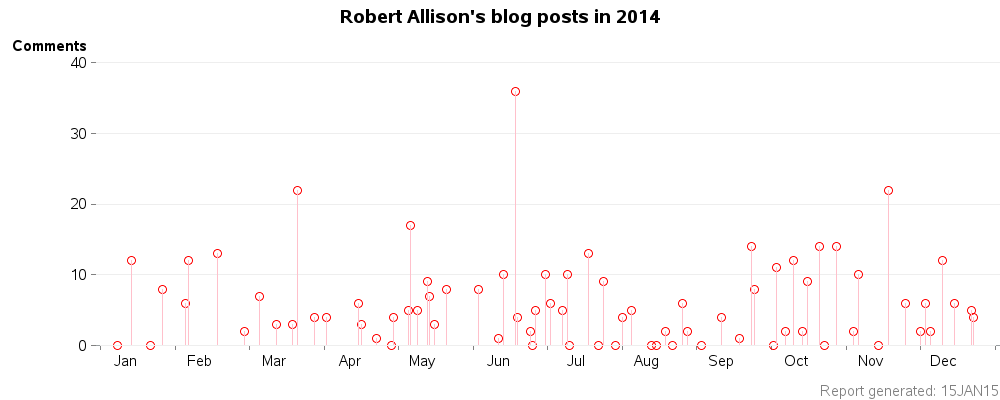
And one final metric - the number of comments a blog post receives. This might be considered a measure of how well the post has 'engaged' the reader (on the other hand, sometimes comments are questions about a confusing post, or corrections to an error in a post). My blog post receiving by far the most comments was the one announcing the Free SAS Software.
So, did the blog post(s) you found most memorable/useful stand out in any of these graphs?
What kind of blog posts would you like to see more of in 2015?


7 Comments
Thank you, Robert, for Showing us how to Know the Status of my Blog... This SAS Analytics is very useful for Bloggers from where they can track them. Can you Please Tell me How to integrate this into my Blog and to run it in my Blog Thank you
Here's the SAS code I used to graph the data (the SAS code to collect & manage the data will vary, depending on how you collect stats for your blog): http://www.robslink.com/SAS/democd75/blog_posts_2014.sas
SAS analytic s is very very useful, indeed! Specially to those blog owners out there. Now, they can track how their blog posts are doing. It can help them improve their blog in a faster and easier way.
We use SAS techniques for quite a lot of "operational" reports about our blogs. We can use the results to improve our content and process so that our blogs are more effective and more efficient -- here's an example of one improvement.
I submitted a SAS Global Forum topic about how SAS uses SAS to analyze SAS blogs, which I'll present at SAS Global Forum 2015.
^^^ Chris is a 'master' at blog analytics! :)
How very meta to blog with graphs of your blog posts ;-)
I like the variety of topics and tips you provide with your blog posts. Keep it up!
Comments like this make me happy - thanks! :)