The holidays are sometimes chaotic, especially for those tasked with analyzing consumer shopping data! I would like to share a few tips on adding order to your chaotic data.
SAS recently published an interesting article, sharing the results from a consumer survey. The infographics in the article showed high-level summary information, such as:

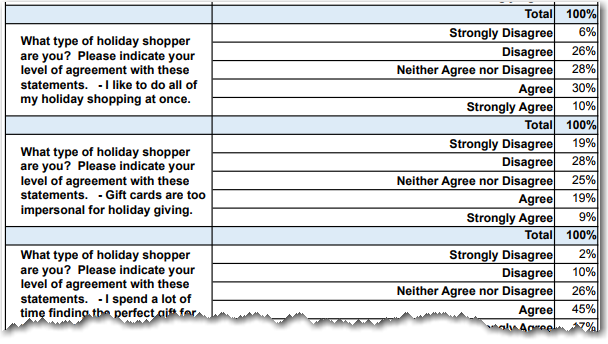
There was also a link to the survey results in a more raw/numeric form. Several of the survey questions rated the answers on an Agree<->Disagree scale, like the ones below. Therefore I decided to plot those all together in a single graph. Follow along as I show you how I created that graph, and incrementally improved it...
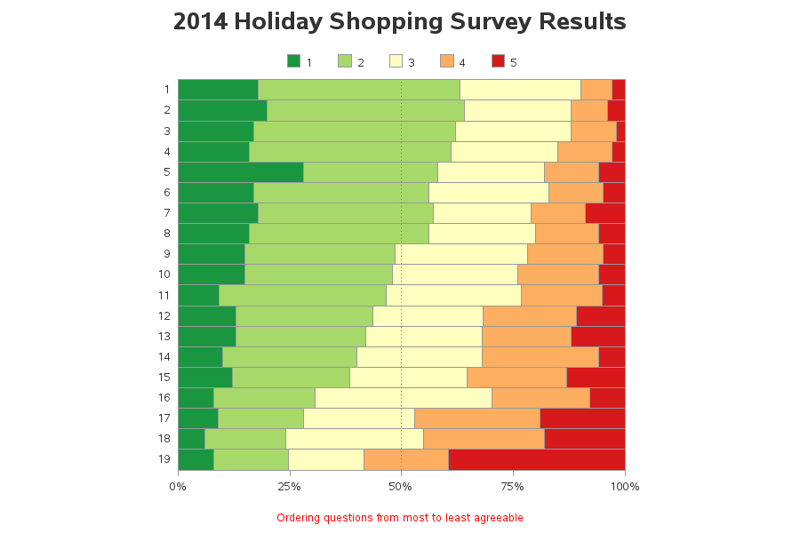
For starters, here are the results, naively plotted using the default alphabetic ordering of all the text values, and using the default colors:
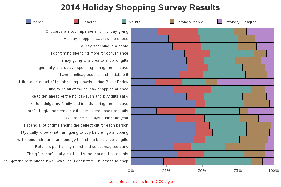
I can quickly 'see' all the data together now, but the graph doesn't really help me make sense of the data. By default, SAS picks colors that look okay together, and that are easy to discern. But since the survey allows users to choose answers on a scale from Agree<->Disagree, it would be more useful to assign colors such that Agree is green and Disagree is red. I can accomplish this by assigning colors manually in pattern statements (in the same order as the alphabetic items appear in the legend):
pattern1 v=s c=cxa6d96a; /* agree */ pattern2 v=s c=cxfdae61; /* disagree */ pattern3 v=s c=cxffffbf; /* neutral */ pattern4 v=s c=cx1a9641; /* strongly agree */ pattern5 v=s c=cxd7191c; /* strongly disagree */ |
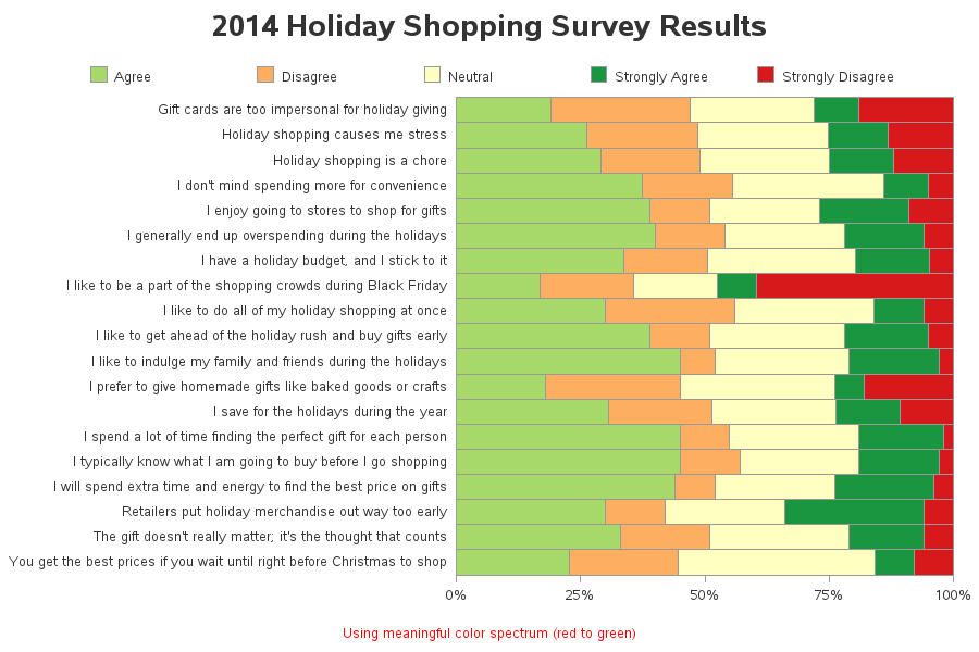
The colors are now meaningful, but they're not in a logical order in the legend, or stacked in a meaningful order in the bars. To fix that problem, I assigned numeric values (stack_order) in a data step, and then plotted by the numeric values instead of the text.
if response='Strongly Agree' then stack_order=1; if response='Agree' then stack_order=2; if response='Neutral' then stack_order=3; if response='Disagree' then stack_order=4; if response='Strongly Disagree' then stack_order=5; |
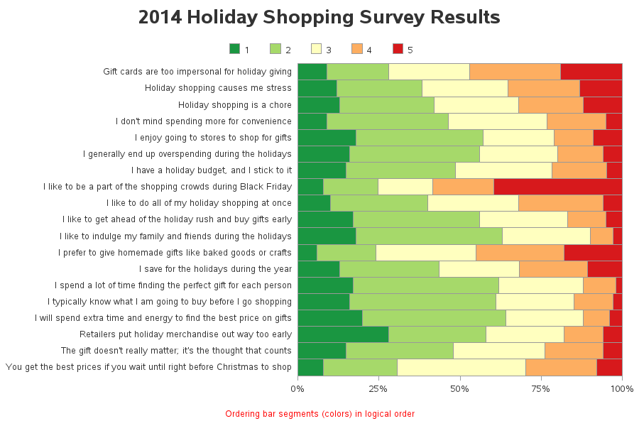
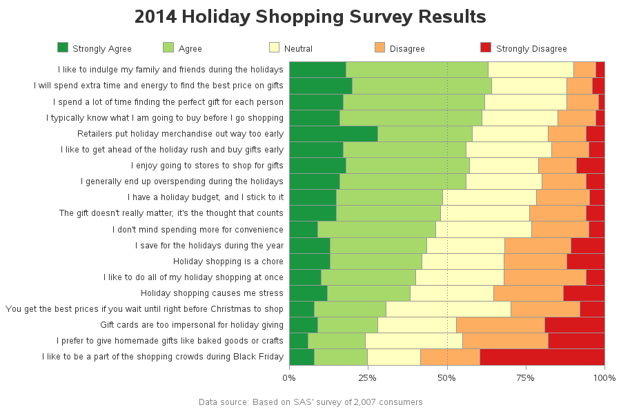
Now the colors in the legend and bars are in a logical order, but there's still a bit of 'non-order' in the graph. The questions/statements are still in their default alphabetic order, which doesn't really benefit us. Therefore I assigned a numeric value to each question, based on how much the users agree/disagree with it (specifically, the value was based on the middle value of the 'neutral' colored segment). I then plotted the graph by these numeric values, rather than the question text:
Now the graph looks very sharp, and logically-ordered ... but the numeric values don't tell us much about the questions and the answers. So I used a little trick called user-defined-formats to make those numeric values show up as the desired text. Here's the code that creates the user-defined format for the legend:
proc sql; create table foo as select unique stack_order as start, response as label from tran_data; quit; run; data control; set foo; fmtname = 'stackfmt'; type = 'N'; end = START; run; proc format lib=work cntlin=control; run; |
Now we have a wonderful graph, where the bar segments (colors) are stacked in a logical order, and the questions themselves are even ordered in a logical way:
So, were any of these survey results a 'surprise' to you? What other questions do you think would be interesting/useful to add to the survey?


5 Comments
Thanks.
I used this numeric reorder method in the past but I thought by now the legend statement would have a statement to order the colors based on the the ORDER statement in the legend. Any chance yet or the future? Thanks.
I doubt that an option will be added to gchart to control the order in which the bar segments are stacked. (If such an option is added, it would probably be in proc sgplot instead, since that proc is still under development.)
very good blog entry
Black Friday shopping appears to be a lot less popular than recent ads and media hype had led me to believe!