Back in the 90s, there was a song by the C&C Music Factory about things that just didn't quite make sense - the song was called Things That Make You Go Hmm.... And in that same spirit, this blog post is about Graphs That Make You Go Hmm...
I'm not really into politics, but I look forward to elections just so I can see what they do with all the data. Some of the graphs are good, some are bad, and some just make me go "Hmm... what were they thinking???". Here's an example of such a graph that appeared in our local newspaper:
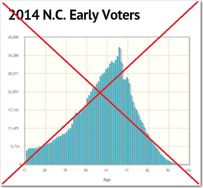
At first glance, the graph seemed OK, and told me that as working-age voters get older they tend to do more early voting, and then after they retire they do less early voting (I presume that's partly because retired people don't need to worry about their work schedule any more, and partly because there are fewer older people still living).
But then I started looking at the finer details of the graph, such as tick marks along the axes. Why did they choose 17 as the starting point for the age axis? You have to be 18 to vote. And the horizontal axis tick marks were spaced by 11 years ... until it reached age 61, and then they incremented by 10 years, and then went back to 11 years. Why? And why didn't they choose some increment of 5000 for the tick marks on the vertical axis? Why did they include a shadow to the right of the bars? The shadow makes the entire graph be visually biased towards the right. The hover-text for the bars shows values such as 'Count: 36800' - why not format the number with a comma like the axis values, maybe something like 'Voters: 36,800'. Hmm...
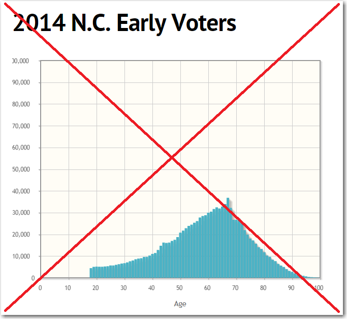
But the thing that really just made me SMH - when I re-sized my browser window, the vertical axis got re-drawn with a scale way taller than needed (making the bars very short), and the most significant digit of the highest value on the axis got chopped off (at first glance, I thought it was 30,000 instead of 100,000). I guess whatever dynamic/interactive software they're using to draw the graph is just too fancy. Hmm...
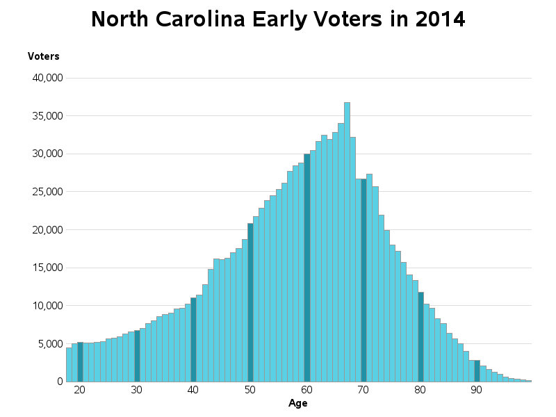
So, I decided to create my own SAS version of this graph, and try to avoid all the problems shown above. Here's what I came up with. Can you name all the improvements? What else would you change?


10 Comments
It would be interesting to who made the graph and what they wanted to show. It would help distinguished whether the misleading problems with the plot are accidental or intentional - the product of ignorance or of careful strategy.
In the original graph, I don't think there was any article/text explaining the graph, so I'm not sure of the original intent.
While I know we dont have all the data at hand, would be interesting to see drill down of male vs. female early voters, and comparison by tax bracket.
Yep!
Hope I'm still here at 99 and early voting!
In addition to comparing to election day voters, it would be great to compare to total number of registered voters for each age.
Good idea!
Yes, it would be great to compare to total number of registered voters for each age, and show what % of each age voted early.
Your comment that:
"At first glance, the graph seemed OK, and told me that as working-age voters get older they tend to do more early voting, and then after they retire they do less early voting"
... is based on the raw numbers of early voters per age, not the % of early voters per age, and could easily be thrown off by the pure demographics... Baby Boomers, etc., and how many registered nonagenarians are there... probably relatively few to begin with, so the raw number of nonagenarian early voters means much less than the % of registered nonagenarians who voted early...
The dip and susequent rise are very close to people born during and immediately after the second world war. So it would be really nice to see population vs age & the per capita rates.
Might be interesting to compare to election-day voters.
Hmm ... yes, that could be interesting!
(I'll have to look around and see if I can find that data.)