When the recent earthquake hit California, one of my friends commented that "California is so dry right now, I'm surprised it didn't just break off and fall into the ocean!"
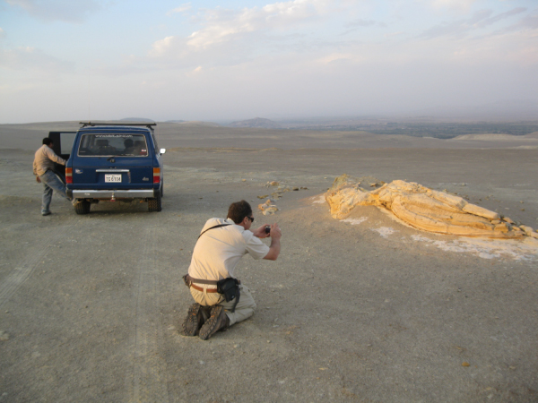
It got me wondering, just how bad and widespread is California's drought? I did a few Web searches and found lots of dramatic before-and-after pictures of their lakes, which are down to about 35% of capacity statewide. Some of the pictures made me think of Southern Peru, and how huge bays and bodies of water there had turned into deserts (millions of years ago), leaving behind fossils of whales which I got to see a few years ago. Here's a picture I took of my buddy Joe taking a picture of one of those whale fossils...
Of course, we're all glad California didn't fall into the ocean, and I'm sure they'll make a comeback from this drought ... but it got me wondering what data is available, and how I might visually analyze it.
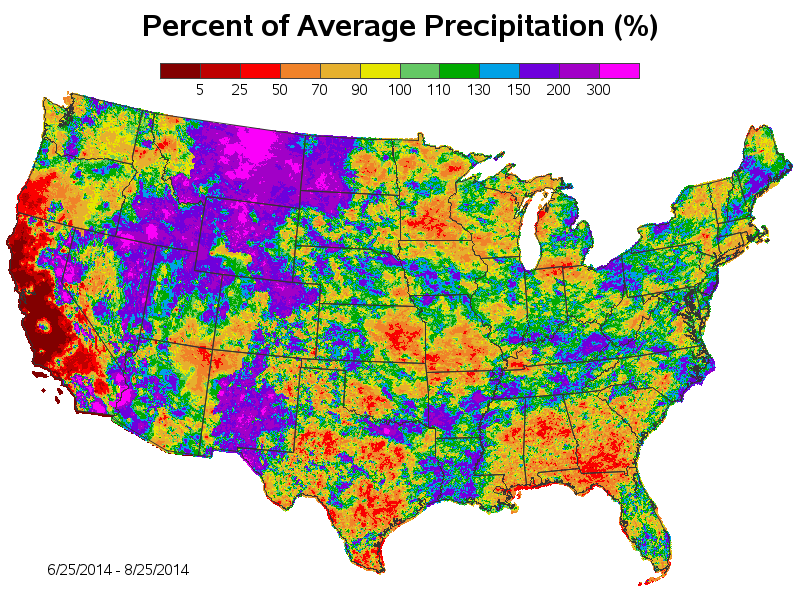
I found that the water.weather.gov site provides shapefiles containing precipitation data. I downloaded the current data for the last 60 days, showing the rainfall in each area of the US as a percent of the average rainfall for that time period. I used Proc Mapimport to get the data into SAS, and found that it was point data (rather than polygons), so I couldn't use Proc Gmap directly on the data. But I was able to use annotate to color-code the points and place them on a blank Gmap. The points are so dense that they have no space between them, and produce what looks like a contour map.
And here is the map! It definitely shows that most of California has had dramatically less rainfall during the past 60 days than the historical average. Here's a link to the code, if you want to try creating your own maps.


6 Comments
Loved the map, Robert. Good selection of distinguishable colors in the legend.
Lower bound on precipitation is obvious, but would be nice to know upper bound, other than that it is some number beyond 300 inches.
Though color swatches are easily distinguishable, as I have reported elsewhere, color needs to be sufficiently large to be reliably discerned. Text and plot or contour lines need to be sufficiently thick. Plot markers need to be sufficiently large. In a high density map with wide and frequent variation, without magnification of the map, hover-text with precipitation and geographic unit area identifier would be a wonderful enhancement. In so far as you are plotting precipitation range, not precise precipitation, your hover text would have to be something like, e.g., County, State, 100-110 in. Now, I realize that there is an ugly technical complication that a County might contain multiple levels of measured precipitation, necessitating perhaps County, State, 100-110 in.; 130-150 in. (or even more).
Even nicer would be to also provide hover exit at the major city level.
Are there technical limitations in the data that make tying the source numbers to standard geographic entities impossible? Or some technical problem in delivering the hover text for this particular map based on how it was created?
As I have espoused elsewhere, images facilitate and accelerate inferences, but you need the data for precise inferences, and, in this case, for identifiable precise locations.
Yep - I'd been giving the hover-text some thought, but if I include "too many" html hover-text tags, it can take a long time for the html to load into the user's browser, and can also cause the browser to "hang" or sometimes even crash. I don't know the exact limit - it probably varies by browser, and how much memory the machine has, and how many (and how long) the html hover-text tags are.
One option I considered was maybe allowing the user to drill-down to state and county level, and then have hover-text for each 'dot' at the county level.
It is helpful to know a bit more about some of the data displayed. Since large chunks of the west get very little precipitation in the summer those areas with 300 percent above average could well be a total precipitation of 1 inch or less. Note that in eastern California you have areas with +200 percent very close to areas with 50 percent of normal. The absolute measures as a comparison would be interesting. And for longer periods of time than a single season.
Yep - that's good analytic thinking! I always recommend looking at the data in several different ways, to get a more complete understanding of what's going on. Those are some good ideas for future maps! :)
Hi Robert. very nice (as usual). Is there a link to the SAS code in the posting (did I miss it)? If not, could you post one in a reply? Thanks.
Glad you liked it! ... Here's a link to the info/code page: http://www.robslink.com/SAS/democd73/precipitation_map_info.htm