If you're a really big company, with many locations around the country, how do you keep track of all that? ... With a great map, of course!
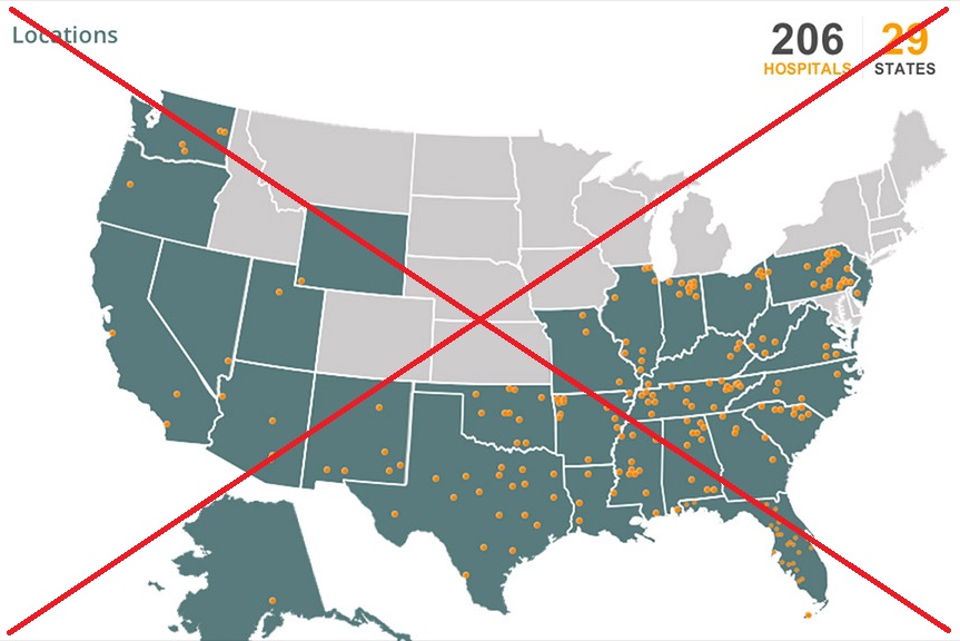
I recently read a CNN article about the Community Health Systems network being hacked - exposing the names, Social Security numbers, physical addresses, birthdays and telephone numbers of 4.5 million patients. That's mind boggling, isn't it?!? The article included a map (see screen-capture below), but it was small and didn't really provide enough detail to be very useful.
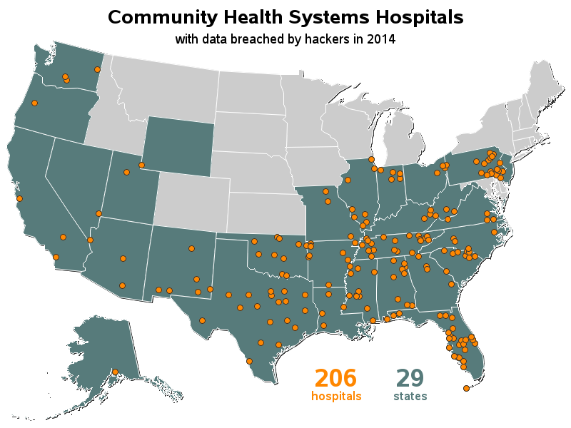
I'm always looking for different ways to use SAS, and I thought maybe we could use it to plot the locations of their 206 hospitals on a map, so people could easily see if their hospital is one of those impacted by the hackers. My new/improved SAS version is below - you can click it to see the full size map, and it will let you hover your mouse over each marker to see the hospital name. I also included the full text list of all the hospitals (below the map), in case you want to search by city name, etc.
That's a nice looking SAS map, eh?!? You're probably wondering "How'd he do that?!?" ...
Well, I started with a list of all the hospitals, and the city & state where each was located. I used Proc Geocode to find the latitude & longitude of the cities, and then plotted a marker at each of those locations using annotate. I used Proc SQL to count the number of hospitals and states, and saved the results into macro variables which I also annotated on the map. ODS HTML allowed me embed html tags so that each marker has hover-text with the name of the hospitals. And, most importantly, it's all data driven (no hard-coding of marker locations or numbers) - therefore to change what I'm plotting on the map, all I have to do is change the data!
Have you got some data that you might want to plot on a map like this? Here's a link to the SAS code, in case you want to try your hand at re-using it. Feel free to leave a comment about this map, or a map you might create with your own data!


2 Comments
Very nice and useful map but it would have been great if you can mention what version of sas has been used (mainly because latest sas version can display more points and though better quality) and also that proc gmap has been used to create the map. Readers might have the impression that proc geocode is the key while in reality without proc gmap there is no map.
Good point! - Yep, I used Proc Gmap to create this map. I used SAS 9.4, but the code should also work in just about any version of SAS (the html hover-text would require at least version ~6.12, and the smooth lines and Proc Geocode would require version ~9.2 or higher). Hopefully most users have access to SAS 9.3 or 9.4 these days!