When teaching statistics, it is often useful to produce a normal density plot with shading under the curve. For example, consider a one-sided hypothesis test. An alpha value of .05 would correspond to a Z-score cutoff of 1.645. This means that 95% of a standard normal curve falls below a value of 1.645. This also means that 5% of a standard normal curve falls above 1.645. So, how might we demonstrate these concepts graphically in SAS?
Graphing a normal curve without any shading is straightforward. To begin with, we create a data set containing the values for the x-axis, the values of the standard normal pdf, and a final variable set to zero.
data pdf; do x = -4 to 4 by .001; pdf = pdf("Normal", x, 0, 1); lower = 0; output; end; run; |
We next plot our data set using SGPLOT.
title 'Standard normal probability density function'; proc sgplot data=pdf noautolegend noborder; yaxis display=none; series x = x y = pdf / lineattrs = (color = black); series x = x y = lower / lineattrs = (color = black); run; |
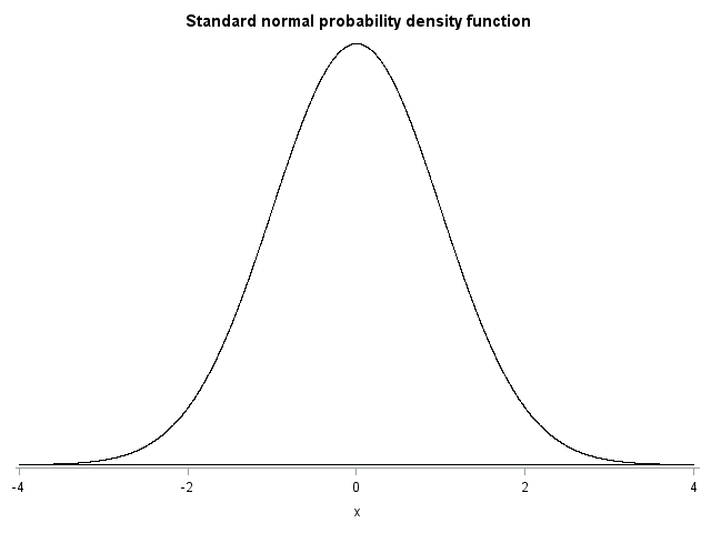
The variable LOWER, which was set to 0, was included to show that the PDF values asymptote at zero for high or low values of X. This is not essential to the plot, but it adds a little extra clarity. I also changed a few other plot options (i.e., removing the legend, removing the border, removing the y-axis, and specifying the colors for the lines) to simplify the appearance of the plot.
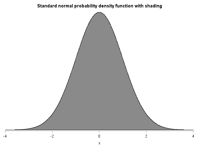
Adding shading to a normal PDF plot requires a few extra steps. SGPLOT does not allow us to directly specify a shape to be shaded, but it does allow for shading between two lines, or bands, using the BAND statement. For example, we can create a standard normal PDF by adding a band between 0 and the PDF values:
title 'Standard normal probability density function with shading'; proc sgplot data=pdf noautolegend noborder; yaxis display=none; band x = x lower = lower upper = pdf / fillattrs=(color=gray8a); series x = x y = pdf / lineattrs = (color = black); series x = x y = lower / lineattrs = (color = black); run; |
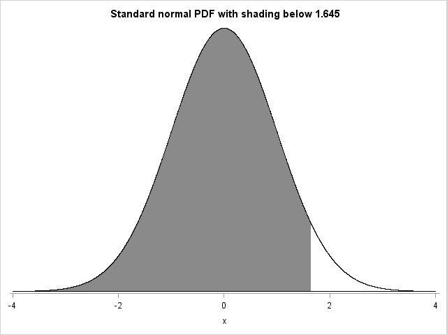
We are not usually interested in shading the entire area under the curve, however. Instead, we are more likely to want to shade an area that is below or above some cutoff. For example, I previously mentioned that 95% of a standard normal curve falls below a value of 1.645. To demonstrate this, we can shade the area of a standard normal curve that falls below the cutoff of 1.645. Unfortunately, we cannot simply tell SGPLOT to only display the band below a particular value of X. Instead, for values of X that should not be shaded we can set the size of the band to zero, producing a line rather than a band. To do this, we add a new variable, UPPER, to the data set. Upper is equal to the standard normal PDF for values of X that we wish to be shaded, and zero otherwise.
For example:
data pdf; do x = -4 to 4 by .001; pdf = pdf("Normal", x, 0, 1); lower = 0; if x <= 1.645 then upper = pdf; else upper = 0; output; end; run; |
We now redo our previous plot, but specify that the band fall between the variables LOWER and UPPER (instead of between LOWER and PDF, which we specified previously).
title 'Standard normal PDF with shading below 1.645'; proc sgplot data=pdf noautolegend noborder; yaxis display=none; band x = x lower = lower upper = upper / fillattrs=(color=gray8a); series x = x y = pdf / lineattrs = (color = black); series x = x y = lower / lineattrs = (color = black); run; |
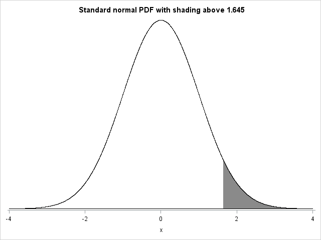
If we want to instead plot the area above 1.645, we rewrite the DATA step as follows:
data pdf; do x = -4 to 4 by .001; pdf = pdf("Normal", x, 0, 1); lower = 0; if x >= 1.645 then upper = pdf; else upper = 0; output; end; run; |
Notice that we changed the inequality used in the IF statement from <= to >. Re-running the same SGPLOT syntax that we used earlier produces the following plot:
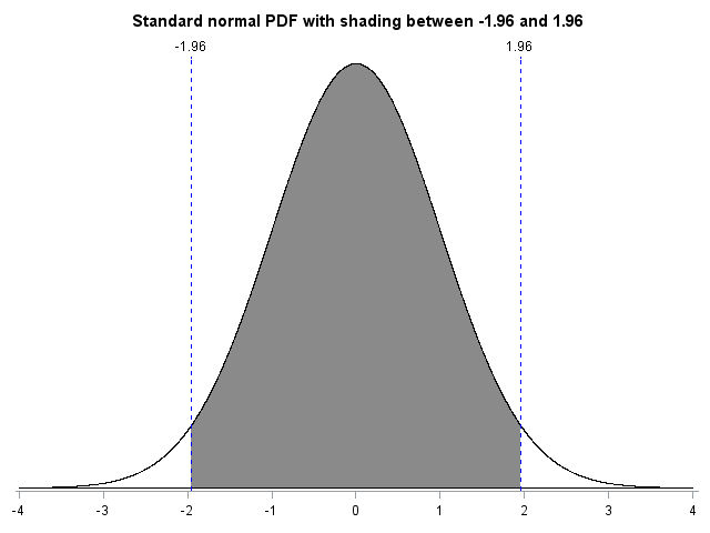
We can adjust the syntax to create more complex figures as well. To make these graphs easier to create (and to keep the syntax concise), I created a macro called NORMALPDF. The macro generates the DATA step and SGPLOT syntax necessary for creating these graphs. For example, we might want to create a plot of a standard normal PDF with shading between -1.96 and 1.96. These cutoffs correspond to a two-sided Z-test with alpha=.05. As such, 95% of the distribution falls between -1.96 and 1.96. We might further want to add vertical reference lines with labels at the two cutoff values. The macro call would be as follows:
title 'Standard normal PDF with shading between -1.96 and 1.96'; %normalpdf(mu=0,sd=1,xaxis=values=(-4 to 4 by 1) display=(nolabel), lower_cutoff1=-1.96,upper_cutoff1=1.96,refline1=-1.96, reflabel1="-1.96",refline2=1.96,reflabel2="1.96"); |
The macro parameters LOWER_CUTOFF1 and UPPER_CUTOFF1 reflect that we are shading an area that is truncated on both its lower and upper ends. This syntax produces the following plot:
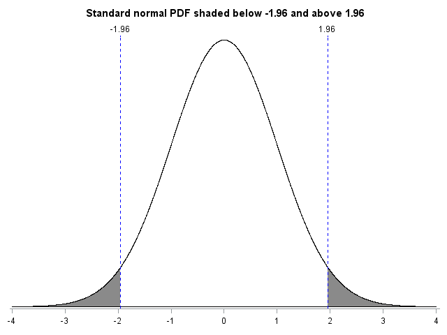
The previous plot showed the standard normal PDF with shading between -1.96 and 1.96. We might instead be interested in shading the tails of the distribution. That is, we might want to create a plot of a standard normal PDF with shading below -1.96 and above 1.96. The macro call would be as follows:
title 'Standard normal PDF shaded below -1.96 and above 1.96'; %normalpdf(mu=0,sd=1,xaxis=values=(-4 to 4 by 1) display=(nolabel), upper_cutoff1=-1.96,lower_cutoff2=1.96,refline1=-1.96, reflabel1="-1.96",refline2=1.96,reflabel2="1.96"); |
Notice that different parameters were used for the previous macro call. Rather than employing LOWER_CUTOFF1 and UPPER_CUTOFF1, I specified UPPER_CUTOFF1 and LOWER_CUTOFF2. This was done to reflect that two separate bands of the distribution were to be shaded. The first band was shaded from -4 (the lowest value on the graph) to -1.96. The second band was shaded from 1.96 to 4 (the highest value on the graph). The following graph would be generated:
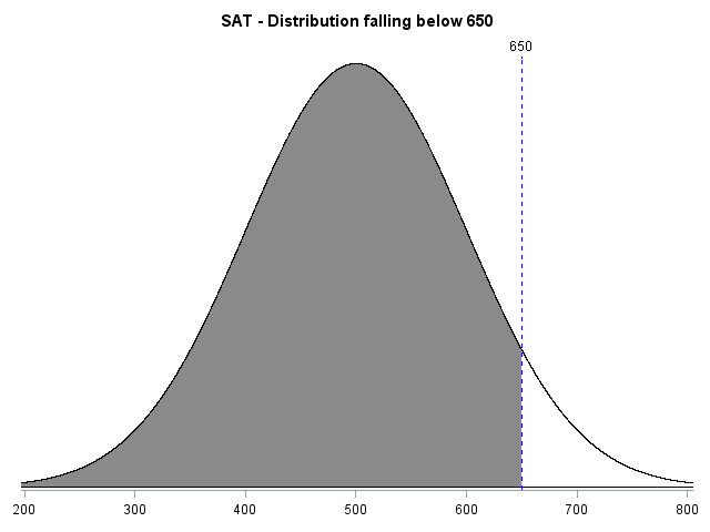
The macro also allows the distribution moments and the x-axis values to be quickly updated. For example, the SAT was traditionally scored to have a mean of 500 and a standard deviation of 100. If a person were to score a 650 on the SAT, we might want to depict the proportion of test-takers falling below that score. To do this, we first change the mean and standard deviation of our distribution to be 500 and 100, respectively. We also need to ensure that the graph shows the appropriate range of values. So, we specify x-axis values ranging from 200 to 800, with a tick mark at every multiple of 100. Finally, we add a cutoff at 650 with a corresponding label. The syntax and resulting graph are below.
title 'SAT - Distribution falling below 650'; %normalpdf(mu=500,sd=100,xaxis=values=(200 to 800 by 100) display=(nolabel),upper_cutoff1=650,refline1=650,reflabel1="650"); |
 The macro, the macro parameters, and the macro parameter defaults are shown at the end of this blog.
*********1*********2*********3*********4*********5*********6*********7*********8********* * Program name : NORMALPDF * Author : Stephen A Mistler * Company : SAS Institute, Inc. * Purpose : Produce graphs of probability density functions, with * optional shading, reference lines, etc. * Inputs : None * Outputs : None * Version : 2.00 * Date created : 5-27-2014 * Version Info : * Compatibility : Designed for SAS 9.4M1 -- not tested with older versions *********1*********2*********3*********4*********5*********6*********7*********8********; %macro normalpdf(mu = 0, sd = 1, lower_cutoff1 = none, upper_cutoff1 = none, lower_cutoff2 = none, upper_cutoff2 = none, options =, yaxis = , xaxis = ,shading=yes, meanline = no,refline1=none,reflabel1=, refline2=none, reflabel2=); data pdf; do x = -4 * &sd + &mu to 4 * &sd + &mu by .001 * &sd; lower = 0; pdf = pdf("Normal", x, &mu, &sd); %if "&lower_cutoff1" = "none" & "&upper_cutoff1" = "none" %then %do; upper = pdf("Normal", x, &mu, &sd); %end; %else %if "&lower_cutoff1" = "none" & "&upper_cutoff1" ne "none" %then %do; if x <= &upper_cutoff1 then upper = pdf("Normal", x, &mu, &sd); else upper = 0; %end; %else %if "&lower_cutoff1" ne "none" & "&upper_cutoff1" = "none" %then %do; if x >; &lower_cutoff1 then upper = pdf("Normal", x, &mu, &sd); else upper = 0; %end; %else %if "&lower_cutoff1" ne "none" & "&upper_cutoff1" ne "none" %then %do; if x > &lower_cutoff1 & x <= &upper_cutoff1 then upper = pdf("Normal", x, &mu, &sd); else upper = 0; %end; %if "&lower_cutoff2" = "none" & "&upper_cutoff2" ne "none" %then %do; if x <= &upper_cutoff2 then upper = pdf("Normal", x, &mu, &sd); %end; %else %if "&lower_cutoff2" ne "none" & "&upper_cutoff2" = "none" %then %do; if x > &lower_cutoff2 then upper = pdf("Normal", x, &mu, &sd); %end; %else %if "&lower_cutoff2" ne "none" & "&upper_cutoff2" ne "none" %then %do; if x > &lower_cutoff2 & x <= &upper_cutoff2 then upper = pdf("Normal", x, &mu, &sd); %end; output; end; run; proc sgplot data=pdf noautolegend noborder &options; yaxis display=none; xaxis &xaxis; %if &shading = yes %then %do; band x = x lower = lower upper = upper / fillattrs=(color=gray8a); %end; series x = x y = pdf / lineattrs = (color = black); series x = x y = lower / lineattrs = (color = black); %if &meanline = yes %then %do; refline &mu / axis=x lineattrs = (pattern=2 color=red); %end; %if "&refline1" ne "none" %then %do; refline &refline1 / axis=x lineattrs = (pattern=2 color=blue) label=&reflabel1; %end; %if "&refline2" ne "none" %then %do; refline &refline2 / axis=x lineattrs = (pattern=2 color=blue) label=&reflabel2; %end; run; %mend normalpdf; |
%macro normalpdf(mu = 0, [the mean of the distribution]
sd = 1, [the standard deviation of the distribution]
lower_cutoff1 = none, [the lower cutoff of the first shaded distribution]
upper_cutoff1 = none, [the upper cutoff of the first shaded distribution]
lower_cutoff2 = none, [the lower cutoff of the second shaded distribution]
upper_cutoff2 = none, [the upper cutoff of the second shaded distribution]
options =, [options for sgplot]
xaxis = , [x-axis options]
shading=yes, [optionally turns off shading]
meanline = no, [requests a reference line at the mean]
refline1=none, [specifies the location of an optional reference line]
reflabel1=, [specifies the label of an optional reference line]
refline2=none, [specifies the location of an optional reference line]
reflabel2= [specifies the label of an optional reference line]
);


10 Comments
five years old, don't know if you'll get this, but thank you! - this is a great macro for shading different portions a normal distribution
Weird thing is that I didn't need to put any of that part for the one tail. All I did was use this.
data pdf;
do x = -4 to 4 by .001;
pdf = pdf("Normal", x, 0, 1);
lower = 0;
if x <= 2.096 then upper = pdf;
else upper = 0;
output;
end;
run;
proc sgplot data=pdf noautolegend noborder;
yaxis display=none;
band x = x lower = lower upper = upper / fillattrs=(color=gray8a);
series x = x y = pdf / lineattrs = (color = black);
series x = x y = lower / lineattrs = (color = black);
run;
The error I'm getting when I use my two tail code from my previous post is that UPPER is not defined. Do I still need to use all the macro code? (FYI, I just started using SAS 6 weeks ago)
The reason for the error in the previous post is this line:
%normalpdf(mu=0,sd=1,xaxis=values=(-4 to 4 by 1) display=(nolabel),
upper_cutoff1=-2.145,lower_cutoff2=2.145,refline1=-2.145,
reflabel1="-2.145",refline2=2.145,reflabel2="2.145");
The syntax "%normalpdf" means that it's calling the normalpdf macro, which creates the variable called UPPER.
Hopefully, someone sees this. I used this code last night to do a two tail shading. And today it's not working. My only thought is that I made some change before saving. Any ideas what is wrong?
data pdf;
do x = -4 to 4 by .001;
pdf = pdf("Normal", x, 0, 1);
lower = 0;
output;
end;
run;
%normalpdf(mu=0,sd=1,xaxis=values=(-4 to 4 by 1) display=(nolabel),
upper_cutoff1=-2.145,lower_cutoff2=2.145,refline1=-2.145,
reflabel1="-2.145",refline2=2.145,reflabel2="2.145");
proc sgplot data=pdf noautolegend noborder;
yaxis display=none;
band x = x lower = lower upper = upper / fillattrs=(color=gray8a);
series x = x y = pdf / lineattrs = (color = black);
series x = x y = lower / lineattrs = (color = black);
run;
Hi Nicol, Did you put the code for creating the macro (everything from %macro normalpdf to %mend normalpdf;) in a different file? If so, you'll need to rerun that code to redefine the macro for SAS before running your code. I just tried your code after running the macro definition and it worked fine.
Congratulations on your first blog post, Stephen. You can use this same trick for showing probabilities for nonnormal distributions and for applications such as computing the definite integral under a curve. I like to use the REFLINE statement to display the lower axis, rather than a second SERIES statement. Also, I'd recommend that you use (&std / 100) as the stepsize in the macro, which is more robust than the hardcoded value 0.001.
Thanks, Rick! You are absolutely correct that this trick is not limited to the normal distribution. Using the REFLINE statement for the lower axis also makes a lot of sense. When shading is included in the figure, however, the variable upper sometimes takes on the value of the density and sometimes takes on a value of zero. Using a second SERIES statement to create a line with a density value of zero ensures that the line at zero is consistent across all values of X. As for changing the stepsize in the macro, it is already set to .001 * &sd. Switching to &sd/100 would result in fewer steps (800 steps rather than 8000), but would not improve the robustness of the macro.
Very cool illustration of how you can get exactly what you want if you know a little SAS code!
Great ... I have done a Macro using the same idea ... to teach my students.
Jorge
Thanks, Jorge, for taking the time to comment! I hope the macro is helpful. I've met multiple professors who have written code for producing these or similar plots. Unfortunately, nobody has posted their code online. Hopefully this post will save a lot of people the time of writing their own macros.