Why do people have 12 pairs of shoes and no health insurance? - Perhaps the consumer price index data can help explain it ...
Great minds think alike - I recently saw a plot of the Consumer Price Index (CPI) data that Layne Ainsworth had created, and it reminded me of some SAS plots of the CPI I had created last fall for a talk I gave to the NCSU College of Textiles. Layne's plot has such a great title, I decided to steal it (with his permission, of course) and use it for my blog title! :)
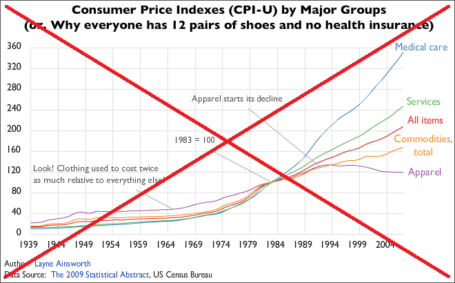
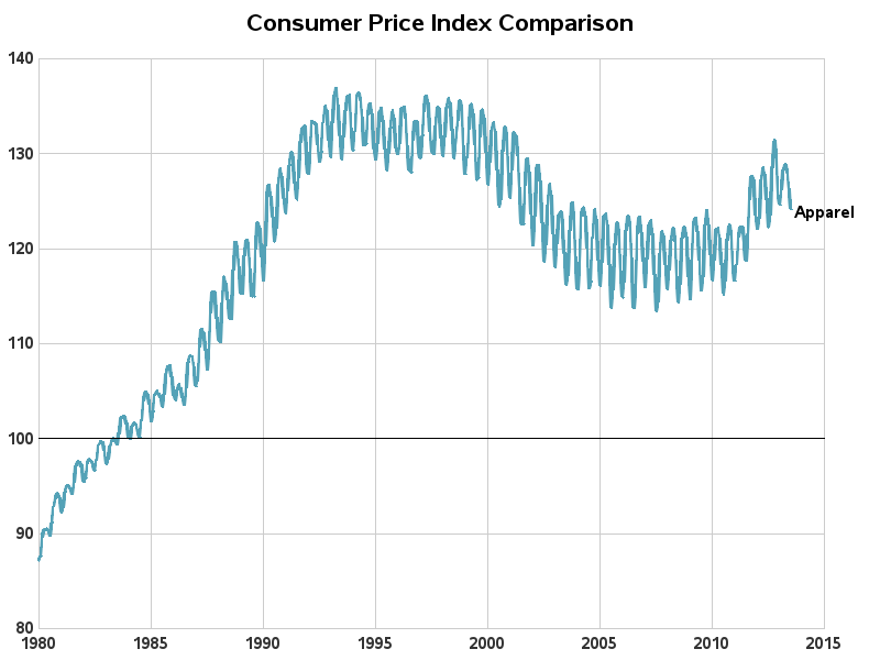
I find CPI data interesting. It basically show how much more (or less) our money buys, over time, for certain things. For example, the CPI for apparel (clothing) shows that prices increased during the 1980s and 90s, and then started dropping in the 2000s. Apparel is quite a bargain these days!
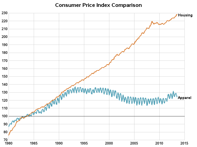
If we also plot the CPI for housing, we can see that housing prices have gone up a lot compared to apparel. So we might be homeless, but we're well dressed. :)
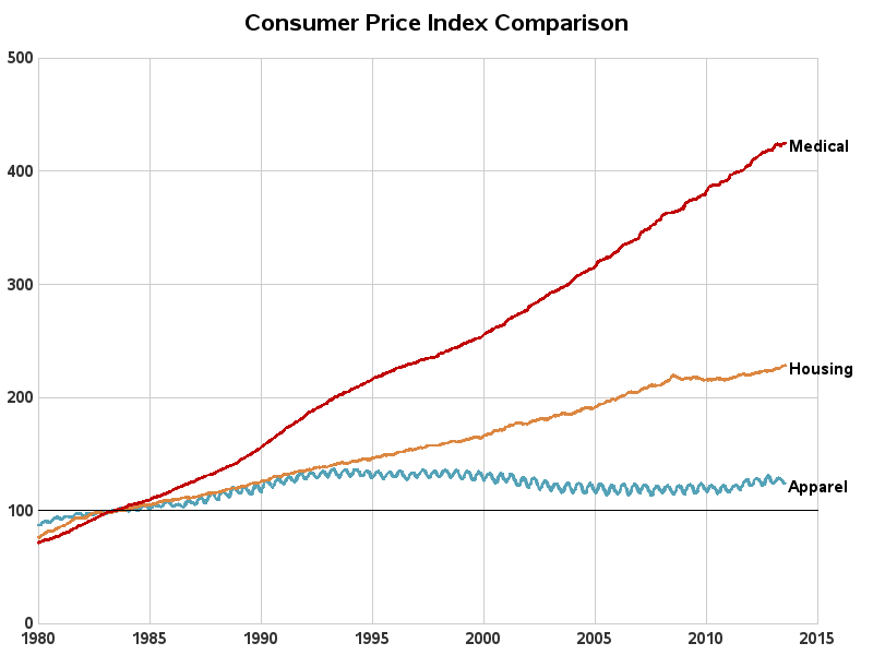
But, how does this tie in to the title ... "12 pairs of shoes, but no health insurance"? When we add the CPI for medical expenses to the plot, we see how the increases in medical cost prices even dwarf the increases in housing costs ...
So, some of you with insight into prices of things such as apparel, housing, and medical expenses - tell us why the CPI data is doing what it's doing in these graphs. Feel free to leave a comment with your theories!


9 Comments
Pingback: How cold was it? It was so cold that...
Rob:
Should add "Food".This ties in well with Bill Baumal's "Cost Disease" hypothesis...
Mo Hussain
I wonder what the graph would be like with expenses by the public medical system in England... Would the rise be also a question of management x medical-industry pressures ?
Good question! - Perhaps one of the blog readers from England might be able to provide a similar graph of their data?
A comparison of other countries would be very insightful! I'd love to see that too. Anyone have the data?
I believe the 1987 revision of the CPI was the beginnings of adjusting the market basket on an ongoing basis for changes in consumer expenditure patterns. In the early 80s I was a consultant/tech lead for the the Consumer Expenditure Survey (CES) at BLS. The CES data was integrated into determining the baskets used in the 1987 CPI revision. My team wrote roughly 600K lines of SAS code for the CES and our parts of the 87 CPI Revision. And I've heard that quite a bit of that code is still being used.
Very interesting inside-information!
The basket of goods and services in that Medical bucket has changed dramatically over the decades. Far more so than the buckets for Housing and Apparel. Your graphs miss that completely.
Hmm - I guess that could be somewhat like trying to compare the prices of computers over the years!