Can the selection of the axis range in a graph influence how you perceive the data? Let's find out with a "Labor Participation Rate" graph ...
Medical doctors have traditionally taken the Hippocratic Oath, swearing to practice medicine honestly. I have often thought that people creating graphs should swear a similar oath, or at least strive to "do no evil." Which leads to the topic of this blog - what I call (tongue-in-cheek) "the axis of evil."
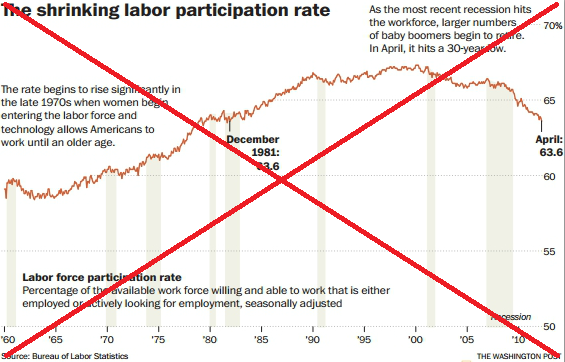
After my recent blog about the unemployment rate, I decided to look into some additional statistics that might help provide a more complete picture of employment in the U.S. I found an interesting article that showed a graph of the Labor Participation Rate since 1960. The graph definitely showed a climb during the 1970s and 80s, and then a drop after the recent recessions.
Here's my SAS version of this graph (pretty good imitation, eh?!?):
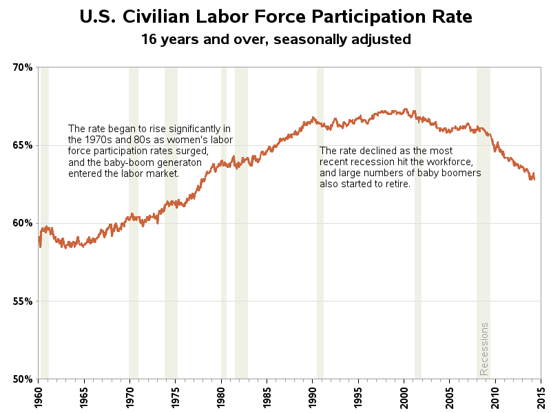
I was thinking, "Wow, this is a great graph!" But then I started looking more closely, and the y-axis started bothering me... Why had they chosen to start the y-axis at 50%? That's not where the data starts, and I can't think of a good reason why "50%" is important to include in the axis. Therefore it seems like it was an arbitrary decision - at best, for aesthetics ... and at worst, to try to try to squish the line so that the changes don't look as big as they really are.
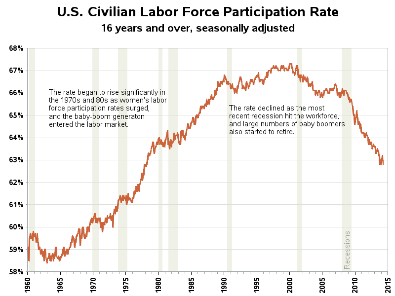
Therefore I created a 2nd version of the graph, and let the y-axis auto-scale. This way the graph shows the data spread out to its maximum extents, so you can best see any changes in the data.
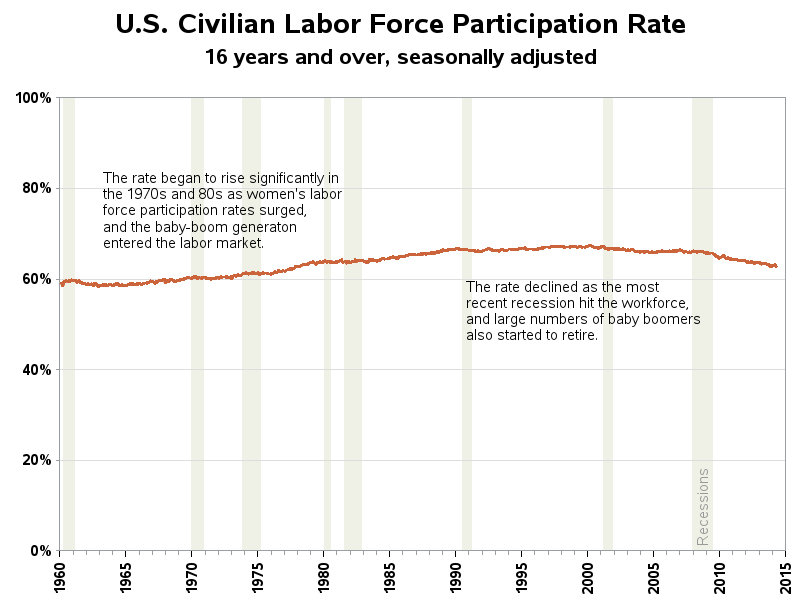
And then I got to thinking ... the range of possible values for the labor participation rate are 0% to 100%, therefore why not use those values for the y-axis scale? This will show what the data has done "in the grand scheme of things." Hmm - when plotted like that, the changes are more of a smooth speed-bump, rather than a mountain & cliff.
I always recommend looking at data in several different ways, to get a more complete picture. And using SAS software makes that simple to do!
Which of the 3 versions of the graph do you like best, and which one do you think best shows what's important about the data?


5 Comments
The original graph is not bad if you are trying to make a point about women in the workforce. Because the time axis starts at 1960, I think this is a reasonable "story" to extract from the data: the progression of women into the workplace. Women make up about half of the population, so a graph that starts at 50% indicates "full participation" of men and no participation of women. That's what makes 50% a reasonable "bottom" for the Y axis.
To me the first graph says, "At the beginning of the 1960's only a small percentage of the workforce was composed of women. This percentage grew through the 1990s, when it then reached a plataeu. In recent years new demographic and social trends have eroded job participation."
Of course, if your point is really about women in the workplace, it would be better to plot both males and females for these years. Then 0 becomes the natural "bottom" for the Y axis.
As I have long advocated in my papers on graphic design, starting the y-axis at zero for time series plots is usually the best choice. It prevents unjustified elation or dismay about changes that might not really be that significant.
As I also have been advocating, images facilitate and accelerate inference, but reliable inference needs precise numbers as well. Here, those numbers would be absolute magnitude of the change or percent of the change versus the pre-change base. The actual important impact is in the numbers, not the graphic vibrations.
However, if you have a situation where you want to most easily visually perceive the granularity of change, then choosing axis boundaries very close to the historic minimum and maximum is the best choice, rather than letting software pick the boundaries by default.
Sounds like good advice!
I confess. I've often taken the aesthetic path and there' no science there. Most clients I've worked with have asked I start with zero on every graph even though all the trends channeled between 80 and 100 percent. Would an appropriate (scientific?) rule of thumb be use a few points below the bottom most range?
If I'm going to pick a range for the axis, I usually try to do so in a meaningful way. For example, the range of possible values, or as LeRoy suggested the historic minimum and maximum. Also, it's sometimes important to consider choosing a range that will work with future versions of the graph, so you can easily compare them with the current version. I guess one important thing is to "be aware" of why you picked a certain range :)