Would you like to analyze the 9 million lines of Medicare payment data that was recently made public? You'll need lots of luck if you're planning to use Excel ... whereas this is the kind of thing SAS was built for! Here's a sneak-peek at what the text data looks like:
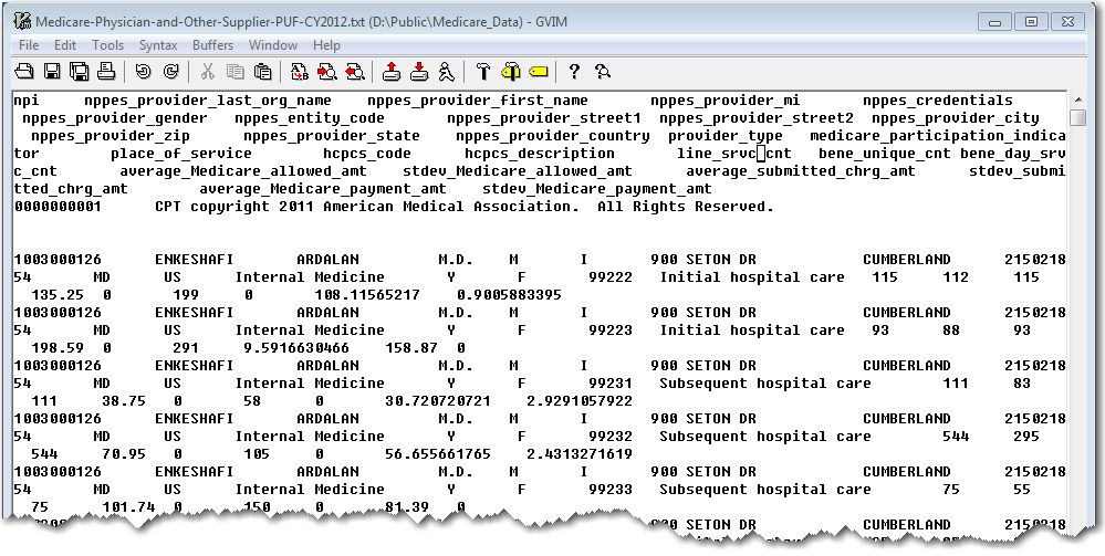
Their data download page warns that trying to import the raw data into Excel "will result in an incomplete loading of data" and they provide the data split into 12 separate Excel spreadsheets. By comparison, I downloaded the raw text data and easily imported into a single SAS dataset, and analyzed it ... using a simple laptop PC. It's good to be a SAS user! :)
Now for some analytics...
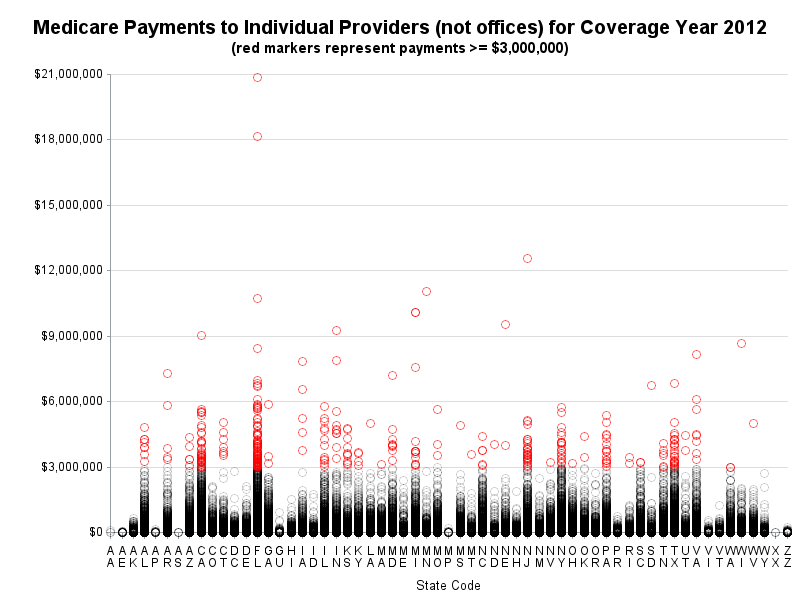
I'm a big fan of using analytics to help detect (or better yet, to deter) waste and fraud, and that's why I was excited to hear that the Medicare payment data was now available. Our local news mentioned that "344 out of more than 825,000 doctors, received $3 million or more apiece — a threshold that raises eyebrows for the government's own investigators." This was an interesting number, therefore I decided to try to crunch & summarize the raw data, and see if I could come up with the same numbers.
I won't bore you with all the coding details (click here if you'd like to see the code) - basically I used the code they provided to import the data, a data step and an sql query to summarize it, and then plotted the results visually with Proc Gplot.
Here's a snapshot image of the graph, with the 344 red markers showing the individual providers receiving $3 million or more in Medicare payments. Click here to see the interactive plot, with hover-text on the red markers so you can see their names (the interactive plot is followed by a table with details about the 344 names):
Now that the basics are out of the way, what analytics would you like to see performed on this data, to look for suspicious payments and such? (Let us know in a comment!)


4 Comments
I've made a few improvements to the graph and table now:
http://robslink.com/SAS/democd70/medicare_payments.htm
Fabulous post. I can see this technique being useful to graphically (and literally) identify outliers in many different applications. It also serves to highlight some useful public use data available from CMS on health economics and quality measures. Thanks!
I'd be interested to know if there are particular times of the year for the Medicare payments. Is it during winter/summer or close to the end of the financial year. If $3,000,000 is a particular threshold/number of interest then perhaps look at the patterns/behaviours of those above $3,000,000 to those below. I think further investigation of providers in Florida is in order as there appears to be more providers there than other states (hard to tell in this chart - my preference is a boxplot).
I'd certainly be interested to explore and analyze the data using SAS Visual Analytics!
Interesting ideas! This particular data source doesn't have any date values in it (it's just the annual summary), but no doubt the people working with the raw data might be interested in performing that type of analysis!