Teacher pay, and the possibility of a raise, has been a hot topic in North Carolina lately. So I decided to look around and see if I could find any good data related to teacher salary, and then try to determine the best way to present that data graphically.
I found that the National Center for Education Statistics (NCES) had some salary data available in a convenient (spreadsheet) format – it contained the average salary, by state, with a snapshot every 10 years for the past few decades. They also used the consumer price index to convert the salaries into 2012/13 dollars, so the old salaries could be easily compared to the current salaries.
Bar Chart:
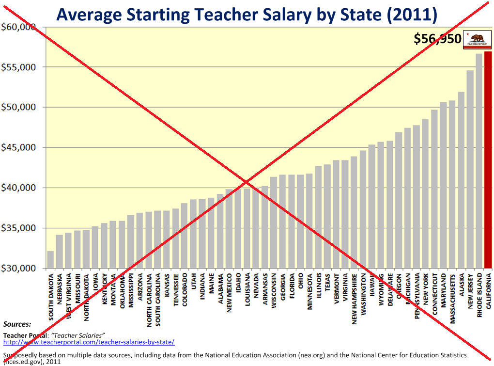
First, I looked around on the Web to get some ideas for presenting this type of data, and I found this bar chart (see screen-capture below). Notice that South Dakota’s average starting salary appears to be almost nothing compared to California’s! But I’m sure that you (my sharp-eyed blog readers) quickly noticed that the height axis does not start at zero, which is a big no-no for bar charts, and makes it impossible to proportionally compare the bar heights.
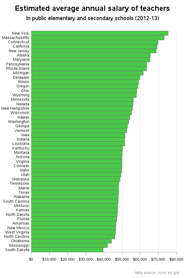
So, learning from the deficiencies of that bar chart, I decided to create mine with the height axis starting at zero, and also using horizontal bars so the state names are easier to read. It appears that North Carolina is 4th from the bottom - how did your state compare? (You can click on the snapshot below, to see the web version with html hover-text.)
Geographical Map:
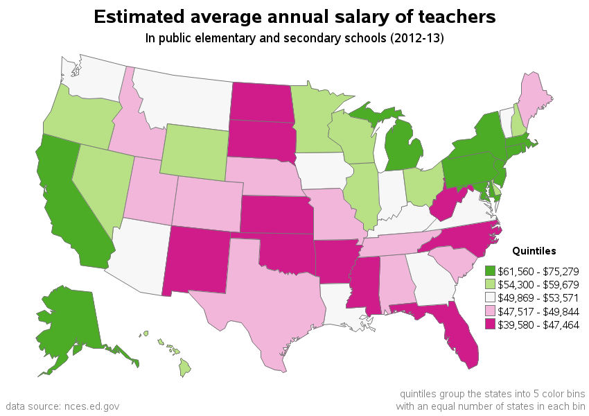
I don’t have any cost-of-living data to help make a fair comparison between states, but I thought the next best thing would be to plot the data on a map. I assumed that most of North Carolina’s neighboring states would have a similar cost-of-living, and therefore we could visually compare NC’s salary to its neighbors on a map. I use ‘quintile’ binning so that the states are divided into 5 groups, and North Carolina is in lowest/worst quintile (reddish-pink), whereas none of NC's bordering states are not in that worst quintile. How does your state compare to its neighbors?
Time Series Plots:
The previous graphs only show the most recent data, but the NCES also provided historical data every 10 years. A natural way to plot this data would be a time series plot, with the x-axis representing time. I first plot the data using a boxplot, which tells a lot about the data for those who know how to read it.
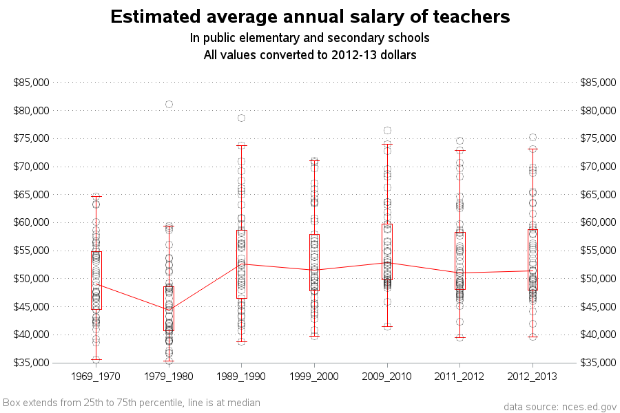
But perhaps the previous plot is not all that meaningful to people not familiar with boxplots. Therefore, I also plot the data with a simple line plot (with a separate line for each state). The line plot is a bit cluttered, but it lets you look for general trends. Also, if you color one state's line red, you can easily compare it to the rest of the states. It definitely appears that NC's line (red) has gone down significantly in the past few years, compared to the other states. (When you click the thumbnail below, scroll down to see several variations of line charts.)
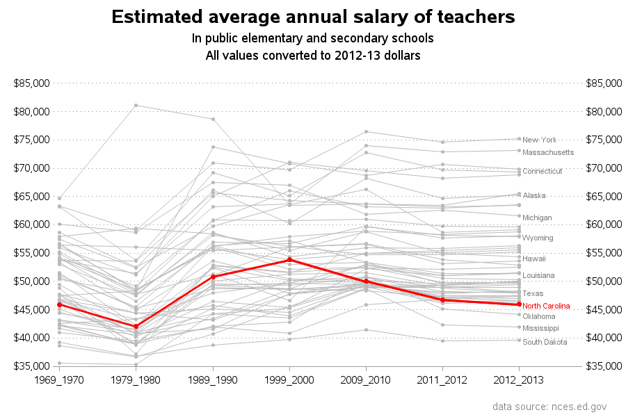
One subtle detail about the line plots – the time values evenly-spaced in the plot, but they are actually a mixture of 10-year increments for the first 5 intervals, and 1-year increments for the last 2 intervals. The plot would be more ‘perfect’ to a purist if I only plotted the 10-year increments, but I thought it worthwhile to also include the more recent data (even though that makes the time-axis non-proportional).
I welcome discussion and comments … Do you have any suggestions on better ways to present this data? Do you know of other data available, that might be good to combine with this data? What other factors need to be taken into consideration when comparing salaries? (cost-of-living? subsidies? number of days per year spent working? benefits such as health insurance and pensions? average tenure of teachers? others?)


15 Comments
The chart is misleading:
You need length of time teaching
AND
You need degrees held.
I am a teacher.
This is what affects our pay schedule/s.
Is there a national teacher database containing this type of detailed data, I could use to create a better plot?!? :)
Would it be possible for us to see the code behind all these gorgeous graphs? Thank you.
Certainly! - These examples (including SAS code) are on the bottom row of samples on the following page:
http://robslink.com/SAS/democd69/aaaindex.htm
I'd also like to see age of teachers and also length of teaching as well. In general newer teachers have lower salaries and longer tenured teachers higher salaries. So is it that States like New York and California pay higher overall, or is it that the majority of their teachers have served longer?
thanks,
--Jack
Good point!
For cost of living by state, look here: http://www.missourieconomy.org/indicators/cost_of_living/
The time series analysis might look best with a Time Contour Plot. At SAS Global Forum in a few weeks, I am presenting a paper on how to make one. There is still have time to add a new slide to the presentation - I'll see if I can add one for this.
David Corliss
Excellent!
Because this discussion is based on such great data, it is wonderful analysis. However, because the discussion does not ask such questions as why might societies benefit by higher teacher pay, it also misses something important. I would suggest that what is most valuable to teachers is also most beneficial to everyone else: Teachers want to be free of worry about how to support their families, so they can focus on how to accomplish the personally consuming tasks of helping a group of young people become more self actualized, happier, and better contributors to society. (This also requires that they need the autonomy to do so.)
The amount of pay necessary to accomplish that goal would, of course, be a bit different from state to state, but a good proximity might be somewhere a bit above the median household income.
Also, there is the necessary ingredient of good teachers. We must attract good people, who can learn to be good teachers. (Keep in mind about half of those who try being a teacher leave the profession within the first five years; it isn't easy, and not everyone can do it.) I would suggest that since it takes years of education and training to become a good teacher, it will be difficult to attract and keep such people without a pay rate that allows them to happily raise a family. Again, qualitative analysis suggests something appreciably above the median family income would be appropriate. Perhaps one standard deviation above the median would be sufficient for this purpose.
Rob,
It would be interesting for NC data, to look at the length of time teachers have been working vs their salary. The average salary is interesting, but what are teachers being paid in their first five years on the job?
What is the rate of pay raise per year of experience?
How many teachers are 0-5 years, 6-10 years, 11-20 years, +20 years?
What is the average pay for each of these teacher cohorts?
Which cohort block is the smallest?
Which cohort block is the largest?
Is there any correlation between the cohort blocks and their pay scale?
Sara
Nice ideas - but I'm not sure how to get the data for those particular graphs!
This is interesting, but there are two issues I want to bring up. First, I think the question that might be more appropriate given your data is: "Are some states underpaying teachers relative to other states?" Second, somehow adjusting for cost-of-living would put things into much better, proportional, perspective (dealing with absolutes is a bit tricky and could be misleading). I understand that you don't have access to cost of living data, but median income data (by state) are fairly readily available. It is reasonable to argue that income data may be a relatively good proxy for cost-of-living, as wages and prices tend to follow each other (at least in the medium to long run).
I combined your NCES data with two additional and easily accessible measures---the 2012 median income and the 2012 median income for a family of four. Here are several interesting findings:
* There is a fairly strong correlation between teacher salaries and incomes (between 0.58 and 0.65, depending on which income measure you use). Because most schools are funded through local taxes, this suggests that salaries may actually be commensurate with local incomes.That is, teacher salaries are relatively strongly related to variation in cost-of-living.
* Teacher salaries in almost all states are higher than the median income in those states. Only in North Dakota and South Dakota do teachers get paid 9% less than the median income in those states.
* Relative to the median salary for a family of four, teacher salaries in North Carolina are right in the middle of the pack, ranked 28th out of 50 states. This is considering that NC ranks 42nd for median family incomes and 38th for median individual income. This information is significantly different than that provided in your graphs of absolute salary ranks, which show that NC is in the bottom quintile of the salary distribution.
* Relative to the median salary for a family of four, the five states in which teachers are paid least include Colorado, New Hampshire, North Dakota, Virginia, and South Dakota.
* Maryland, which has the highest income per family at $106,707, is ranked 44th in proportional teacher salaries.
Now, to answer the question that is the title of your post, "Should teachers get a pay raise?" The answer is a resounding Yes (but I'm slightly biased, of course). The answer that the remainder of the post tries to address, "Teachers in what states should get a pay raise?", should be re-evaluated using relative measures.
Wow - nice suggestions!
I bet this would make a great conference paper (hint, hint!) :)
Something I've wondered is how the mechanism by which teachers get paid relates to the distribution of incomes. In NC, it's set in the General Assembly, instead of a more (to my mind, not being in education) federal approach of allocating money to counties or school districts, the school districts allocating money to schools, and schools to teachers. What effect does tenure, legislative guarantees, union representation (both optional and mandatory) have? Both on average, median, and distribution.
Also, what is the source of your data? I've not heard a number of these points before.
Thanks!
Here are the sources:
Income by family size: Census Bureau
Median income: Bureau of Economic Analysis
It looks like (from the NC state Dept of Public Education expenditures report) that the state funds 62% of school expenditures and 24% is funded from local sources. This is unlike most other states, where most of the funding comes from local tax revenues. This relatively unique funding strategy may be even more dependent on median incomes at the state level, since the tax revenues are coming from the entire state. However, I am not enough of an expert to know how the funding distribution mechanism works.
There is a large body of research on the economics of education. I would suggest starting to look for answers to a lot of your questions in the Education of Economic Review (EER), which is a scholarly journal that publishes articles related to the economics of education. My points are based on a very basic, largely unconditional analyses, so treating these as causal would not be recommended. The more rigorous articles in EER would provide significantly more insights.