Do you know (right off the top of your head) the simple SAS/GRAPH code you would use to create line graphs? ... If not, then this tutorial is for you!
A line plot is basically a scatter plot where the markers are connected. A line plot should only be used when the order of the markers is important – for example, when the data is plotted over time, or when the values of a function are being plotted.
Below are several examples of different kinds of line plots you can create with SAS/GRAPH. And at the bottom of this blog, you will find a link to the tutorial, with easy step-by-step directions for creating all of these line plots!
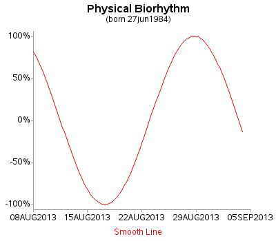
Basic Line Plot
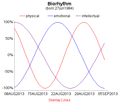
Overlay Line Plot
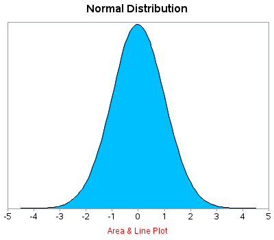
Area Under Line
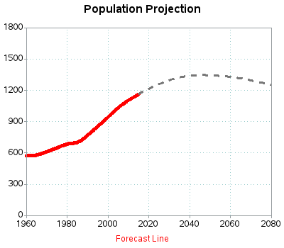
Forecast Line
Confidence Bands

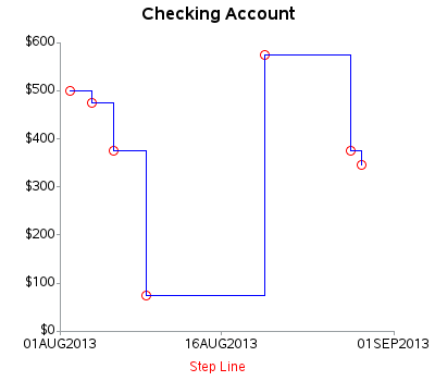
Step Line
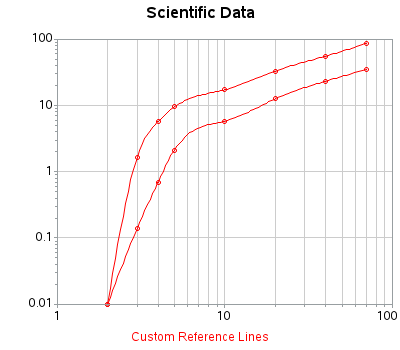
Logarithmic Axes
And, as promised, here are links to the PDF files for the tutorial:
I'd love to hear your feedback and suggestions, and whether this kind of tutorial would be useful to you for other types of plots as well (maybe bar charts, maps, etc?) Feel free to leave a comment!
Click here to see my other tutorials on creating basic graphs!

2 Comments
Robert,
These are great.
This should be a prequel to your book.
Funny you should say that! ... ;-)