With the medical science these days, there are many genetic defects you can be tested for, to see if you might develop a certain problem/disease, or might be a carrier for it. Would you rather know, or not know? (Would your health insurance company rather know, or not know?)
These are tough questions, eh!?!
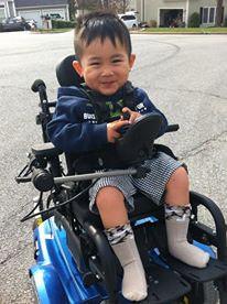
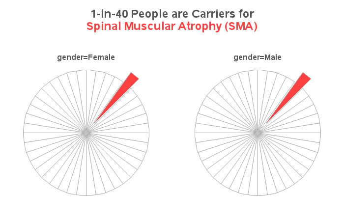
What got me thinking about this? ... A friend of mine (the coach on our dragonboat paddling team) recently found out that his son has a genetic disorder called Spinal Muscular Atrophy (SMA). All of us have about a 1-in-40 chance of being a "carrier" for this disease, and when two carriers happen to have a baby, the baby has a 25% chance of having SMA. SMA is a devastating disorder - it is an often fatal disease that destroys the nerves controlling voluntary muscle movement, which affects crawling, walking, head and neck control, and even swallowing. It does not affect the brain, therefore it leaves a bright child trapped in a 'broken' body. Here's a picture of my friend's son (Brady):
Knowing that SAS is used for everything, I got to wondering how SAS might be used to help find a cure for SMA. Maybe it's being used for designing experiments, clinical trials, or genetic research? If you're one of the people using SAS to look for a cure, feel free to leave a comment!
In the meantime, I thought I'd put my SAS/GRAPH skills to use, and try to come up with a graphical representation of the numbers for the likelihood of carrying SMA. Since 1-in-40 people is a carrier, I thought maybe a pie chart would be a good way to show that (pies are a good way to show part-to-whole). But rather than just having the huge pie slice to represent the 39/40 chance of not being a SMA carrier, I thought it might be useful to draw light gray borders so you could see that it actually represents the 39 people. Not sure if this is a good or bad idea, but here goes...
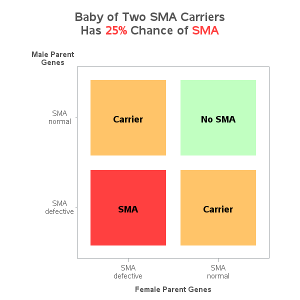
If two SMA carriers have a baby, the baby has a 25% chance of having SMA ... and a 50% chance of being a carrier, and a 25% chance of being neither. How can we graph that? ... Well, it turned out to be pretty easy! I created a scatter plot with 4 points in it, and used the new "squarefilled" marker, and made the markers really big (such that each marker filled an entire quadrant of the graph).
If you'd like to find out more about SMA, here is a great website with lots of info. Also, Brady's mom is hosting an event this Saturday (Aug 10, 2013) in Raleigh, NC to help raise money to find a cure. If you'd like to find out more about Brady's experience with SMA (pictured above), you can check out his mom's blog.

3 Comments
This is a hard area. A new study seems to find chemicals that improve the symptom in mice with SMA (Mouse strain might have been genetically modified to develop SMA for drug development). But it is hard to see how well the results in mice can be translated into human.
http://www.sciencedaily.com/releases/2013/06/130604153509.htm
Interesting, Sean! ... Thanks for posting the link to the article!
amazing how SAS can help in throwing light on genetic disorders. I saw firsthand when I helped raise funds for a special needs school. The Principal has SMA & its heartbreaking to watch him work, taking dusty trains to gather support to help others with the same special needs..thanks for raising awareness with your graphs!!