ODS graph styles provide users with an easy way to control things such as the colors and fonts used in a graph, freeing the user from having to specify these properties in their code. A lot of thought was given to picking colors that work well together, and look good. The styles were first introduced in SAS 9.1.3 for the java and activex graphs, and then in SAS 9.2 support was added for the traditional gif and png device graphs. Here is a link to some of the graph styles available since SAS 9.2.
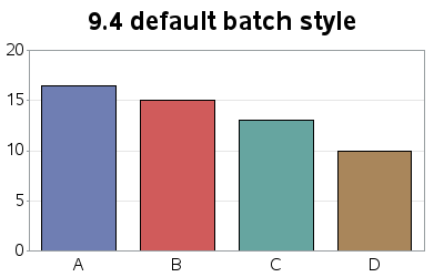
If you didn't specify a graph style in your code, a default style was used ... and the default style was different, depending on how you were running SAS (DMS, EG, batch, etc). Now, in SAS 9.4, the same default style is used, no matter how you run SAS!
Which style is the SAS 9.4 default, you might ask? ... htmlblue!
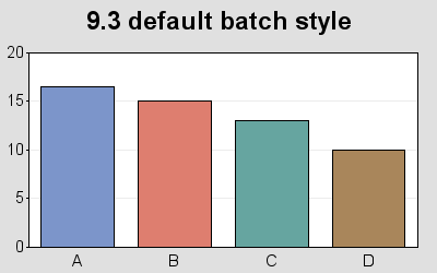
Here is an example of a GCHART created using the default style in SAS 9.3 and SAS 9.4 -- I think you'll agree that the htmlblue (9.4 default) style looks much better. And best of all, no matter how you run your SAS job the same default style is used! (Note that I don't typically recommend coloring each bar a different color, but I'm doing so in this case so you can easily see what the default colors are, for the default style.)
What do you think of the new SAS 9.4 default style? Leave your comments below.


7 Comments
Robert, These 2 examples did go to tech support, to no avail.
Bottom line: don't break compatibilty, don't anti-alias all fonts.
Is that not easy and common sense?
I sure hope you haven't broken the existing styles again, like was done from 9.2 to 9.3. If you want new looks, create new styles. Existing styles should stay as is.
Some people spend a lot of time fine tuning their reports and graphics, and they should not break when upgrading, like seaside was changed to use black fonts instead of blue ones. :(
Another example, 9.2's crisp pixel-aware graphic fonts could never be recovered in 9.3, even by using the dubious option FONTRENDERING=HOST_PIXELS; and 9.3 now has nasty blurry axis fonts. Anti-aliasing is good. Sometimes. Like for titles. Or fonts above say 12pt. But for small fonts on screen, it isn't. This blog text doesn't use anti-aliasing for a reason.
Chris - I almost always use a black font on a white background, and therefore don't see any problems with anti-aliasing or "halos" around the text, but perhaps that is more problematic with colored backgrounds and such. To make sure the problem you're seeing is addressed, it would be good to report it to SAS Tech Support (along with an example they can easily reproduce the problem with), and they can relay the problem to our font experts! :)
Is there an illusion? I feel that the blue and the red are more saturated.
I like it more.
Good eye! It's not your imagination or an illusion, the colors are actually different!
For example, in the 9.3 default the 'red' is cxde7e6f, and in the 9.4 default it is cxd05b5b (I used a Windows tool called 'Pixeur' to determine the hex color codes just now, if you're curious how I got the numbers.)
I appreciate that the gray is gone -- some printers don't deal well with it.
I agree - I'm not a big fan of colored backgrounds behind graphs by default.
There are special cases where that can be useful (such as to make a graph visually 'blend in' with a webpage that has a colored background), but I like to leave the background blank/white in the general case.