They say "Imitation is the most sincere form of flattery"...
Therefore when I imitate Hans Rosling's famous world-data animation, it's not that I'm jealous, but that I'm paying homage to him! (OK, and maybe also a little bit jealous! LOL)
Well, anyway, for those of you who haven't seen it, here is a link to one of Hans Rosling's famous Flash graph animations. I invite you to have a look at it, and play around with it a bit. Below is an example of Hans doing a presentation with his animation:
You might be saying, "I wish we could do animations like that in SAS!" Well, we can ... sort of!
Here's a link to the closest I could get, using SAS/Graph Proc Gplot, some annotation, and a gif animation (... and I just happened to use the new/improved SAS 9.4 gif animation syntax which makes creating animations a lot easier than it used to be!). I think it looks a lot like Hans' animation.
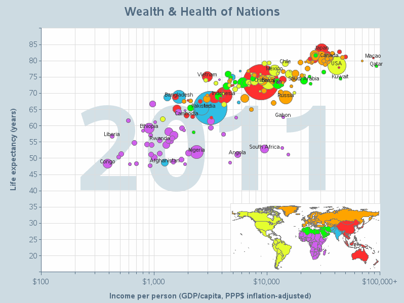
Here is a snapshot of one frame of my SAS animation (to help lure you into clicking the link to see the real thing!)
Here are some advantages of my SAS version:
- Most importantly, you can view a gif animation in any browser, including mobile safari on Apple iPhones/iPads! (whereas a Flash animation is difficult/impossible to run on many devices)
- The gif animation loads quicker than the Flash animation.
- I keep the logarithmic axis simple, so (hopefully) it's more obvious it's a log axis.
- I label all the large countries & outliers in the graph, so the user doesn't have to manually interact with the graph to see those country names.
- I include the country/color legend in the graph area, rather than separately to the side.
- I include the bubbles with income >$100,000 rather than omitting the values that would otherwise go off the side of the graph.
- I use a light purple, rather than dark blue, for the African countries. This color is more comparable (contrast-wise) to the other colors, and the dark text labels show up better against a lighter bubble.
If you'd like to see more animations (and their SAS code), check out the link to my animation samples library!
Food for thought ... what data would you like to see animated?


20 Comments
Pingback: Drug overdose deaths are on the rise in the US - SAS Learning Post
I am a 80 year old women from Ontario, Canada. I saw Hans Rosling's program on television this week and was amazed how easy I understood statistics with his moving diagrams. I shared this with my husband ,children and grand- children. Thank- you Mr.Rosling. It was brilliant!!!!!!!
Pingback: Analyzing 60 years of tornado data with animation | SAS Training Post
Hi Robert!
Congratulations!
I sent you an email long time ago (2007, 8, 9 or 10, I do not remember) but I never got an answer. Anyway, it is ok.
You have been doing a wonderful work (all the graphics stuff using SAS that you keep online) from long time ago. This material has letting me advance in my SAS knowledge and increase my SAS skills at the same time.
This stuff about creating animations like Hans Roslingis is just a super awesome way to demonstrate by doing how powerful SAS can be.
The only problem is that by doing this you are forcing me to learn more stuff about SAS Gif Animations. But it is ok because by this time I do not have the last version of SAS to do so. Then, I will not be disturbed now by moving me away from my other work in trying to get the same (or similar) animation that you are getting done by using SAS.
Congratulations Robert again!
My best greetings!
HA
Pingback: How to create a bubble plot in SAS University Edition | SAS Training
We watched Rosling's TED talk at work for an education event.
I would like to see US Census office population projections for the world animated. In fact, because I have a particular problem I want to see in these projections, I may grab your code and try to work with the "cleaned into SAS' with "problem coded" dataset I have and your animation code and see if I can do it.
Sounds like a fun & useful project!
Here are some other SAS/Graph animations, in case one of these might be closer to what you're wanting to do. Also, most of these others use pre-9.4 syntax (in case you don't have the newly-released 9.4 yet!)
http://robslink.com/SAS/democd27/aaaindex.htm
Thanks.I think your population pyramid is what I want. I may try to use it in a panel display for multiple countries. The added feature I am now thinking of is when a country shows a baby boom about to retire the animation will stop there and print the year in large font as an overlay. I am looking at various baby booms around the world and the years of retirement for these booms and the danger of these retiring workers taking knowledge out the door of their firms..
Sounds like a good & do-able plan!
I, too, recall how amazed I was the first time I saw this during the TED talk that Hans Rosling gave some time ago. I remember wondering to myself if it could be done in SAS. Wow, Robert! You have certainly answered that question!
Thanks Richard! That was my goal! :)
This is great work. The Hans Rosling visual blew me away when I first saw it on his TED talk. It is exciting to see this done in SAS. I'm new to SAS, so I'm not sure if the following is a reasonable suggestion. Have you considered the possibility of smoothing out the animation by extrapolating a series of in between values? I did this when I made an Xcelsius model of the Hans Rosling visual and it worked great. The animation was very much like the original.
Thanks, Ron
Hi Ron - glad to hear you're starting to use SAS now! Sounds like you've got good ideas, and also the skills to "make it so" :)
Yes - interpolating some "between values" would smooth out the animation. But the trade-off is that since those interpolated values aren't real ("blessed") data values then they might possibly mis-represent what the actual population did between the official data points, and there's no easy/graceful way to give a visual cue that certain frames of the animation are actual values, versus interpolated values. It probably wouldn't be a huge problem or compromise the data integrity of this particular data, but just something to consider!
Many thanks Rob for sharing this excellent example of animated gif with SAS.
Looking forward to testing SAS9.4 myself too!
Thanks! - Also, be on the lookout for more cool upcoming SAS/Graph 9.4 features in my upcoming blogs!
This is really cool! Thanks for sharing!
This is super awesome!
Thanks!
speechless.....
:-)