I haven't seen an official definition of 'infographic' that I really like ... but in my mind it's something 1/2 way between data visualization & artwork. It borrows elements from graphs & dashboards, and combines that with an artistic poster.
If you perform a Google image search on infographic you'll see a variety of examples.
You might ask - "Can SAS create infographics?" I will answer that question with the following examples I created using SAS (some of these are a bit large/wall-size, so you'll probably want to click on them to see them full size) ... Any more questions?!? :)
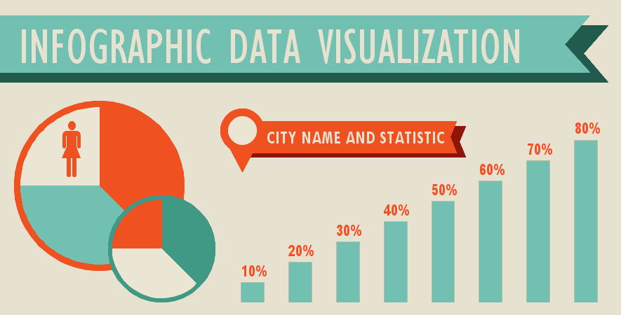
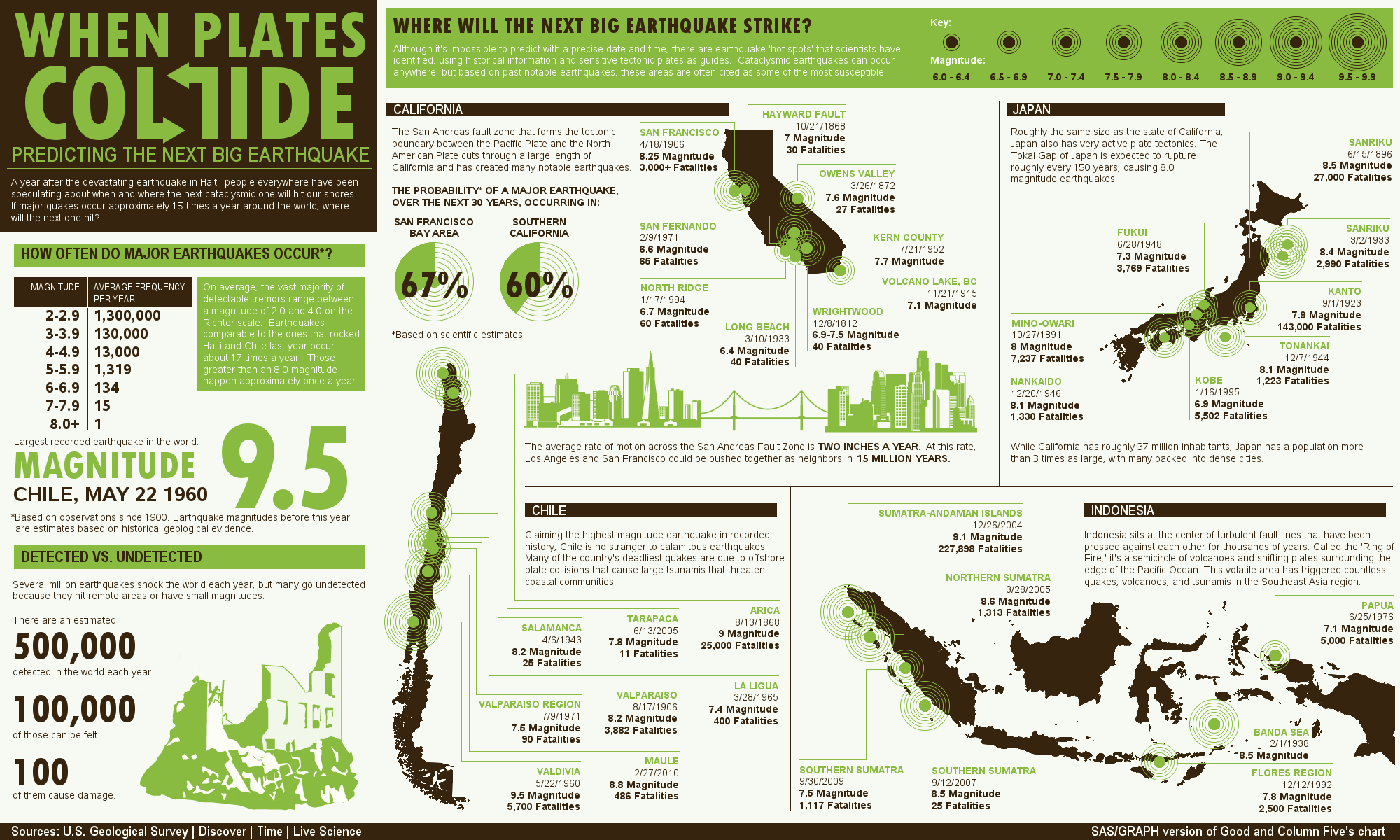

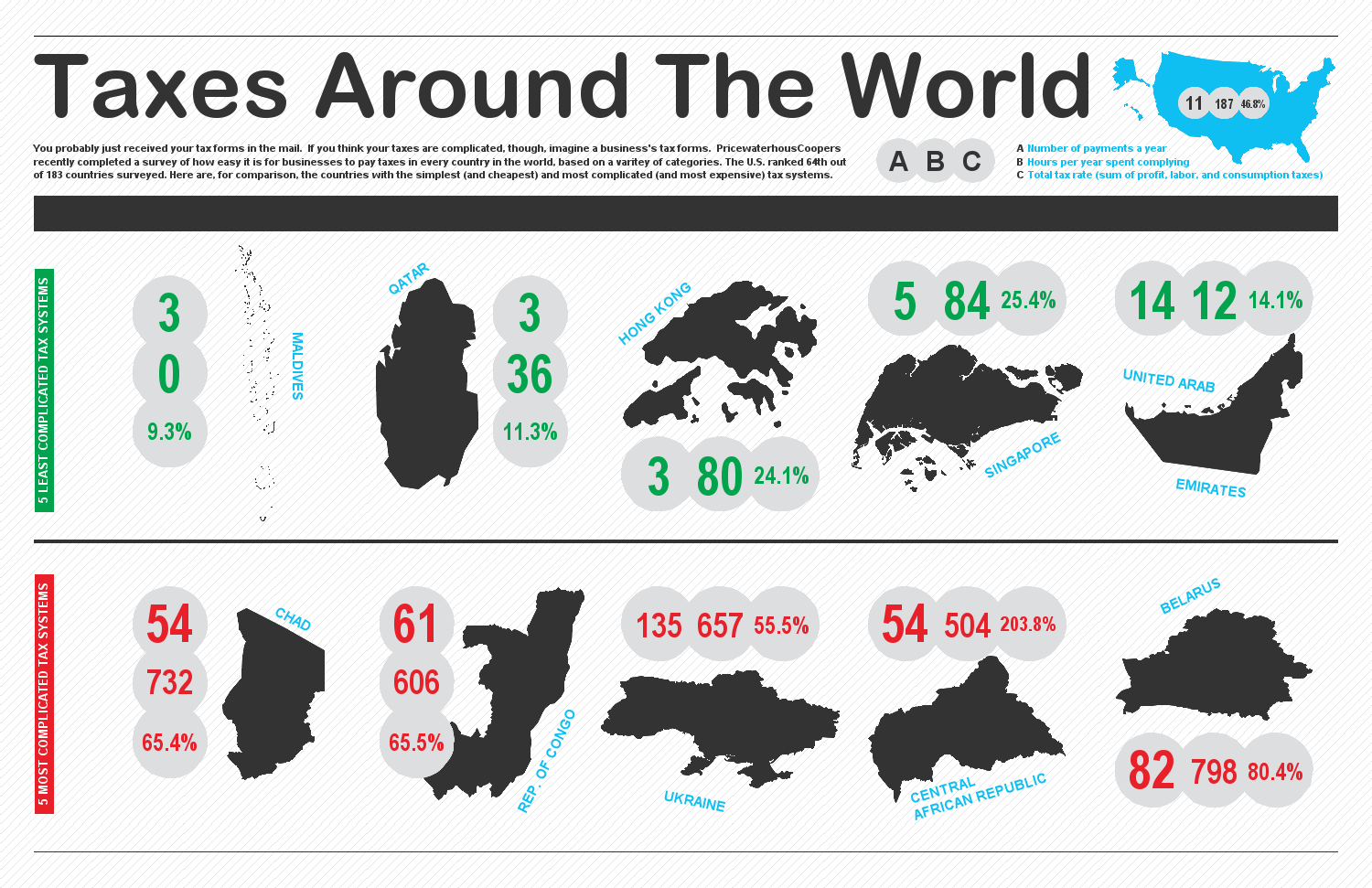
Note: All of these infographics are modeled after ones I found on the Web, via a Google image search (like the one above). Here are links to the originals: graph1, graph2, graph3, graph4, graph5, graph6, graph7.
-----------------------------------------------
April 16, 2013 Update:
As promised, here are the details you requested ...
There are several ways to create nice graphical layouts in SAS (many of them mentioned in the comments), and as several of you guessed I used the SAS/Graph product. You will be well on your way to creating similar infographics with the "tricks" you will learn in the SAS/Graph Essentials class, and my book SAS/Graph: Beyond the Basics !
Here are links to info & SAS code for the infographic examples shown in the blog above:
http://robslink.com/SAS/democd64/infographic_template_info.htm
http://robslink.com/SAS/democd52/plates_collide_info.htm
http://robslink.com/SAS/democd57/better_america_info.htm
http://robslink.com/SAS/democd52/world_taxes_info.htm
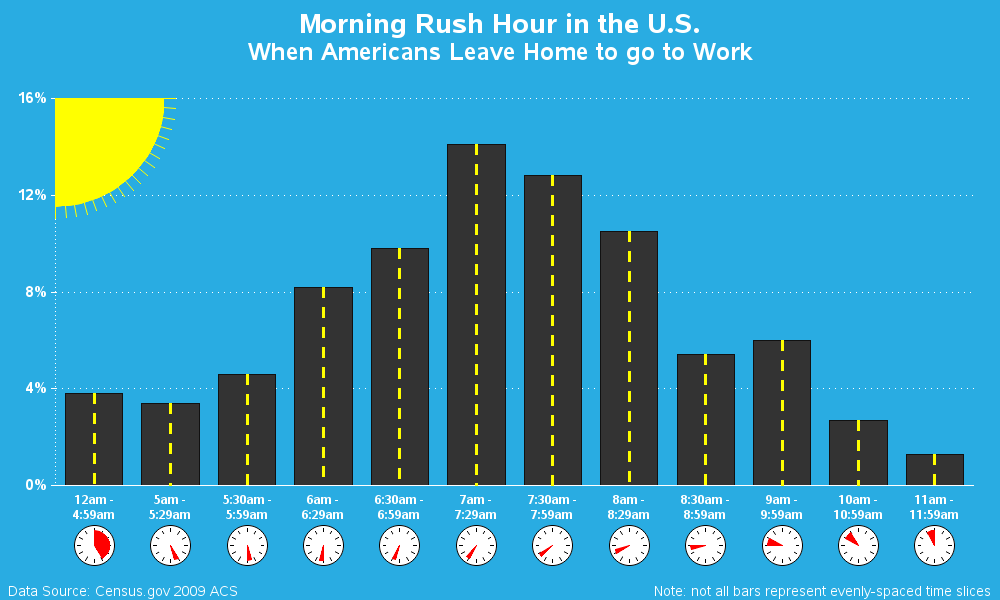
http://robslink.com/SAS/democd58/rush_hour_info.htm
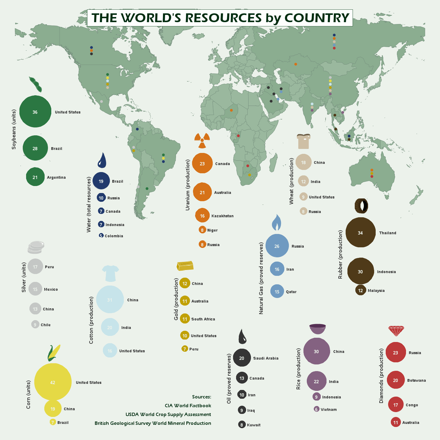
http://robslink.com/SAS/democd52/world_resources_info.htm
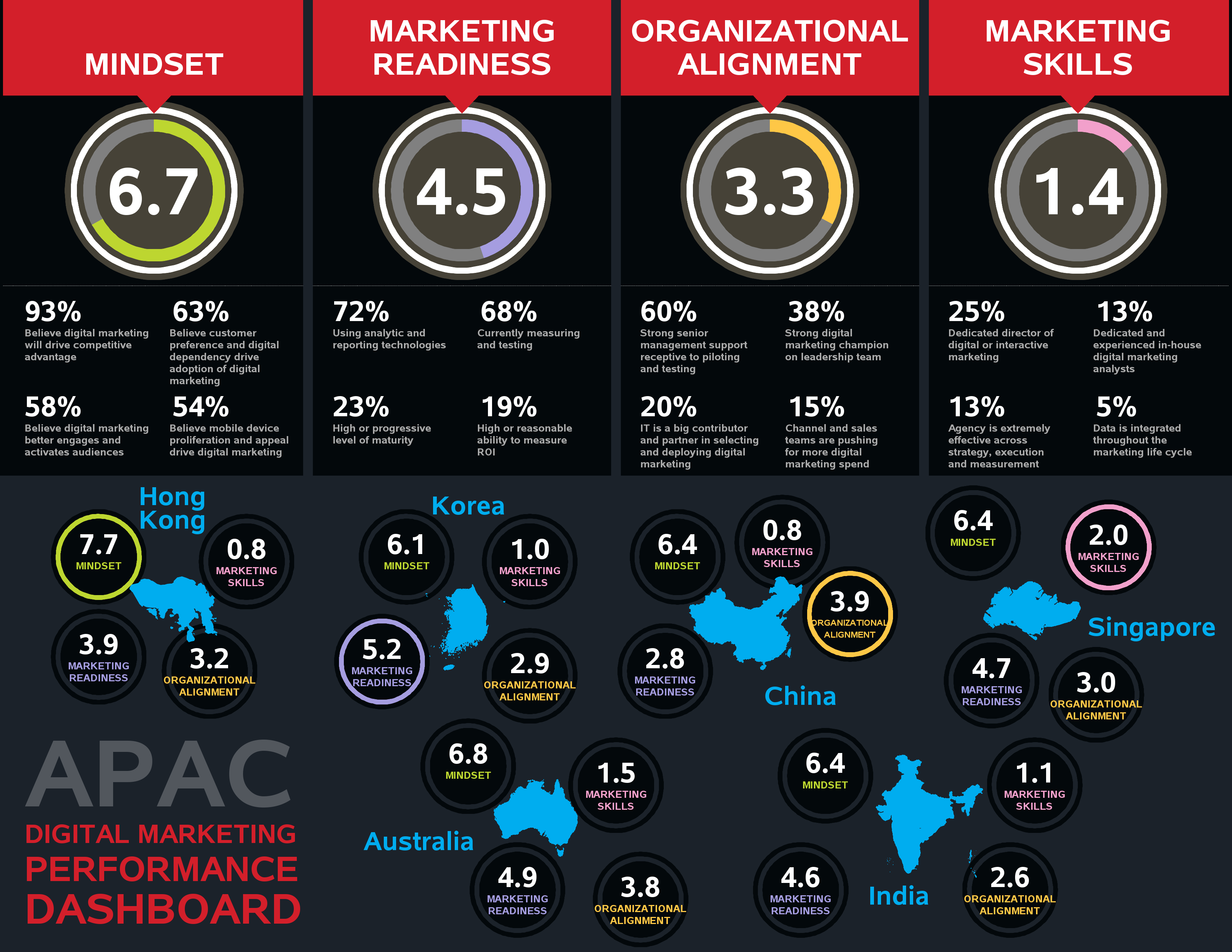
http://robslink.com/SAS/democd64/apac_dashboard_info.htm


31 Comments
I'm finally done with my infographic. Just a few things that came up that I'm hoping you can shed some light on please, Robert.
1. The resolution seems to be quite low, particularly with GPKI - but all the text around the charts etc look a little 'blocky'. Is there a way to improve this?
2. With GCHART, is there a way to space out the columns / bars more? I found some of my text was bumping into each other. I used 'split' and 'stagger', but they were compromises.
TIA
If you're seeing blocky text, that probably means you're using the old SAS fonts (such as swissb) - make sure you're using an anti-aliased font (such as 'albany amt') and using SAS 9.2.x or higher.
Per GKPI looking low-resolution, make sure you're generating the gkpi's image file in the same size & proportions you're going to later consume it via annotate/greplay/etc.
In Gchart, you can control the width & spacing of the bars, by using the width= and space= option (within certain limits). The axis offsets, gspace, and sometimes the font used can also have an impact.
And, as always, feel free to contact SAS Tech Support about issues that come up!
Thanks heaps!
Okay - I've worked out the problem with the text going over the graph - I've used 'split' now.
Actually - scrap that! Using the 'split' shrinks the space ... grrr.
Okay - you can scrap the scrapping. It was being compressed because of the GReplay.
Hello - your work is AMAZING! I'm hopefully going to get your book ... just seeing if work will pay for it :)
I want to do something like this ...
http://cdn.pamorama.net/wp-content/uploads/2010/03/If-_the_Twitter_Community_were_100_People1.jpg
How would I go about doing it? (I'll have four categories - male / female / Aboriginal male / Aboriginal female). For the Aboriginal elements, I wanted to use the Aboriginal flag as a 'fill' - is this possible?
Also, another thing I wanted to do is:
http://flowingdata.com/wp-content/uploads/2011/10/Speedometer.png
(But I need two needles - to show a comparison).
If you could give me broad instructions I should hopefully be able to figure it out.
Thanks heaps!!!!!!!!!!!!!!!
Roy - this one will show you a couple of different ways to do the 'people' graph:
http://www.robslink.com/SAS/democd77/twitter_as_100_people_info.htm
For your speedometer chart, you'll probably want to use Proc Gkpi. It allows you to have both a needle, and a target marker:
http://support.sas.com/documentation/cdl/en/graphref/63022/HTML/default/viewer.htm#a003212113.htm
Thank you soooo much Robert!
Pingback: The Art of Eight in Analytics
We have a client that's using your code to publish Churn Rates in a very fancy way! quite nice to see this kind of aestethic at SAS.
I'd love to see them (assuming it's not proprietary, of course!)
Rob, this is the infographic. I obviously changed the data. We have a graphic designer who made the design and I transform this in sas code using your examples. Designer also create the custom Typography.
We send this report daily. We also complemented this with shell script to embedd the image directly in the body of the e-mail and we execute it directly from sas.
De Varias 2013
https://picasaweb.google.com/lh/photo/GvMyGlhXdr5G2o5AttoQWtMTjNZETYmyPJy0liipFm0?feat=directlink
Wow - impressive!
Who would have thought SAS/Graph could produce such a chart!?!? :)
Rob, I'm going to buy your book and completly agree with Jaime: you're Les Paul of SAS/Graph.
I finished my first "corporate" infographic based on your examples. Really Really amazing, and Marketing people Loves that much more than other analytics jobs hahaha.
Thanks Sergio! - that's the ultimate compliment! :)
Really Amazing!! Thx for share the code!!
Thanks for sharing the code and revealing the mystery of how they were done. :)
This must be some of the best looking SAS/Graph output I've ever seen. I'm always impressed with what can be done with SAS/Graph and extra power of annotate (and it's so much fun too). [ Reading your post reminded me of some annotate work I did in the mid 90's on a non-graphics mainframe terminal where I had to wait for batch queues, print queues and then printouts to be delivered before I could see my results :) ]
Thanks for pointing out your book. It looks very interesting. I'll look out for it at the SAS Global Forum.
We should have an "I learned SAS/Graph so long ago..." blog, eh?!? ;)
Running SAS jobs "old school" that way (at least for a while) makes you a better SAS programmer, I think! :)
I have updated the blog with links to the SAS code - enjoy!
Old school, annotate or DSGI? :)
Ahh! - Another good guess!
(for those that don't know, DSGI is the SAS Data Step Graphics Interface)
Good guesses, so far! Keep them coming! :)
visual analytics...?
These look great. Like others have mentioned, we want the code!
Great definition of infographic!
i guess.... sas visual analytics
I'll post the answer in a few days ... in the meantime, everyone feel free to post your guess as to what SAS product(s) I used to create these infographics!
He used SAS/Graph.
For those who don't know, Rob Allison is the Les Paul of SAS/Graph.
Really Nice! Anyway to share code and data?
How did you do it????
Very impressive!