If you're like me, you hate all those pop-ups you get suggesting (or sometimes forcing) that you install an upgrade such as Windows, Java, browsers, phone apps, etc, etc. And quite often they don't convince you why you'd want to upgrade (will life be better?) ... they just tell you to do it.

Well SAS is different!
I can always find a list of What's New in the latest SAS release, and the new releases always have exciting new features that compel me to want to upgrade.
For example, here are 3 great new enhancements that were added to SAS/GRAPH in SAS 9.3. In my opinion, these 3 features alone make it worth upgrading.
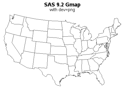
Smooth Lines
In previous versions of SAS, angled lines in your graphs might have looked a little jagged -- in SAS 9.3 the lines are now smooth! This happens automatically ... just rerun your code in 9.3, and you get smooth lines! (This is for device=png, which is the SAS/GRAPH default, and is the device I use in 99.9% of my graph examples.)
Here's a before and after comparison:

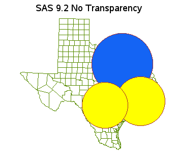
Transparent Colors
SAS 9.3 now supports the use of transparent colors. Similar to specifying a color as CXrrggbb, you simply specify it as ArrggbbXX (where XX is the level of transparency). This opens up many new possibilities in your graphics. Here is an example:

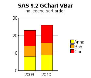
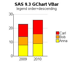
Legend Ordering
This next feature is a personal favorite that I plan to use a lot. Others might not even notice this feature, but let me try to convince you how cool it is...
In a Gchart bar chart, the bar segments are stacked alphabetically from bottom to top. And by default, if you put a legend on the side of a plot, and make it 1 column wide, the legend items are stacked alphabetically from top to bottom. Although the graph is technically correct, I think it's a lot more intuitive and easier to read (imho) if the legend items are stacked in the same order as the bar segments.
Previously, you had to hard-code all values using the order= option in a legend statement to reorder the legend (this could be cumbersome if/when your data changes). In SAS 9.3 you can simply use the new descending legend option!
There now - doesn't that make you want to upgrade?!? I invite you to read more on the official SAS/GRAPH What's New page, and see demonstrations of the features (along with sample code) in my samples collection.


9 Comments
SAS 9.4 is planned for release next year, wouldn't it be better to wait?
But then you'd have to go a whole year without the 9.3 enhancements!
I recommend upgrading as soon as a new version is available, so you can start using the new features asap.
When I bought my first PC, I kept waiting because I knew that "next month" the PCs would be faster and cheaper ... I ended up witing 10 years to buy that first PC, LOL! ;-)
Robert,
I have long been a strong advocate for mouse-over text if you can deploy a chart on the web or at least with HTML packaging. However, I am even more a fan of providing the numeric values directly and permanently in the display field of the chart. It's a solution that also works for a chart imbedded in a slide or Word document or printed.
Unfortunately, mouse-over text disappears as soon as you move the mouse, and it is impossible to compare the numbers for two or more sectors of the stacked bar(s) or to compare the numbers for the corresponding sector in two or more stacks. If you need to have that information available for a web-deployed stacked bar chart, you can link it to a spreadsheet (and link the spreadsheet back to the bar chart.) See, e.g., in the context of a trend chart, the paper
http://support.sas.com/resources/papers/proceedings10/231-2010.pdf The chart type is different, but the linking code concept is portable to any web-deployed chart.
The seeming problem you mention that could arise with a large number of groups of side-by-side bars, one of which in each group would be the total for that group of component bars, is easily addressed by rotating the chart. I have always recommended horizontal bars instead of vertical bars. (Further, I have solved the problem, as will be shown in a forthcoming paper, of sizing the image file height and label font size to assure that any number of horizontal bars can be fit without bar or label overlap.) With vertical bar charts, unless your bar labels happen to be something as compact as simply a year value, it often happens that the bar labels will not fit. (I have never been an admirer of rotating labels to a vertical orientation to make them fit. We don’t read that way.) Horizontal space for horizontal bar labels is never a problem, especially now that label length is effectively unlimited (256 characters--always more than enough). And the extra advantage of horizontal bar charts is that you have space to imbed EXTRA information in the bar label. E.g., see paper http://support.sas.com/resources/papers/proceedings11/278-2011.pdf for how a horizontal bar chart can be used to imbed value and percent of whole in bar labels.
LeRoy,
Thanks for the info!
It would be interesting to see your alternate (non-stacked) version of the 3 charts I posted. If you'd like to get my SAS code as a starting point, change the '.htm' to '_info.htm' and that will give you a link to the SAS code.
I understand that SAS/GRAPH has been added to Base SAS and is not licensed by iotself in 9.3 of the SAS system. Is this correct?
Hi Joyce - as far as I know, SAS/GRAPH (which includes procs such as Gplot, Gchart, Gbarline, Gmap, etc) is still a licensed product, and not included in Base SAS. Most customers buy a "package deal" of several products, but SAS/GRAPH is not part of Base SAS.
I believe what you are thinking of is the "ODS Graphics" (the automatic graphics you get when you run SAS/STAT and SAS/OR procs, and when you run the 'sg' procs such as sgplot). The ODS Graphics are part of Base now.
What you will see in most of my blogs are SAS/GRAPH examples. You will see mostly "ODS Graphics" examples in Sanjay Matange & Dan Heath's blogs.
Hi Joyce
Some graphing functional is available now in SAS 9.3 Base SAS through ODSGraph
Cheers
Dave
Robert, I appreciate the benefit of smoother lines, curves, & text contours, and the value in some applications of transparent colors. However, less important than controlling the order of legend entries in a stacked bar chart is that a stacked bar chart is NOT sufficiently communication-effective. Estimating the magnitude of a bar by comparing it with tick mark values on an axis is never as reliable as reading off the value that has been displayed past the end of a bar. (Imbedding the value inside the bar is NOT a satisfactory alternative because some bars will be too short to fit the value.) But the inherent problem with the stacked bar chart is that, although one CAN estimate the magnitude of the total stack and of the bottom bar, it is impossible to easily estimate the magnitude of any of the other constituent bars in the stack. (Do you really want viewers to estimate the top value and bottom value at the ends of a constituent bar and then do mental subtraction?) Visuals provide easy and quick inferences and decisions, but precise numbers are needed for reliable inferences and decisions. The correct communication-effective alternative to the stacked bar chart has been advocated and demonstrated by me at least since 1992 (“Pie Charts and Bar Charts: Getting Their Best out of SAS/GRAPH Software”), and more recently in “Easy, Elegant, and Effective SAS Graphs: Inform and Influence with Your Data” which can be found at
http://www2.sas.com/proceedings/sugi28/068-28.pdf
(In my solution, the custom legend is created by SAS code, because the needed legend is not supported at all by SAS/GRAPH, or at least was not supported at date of writing.) Adding the Bessler alternative to the stacked bar chart as a standard feature in SAS/GRAPH and in the new ODS Graphics would be a future feature worth your reporting when it is available. Thanks.
LeRoy - as always, you make some good points!
But I think there is no 1 absolute best way to graph all data. I think stacked bar charts are useful in certain situations, and therefore I think it's great to add features that support them in SAS!
One situation where stacked bar charts is useful (imho) is when the bars add up to 100% - these allow you to look for "shifts" from one category (color) to another. For example, the shift towards Android-based smartphones in this graph:
http://robslink.com/SAS/democd48/smartphones.htm
I think a stacked bar chart is also useful when the "total" (sum of the stacked segments) is the important thing ... but when you also want to see (as a secondary thing) what comprises that total. Note that with web-based graphs, you can add mouse-over text to the bar segments, so you can mouse-over them to see the actual value (if labels don't fit in the small bar segments):
http://robslink.com/SAS/democd38/best_beer.htm
And then an extension to that case - when the there are also too many stacked segments to show in paired/grouped side-by-side rather than stacked bars:
http://robslink.com/SAS/democd47/hybrids.htm
I think it's always useful to plot the data in a variety of ways, to see different things!