Facebook has millions of users, and therefore when people share an interesting graph on Facebook it can "go viral" and millions of people might see it. Some of the graphs are obviously a bit biased - especially ones that are trying to sway your opinion one way or another on a topic such as politics. But sometimes the bias isn't so obvious (and perhaps not even intentional). This blog is about one such graph, and how I created a better version with SAS/GRAPH!
But first, let's start with a little trivia contest - who can name the singer and title of the song with the following lyrics ...
"Trailers for sale or rent, rooms to let ... 50 cents. No phone, no pool, no pets. I ain't got no cigarettes!" [hint]
Renting a room for 50 cents - those days are long gone, eh!?! So, what does rent cost these days? That was the topic of a graphic that one of my friends recently shared on Facebook. It was a map of the U.S., with each state shaded to show the number of hours needed to work at minimum wage to rent a 2-bedroom apartment.
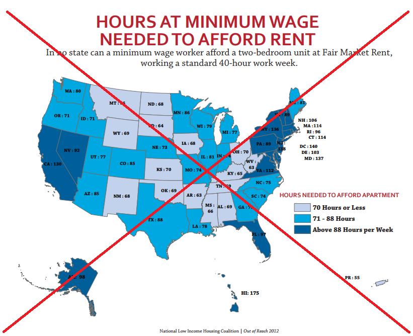
It was a very interesting map, but when I read it closely, I found that I couldn't really tell exactly what it was saying. After quite a bit of Internet searching, I found the original study that the map had come from, and found out exactly what the data values represented.
I then created my own version of the map, which clears up any confusion/uncertainty I had with the original map. Specifically, my map contains the following additional info:
- Minimum wage is $7.25/hour.
- Calculation is based on a person spending 30% of their income on rent.
- I make it clear (in main title) that this is *weekly* hours worked.
- I add mouse-over text so you can see the state names & values more easily.
- I draw lines from the small states to their labels.
- I move the secondary title info to the bottom of the map.
- I simplify the legend.
- ... and I print a sorted table of the data below the map.
Here's my SAS/GRAPH version of this map - be sure to click to see the interactive version with the html mouse-over text!
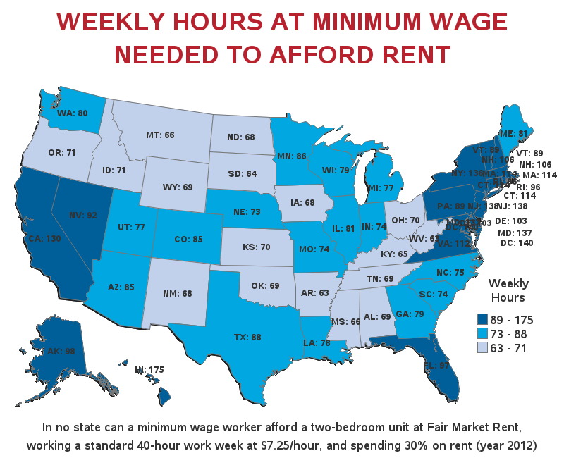
As you can see, SAS can create some really neat maps! If you're interested in learning more about creating maps with SAS, I highly recommend the 2 day course on Producing Maps with SAS/GRAPH :)


5 Comments
Hello, all is going nicely here and ofcourse every one
is sharing data, that's genuinely excellent, keep up writing.
Hey there would you mind stating which blog platform you're using? I'm looking to start
my own blog in the near future but I'm having a tough time selecting between BlogEngine/Wordpress/B2evolution and Drupal. The reason I ask is because your design seems different then most blogs and I'm
looking for something completely unique. P.
S Apologies for getting off-topic but I had to ask!
Hello,
We use WordPress. Good luck with your blog!
According to this, in Hawaii you must work 7 more hours than there are available! And Magnum P.I. made it look so easy! Was he a man of means? By no means!*
*I smoke old stogies I have found. Short, but not too big around.
Yep! - I would hate to make minimum wage anywhere ... but especially Hawaii!
I would probably have to be a rich old lady's "Pool Boy" LOL