Do you use SAS for analytics and Microsoft Excel for graphs?
Why not use SAS for your graphs too?!? Then you could completely automate the entire process in one SAS program, with no manual steps!
A lot of people use Excel to create their graphs because "it's what they know." What if somebody handed you some very simple examples, showing how to create all the common Excel-like graphs in SAS?
Well, that's exactly what I'm doing!
Here is a link to 36 very simple SAS/GRAPH examples that show how to create SAS graphs that look very much like the Excel graphs you know and love -- now you can know and love them in SAS! Click on the link or the sample graphs below to see all 36 samples.

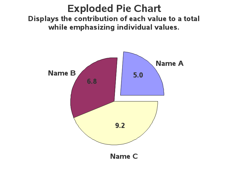
These examples show you how to structure the variables in your data set, how to specify the Excel-like colors, what procedures to use, and what options to specify. Start by downloading the SAS code and running the examples as-is, and then try changing the data values and titles. If you can do that, you're well on your way to creating all your graphs in SAS!


13 Comments
I like your examples! Just curious I am doing a lot of reports that use Excelxp tag sets and ods to send proc tabulates to excel XP. I like this but I read it doesn't support graphics. We are upgrading to Excel 2010 shortly and I was curious if there is any similar dos technique that would allow all the flexibility of exporting to excel with excelxp options but also support graphics?
Good question Ben! - My expertise niche is very small (custom graphs), and I haven't dabbled in the Excelxp end of things yet. So this might be a good question to run by SAS Tech Support - I bet they have some experts in that area!
Hey Robert,
Just FYI. AMO now allows users to generate Excel charts. Tools > Options > Graph > [x] Create Microsoft Excel charts when possible . That's not the direction you're trying to point people however. And this option simply generates some of the basic charts w/o many options so users would likely still need to tweak the output manually.
Anna
Thanks Anna! - That info will also be of interest to the target-audience of this blog!
And, in case anyone reading doesn't know what "AMO" is, that's the "SAS Add-In for Microsoft Office"
http://support.sas.com/documentation/onlinedoc/addin/index.html
I use Excel for a lot of my charting. SAS just doesn't do it for me all the time. I find for small data sets, using the mouse to select the data rows for charting is quicker than programmatically selecting the data. For large data sets, I use SAS to generate the output data which I then graph in Excel.
A typical scenario for me is that I am writing a more or less academic report in MS Word. Pasting in a MS Excel chart affords me the ability to modify the chart from within MS Word. I can match the chart to the visual theme of the report and make other modifications as required such as font. I can't quickly modify SAS graph output (e.g. jpeg).
MS Excel charts (for version 2007 and up) are sexy. It's a challenge sometimes to make SAS charts visually appealing. The example charts here are equivalent to the unsexy charts generated in Excel 2003 or lower. Gross.
I'm sold on the benefit of charting in SAS for production runs. But Excel users need to see how to quickly generate a variety of visually appealing charts. So I am eagerly awaiting future posts.
As a side note, sometimes people have the results they want to graph in a tabular form. E.g.
Jill 20%
Jane 40%
Jean 35%
Jess 5%
Charting this is super easy in Excel. But EG and SAS charts always seem to expect the raw data rather than result data, making it difficult to chart the above?
I never thought I'd say this, but I think SAS' Graph and EG products can still learn a lot from Microsofts Excel product.
Jared - good point about editing the font and such once you get an Excel chart into a Word doc!
And I'm glad you mentioned the "sexy" new Excel charts! ... This gives me a good lead-in/excuse to give a plug for Stephen Few's article on that very topic. I don't think I can improve upon what he says on that topic (see link to it below), but suffice it to say that I was intentionally staying away from creating "sexy" graphs! :)
http://www.perceptualedge.com/articles/b-eye/excels_new_charting_engine.pdf
Jared,
I have to agree. I just had to create graphs showing percentages instead of frequencies, and was amazed and what I had to do with the vbar option in proc sgplot -- I had to calculate the percents, save them in a data file, then plot them! It's unbelievable! It's much easier to copy data tables into Excel and create graphs with it -- these are easy to modify once you have them, just by clicking on the options. I wish SAS would generate graphs more easily. Perhaps the solution is an interface between SAS and Excel - why reinvent the wheel?
Wow! This is spectacular!
I don't use SAS/Graph that often, but I really like it. This page is going at the top of my "Keep" list, I know I'll use it often.
Thanks, thanks, thanks!!
Tom
That's what I like to hear! :-) And keep an eye out for future posts ... I'll be showing more/better collections of graphs in the future!
Dr. Allison,
I'm an admirer of your work. I know no one who can approach your skills when it comes to SAS/Graph. You can make it do wonderful things.
Your post is spot on about automating the output of of graphs using SAS. That's a very useful feature, and one that I use frequently for getting out insightful reports about critical business processes.
I take issue, however, with the Excel graph types you chose to mimic on your 'SAS version of Microsoft Excel Charts' page.
There is no place in the world for 3d bar charts or 3d pie charts, because they add zero value over their 2d counterparts and, in fact, are more difficult to read than a standard 2d chart. I'm 99% sure you know this. I suspect you made this post because there are SAS customers out there who want to automate their crappy Excel charts with SAS.
But just because a customer wants something doesn't make it right. It's our responsibility, as info visualizers, to steer folks away from bad charts and towards the good stuff. Tufte says to 'do whatever it takes' to communicate your story. People look up to you, Rob, because you're an expert in your field. And your readers deserve a better solution to this problem. Automation is great, but replicating bad graphs...not so great.
Perhaps a follow up post telling your readers how to transform their bad Excel charts into wonderful SAS charts would serve as atonement for this sinful post :>
John C. Munoz
http://www.bizintelguru.com
Hi John - thanks for the long/insightful comment! I've seen some examples of your dashboards and such, and just like your work being spot-on, so is your comment! I think that's a great idea for a follow-up post!
Just so you'll know ... my "secret strategy" is to lure the Excel users in by showing them "what they know and love", and then once we've lured them over to "the SAS side" we'll re-brainwash them (or re-program their brains) to think about graphics the *right* way! :)
I should have known you had a grand strategy Rob. I hope it works. Automating SAS routines, with graphs and all, is an easier, and way more stable way to go than using VB with Excel.
I'm curious, will you be talking about the ODS Graphics designer at all, or is that Sanjay's area.
Can't wait to see what's next!
Currently, I'm leaving all the ODS stuff to Sanjay Matange and Dan Heath. But I'll be showing you lots of new tricks in the traditional SAS/GRAPH software :)