Do you have a favorite television show? Or a favorite movie franchise that you follow? If you call yourself a "fan," just how much of a fan are you? Are you merely a spectator, or do you take your fanaticism to the next level by creating something new?
When it comes to fandom for franchises like Game of Thrones, the Marvel movies, or Stranger Things, there's a new kind of nerd in town. And this nerd brings data science skills. You've heard of the "second screen" experience for watching television, right? That's where fans watch a show (or sporting event or awards ceremony), but also keep up with Twitter or Facebook so they can commune with other fans of the show on social media. These fan-data-scientists bring a third screen: their favorite data workbench IDE.
I was recently lured into into a rabbit hole of Game of Thrones data by a tweet. The Twitter user was reacting to a data visualization of character screen time during the show. The visualization was built in a different tool, but the person was wondering whether it could be done in SAS. I knew the answer was Yes...as long as we could get the data. That turned out to be the easiest part.
WARNING: While this blog post does not reveal any plot points from the show, the data does contain spoilers! No spoilers in what I'm showing here, but if you run my code examples there might be data points that you cannot "unsee." I was personally conflicted about this, since I'm a fan of the show but I'm not yet keeping up with the latest episodes. I had to avert my eyes for the most recent data.
Data is Coming
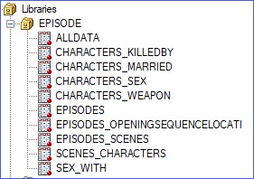
A GitHub user named Jeffrey Lancaster has shared a repository for all aspects of data around Game of Thrones. He also has similar repos for Stranger Things and Marvel universe. Inside that repo there's a JSON file with episode-level data for all episodes and seasons of the show. With a few lines of code, I was able to read the data directly from the repo into SAS:
filename eps temp; /* Big thanks to this GoT data nerd for assembling this data */ proc http url="https://raw.githubusercontent.com/jeffreylancaster/game-of-thrones/master/data/episodes.json" out=eps method="GET"; run; /* slurp this in with the JSON engine */ libname episode JSON fileref=eps; |
Note that I've shared all of my code for my steps in my own GitHub repo (just trying to pay it forward). Everything should work in Base SAS, including in SAS University Edition.
The JSON library reads the data into a series of related tables that show all of the important things that can happen to characters within a scene. Game of Thrones fans know that death, sex, and marriage (in that order) make up the inflection points in the show.
Building the character-scene data
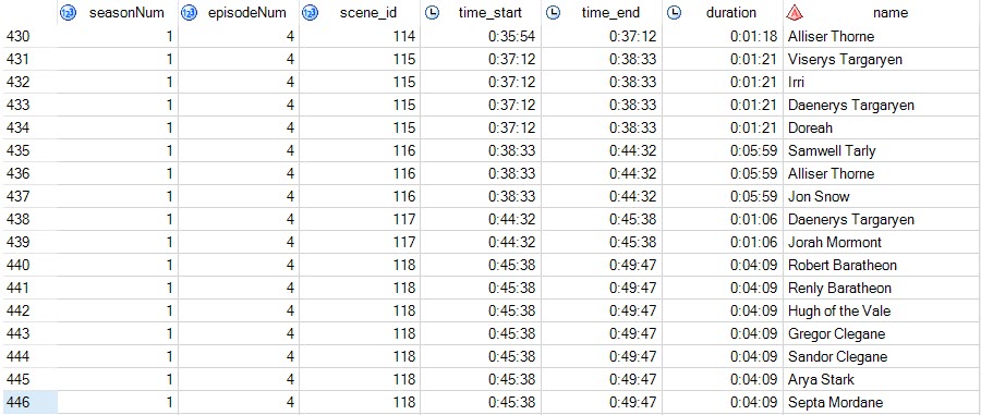
With a little bit of data prep using SQL, I was able to show the details of the on-screen time per character, per scene. These are the basis of the visualization I was trying to create.
/* Build details of scenes and characters who appear in them */ PROC SQL; CREATE TABLE WORK.character_scenes AS SELECT t1.seasonNum, t1.episodeNum, t2.ordinal_scenes as scene_id, input(t2.sceneStart,time.) as time_start format=time., input(t2.sceneEnd,time.) as time_end format=time., (calculated time_end) - (calculated time_start) as duration format=time., t3.name FROM EPISODE.EPISODES t1, EPISODE.EPISODES_SCENES t2, EPISODE.SCENES_CHARACTERS t3 WHERE (t1.ordinal_episodes = t2.ordinal_episodes AND t2.ordinal_scenes = t3.ordinal_scenes); QUIT; |
With a few more data prep steps (see my code on GitHub), I was able to summarize the screen time for scene locations:

You can see that The Crownlands dominate as a location. In the show that's a big region and a sort of headquarters for The Seven Kingdoms, and the show data actually includes "sub-locations" that can help us to break that down. Here's the makeup of that 18+ hours of time in The Crownlands:

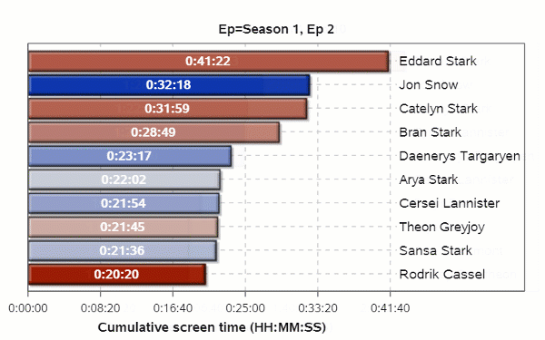
Screen time for characters
My goal is to show how much screen time each of the major characters receives, and how that changes over time. I began by creating a series of charts using PROC SGPLOT. These were created using a single SGPLOT step using a BY group, segmented by show episode. They appear in a grid because I used ODS LAYOUT GRIDDED to arrange them.

Here's the code segment that creates these dozens of charts. Again, see my GitHub for the intermediate data prep work.
/* Create a gridded presentation of Episode graphs CUMULATIVE timings */ ods graphics / width=500 height=300 imagefmt=svg noborder; ods layout gridded columns=3 advance=bygroup; proc sgplot data=all_times noautolegend ; hbar name / response=cumulative categoryorder=respdesc colorresponse=total_screen_time dataskin=crisp datalabel=name datalabelpos=right datalabelattrs=(size=10pt) seglabel seglabelattrs=(weight=bold size=10pt color=white) ; ; by epLabel notsorted; format cumulative time.; label epLabel="Ep"; where rank<=10; xaxis display=(nolabel) grid ; yaxis display=none grid ; run; ods layout end; ods html5 close; |
Creating an animated timeline
The example shared on Twitter showed an animation of screen time, per character, over the complete series of episodes. So instead of a huge grid with many plots, need to produce a single file with layers for each episode. In SAS we can produce an animated GIF or animated SVG (scalable vector graphics) file. The SVG is a much smaller file format, but you need a browser or a special viewer to "play" it. Still, that's the path I followed:
/* Create a single animated SVG file for all episodes */ options printerpath=svg animate=start animduration=1 svgfadein=.25 svgfadeout=.25 svgfademode=overlap nodate nonumber; /* change this file path to something that works for you */ ODS PRINTER file="c:\temp\got_cumulative.svg" style=daisy; /* For SAS University Edition ODS PRINTER file="/folders/myfolders/got_cumulative.svg" style=daisy; */ proc sgplot data=all_times noautolegend ; hbar name / response=cumulative categoryorder=respdesc colorresponse=total_screen_time dataskin=crisp datalabel=name datalabelpos=right datalabelattrs=(size=10pt) seglabel seglabelattrs=(weight=bold size=10pt color=white) ; ; by epLabel notsorted; format cumulative time.; label epLabel="Ep"; where rank<=10; xaxis label="Cumulative screen time (HH:MM:SS)" grid ; yaxis display=none grid ; run; options animation=stop; ods printer close; |
Here's the result (hosted on my GitHub repo -- but as a GIF for compatibility.)
I code and I know things
Like the Game of Thrones characters, my visualization is imperfect in many ways. As I was just reviewing it I discovered a few data prep missteps that I should correct. I used some features of PROC SGPLOT that I've learned only a little about, and so others might suggest improvements. And my next mission should be to bring this data in SAS Visual Analytics, where the real "data viz maesters" who work with me can work their magic. I'm just hoping that I can stay ahead of the spoilers.

5 Comments
They will never let him rule.
Chris,
Thanks so such to share your fantastic SAS work well done. After downloaded and run your entire SAS code, other than getting animated SVG result, I don't get the 3 column image file with png or jpg format.
named "got_gridded_jpg". Could you shed some lights on that?
Thanks,
Ethan
Ethan, any errors that you saw? What version of SAS? Some of these options require SAS 9.4m5, I think. I've run this code as-is from SAS Enterprise Guide with local SAS, as well as within SAS University Edition (changing only the file reference for the last SVG) and...while it can take a while to build all of those graphs, it worked.
Chris,
I run the code on 9.4m6 and created 68 different SVG files with any error.
OTE: Listing image output written to
C:\Users\zhouwx1\screen_time410.svg.
NOTE: Listing image output written to
C:\Users\zhouwx1\screen_time411.svg.
NOTE: Listing image output written to
C:\Users\zhouwx1\screen_time412.svg.
NOTE: Listing image output written to
C:\Users\zhouwx1\screen_time413.svg.
NOTE: There were 689 observations read from the data set
WORK.ALL_TIMES.
WHERE rank<=10;
1176 quit;
1177 ods layout end;
1178 ods html5 close;
NOTE: This SAS session is using a registry in WORK. All
changes will be lost at the end of this session.
Ethan,
The images should be embedded in the HTML5 output. But the default results viewer in SAS (display manager) may not be able to render this. You can try changing the FILENAME statement that I use for the HTML5 out from "temp" to an HTML file location on your local system, and then open that with another viewer (Chrome, for example).