While talking to SAS users in Australia earlier this month, I often demonstrated the capabilities of the new Map Chart task in SAS Enterprise Guide 4.3. Creating map charts has never been easier: select your map data source, then select your response data source, and click Run. Voila! You've got a map chart. (See this SAS Global Forum paper from Stephanie Thompson for proof that it's "easier than you think".)
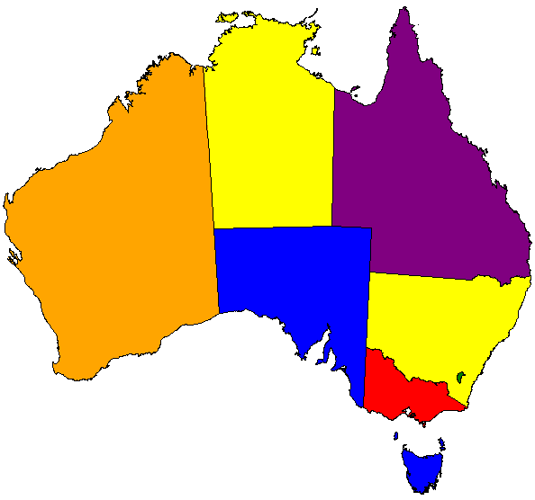
Of course, all of my map chart examples used data from the United States. Australians recognize a map of the USA when they see it (I cannot say the same of many Americans who view a map of Australia), but they wanted to see examples of maps that featured their country. And although SAS provides map data for Australia with detail to the state level, these users wanted more detail than that. Here is an example of a "coarse-grained" map chart of Australia with just the state boundaries, created using the MAPS.AUSTRAL data set that is supplied with SAS:
On their web site, the Australia Bureau of Statistics provides map data with more details, down to the "statistical regions", "local government regions" and more. These data files are provided as shape files in ESRI or MapInfo format.
Fortunately, it's easy to import ESRI shape files into SAS map data sets by using PROC MAPIMPORT. Assuming you've downloaded the ESRI shape files to your local system, this simple code can convert them to a SAS map data set:
/* Shape file for statistical local areas */ proc mapimport out=aus_sla datafile="c:\projects\AusMaps\SLA11aAust.shp"; ID=SLA_CODE11; run; |
With the map data now available in WORK.AUS_SLA, all you need is some response data that contains a shared identifier field. The following step creates a data source with random values:
/* make up some response data */ data response_sla; set aus_sla (keep=SLA_CODE11 SLA_NAME11); /* keep just one value per region */ by SLA_CODE11; if first.SLA_CODE11; /* random value between 0 and 100 */ RespValue = ranuni(0) * 100; run; |
Now use the GMAP procedure to combine the two data sources into a colorful, if somewhat meaningless, map of Australia:
/* create a simple map chart by combining the two */ legend1 across=3 label=("Values"); goptions colors=(green blue purple red orange yellow ); proc gmap data=work.response_sla map=work.aus_sla all; id sla_code11; choro RespValue / levels=6 woutline=1 legend=legend1 ; run; quit; |
Here is a sample of the output (Americans, take note):
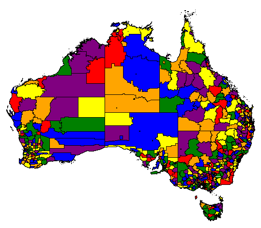
Just remember: Map Charts = Map Data + Your Response Data. With a third data set for annotations, you can create even fancier results. But that's a topic for another blog post. For those readers who are curious in the meantime, a simple SAS support search will open the door for you.

8 Comments
Great article and thank you for localising it too. I didn't know the ABS provide the ESRI shape files for the Australian Statistical Local Areas. Will definitely be sharing this blog post. Thanks!
Thanks for the great advice Chris. For other Australians out there trying to map their data, here's a handy link which gives the longitude and latitude for postcode / suburb data - which is extremely useful for a nifty annotate data set. See http://www.corra.com.au/support/downloads/
This will be appreciated greatly by Australian SAS users. I wonder if we could further localise the map to a single State Level?
I think that reducing the map to just a subset (by subsetting the MAP data set to contain just the information for a single state, based on state code) would do the job.
Can somebody tell me why I can't get colors to appear on my map?
Chris, you might try putting this question (with some sample code around what you're doing) to the SAS/GRAPH forums on communities.sas.com.
Hi ... nice post. If anyone wants to read a little more on MAPIMPORT, you might try ...
"From Shapefiles to Maps Via PROC MAPIMPORT and PROC GMAP"
Handy tips - I just gave a paper at MWSUG 2016 and SGF 2017 on this very topic, http://support.sas.com/resources/papers/proceedings17/1307-2017.pdf! There's quite a bit of data to be had at the Australian postal code level and many cities, towns and larger entities are creating data farms with municipal data. With PROC MAPIMPORT, the sky, and beyond, is pretty much the limit. In the paper, I demonstrate using PIGWAD data and shape files to map Mars. I have to put in a plug for SAS MapsOnline http://support.sas.com/rnd/datavisualization/mapsonline/html/home.html. There is so much useful information and data, including British geocoding. In addition, Robert Allison of SAS has an amazing site with samples galore (including code and free ebooks to help you get started.) http://www.robslink.com/SAS/Home.htm. Happy Mapping, all.