The Data Visualization Charting 101 series explores different tools to visualize data. Check out other posts to see which data visualization is right for you.
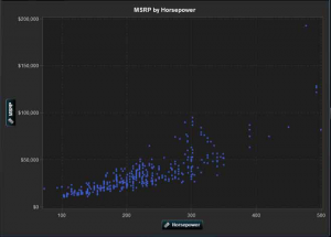
Have so much data that your head is spinning? If you have a lot of data that needs to be visualized, a scatter plot, aka an X-Y plot, would be the most useful of the charts we’ve examined on this blog series. They can help your audience quickly identify patterns and correlations.
Scatter plot basics:
- Two-dimensional plot that shows the joint variation of two data items
- Each marker (symbols such as dots, squares and plus signs) represents an observation
- The marker position indicates the value for each observation
- A scatter plot matrix is a series of scatter plots that displays every possible pairing of the measures that are assigned to the visualization
When should you use a scatter plot?
Scatter plots are useful for examining the relationship, or correlations, between X and Y variables. Variables are said to be correlated if they have a dependency on, or are somehow influenced by, each other. For example, “profit” is often related to “revenue” – and the relationship that exists might be that as revenue increases profit also increases (a positive correlation). A scatter plot is a good way to visualize these relationships in data.
In a scatter plot, you can also apply statistical analysis with correlation and regression. Correlation identifies the degree of statistical correlation between the variables in the plot. Regression plots a model of the relationship between the variables in the plot.
Once you have plotted all of the data points using a scatter plot, you are able to visually determine whether data points are related. Scatter plots can help you gain a sense of how spread out the data might be or how closely related the data points are, as well as quickly identify patterns present in the distribution of the data.
Scatter plots are helpful when you have many data points. If you are working with a small set of data points, a bar chart or table may be a more effective way to display the information.
Is your data big enough to warrant a scatter plot? Learn more about which chart works best for different data sets by downloading the white paper, Data Visualization Techniques.
Also, get your hands on data visualization software SAS® Visual Analytics at the "Software Cafe" at SAS Global Forum, April 28-May 1, in San Francisco.