How have healthcare providers and governmental agencies predicted the fast-changing, potentially exponential increase in the need for medical services and equipment through the various stages of the COVID-19 pandemic? Mathematical techniques that attempt to model and understand the likely spread of the disease have been instrumental.
The SEIR model is a compartment model that uses a mathematical and statistical approach to model the spread of an infectious disease within a population. It divides the population into four compartments:
- Susceptible: those who are susceptible to becoming infected.
- Exposed: those who have been exposed to an infected person but have not yet become infectious.
- Infectious: those who are currently infectious.
- Recovered: those who have recovered and are no longer infectious.
SEIR models simulate an epidemic and provide projections of the epidemic peak by estimating future numbers of susceptible, exposed, infectious, and recovered Individuals. These models are often used to aid in policymaking and capacity planning in healthcare and other industries that provide essential goods and services during an epidemic. For example, hospitals use SEIR models to ensure that necessary staff and equipment are placed where they are needed most, with a goal of preventing poor outcomes.
How can hospitals and hospital systems gain the right knowledge to create effective policies and allocate resources to ensure they meet peak demand? SEIR models help but not every hospital has access to data modelers and modeling software.
To make these models more readily available, SAS has partnered with Cleveland Clinic, a leader in research, to produce an epidemiological modeling framework for the COVID-19 pandemic that projects the impact of the disease outbreak. Using SAS’ advanced analytics, a team of epidemiologists and data scientists from SAS and Cleveland Clinic worked in collaboration to develop an analytics engine specifically focused on the COVID-19 pandemic. These models are available free to the public and can be found on GitHub for anyone to download and use. In addition, an interactive, user-driven interface, COVID-19 Epidemiological Scenario Analysis environment, was created using these models with free access available to the public.
This environment allows you to:
- Run different regional scenarios of the epidemic and generate projections of the infected population as it moves through the different stages of the pandemic.
- Use a set of regional, hospital-level, and epidemic parameters to calculate key parameters such as the Effective Reproduction Number (R(t)), or an average number of people who will catch the disease from one infected person.
- Assess the impact and effectiveness of interventions, such as social distancing or other policies implemented, on the projections.
- Download scenario projections for further analysis.
Let’s look at this environment.
The report has five different pages:
- Projection Engine
- Model vs. Market Share
- Peak Analysis
- Model Impact
- Compare Scenarios
Let’s say we are a team of hospital administrators meeting today (June 3rd, 2020) who want to plan resources to ensure the hospital is equipped to meet any surge in patients throughout the pandemic, and to develop policies and guidelines.
Setting regional parameters and running scenarios
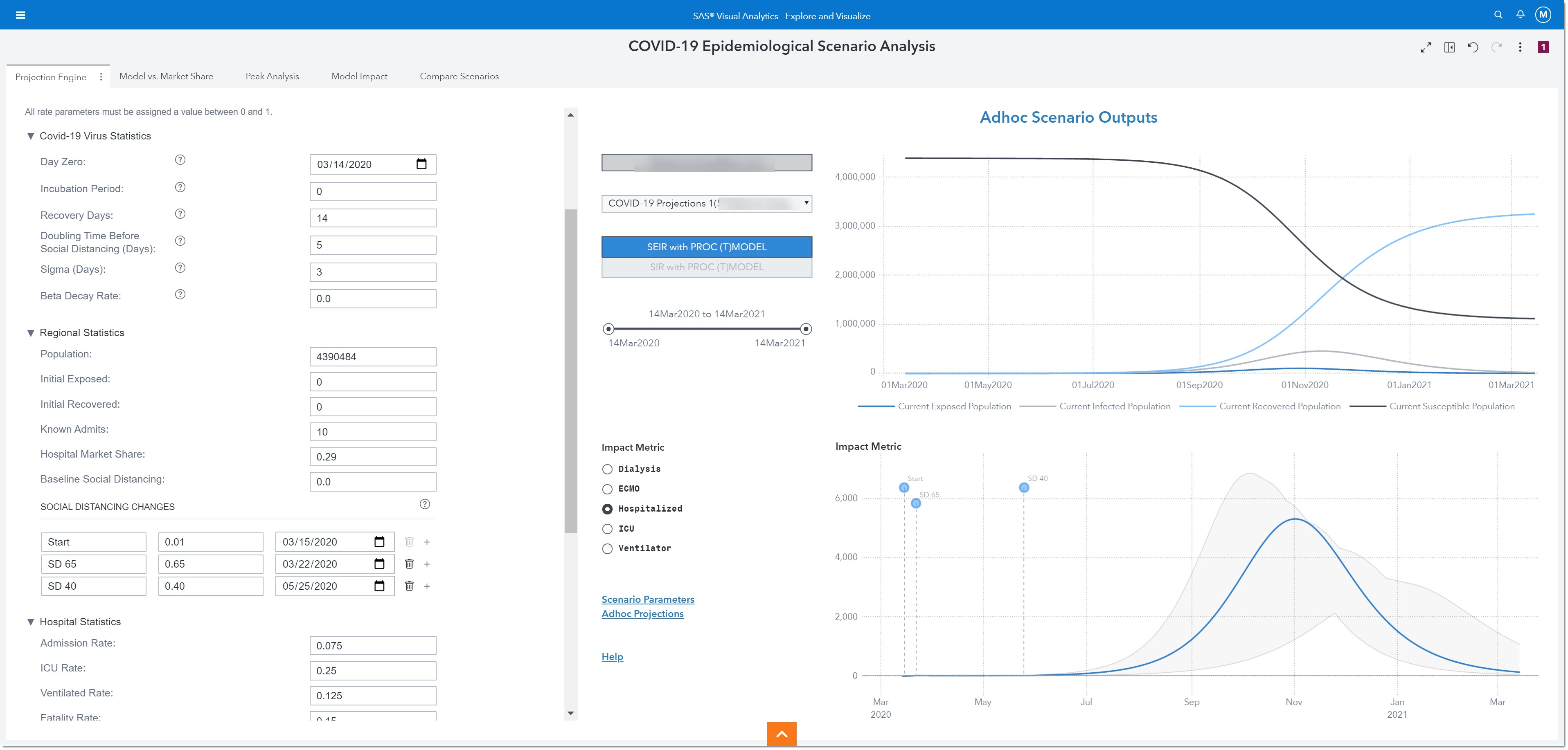
The Projection Engine page is where we will modify projection parameters to reflect our population and run scenarios.
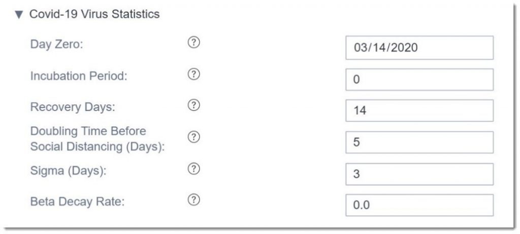
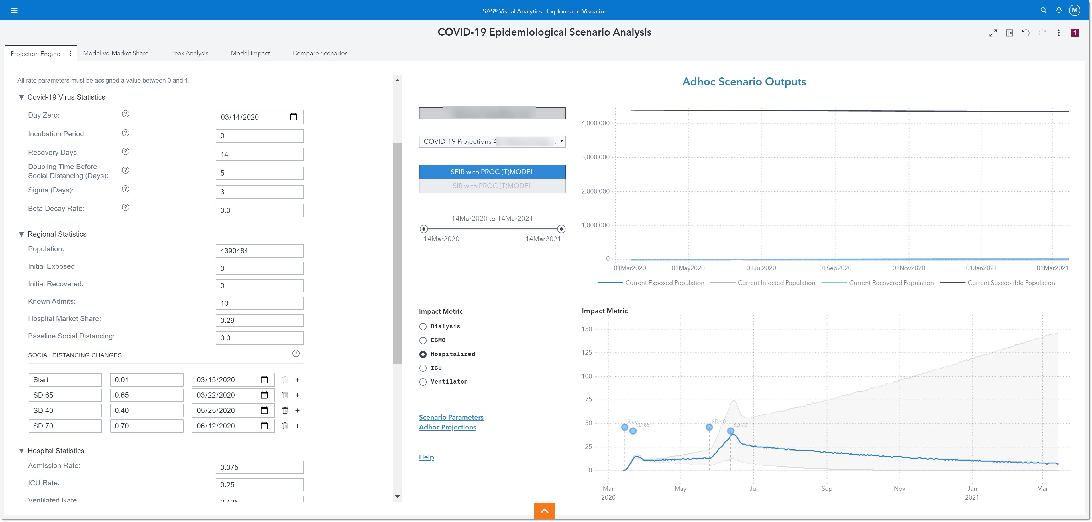
There are three different groups of projection parameters that we can modify: COVID-19 Virus Statistics, Regional Statistics, and Hospital Statistics.
Here are the COVID-19 Virus Statistics we can modify. We are going to leave these parameters as is, but we may revisit them in the future as our understanding of the virus changes based on scientific research.
The next group of parameters we can modify are the Regional Statistics. Here is where we enter details about our specific population, including any social distancing interventions where the change rate corresponds to a percentage reduction in social contact compared to normal activity.
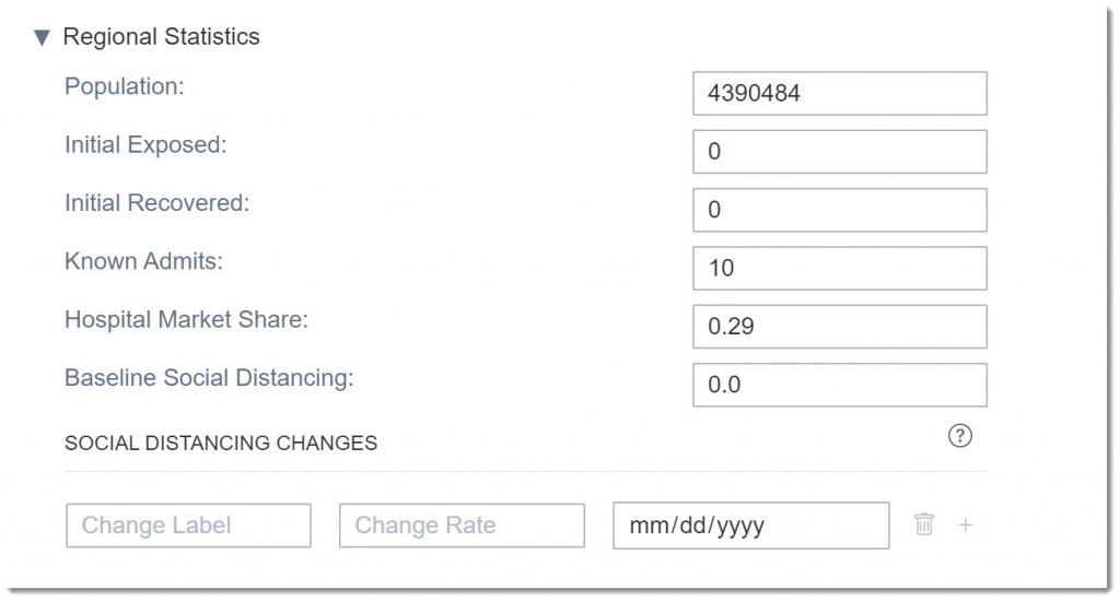
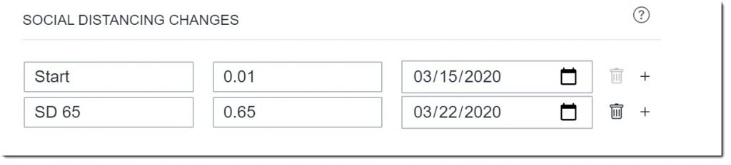
Let’s add some social distancing changes to represent what has been happening in our region. We’ll add an intervention for March 22nd, 2020 when strict social distancing policies and initiatives were first implemented in our area, with an estimated change rate of 0.65, corresponding to a 65% reduction in R(t). The goal for any intervention, such as social distancing guidelines and policies, is to reduce the Effective Reproduction number as close to or below 1, which--in combination with other epidemic parameters accounted by the model, such as exposure before infection or incubation period--will lead to less people getting infected than people recovering. If this intervention is implemented correctly and not ended too soon, it will lead to the elimination of the virus and hopefully the end of the pandemic. Note: the first social distancing change labeled Start is just a placeholder that will allow the user to visualize the start of the pandemic on the reports.
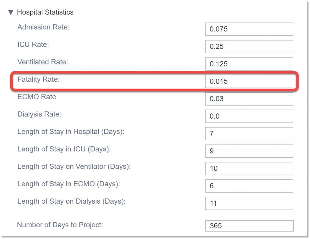
Before we run this scenario, let’s look at the final group of parameters: Hospital Statistics. Here we enter estimates for utilization rates and length of stay and how far out to project the analysis. We’ll leave most of the default numbers but will change the fatality rate to what we’ve seen in our region, 0.015 (1.5%).
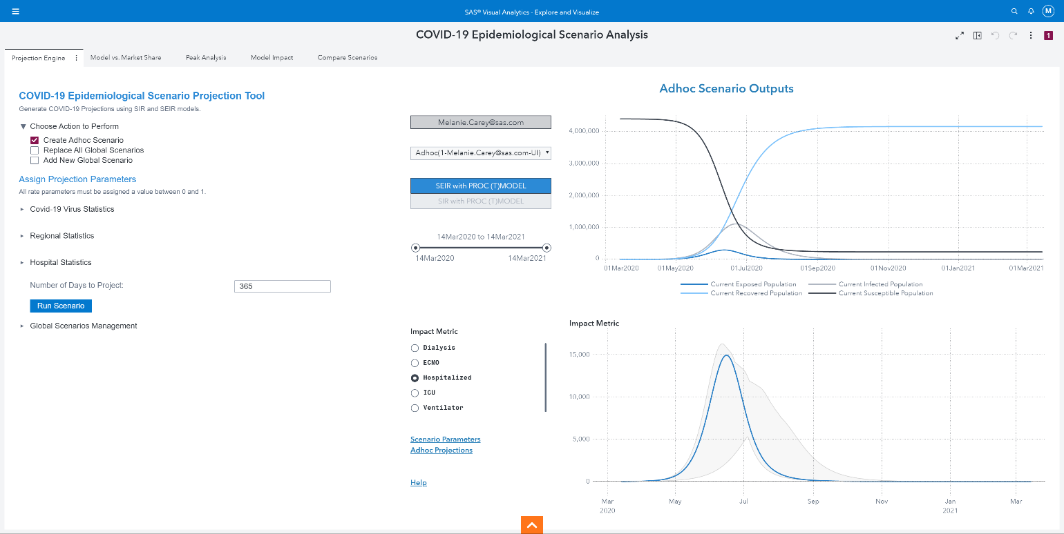
Now that we’ve finished modifying all the parameters, we’ll run the scenario.
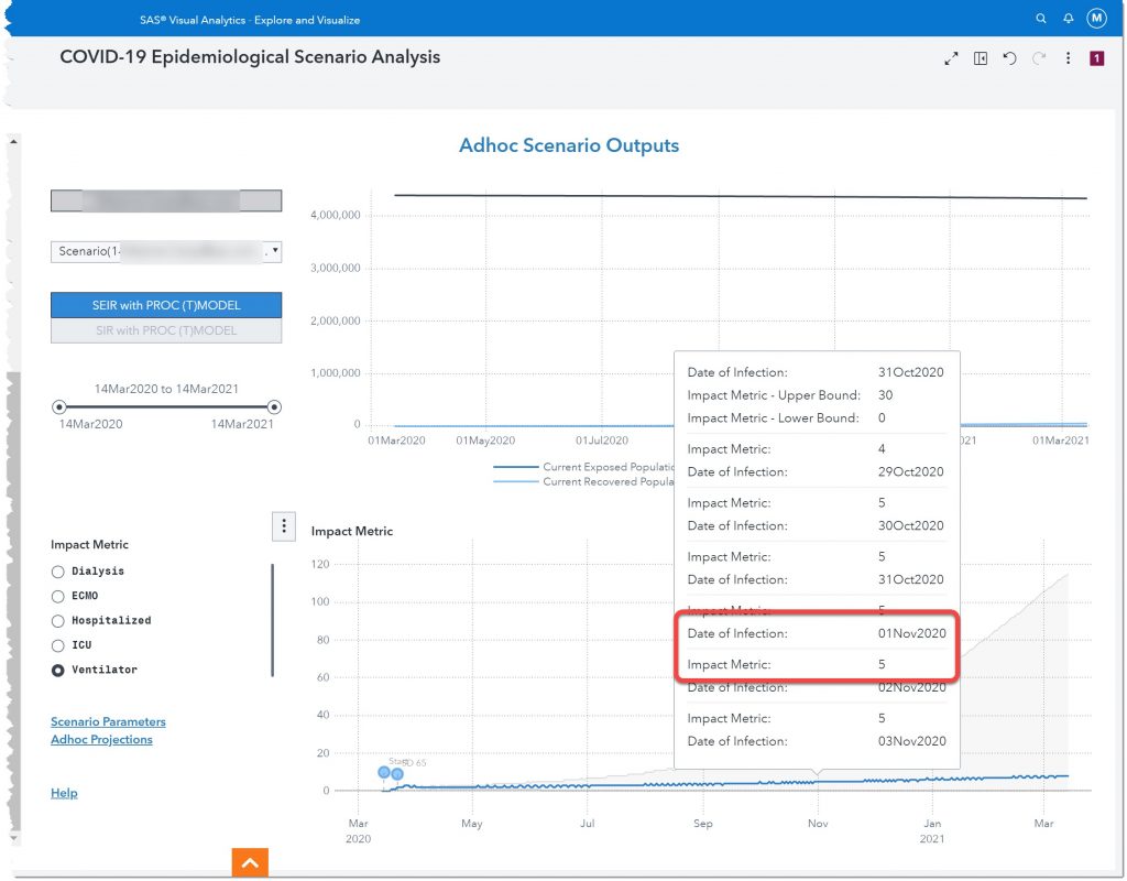
The results of this ad hoc model are shown on the right. We can choose to show results from the SEIR or SIR model.
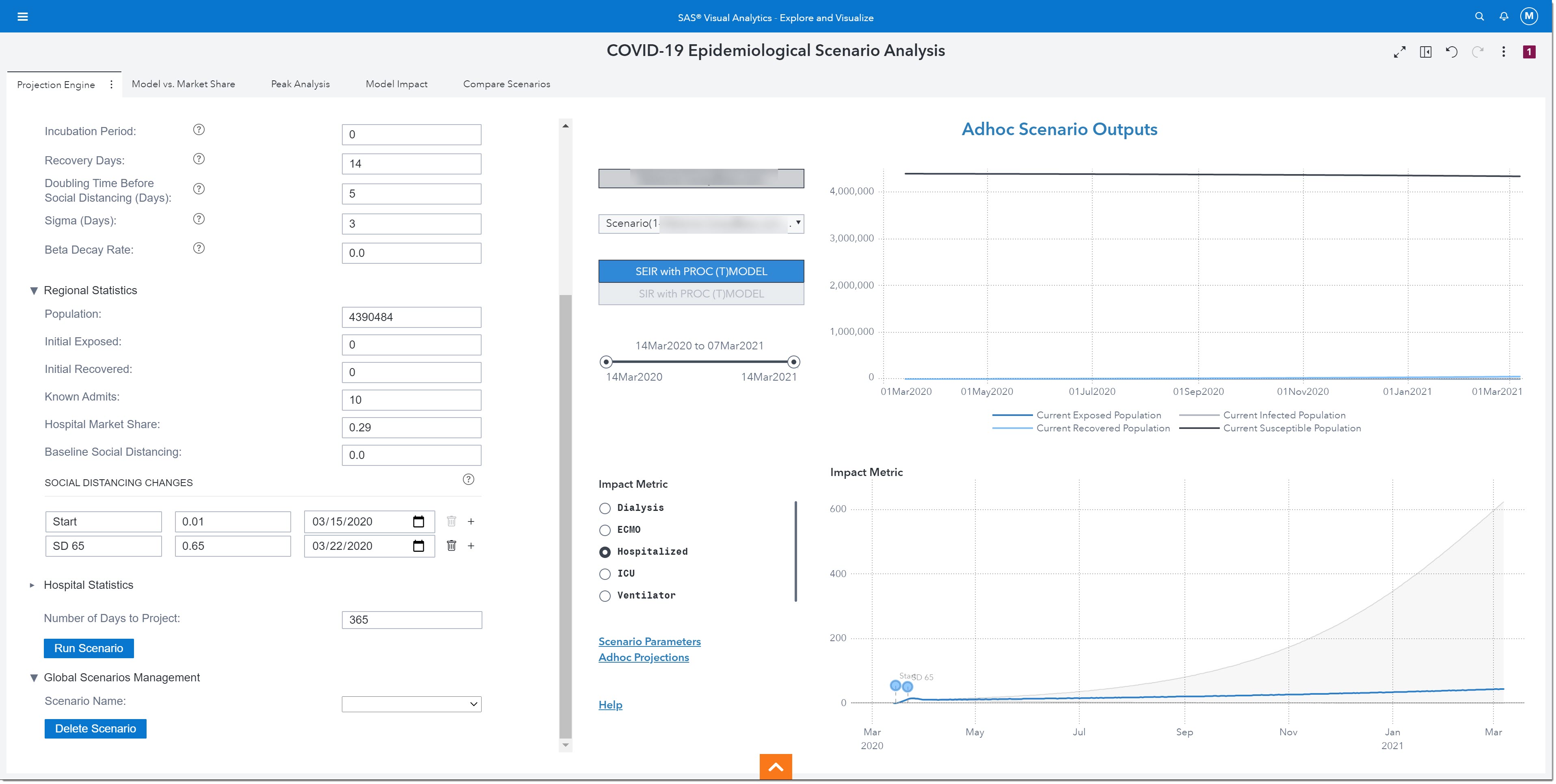
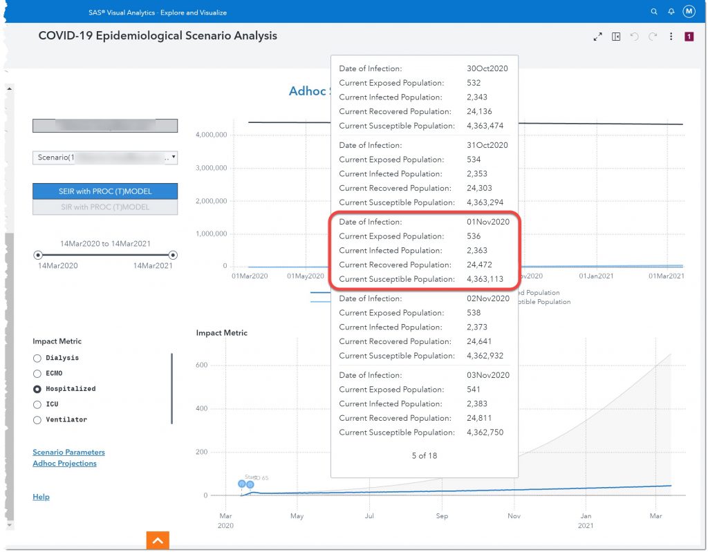
Let’s take a closer look. If we hover over 01Nov2020, in the top chart, we see that by November 1 of this year, there will be 536 people exposed to the disease, 2,363 infected, 24,472 recovered, and 4,363,113 susceptible.
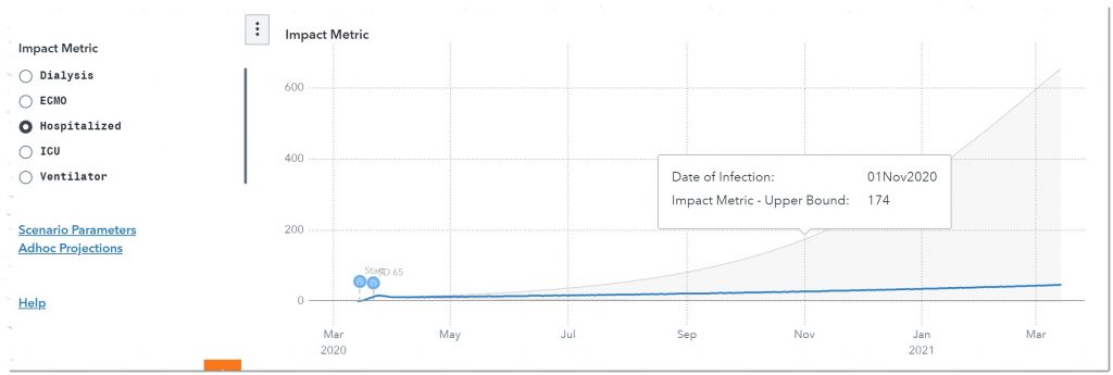
The bottom chart allows us to see how this will impact certain resources such as dialysis, ECMO, Hospitalized, ICU, and Ventilators. Hospitalized is currently selected (see radio buttons to the left of the chart) so let’s look at how many potential patients we can expect to be hospitalized on November 1st of 2020. Also, take note of the two labels at the beginning of the line chart. Those are the two social distancing measures we entered.
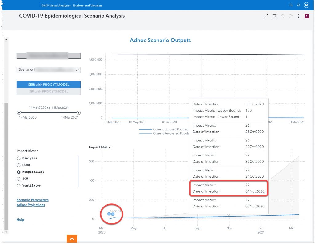
Here we see that, given our current model, we can expect 27 people to be hospitalized November 1st of 2020. But to be conservative, we should ensure that we have plans in place to meet the upper bound number of 174 hospitalized.
We can also look at the other impact metrics to build a full plan, including policies and procedures, to meet the potential demand for these resources.
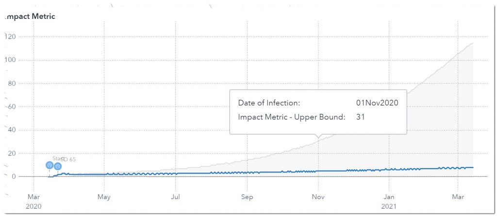
Let’s look at one other measure: ventilators. Here we see that on November 1st, 2020 we will need somewhere between 5 – 31 ventilators.
Next, we’ll add the phase 1 reopening that occurred on May 25th. At that time the more restrictive social distancing guidelines were reduced. Let’s see what that does to the projections. Let’s add this as another social distancing change. We anticipate more normal activity, which equates to less social distancing, so we’ll move the level of social distancing to 0.40 (40%). Here are the new results:
As we can see by the uptick in infections starting in July, the reopening happened too fast, and we will be entering a second wave. This realization may lead to a regional third intervention where we try to alleviate the effects of reopening too soon through the implementation of a stricter social distancing policy. These guidelines will go into effect June 12, 2020, with an expected 70% decrease in R(t). Let’s look at the projected effect of this additional intervention:
In this case, we see the curve declining again, with a peak on the day of implementing the third intervention. This means that we are back on track to an effective reproductive number that could lead to a slowdown in infections to a level that could help end the pandemic.
Let’s save this ad hoc run as a Global Scenario for future analysis. We can continue to run additional ad hoc analyses and save up to five different Global Scenarios.
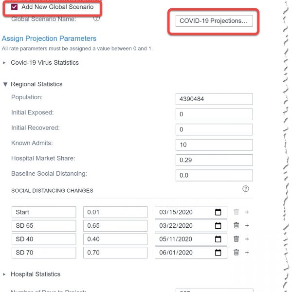
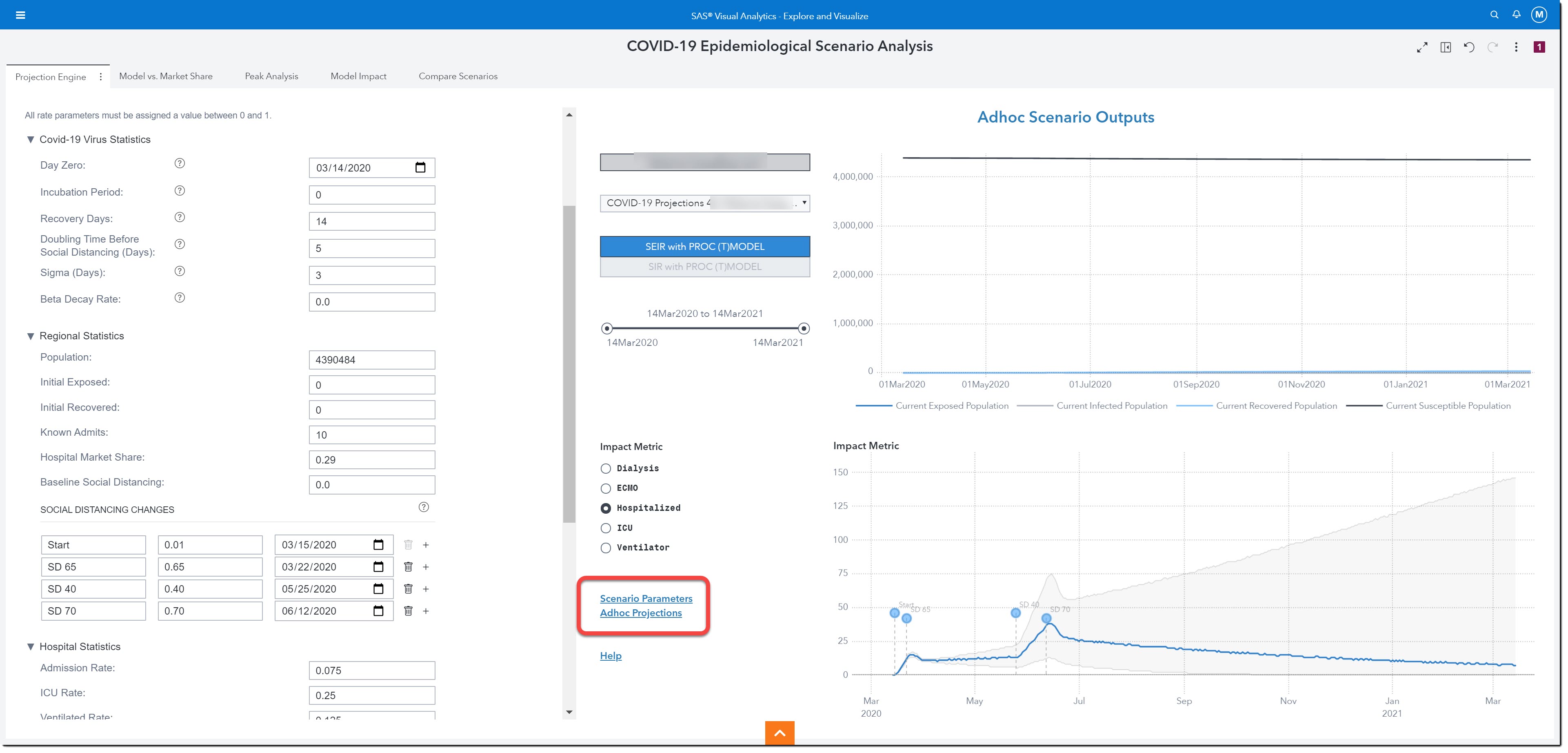
The two links on this page, Scenario Parameters and Ad hoc Projections, allow us to gain an easier view into the parameter set submitted for the current projection exercise and get access to other projection reports.
All the other pages display information about Global Scenarios. Remember, we can have up to 5 different global scenarios. Let’s use the other pages to see more details about the global scenario we just saved.
We’ll first look at the Model vs. Market Share page.
Comparing Model vs. Market Share
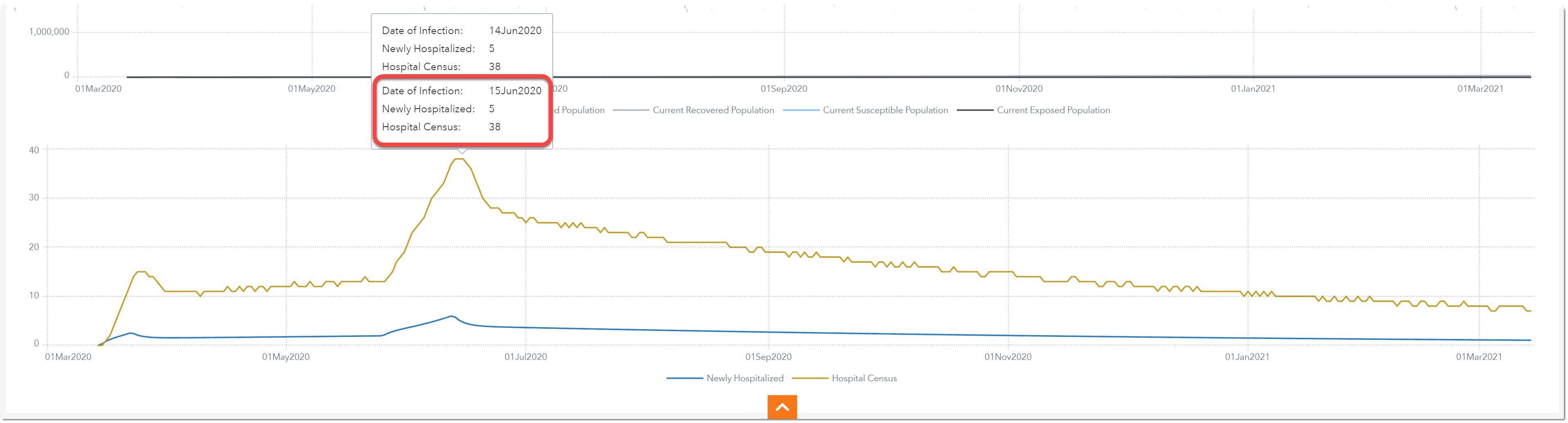
The Model vs. Market Share page provides visualizations showing the projected number of individuals in the different stages of disease (SEIR or SIR) (top chart) and those newly hospitalized and total hospitalized by date (bottom chart).
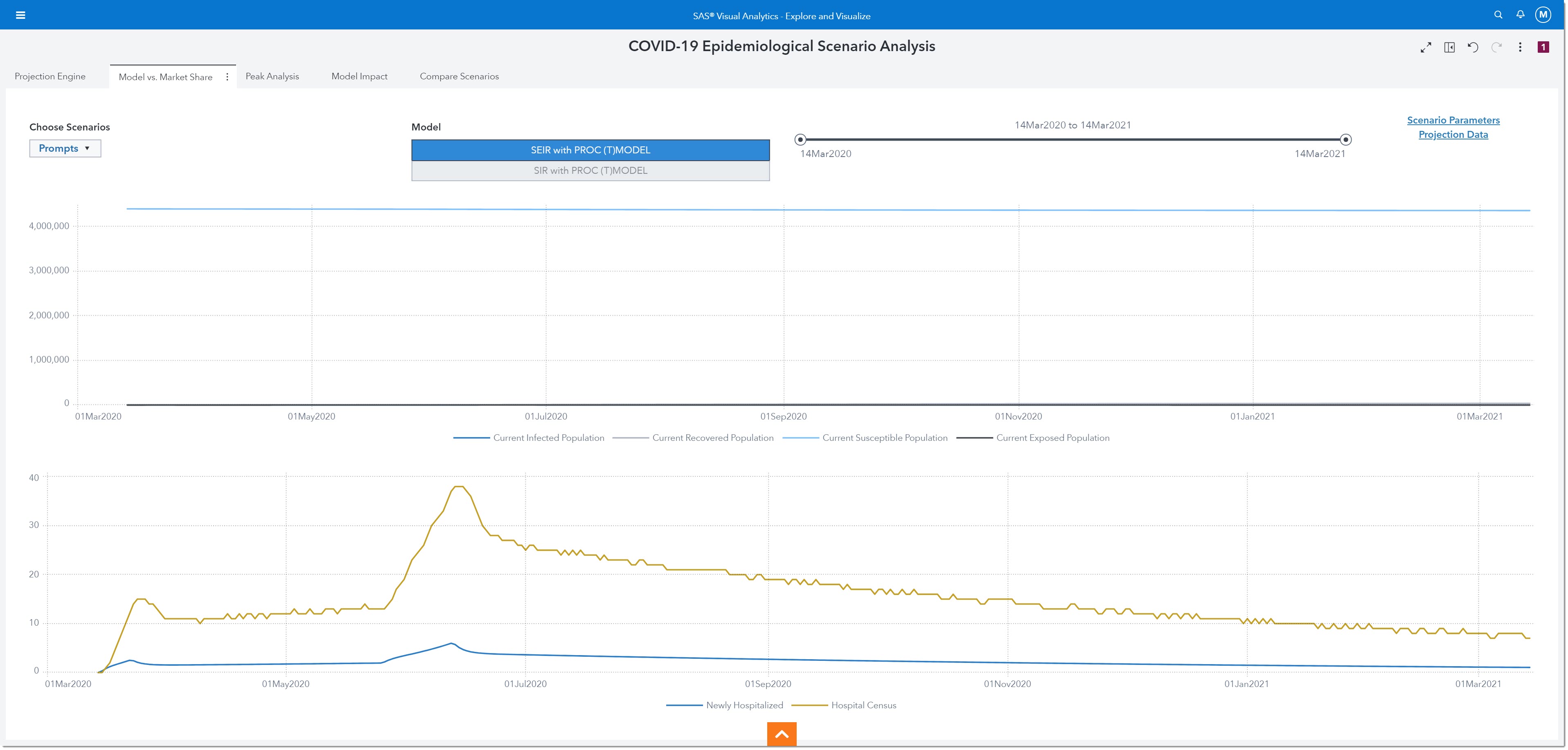
If we look at the lower chart, we can see that our Hospital Census will be at its peak in mid-June. It is projected that on June 15th, there will be 5 new patients admitted and a total of 38 COVID-19 patients hospitalized.
Note: if we saved multiple scenarios, we can change the scenario we are viewing by using the Prompts dropdown.
Notice on the far top right there are two links: Scenario Projections and Projection Data. Use these links to see the data behind the model. With any visualization, we can download the data used to create it by right-clicking on the object and selecting Export Data.
Next, we’ll look at some peak numbers around the demand for our resources. We’ll select the Peak Analysis page.
Identifying Peak Resource Demand
Here we’ll see projections and key peak metrics for resources (beds, ICU, ventilators) and deaths. The first tab shows resource peaks and projections.
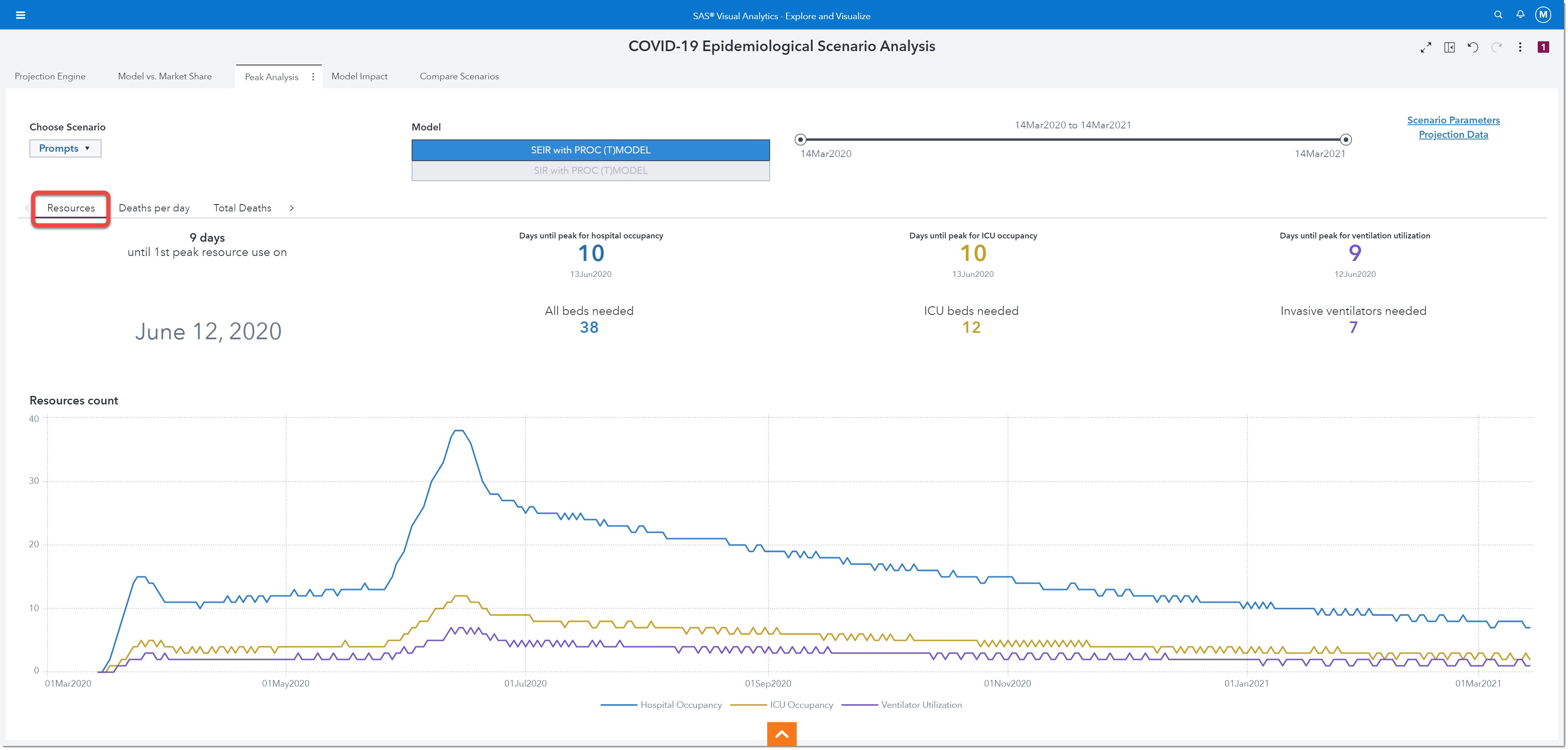
If we look closely at the peak resources, we can see that we will reach one of our peak demands on June 12th, 2020. That is 9 days from today. On June 13th (10 days from now) we will have our peak occupancy (38 beds needed). Our peak number of ICU beds needed will be 12 and that peak will occur on June 13th as well. The maximum number of ventilators we will need will be 7 and the peak will happen on the 12th of June. These numbers can help us better plan for resources and staffing!
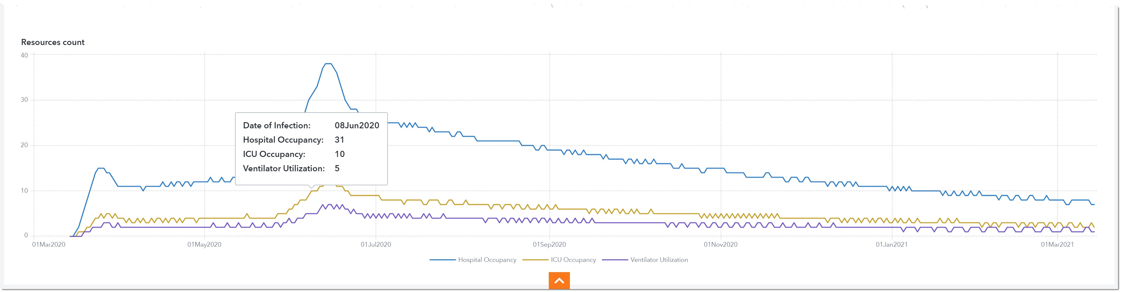
The graph below shows hospital occupancy, ICU occupancy, and ventilator utilization over time. Let’s say we only have 5 ventilators to spare for COVID-19 patients at our hospital. We can use this chart to plan our deadline for borrowing or purchasing extra ventilators. We can start calling around to other health care providers to see if we can borrow ventilators starting June 8th and return them on July 19th when the ventilator demand drops to 4.
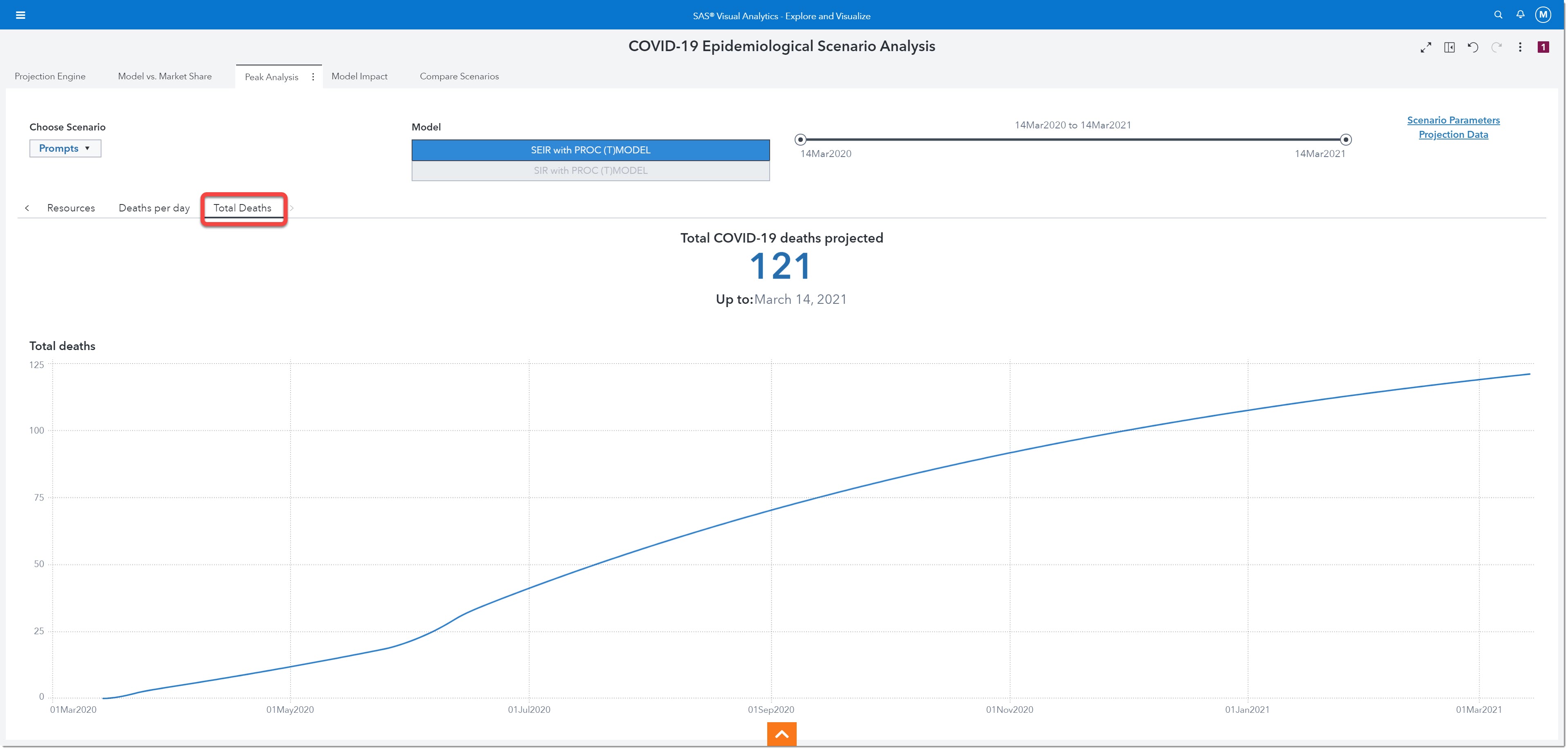
The next visualization we’ll review is Total Deaths. Here we see that by March 14th, 2021 we will have a total of 121 cumulative COVID-19 related deaths within the projected region.
Next, we’ll look at the models’ impact on various resources.
Model Impact
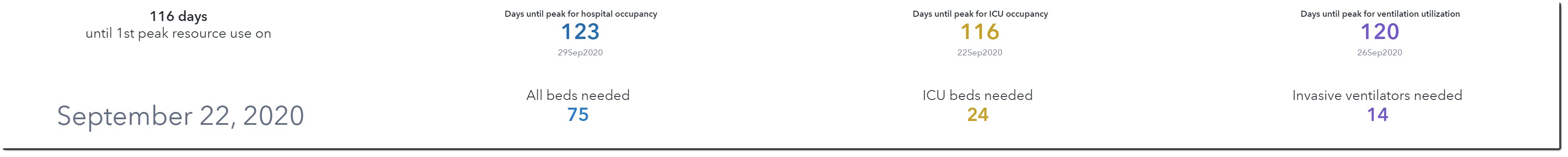
On this page, we will be able to visualize the projections for impact metrics such as Dialysis, ECMO, Hospitalized, ICU, and Ventilator. This is similar to what we saw on the Projection Engine page.
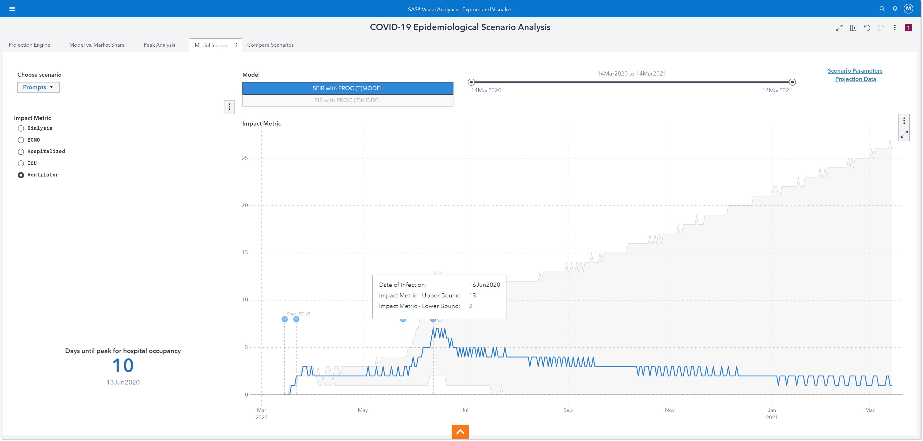
This visualization shows us that we actually need to plan for 13 ventilators in order to ensure that we are prepared for the worst-case scenario.
The last page lets us compare one scenario to another.
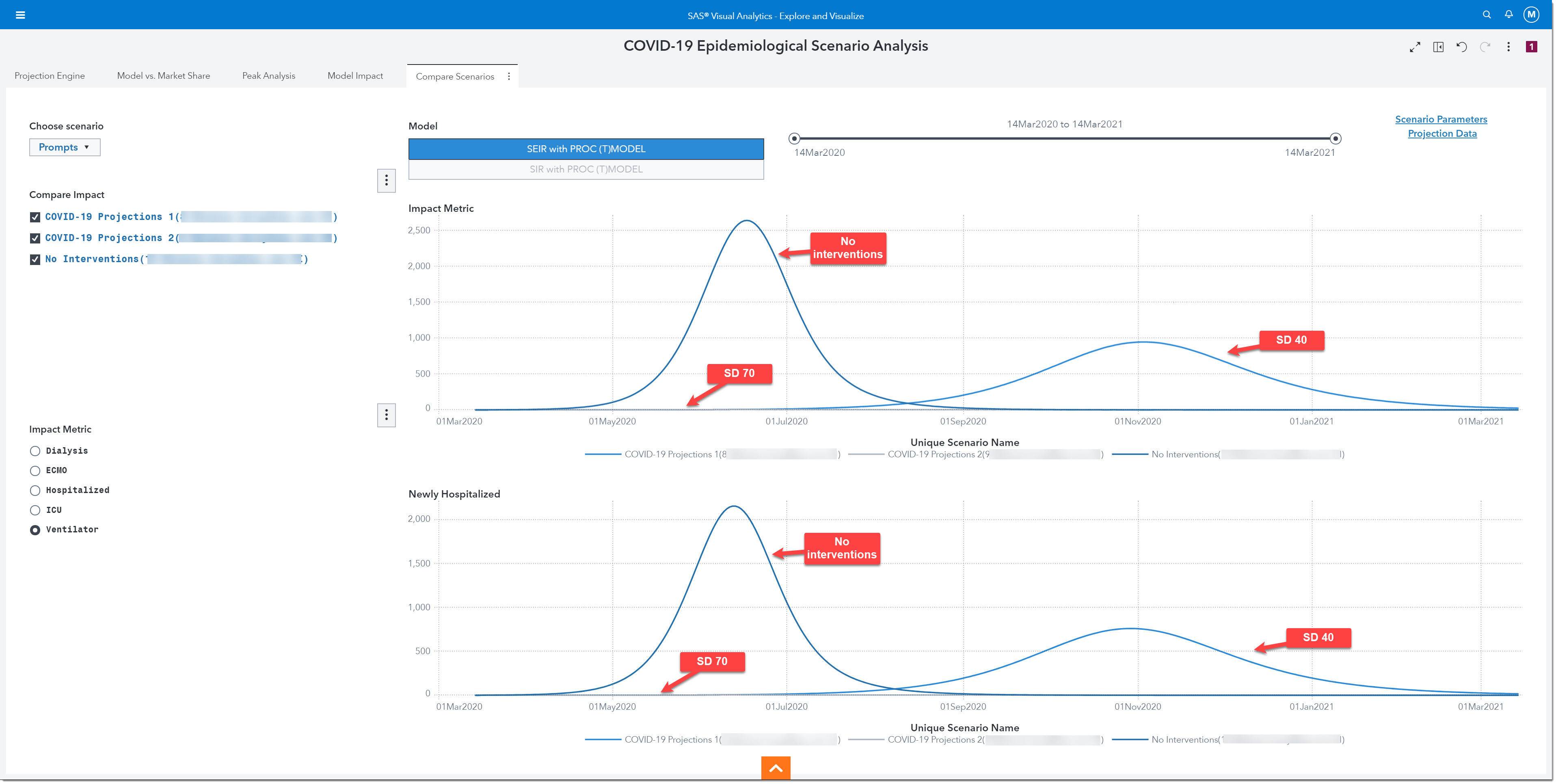
Compare Scenarios
This final page allows us to select multiple scenarios to compare their projections for our choice of impact metric and newly hospitalized. Let’s compare what would have occurred if our region did not implement any social distancing measures (no interventions) versus what would have happened right after the reopening without SD 70 (SD 40), versus what would occur with the last social distancing initiative in place (SD 70). The top line chart shows us the impact metric, ventilators. Here we see that, with no interventions, we would have reached our peak need of more than 2,600 ventilators by June. The SD 40 line shows us that we would reach our peak need by November and require more than 900 ventilators, but with SD 70 the number of ventilators is no greater than 5. The bottom chart shows us very similar curves for newly hospitalized. Clearly, the initial opening (SD 40) was too fast, and a second wave would have overwhelmed our hospital.
In summary, the COVID-19 Epidemiological Scenario Analysis allows users to run and compare multiple SEIR and SIR epidemiological models to project stress on the health system at a regional level, run the engine based on regional parameters, and export the output data for further analysis - Any user can sign up now to gain access to the COVID-19 Epidemiological Scenario Analysis environment.

3 Comments
Very timely topic, and I really like the step-by-step guidance on how to use the environment to get real insights. Thanks Melanie.
Hey there! Just came across your article and found it useful. I admire your work behind this blog. Please keep sharing such interesting content to readers. Thank you and I would be grateful to read.!
Great info. I like your articles. Thanks for your sharing this.