
The current state of policy enforcement during an infectious disease pandemic is mostly reactive. Public health officials track changes in active cases, identify hot-spots and enforce containment policies primarily based on geographic proximity.
By combining telecommunications data -- which we turn into mobility information -- with public health data of positive cases, we can use network analytics to better understand the spread of COVID-19 and make more proactive decisions on social containment policies. Data required for this application includes aggregated physical subscriber movements over time, provided by telecommunications companies, and confirmed cases by place over time provided by public health authorities.
What is network analytics?
Network analytics is the study of connected data. Every industry, in every domain, has information that can be analyzed in terms of linked data in a network perspective. Network analytics can be applied to understand the viral effect in some traditional business events, such as churn and product adoption in telecommunications, service consumption in retail, fraud in insurance, and money laundering in banking.
But in this case, we’re applying network analytics to correlate population movements to the spread of the coronavirus. At this stage, we attempt to identify specific areas to target for social containment policies, either to better define shelter in place measures or gradually opening locations for the new normal.
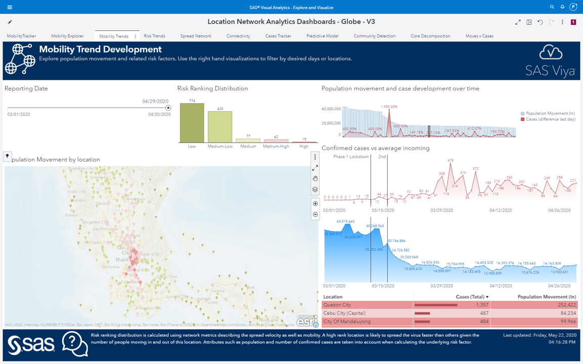
Tracking movement with mobile data
Using mobile data, penetration of cell phones, companies market share, and population, we can infer the physical amount of movements over time between geographic areas. Based on this data, we use network algorithms to define relevant key performance indicators (KPIs) by geographic area to better understand the pattern of the spread of the virus according to the flow of people across locations.
These KPIs drive the creation of a set of interactive visualization dashboards and reports using visual analytics -- which enable the investigation of mobility behavior and how key locations affect spread of the virus across geographic areas over time.
Using network analytics and the KPIs, we can understand the network topology and how this topology is correlated to the spread of the virus. For example, KPIs can:
- Identify key locations that, according to the flow of people, contribute most to the velocity of the spread of the virus.
- Identify locations that serve as gatekeepers -- locations that do not necessarily have a high number of positive cases, but serve as bridges that spread the virus to other locations by flowing a great number of people across geographic regions.
- Help in understanding clusters of locations that have a high level of interconnectivity with respect to the mobility flow, and how these interconnected flows impact the spread of the virus among even distant geographic areas.
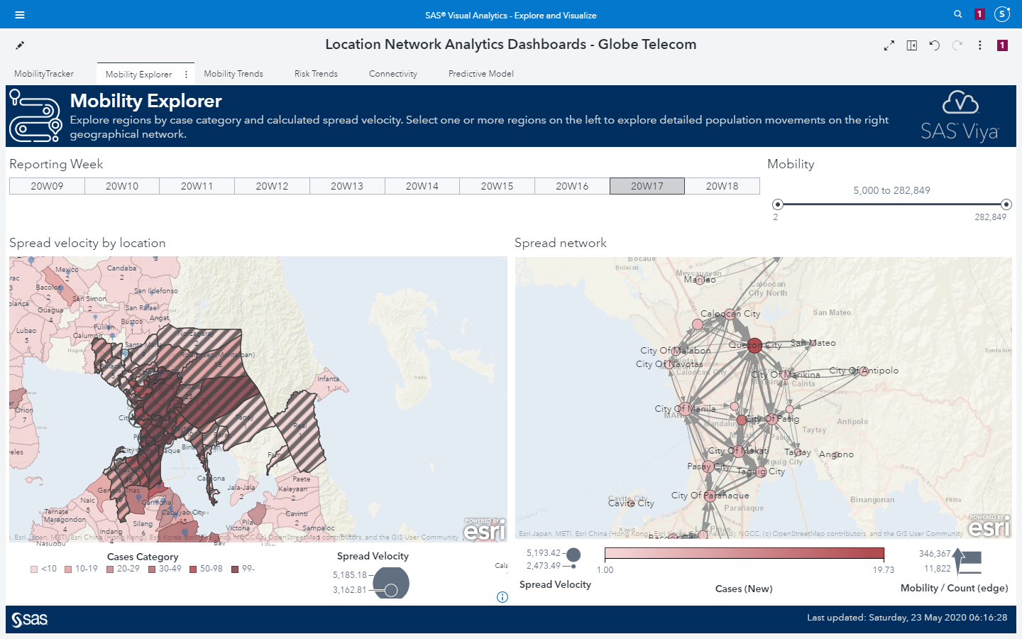
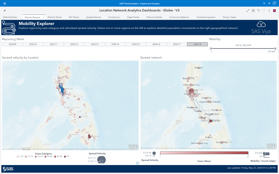
Mobility explorer: Visualizing the spread of COVID-19
SAS® Visual Analytics dashboards and reports provide an interactive view, over time, of the mobility data and the health information, combined to the network KPIs, or the network metrics computed based on the mobility flows over time.
On the maps in Figure 1 below, the blue circles indicate key locations identified by centrality metrics computed by the network algorithms (see network procedure in VDMML here). These locations play a key role in the flow of people across geographic areas. We can see the shades of red representing the number of positive cases over time. Notice that the key locations are also hot spots for the virus, presenting a higher number of cases. These key locations are central to the flow of people in and out of geographic areas, even if those areas are distant from each other.
Notice that all those hot spots on the map are connected to each other by the flow of people. In other words, a substantial amount of people flowing in and out between locations can affect the spread of the virus, even across a wide geographic region. The mobility behavior tells us how people travel between locations, and the population movement index basically tells us that a great volume of people flowing in and out increases the likelihood of the virus also flowing in and out between locations.
On the Mobility Explorer, we correlate movement behavior and the spread of the virus over time. On the left-side map in Figure 1, the areas in shades of red represent locations with positive cases and the blue bubbles represent the spread velocity KPI. In addition, note that most of the red areas are correlated to key locations highlighted by the KPI, on the right-side map you can see the in and out flows between all these locations which in fact drives the creation of this KPI. You can easily see how the flows between even distant locations can possibly also flow the virus across widespread geographic areas.
On the right side, the shades of red indicate how important these locations are in spreading the virus. These locations play an important role in connecting geographic regions by flowing people in and out over time. The right-side map shows how all those hot spots on the left-side map are connected to each other by the flow of people. The side- by- side maps show how movements between locations affect the spread of the virus.
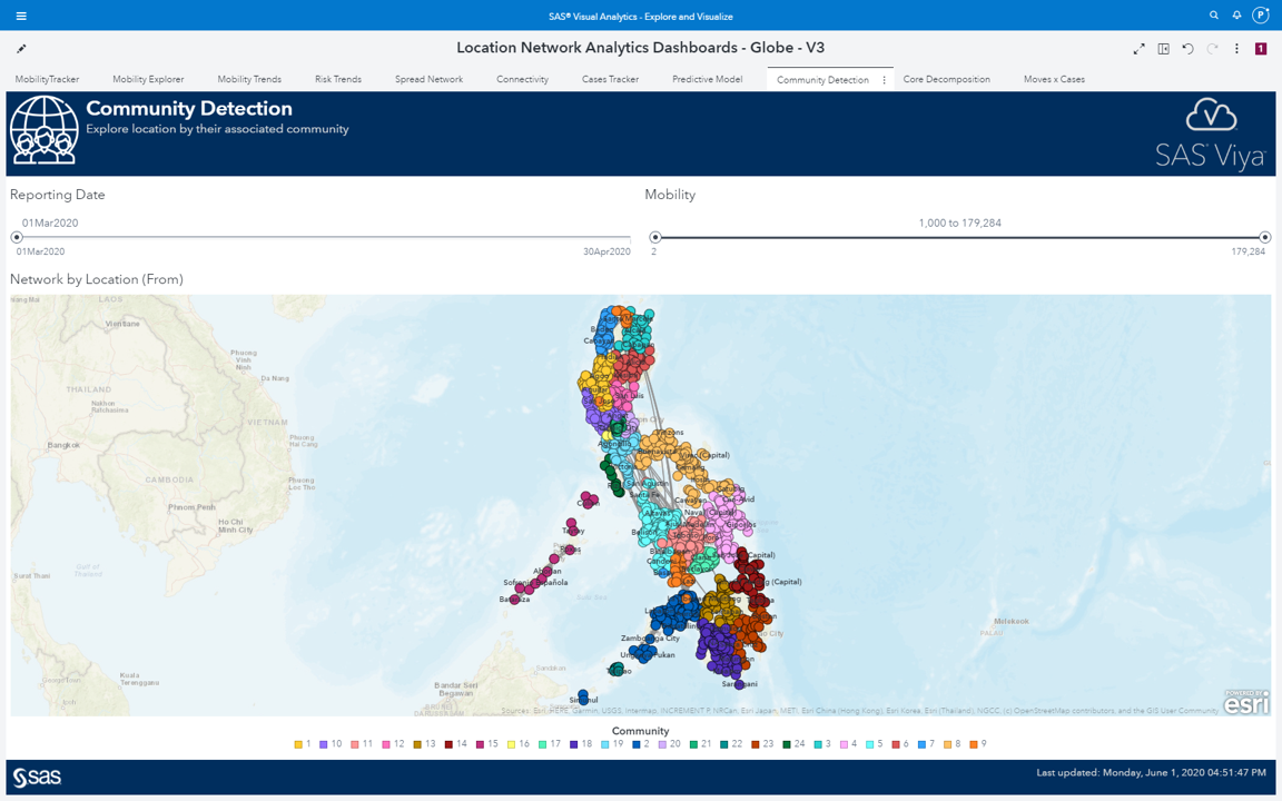
Community detection: Identifying hot spots
As we commonly do when applying network analysis for business events, particularly in marketing, we performed community detection to understand the mobility behavior groups’ locations and the flow of people traveling between them. And it’s no surprise that most of the communities group together locations which are geographically close to each other. That means people tend to travel to near locations. Of course, there are people that probably need to commute long distances. But most people try to somehow stay close to work, or school, or any important community to them. If they must travel constantly to the same place, it makes all sense to live as close as possible to that place. Therefore, based on the in- and -out flows of people traveling across geographic locations, most communities comprise locations in close proximity.
In terms of virus spread, this information can be quite relevant (see Figure 2 below). As one location turns out to be a hot spot, all other locations in the same community might be eventually at a higher risk, as the number of people flowing between locations inside communities are greater than between locations outside communities. As an analogy to telecommunications, when a customer decides to churn (i.e. switch to another mobile provider), all other customers in the same community may have a higher likelihood to churn afterwards.
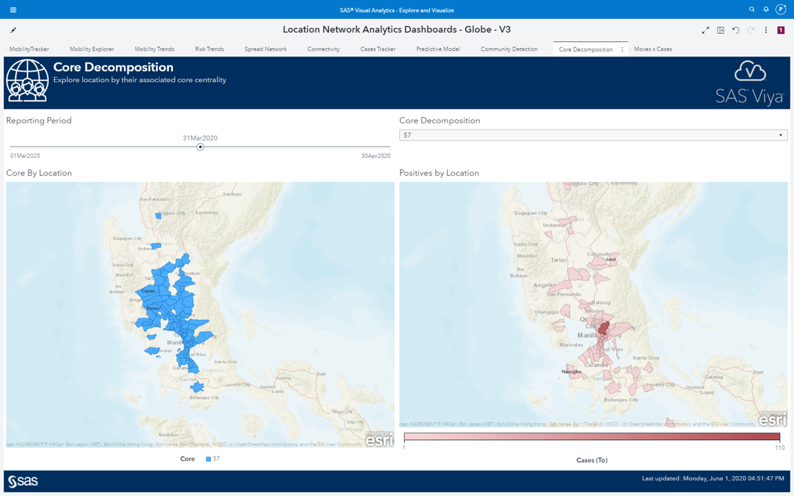
Core decomposition: Examining interconnectivity and the spread of the virus
Core decomposition is a way of clustering locations based on similar levels of interconnectivity. Here, interconnectivity means mobility. Core locations do not necessarily show a correlation to geographic proximity but instead, it shows a correlation to interconnectivity, or how locations are close to each other in terms of the same level of movements between them.
One of the most important outcomes from core is the high correlation to the wider spread of the virus. Locations in the most cohesive core do correlate over time to locations where new positive cases arise over time. By identifying cores, social containment policies can be more proactive in identifying groups of locations that should be quarantined together--rather than simply relying on geographic proximity to hotspots.
Locations within the most cohesive core are not necessarily geographically close, but hold between them a high level of interconnectivity, which means they consistently flow people in and out between them and then they spread the virus more widely. This explains the spread of the virus over time throughout locations geographically distant from each other, but close in terms of interconnectivity (see Figure 3 below).
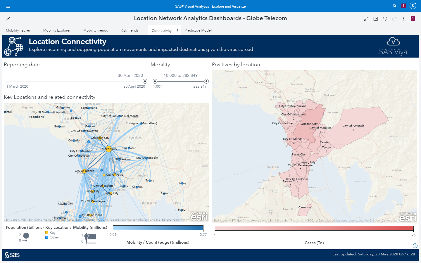
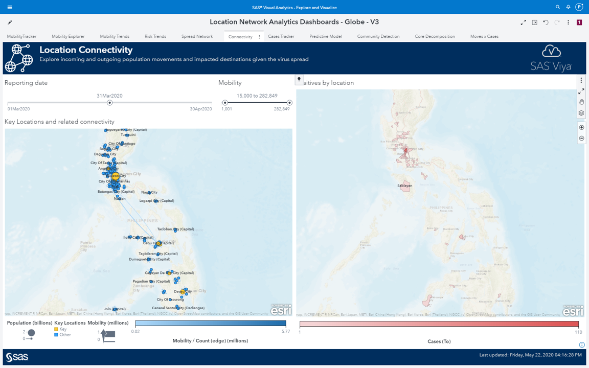
Location connectivity: How the virus spreads to distant regions
A combination of network metrics, or network centralities, creates important KPIs to describe the network topology, which explain the mobility behavior and then how the virus spreads throughout geographic locations over time.
Considering a specific timeframe, we can see the number of positive cases rising in some locations by the darker shades of red in the map (see maps in Figure 4 below). At the same time, we can see the flow of people between some of those hot spots. We see a great amount of people flowing between those areas, spreading the virus across different regions even if they are geographically distant from each other.
As time goes by, we notice the increase of the dark shades of red going farther from the initial hot spots, but also, we can notice the flow of people between those locations. Again, the great volume of people moving from one location to another explains the spread of the virus throughout distant geographic regions. Even when you start getting even farther from the initial hot spots, we still see a substantial flow of people between locations involved in the spread of the virus. The mobility behavior, or the flow of people between locations, explains the spread across the most distant regions in the country.
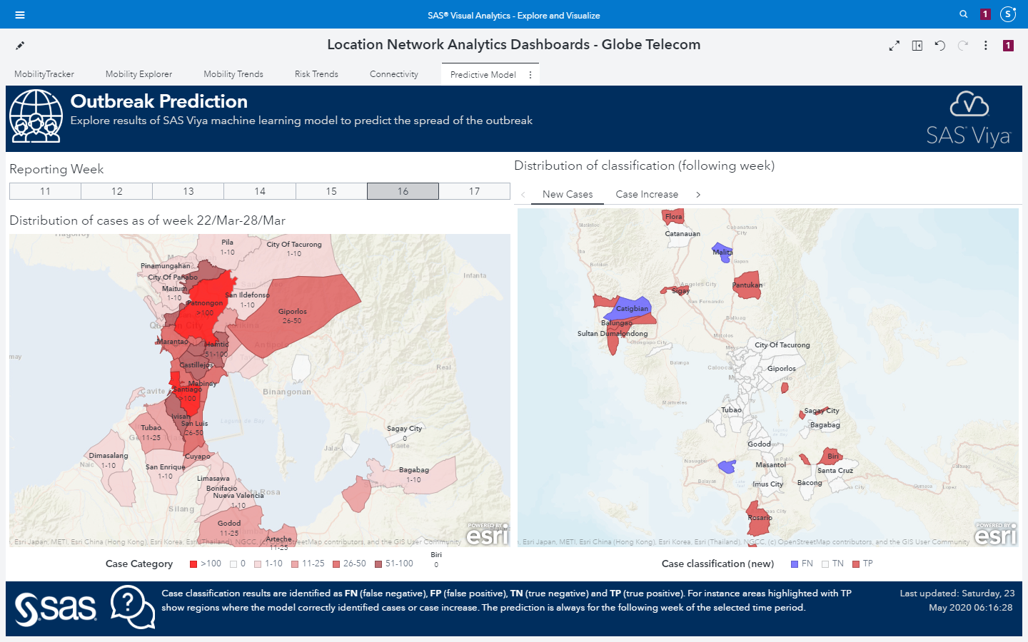
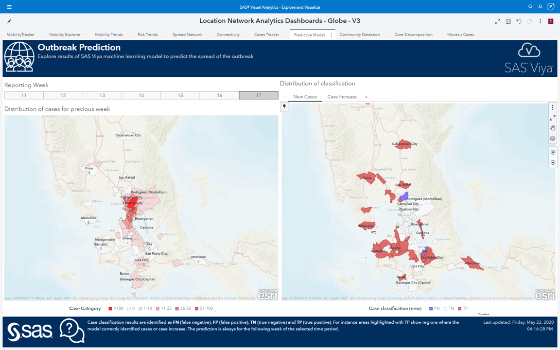
Outbreak prediction with machine learning
The network metrics computed to explain the mobility behavior can be used as features to supervised machine learning models. These models can be trained to predict locations that will present new cases or locations that will present an increase in the number of cases (see maps in Figure 5 below).
These features, used to train the machine learning models, are based on the network metrics. These network metrics describe how the network evolves over time while social containment policies are put in place as the virus spreads. These features ultimately hold a high predictive power as they correlate the mobility behavior to the virus spread. The machine learning models use this high predictive power in the features to accurately classify the targets, or the possible locations for new outbreaks.
Where we go from here
Local authorities can use the outcomes from mobility tracing and outbreak prediction to foresee where the virus is coming from and where it’s going next. Being well informed about the behavior of the virus spread (see Figure 6 below), its common trajectories, and the surrounding geographic locations around the key locations and hot spots, can help health agencies make good policy decisions in terms of shelter in place, public transportation planning, getting medical resources prepared in specific locations where the mobility tracing forecasts a substantial increase -- or easing social distancing restrictions and reopening the economy where the outcomes are not foreseeing any increase in the number of cases.
To learn more, view the SAS Global Forum on-demand video: Using Analytics to Track the Spread of COVID-19 (complimentary views; registration required).
Or visit the COVID-19 Data Analytics Resource Hub.
Author's note:
Many thanks to my SAS colleagues who collaborated on this project: Falko Schulz, Natalia Summerville and Matthew Galati.

1 Comment
Wonderful article Carlos. Really helps depict how advanced network analytics can be used to help understand how the virus is transmitted so that epidemiologists can study and track the migration and transmission. Nice work.