
When disasters strike, we’re all left wondering what we can do and how we can help. Many donate money and items. Others donate their time volunteering on the ground. Me? I dive into data.
I have a passion for using data for good, and have been fortunate to be involved in a variety of projects that let me unleash my natural curiosity and help people using analytics. There’s no shortage of disasters in the world. If I can do something with analytics and data that can make a positive impact on peoples’ lives, I’m all in.
This year’s hurricane season was devastating to many areas, especially the islands in the Caribbean. Puerto Rico was affected by hurricane Irma, then devastated by hurricane Maria two weeks later. Puerto Rico’s power grid was destroyed and communication networks were badly damaged. This left the people of Puerto Rico in the dark without any effective means of communication.
In the aftermath of hurricane Irma, I began working with NetHope, a technology consortium working with over 50 global non-governmental organizations and nonprofits, in partnership with the largest technology companies to restore Internet connectivity and other technology solutions in developing countries and areas affected by disaster. Their current focus is on bringing communication back to Puerto Rico, and our work with NetHope has continued after Maria devastated the island.
Communication is a lifeline for not only citizens, but also first responders and relief workers. Without access to communication, it becomes even more difficult to provide relief to the areas and people that need it most. Information is aid for those impacted by natural disasters or other catastrophic events.
Data reveals where to help first
Projects like this often take a bit of discovery. We engage in a bit of back and forth, and explore the art of the possible. We dive into different ways analytics and visualization can be used to help provide answers. The end-goal is to provide organizations with information, so they can make better decisions faster.
When I first teamed up with NetHope, we began exploring social media data, to determine if status updates (or lack of social media activity) could reveal trends. We soon realized that a more useful analysis would be to provide information on how to prioritize service areas. NetHope had a spreadsheet report with location information. I imported that data into SAS® Visual Analytics and started creating maps.
My first iteration explored total population within a 15-mile drive distance of one of the identified areas for restoration, Caguas. My contact at NetHope saw this, liked it, and provided feedback.
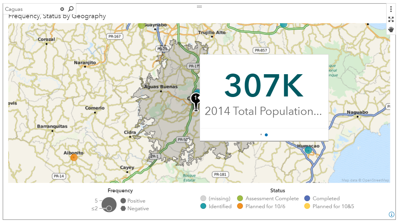
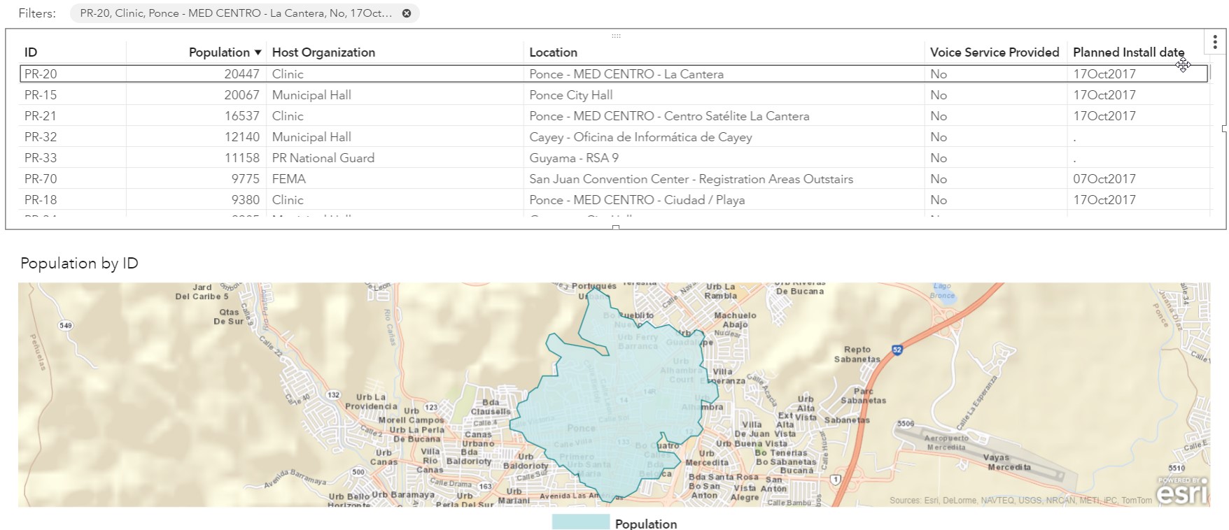
What NetHope really needed was a similar view, focused on one-mile drive distances from restoration areas, because that was the reach of some of the communication capabilities. I went back to the drawing board and partnered with a contact in our research and development team to provide the image below. It’s an interactive report that shows a table with location and other variables of interest, sorted by descending population. The map below outlines each of the restoration sites with a one-mile drive radius. This information helps them better prioritize sites to bring back online.
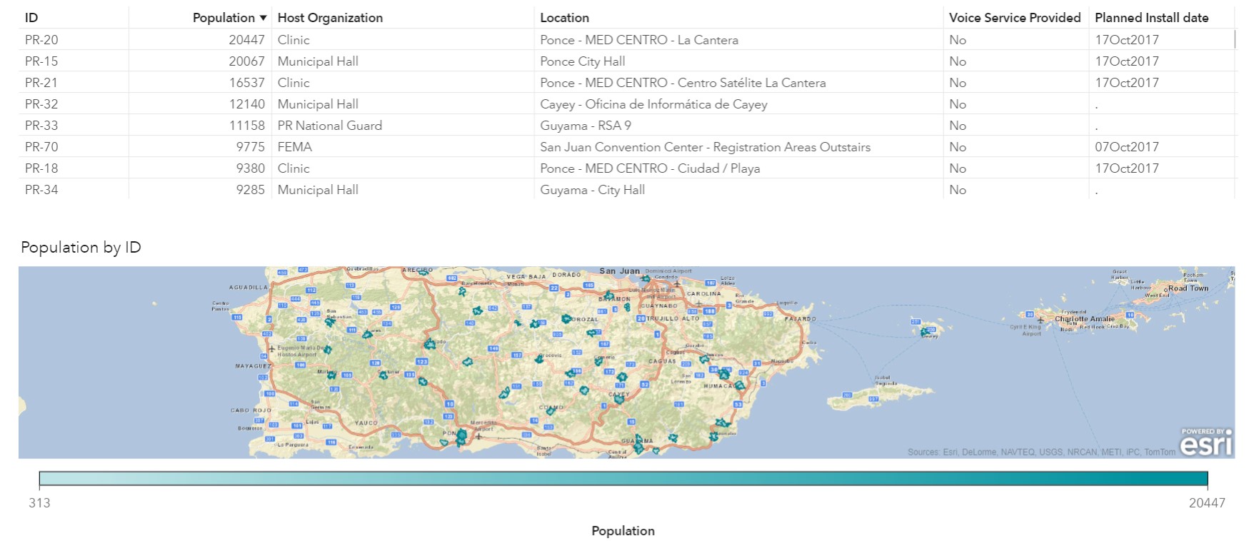 Clicking on a record in the table, zooms the map to that location.
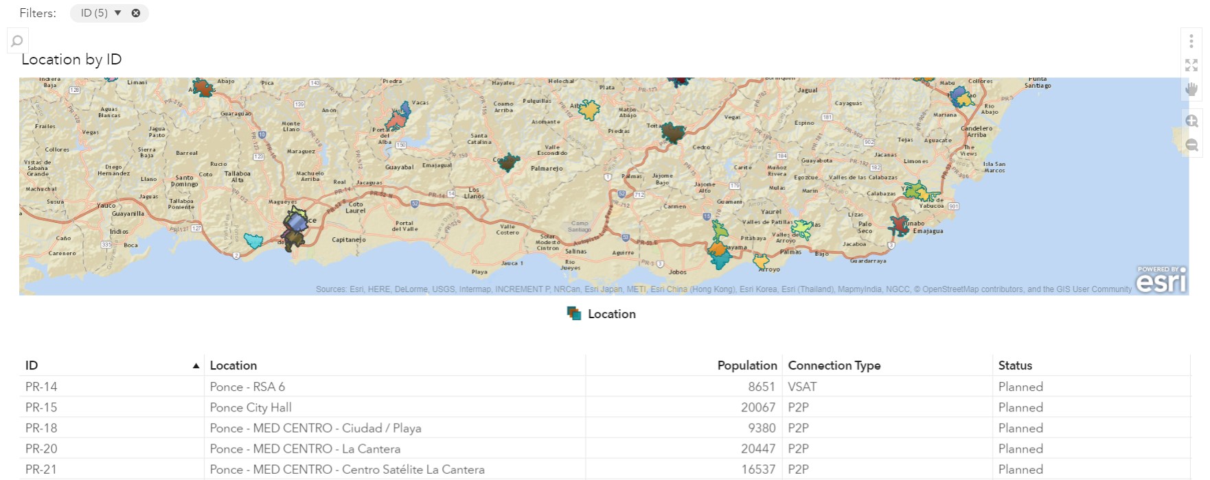
The data can also be explored in a different way—in this case using the location variable to provide color to the distances. This view is interesting because it shows that some of the areas needing restoration overlap.
What's next?
Like many data-for-good projects, this projectis still a work in progress. The best part is that when we find something that works, we'll be able to use it again as new disasters occur. We'll always encounter new data and find interesting ways to glean insights from the data.
By doing this type of work, we're also afforded the opportunity to take a step back and figure out what types of data could be beneficial for collection. It ends up creating a nice innovation cycle for both the practitioner and the relief agencies!
Read more data-for-good stories about analytics being used for humanitarian causes, or learn more about NetHope and the work they do.

1 Comment
Nice article and very helpful.