How many meteorites have hit the earth in the last 4,000 years? Where have they landed? And which ones were the biggest? Can we show all of this information - and more in an intuitive data visualization?
It turns out NASA provides public data about recorded meteorite impacts on earth all the way from 2,500 BCE to 2012 (more than 30,000 known meteorites). This comprehensive data set from The Meteoritical Society gives us information about the recorded meteorite impact locations, the class of meteorite and some additional attributes such as weight.
Since I often get questions from customers about how to create more appealing reports than the typical plain, tile layout structured report, I thought this would be good data for an example. Creating modern infographic style reports is becoming more and more popular. In this blog post, I will discuss some ideas on what's possible today with the new release of SAS Visual Analytics 8.1 and how to apply modern data visualization techniques when designing the reports.
Planning your infographic
When designing an infographic - you aren't going ahead and just dropping visuals on the report canvas. A sketch or wireframe design should done beforehand and likely even before you touch the data or a computer. Use a piece of paper or draw a rough report structure on a white board instead. You will be amazed how quickly you come up with something while not getting dragged into the details of data or application features.
Also, don't forget — usually less is more when creating reports. If the visual you selected doesn't tell the full story - do not replace it with five other visuals to compensate. Rather, look for alternative ways to visualize your data.
Draft design
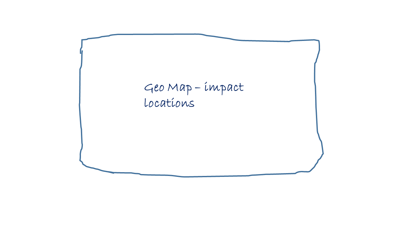
Given my data and related location information I decided that my main visual should be a geographical representation of the extra terrestrial impacts on earth.
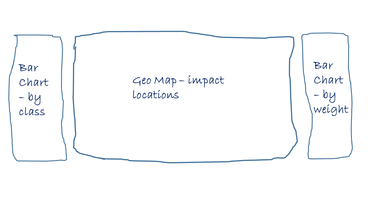
I would also like to show additional information about the distribution of meteorite weight and class. While I could assign additional attributes such as weight as data point size to a geographical map — it would make the visualization very busy and given the majority of the meteorites recorded are very light — only a few larger data points would peak out. So instead I will just color the data points on the map using a distinct color given whether the meteorite was found or we just recorded the fall.
Initial design:
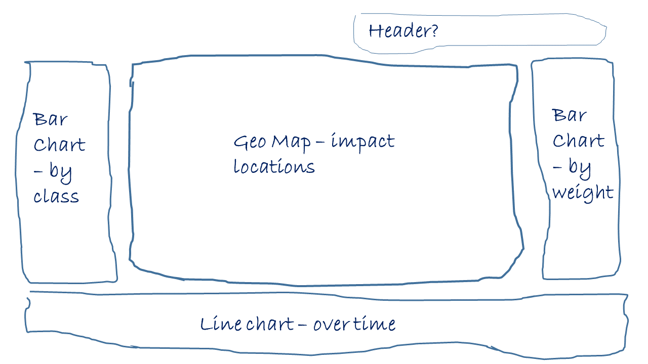
In order to get the additional weight and class information I will add two vertical bar charts showing the overall distribution. I'm also planning to trigger an interaction against the geographical map. This means the user can select a meteorite class, like H5, and the map will filter accordingly to show meteorite impacts given this class of meteorite. Let's start by adding a bar chart on each side of the map:
The final visual also should contain information about meteorite impacts recorded over time. A time line chart to the bottom of the map should work just fine:
First draft of the report
Given our design, creating such a report is not difficult anymore. You can simply start off by dropping related visuals on the canvas, without paying too much attention to where things should precisely end up. I find it easier to perform general role and style assignments early — giving you more room to play with detailed precision layout later.
Using the standard tile layout you will end up with something like this:
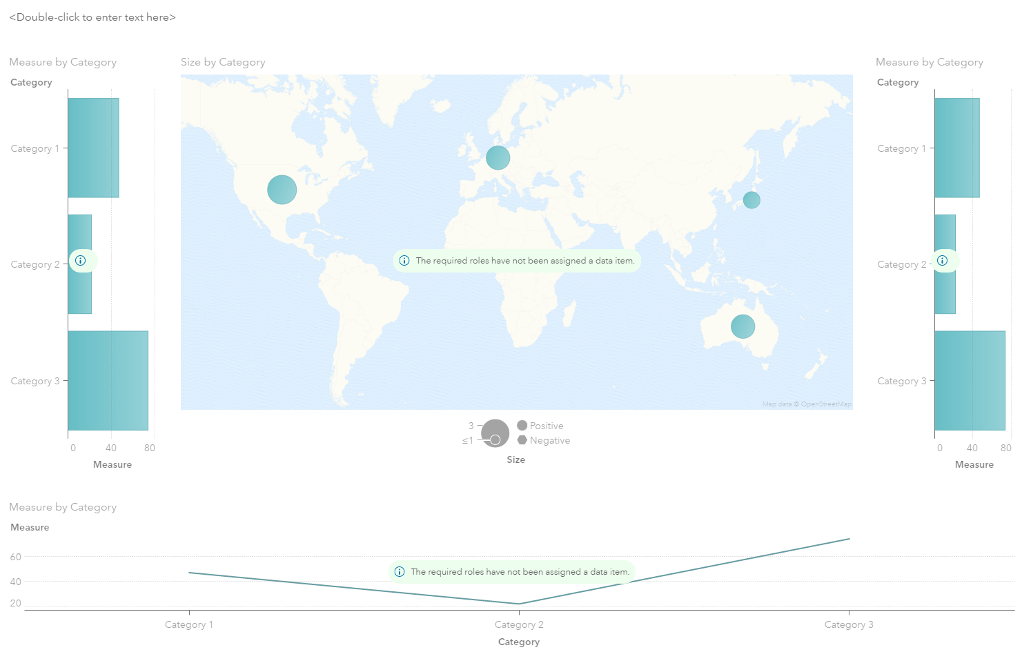
Let's assign roles to the all of our visuals and trigger first data queries:
Not too impressive yet. Things you may notice after initial role and data assignments:
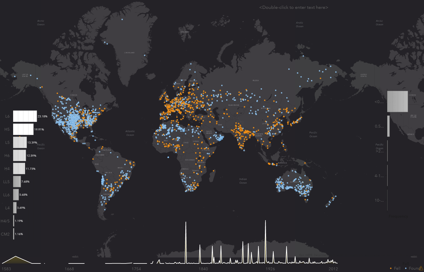
- We seem to have too many of meteorite classes which really gives us too many bars. It seems only a minority of classes are frequent. I decided to display the top 10 only in my next version, using the rank feature.
- Given that meteorites seem to fall everywhere on earth we naturally also have impacts in places like Antarctica. While this is accurate, it causes the geographical map to zoom out too far. So I decided to only include impacts with latitude between -49° and 82° (excludes impacts on both poles).
- Due to the number of impacts, the default bubble chart produces data points that are too large. So I decide to use the coordinates overlay instead.
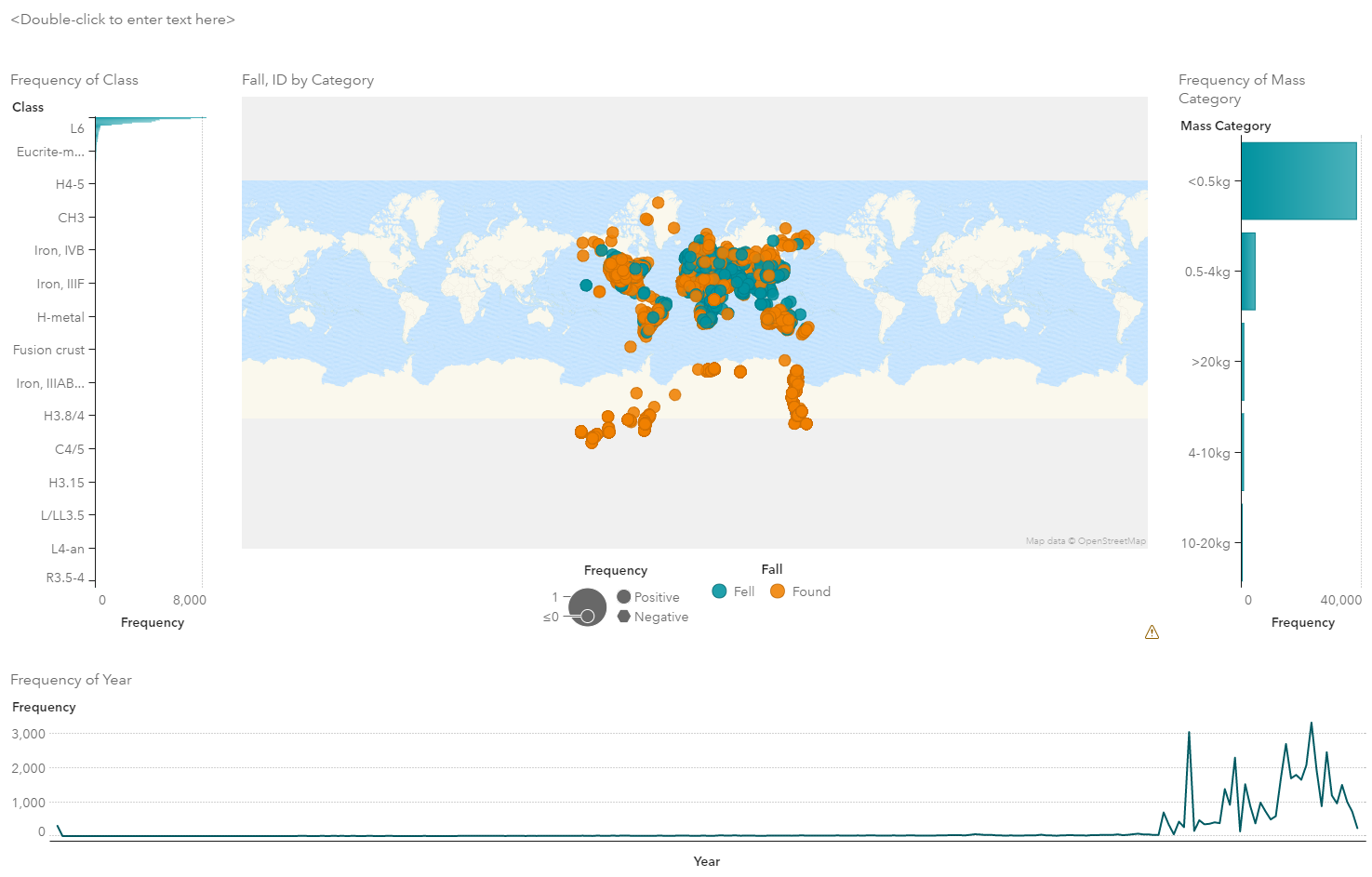
Given these changes we now have:
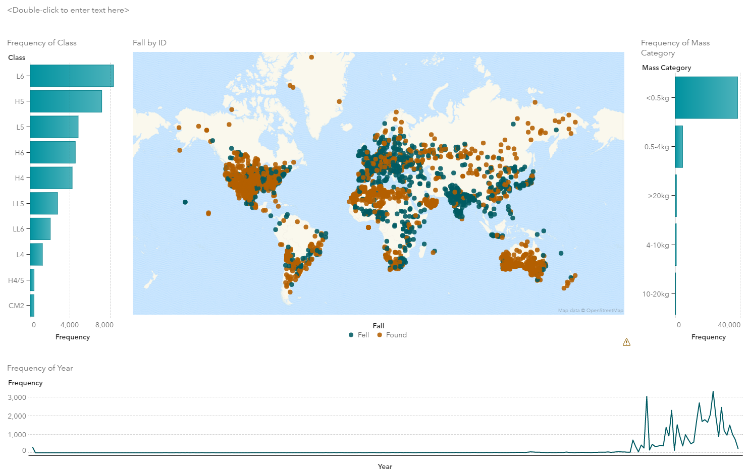
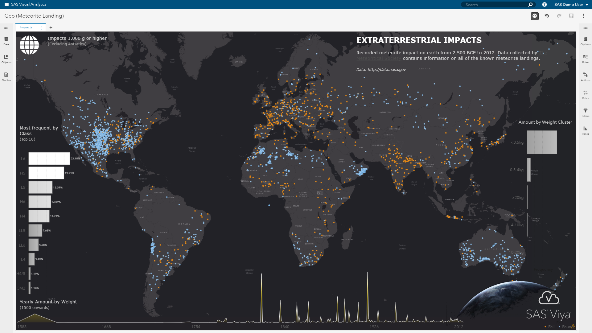
Final report
The previous draft is in fact where most people stop, even though now comes the fun and creative part of report design! Since we have all of our main visuals added to our report, it's time for the final tweaking. We now need to make sure visuals are properly positioned on the report canvas and we assign descriptive titles and headers. We want to make it as easy as possible for the report viewer to understand the information. Again, less is more, as mentioned before.
We also need to decide on the overall color theme. Given the extraterrestrial impact context, I decided to use a rather dark space-like theme. SAS Visual Analytics allows you to change the report theme and tweak each individual visualization via style settings. This also applies to the geographical map where I need to choose a dark background map.
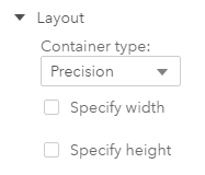
In order to position objects more easily and precisely — we will move all our visuals into a new precision container. Simply drop a container to the canvas and change it's layout option to be precision:
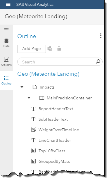
Then move all visuals into this container using the outline panel:
Either use drag'n'drop to move visuals to their intended location or use the options panel to enter the exact location. I found it easier to use the options panel as its typically difficult to drag visuals in such precision. The geo map is our report background and, as such, takes up the entire report width and height. Other visuals such as the bar chart we will overlay on top. We are also applying transparency settings to the charts so that only the bars are visible but not things like the graph background. Some minor adjustments for the color gradient produces bar colors from gray to white - making it easier to read and better merged with the background map theme.
The final tweaks include adding titles, a proper header text (top right corner) and some infographic type icons to make the report more descriptive. Our final report given precision layout may look like this:
Conclusion
While proper report design is not a simple task, SAS Visual Analytics gives you all the tools you need. From a huge range of visualizations, application controls such as button bar or drop-down lists, to things like precision layout. Hopefully, this inspires you to go beyond the standard report design and get people excited even more about the data you share.
Find more great data visualization examples in the SAS Visual Analytics community.