"Correlation does not imply causation.” Does that bring back memories from your college statistics class? If you cringe when you hear those words, don’t worry. This phrase is still relevant today, but is now more approachable and easier to understand.
Here at SAS, we use SAS® Visual Analytics to make sense of it. We can use a correlation matrix to explore relationships between variables, and forecasting to figure out which variables explain a response or target variable.
Before we take a look at that, let’s first dig into how forecasting works in SAS Visual Analytics. Although the business user may not necessarily know this, SAS Visual Analytics runs both Exponential Smoothing Models (ESM) and Auto Regressive Integrated Moving Average models – ARIMA, for short.
If those sound scary, all you really have to know is that they predict future data as a function of the historical data values. Time series models aren’t the same as simply extending a linear trend. Recent data points are weighed more heavily when calculating the future data points. Makes sense, right?
So we have ESM and ARIMA models in SAS Visual Analytics. For a simple forecast, using a line chart in the SAS Visual Analytics Explorer, and without choosing any underlying factors (independent variables), SAS Visual Analytics calculates the Root Mean Square Error (RMSE) for each ESM model and selects the one with the lowest RMSE from the following:
- Damped-trend exponential smoothing
- Linear exponential smoothing
- Seasonal exponential smoothing
- Simple exponential smoothing
- Winters method (additive)
- Winters method (multiplicative)
ESM Models are effective, but don’t include underlying factors in the forecast. ARIMA models can include these and are called ARIMAX models when they do.
When you select underlying factors, SAS Visual Analytics initially selects one ESM and two ARIMA models. It then calculates the RMSE for each model again and, you guessed it, selects the one with the lowest RMSE as the best model.
After all this magic happens in the background, you’ll notice that some underlying factors are grayed out and some are not. If all are grayed out, it means that the selected model is an ESM or ARIMA model. If there are one or more significant underlying factors, then the selected model is an ARIMAX model.
These significant underlying factors can add to the accuracy of the forecast, and the data points for these factors can be moved up or down using the Scenario Analysis capability.
Now that you have a general idea of how forecasting works in SAS Visual Analytics, let’s see how this relates to correlations.
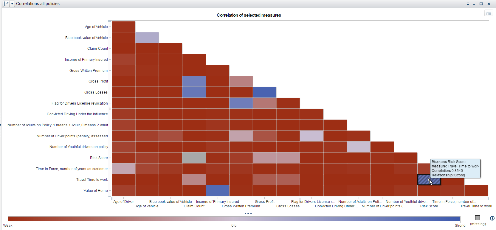
I’ve been working with lots of financial services companies lately, so I’m using some vehicle insurance data in my examples. Here’s a correlation matrix I ran. The tooltip of the tile I’m hovering over shows me that there’s a strong relationship between the Risk Score variable and the Travel Time to work variable.
This makes sense on an intuitive level as well: the more time you spend on the road, the higher your risk score should be from an insurance perspective. However, what’s important to note here is that this strong correlation of 0.8540 only describes the strength of the relationship, but tells me nothing about cause and effect.
Enter the forecast with underlying factors. If I add Risk Score as my variable to forecast and drag in most of the measures available in my data set, I only see Claim Count, Gross Losses, and Time in Force (number of years as a customer) as my underlying factors that have an influence on risk score.
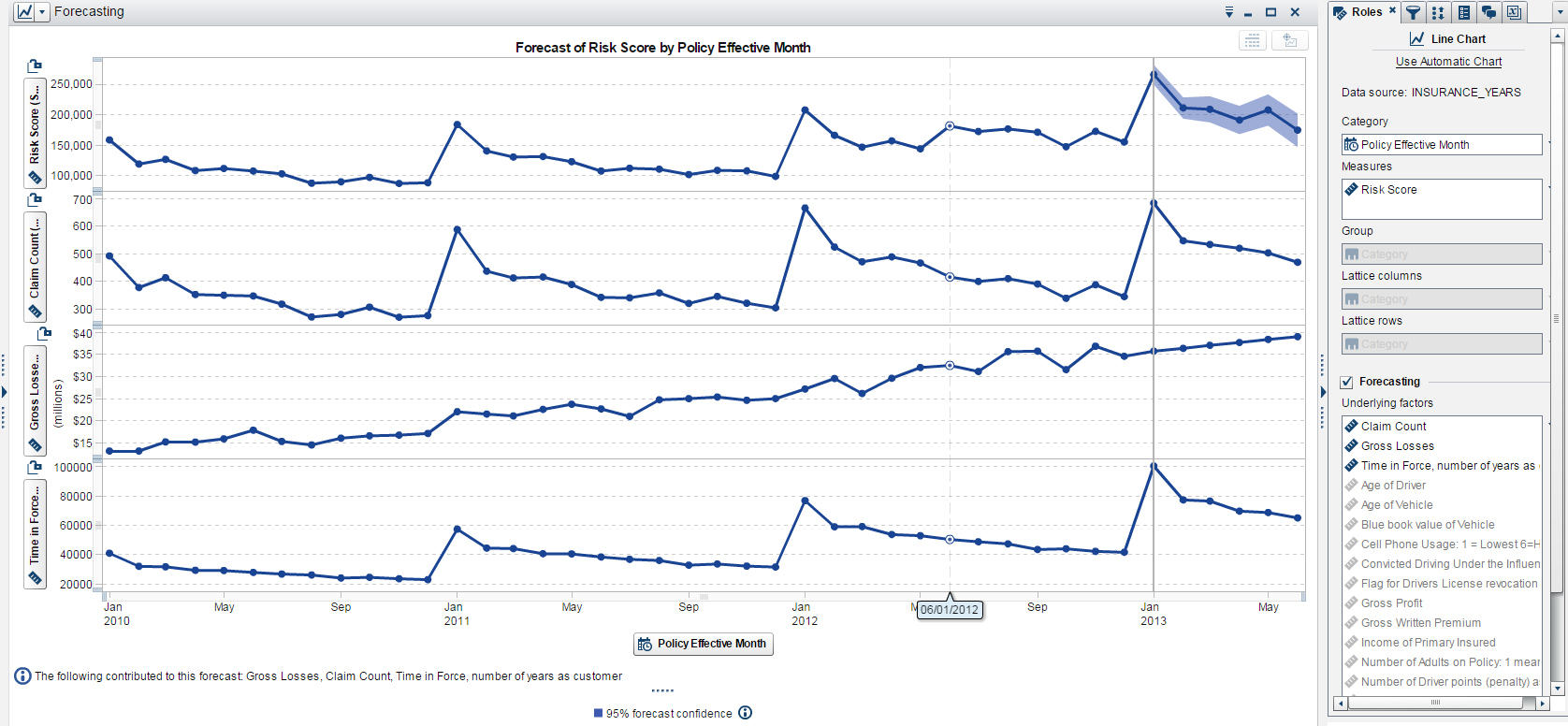
Now, keep in mind that these can change depending on adding or deleting the underlying factors. The moral of the story is that we have a clear example that correlation and forecast results do not necessarily have to match because correlation does not imply causation.
Just because my Risk Score and Travel Time to work variables are highly correlated, does not mean that Travel Time to work causes a high risk score. As intuitive as it may seem, the underlying factors are based on statistical significance, not on what makes sense from a business point of view. Understanding, even at just a high level, the inner workings of forecasts helps me reconcile this in my head and feel confident that I’m providing others with accurate results. And to me, that’s very comforting.
If you’re interested in learning more about SAS Visual Analytics or SAS Visual Statistics, what better way to do so then by trying it out for yourself? Don’t forget to let us know what you think!

2 Comments
Nice summary post Varsha. Good points about causation. I look forward to sharing it.
May I also point out that the correlation indicates the level of linear correlation. A weak correlation may indicate there is another type of relationship (ie/ quadratic etc) so by double-clicking on the cell a new visualization of the selected data items appear. This is very useful to see if data items need to be transformed for modeling. All very quick and easy with SAS Visual Analytics!
Thanks, Michelle! And yes, great point on the relationship of the correlation indeed.