In this interconnected world, it is more important than ever to understand not just details about your data, but also how its different parts are related to each other. Social networks reveal often surprising details about what people think about your product or services, how they are linked to other social communities that could influence your business, and even where your influencers are located. Understanding these networks will give your business unique insights and help making decisions such as who to target in your next marketing campaign.
Introduction
Networks are everywhere. Unlike the abstract world of relational databases, in the real world everything is interrelated. In recent years, companies like Facebook, Google and Wal-Mart have harnessed the power of networks of relationships, information and supply-chains to dominate their competitors.
About networks
A network is defined as a collection of objects, or nodes, in which some pairs of nodes are connected by links. A link can represent any kind of relationship. This definition is very generic, explaining why we can find networks in so many diverse domains.
In mathematical terms, networks are represented by graphs (not to be confused with the common term used to describe some data visualizations). The interconnected objects are represented by mathematical abstractions called vertices, and the links that connect some pairs of vertices are called edges. Graph properties are the subject of study of a branch of discrete mathematics called graph theory.
Along the same lines, network visualization is based on of the visual display of graphs. The most common form is the node-link diagram which uses a set of dots or circles to represent the vertices, joined by lines or curves to represent the edges. Vertex attributes can be mapped to visual node characteristics like size, color and shape. Edge attributes can be mapped to link width and color.
One edge attribute is particularly important: direction. Most relationships are undirected or symmetric. For example, the "friends" relationship in Facebook, where the friendship is mutual. But some network relationships are directed, or asymmetric -- meaning that a link from A to B doesn't imply a corresponding link from B to A. An example is the "follows" relationship in Twitter. In this case the visualization will use arrows or tapered edges to indicate the direction of the relationship.
Social networks
A peculiar aspect of complex systems, and one of the reasons they can be so difficult to predict, is the interplay between its structure and the behavior of its components.
This interplay is particularly visible in social networks. Who you know affects what you do, and vice versa. In the scenario depicted below, the network is comprised of actors -- mostly people, but sometimes even automated agents or bots -- linked by their relationships and the actions they enable, like following, liking and re-tweeting. The impact of what the actors do is largely a function of with whom they relate. Actors in critical places in the topology can affect the entire group in drastic ways.
So how do we go about understanding social networks? We begin by asking two basic questions:
- What is the underlying structure of the network? Do we have a single cohesive group, or strong communities weakly linked by a few bridges?
- Who are the influencers? Who are the key actors in our network that can sway events like markets and elections?
Together these questions reveal how the macro and micro aspects of a network influence each other. Key actors shape the network structure while communities define the scope of their influence.
Data preparation
In one of my previous blog posts I demonstrate how to load Twitter tweets into SAS Visual Analytics. In this blog I will use tweets to demonstrate the analysis of social networks. If you are importing (crawling) Twitter tweets for a longer period of time you will have a substantial amount of tweets collected. In order to help us analyze the network we are going to add network metrics to our data using PROC OPTGRAPH (part of SAS Social Network Analysis). In the future you will be able to perform similar analysis all in SAS Visual Analytics, joining other advanced capabilities like forecasting and text analytics.
In this example, I downloaded Twitter feeds filtered by using hash-tags such as #SASUSERS, #SASGF14, etc. The input table has the following structure:
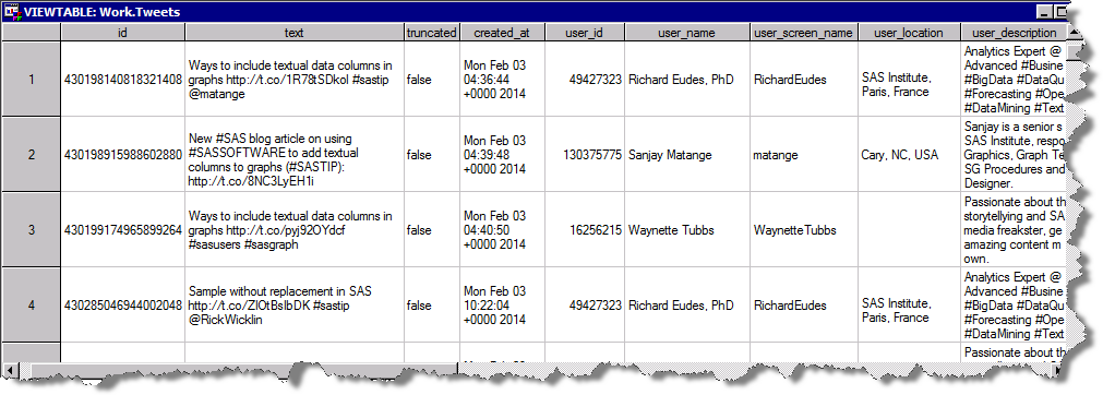
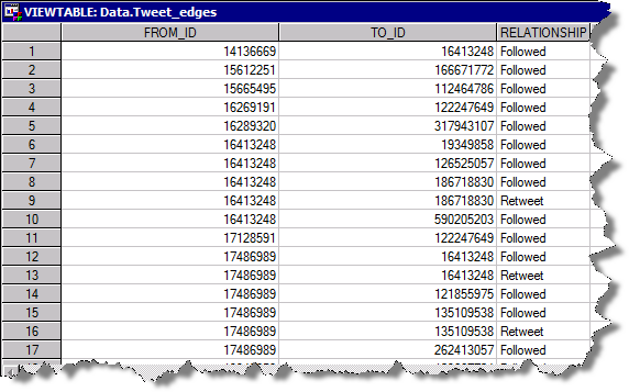
As explained in the previous section this particular network is represented by the users behind these tweets (not the tweet text itself) and their relation to other users (A likes B or A follows B). Based on that we are going to build an ungrouped data structure that includes the two main columns FROM_ID and TO_ID (Twitter user id). The RELATIONSHIP column indicates what this link represents:
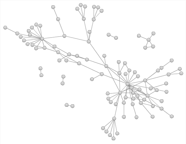
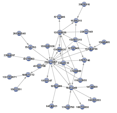
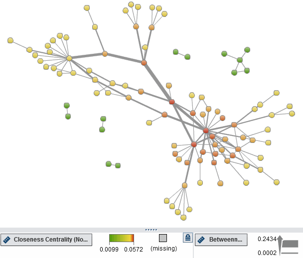
Loading this table into SAS Visual Analytics and creating an ungrouped network visualization reveals first glimpse of this interesting network structure:
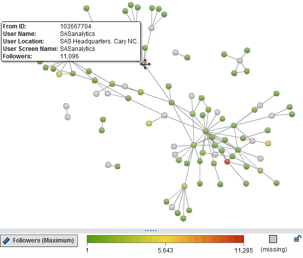
Assigning a people attribute such as "Followers" shows first insights about people or institutions involved in this network.
As you may have guessed, having many followers doesn't automatically mean you are an important person within this network. So let's have a look at how to gain more insights about this network by determining communities and key actors.
Community detection
Community detection, or clustering, is the process by which a network is partitioned into communities such that links within community sub-graphs are more densely connected than the links between communities.
The following OPTGRAPH statement calculates two community groups based on the given resolution. A larger resolution value will produce more communities.
proc optgraph loglevel = moderate data_links = data.tweet_edges out_nodes = work.tweet_groups graph_internal_format = thin; data_links_var from = from_id to = to_id; community resolution_list = 1.0 0.5; run; |
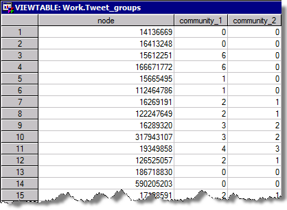
The result table TWEET_GROUPS shows the membership of each node (tweet user):
Merging the community information back to our main network table and loading the data into SAS Visual Analytics - we can highlight communities by assigning a color role:
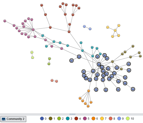
For such a small graph, network visualization by itself can provide many insights. We can see a clear bifurcation within the network, where each region appears to cluster around central communities. We can also see sparse peripheral structures with long "pendant chains". But we can learn a lot more about this network structure by using community detection.
We can use this information to color the visualization by community allowing us to clearly differentiate between them. Furthermore, we can use the community information as a categorical filter. That allow us to narrow our focus to a single community at a time, a starting point for further exploration and analysis. With less data we can add more detail, like labels and arrow directions, without the risk of overwhelming our ability to make sense of the visualization.
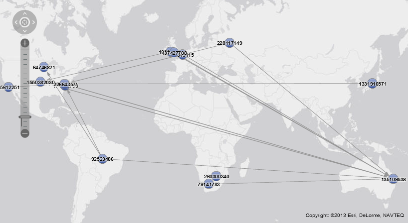
As most of the registered Twitter users also reveal their location as part of their profile we can also apply geo coding in order to visualize the network on a geographical map. We may now use the geographical representation of the network to further narrow down our node selection.
Key Actor Analysis
There are different ways to measure who is important - or central - to a network. Examples of such centrality
measures include:
- Betweenness measures the number of shortest paths an actor is on - which indicates how often actors can reach each other through it. A high score indicates it is a likely path for information flows.
- Eigenvector centrality is proportional to the centrality of an actor’s neighbors. Google’s PageRank algorithm is an example of this metric. A high score indicates the actor is popular among popular actors.
- Degree reflects how many actors are connected to a given actor. This is a simple metric that counts direct relationships: number of friends, followers, etc.
- Closeness indicates the relative distance to all other actors. Closeness is based on the distance between actors, where distance is given by the shortest path between a pair of actors. A high score indicates the actor is close to everyone.
- Influence is a generalization of degree centrality that considers the link and node weights of adjacent nodes in addition to the link weights of nodes that are adjacent to adjacent nodes. This metric, provided by PROC OPTGRAPH, requires a simple traversal and therefore should scale to very large graphs.
The following OPTGRAPH statements calculates these network metrics for us:
proc optgraph loglevel = moderate data_links = data.tweet_edges out_links = work.tweet_edges out_nodes = work.tweet_nodes; data_links_var from = from_id to = to_id; centrality clustering_coef degree = out influence = weight close = weight between = weight eigen = weight; run; |
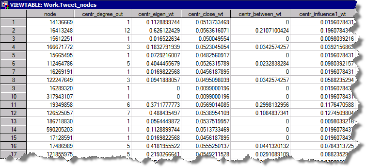
The result is a set of two tables. The first table contains node (tweet user) attributes:
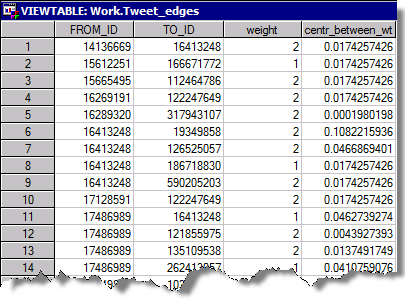
The second table contains link attributes.
Again, merging the new network metrics back to our main network table and loading the data into SAS Visual Analytics shows interesting details about our key players, e.g. who is close to other actors (closeness metric):
Key Actor Analysis identifies critical nodes in a social network by plotting actors' scores for Eigenvector centrality versus Betweenness. Any actor with a high score on both measures is obviously an important node in the network. But given how these measures are expected to be approximately linear, any non-linear outliers are also considered to be key actors playing very specific roles.
An actor with high Betweenness but low Eigenvector centrality may provide the only path to a central actor. These are "gate-keepers", connecting actors to a session of the network that would otherwise be isolated from the core. On the other hand an actor with low Betweenness but high Eigenvector centrality may have unique access to central actors. These are "pulse-takers", well-connected actors at the core of the network.
The implementation of the Key Actor Analysis in SAS Visual Analytics is straightforward. The bubble plot makes it easy to visually identify the key actors and data linking and brushing between the two visualizations highlights these actors in the context of the network structure. We can identify the core leadership, the mid-level actors (pulse-takers) and the bridges between communities (gate-keepers).
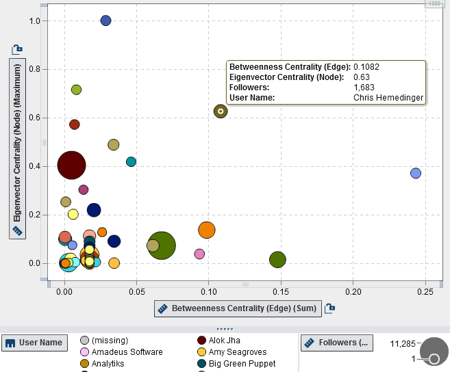
Clearly, our very own Chris Hemedinger is an important part of this network.
Conclusion
Analyzing social networks using SAS graph analysis capabilities together with SAS Visual Analytics network visualization creates a powerful vehicle to find and deliver insights.
Enjoy the power of networks!
References
Barabási, Albert-László, Linked: The New Science of Networks, 2002. ISBN 0-452-28439-2
Barabási, Albert-László, The Science of Networks - From Society to the Web
Matt Bogard. "Using Twitter to Demonstrate Basic Concepts from Network Analysis", 2010.
Drew Conway, "Social Network Analysis in R", 2009.
SAS Social Network Analysis, product documentation

8 Comments
Falko, thank you for this fascinating explanation. I feel a bit like Zaphod Breeblebrox after he gazed into the Total Perspective Vortex. This is not going to help keep my ego in check.
Nice post. I really liked the bubble chart. I've seen those animated in JMP. I think in some cases it might be interesting to look at changes in the network structure (due to I know, marketing, interventions, other dynamics that could be important) and the key actor analysis over time, which you could visualize with an animated bubble chart in SAS VA. I never thought of how powerful the visualization would be adding the brushing capacities as well that you mentioned. A live demo or something at SAS Global doing this would also be really impressive.
Hi Matt, Yes, bubble plot animations are also supported in SAS Visual Analytics and since Tweets are linked to dates - this would give an interesting animation with key actors changing over time as the network grows.
I'm also going to talk about this topic at SAS Global Forum 2014 so if you are interested in seeing a live demo and more details about it - make sure to attend the session "From Traffic to Twitter – Exploring Networks with SAS Visual Analytics". Hope to see you there. Cheers, Falko
Hi Falko- I really like what you've done here. I'm thinking this would be a great demo to build for one of my customers. I've been able to replicate your earlier post and pull down the tweets themselves but I'm wondering if you have sample code to pull the network relationships between the users like you did here? Could you share?
Thanks!
Rachel Hawley
Hi Rachel, In my previous post I'm using proc groovy in order to parse the JSON results into SAS data sets. In this post I'm also using proc groovy but rather than importing details about the tweets - I'm only interested in the actual relationship between the people tweeting. This means I need an edge for each "replies-to" relationship in a tweet and an edge for each "mentions" relationship in a tweet. The following is a code example:
Hope this helps! Cheers, Falko
Hi,
great example; it would be good if you have example with just using SAS VA and what is it capable of producing using just SAS VA functionality; not everyone is licensed with all procs.
Hello Falko,
Great explanation on the VA Network Diagram.
I am trying to replicate the same thing but having confusion on the joining.
We have two output tables after applying "centrality" and "clustering_coef".
In the Edges table, we are having multiple centr_between_wt against the "from" and "to" and in the Nodes table, we are having single record against each from values(here also i can find the centr_between_wt ).
Can you please suggest what all columns we need to use to perform the join with sample code and what columns are required for network diagram.
Also provide network diagram properties screenshot which can give an idea on fields incorporation in SAS VA for network diagram.
Thanks,
Dipan Arya
Hi,
Yes, that is expected as the 'edges' table is really your detail table in this case. So when you join take the 'edges' table as base and left join the 'nodes' table to it. While you would have duplicate representations of the node attributes - this is expected given the requirements on VA side as described in the documentation . When joining make sure to use different column names/labels to properly differentiate between edge and node attributes, e.g. "Betweenness Centrality (Edge)" and "Betweenness Centrality (Node)" (this helps you to assign the correct data item to the graph later)
Additional screenshots and full SQL code used - can be found in the related SAS Global Forum paper (page 16).
Note, that our current release of SAS Visual Analytics has now network metrics built-in and as such doesn't require most of the steps outline in the post for pre-calculating these metrics. If you have access to the 8.x series of SAS VA - simply select a metric in the roles panel for roles such as node color or size.
Hope this helps. Regards, Falko