Last year I was given an iPad. At the time I was rather ho-hum about my new toy, but my fourteen-year-old daughter was ecstatic about it. I now know why. Today, I am writing this blog post from my iPad and I am lost when I leave it at home. The reason I am lost is because of the ease-of-use of this product.
It had been a long time since I had used software that felt like it was custom written for me. The transparency of the tool allows you to concentrate on the important things… the rest comes easily and intuitively. That means from day one, when developing products for the iPad you can focus on the user experience, making the power of SAS analytics readily and easily available to the business analyst.
SAS Visual Analytics is a new offering from SAS that allows a business analyst to explore data, really big data, in an intuitive user experience. While exploring data is fun, the business analyst will want to share their findings with their peers and project stakeholders through flexible reporting options. I will focus today's blog entry on the user experience and discuss reporting options in a future blog post.
One key technology the SAS Visual Analytics team has leveraged for ease-of-use is auto charting. Auto charting is a technique that combines advanced data knowledge plus the science of data visualization and exploration to assist, or guide, the user to the next level of data discovery. This allows the user to see the data in ways they may not have considered; thus encouraging fresh, new discoveries they may not have otherwise encountered. This guide is especially helpful to users who are new to the world of data visualization.
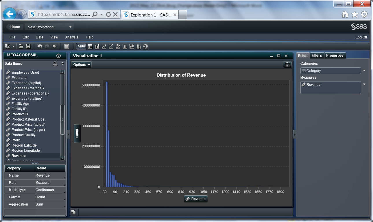
Let's look at an example. If I start with a new visualization on a set of data and drag a measure, such as “revenue,” to that visualization I would be presented with a distribution of revenue and thus I get immediate feedback about the data.
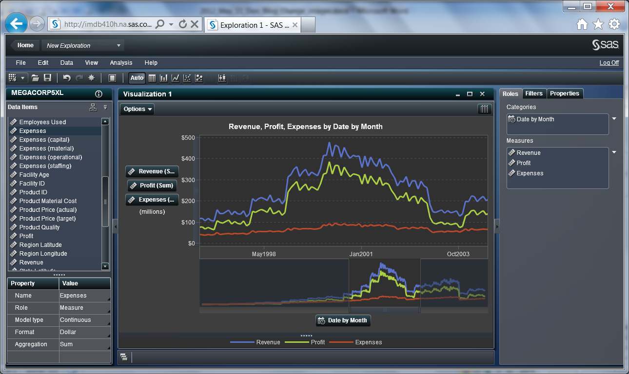
If I drag a “time series” onto the visualization, I would be presented with a line chart; the best visualization for time series.
If I drag a character-based categorical variable, I will get a bar chart; again the appropriate visualization forthe data. Auto charting does not prevent the user from choosing another chart type, it just provides guidance. Now let's say I want to rank “revenue” descending. A quick click on the bar chart icon and I can quickly rank the results.

If your boss asked you to report on why production numbers were down for one of your manufacturing plants in Chicago, what would you do? In SAS Visual Analytics you could grab all of the measures and it will automatically generate a correlation matrix.
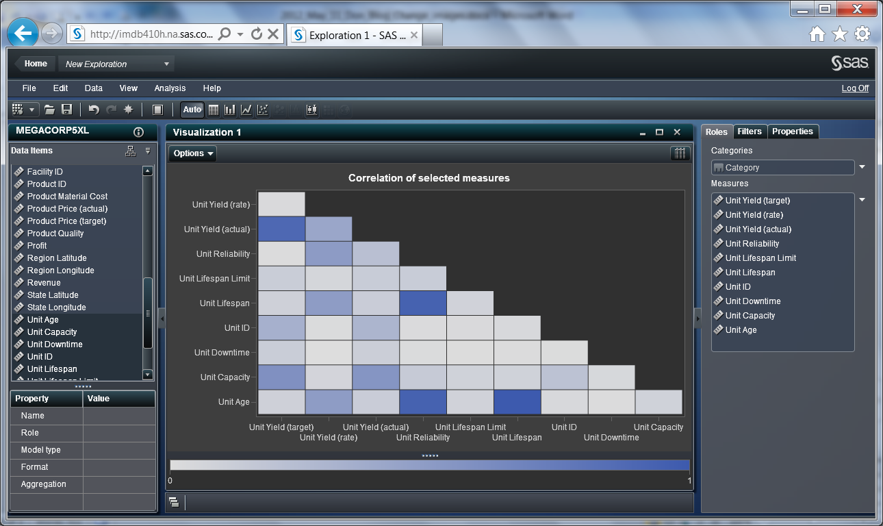
It does this quickly, even with billions of rows of data. Just double click on a crossing to drill into the details. Pretty cool...

There are many other examples of auto charting you can explore. In my next blog post, I’ll share more about the reporting options in SAS Visual Analytics.
Learn more about "big data" visualization - and more - in this special 32-page report on high-performance analytics.

1 Comment
Cool. I did not know this aspect of SAS ran on the iPad!