In my last blog post, I noted that the Control Chart Builder is an overhaul of the older Control Chart platform. One of the most requested features for Control Charts was to offer a way to customize the tests that flag out-of-control samples. I’m happy to report that the new Control Chart Builder platform in JMP 10 has an option to customize the tests – plus you can save the customization to your preferences. So you only need to customize the test once.
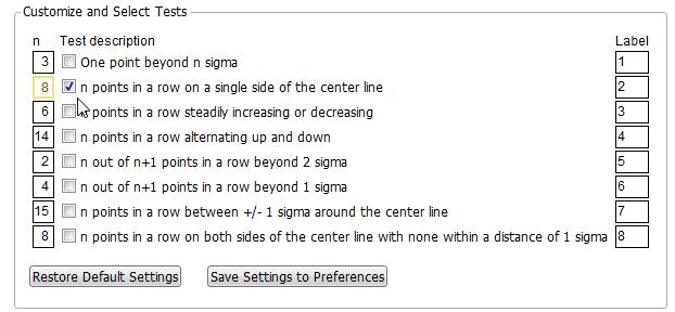
There are many schools of thought on which tests should be used in a control chart setting. In version 3, JMP offered Lloyd Nelson’s set of eight tests. Then in version 6, six Westgard rules were added. Still, one of the most common tests that changes from school to school is the second test in Nelson’s set of eight, which is quite similar to the fourth test in the Western Electric handbook. Nelson gives the test as “Nine points in a row on a single side of the center line,” while the Western Electric handbook states that the test should fail when there are only eight points in a row on one side. Now, it’s easy to customize the test, save it to preferences and use this test from now on in the control charts.
Here’s how:
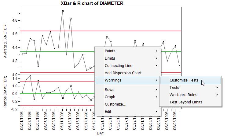
First, open Diameter.jmp in the Sample Data/Quality Control folder and run the script called, “Control Chart Builder.” The results should look like Figure 1 below.
Now, right-click on the top or location chart, which is plotting the average diameter for each day. (Note: You won’t see the menu if you right-click on the bottom or dispersion chart, since the tests only apply to location statistics.) On this menu, choose “Warnings->Customize Tests.”
Since we want to use “Eight points in a row on one side” for test 2, you can check the second test and change the n-value from a “9” to an “8” (see Figure 2). When you click “OK”, the test will run on the chart using the new definition of test 2, as seen in Figure 3 below.
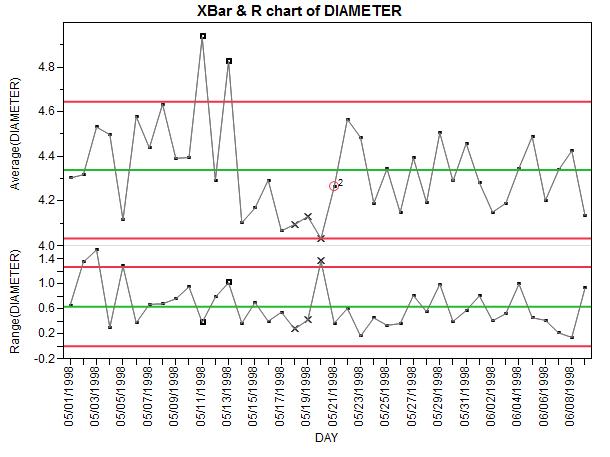
Of course, if we had left the n-value at nine for Test 2, the sample on May 21 wouldn’t have been flagged. In fact, for this data, no sample would have been flagged by Test 2.

You must be a registered user to add a comment. If you've already registered, sign in. Otherwise, register and sign in.