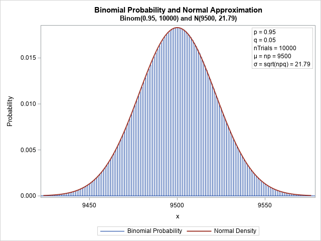
Recall that the binomial distribution is the distribution of the number of successes in a set of independent Bernoulli trials, each having the same probability of success. Most introductory statistics textbooks discuss the approximation of the binomial distribution by the normal distribution. The graph to the right shows that the normal density (the red curve, N(μ=9500, σ=21.79)) can be a very good approximation to the binomial density (blue bars, Binom(p=0.95, nTrials=10000)). However, because the binomial density is discrete, the binomial density is defined only for positive integers, whereas the normal density is defined for all real numbers.
In this graph, the binomial density and the normal density are close. But what does the approximation look like if you overlay a bar chart of a random sample from the binomial distribution? It turns out that the bar chart can have large deviations from the normal curve, even for a large sample. Read on for an example.
The normal approximation to the binomial distribution
I have written two previous articles that discuss the normal approximation to the binomial distribution:
- Overlay the binomial and normal densities: This article shows how to overlay the discrete binomial density and the continuous normal density by using VBARBASIC (or NEEDLE) statement and the SERIES statement in PROC SGPLOT. The graph to the right uses a SAS program that is presented in that article.
- The Normal approximation to the binomial distribution: How the quantiles compare. This article discusses the fact that the tails of the binomial distribution do not agree with the tails of the normal quantiles, even if the normal approximation is very close in the center of the distribution.
The normal approximation is used to estimate probabilities because it is often easier to use the area under the normal curve than to sum many discrete values. However, as shown in the second article, the discrete binomial distribution can have statistical properties that are different from the normal distribution.
Random binomial samples
It is important to remember that a random sample (from any distribution!) can look much different from the underlying probability density function. The following graph shows a random sample from the binomial distribution Binom(0.95, 10000). The distribution of the sample looks quite different from the density curve.
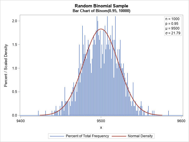
In statistical terms, the observed and expected values have large deviations. Also, note that there can be a considerable deviation between adjacent bars. For example, in the graph, some bars have about 2% of the total frequency whereas an adjacent bar might have half that value. I was surprised to observe the large deviations in a large sample.
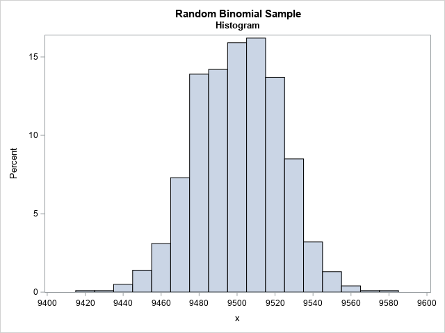
This graph emphasizes the fact that a random sample from the binomial distribution can look different from the smooth bell-shaped curve of the probability density. I think I was surprised by the magnitude of the deviations from the expected values because I have more experience visualizing continuous distributions. For a continuous distribution, we use a histogram to display the empirical distribution. When the bin width of the histogram is greater than 1, it smooths out the differences between adjacent bars to create a much smoother estimate of the density. For example, the following graph displays the distribution of the same random sample but uses a bin width of 10 to aggregate the frequency. The resulting histogram is much smoother and resembles the normal approximation.
Summary
The normal approximation is a convenient way to compute probabilities for the binomial distribution. However, it is important to remember that the binomial distribution is a discrete distribution. A binomial random variable can assume values only for positive integers. One consequence of this observation is that a bar chart of a random binomial sample can show considerable deviations from the theoretical density. This is normal (pun intended!). It is often overlooked because if you treat the random variable as if it were continuous and use a histogram to estimate the density, the histogram smooths out a lot of the bar-to-bar deviations.
Appendix
The following SAS program creates the graphs in this article.
/* define parameters for the Binom(p=0.95, nTrials=10000) simulation */ %let p = 0.95; /* probability of success */ %let NTrials = 10000; /* number of trials */ %let N = 1000; /* sample size */ /* First graph: Compute the density of the Normal and Binomial distributions. See https://blogs.sas.com/content/iml/2016/09/12/overlay-curve-bar-chart-sas.html */ data Binom; n = &nTrials; p = &p; q = 1 - p; mu = n*p; sigma = sqrt(n*p*q); /* parameters for the normal approximation */ Lower = mu-3.5*sigma; /* evaluate normal density on [Lower, Upper] */ Upper = mu+3.5*sigma; /* PDF of normal distribution */ do t = Lower to Upper by sigma/20; Normal = pdf("normal", t, mu, sigma); output; end; /* PMF of binomial distribution */ t = .; Normal = .; /* these variables are not used for the bar chart */ do j = max(0, floor(Lower)) to ceil(Upper); Binomial = pdf("Binomial", j, p, n); output; end; /* store mu and sigma in macro variables */ call symput("mu", strip(mu)); call symput("sigma", strip(round(sigma,0.01))); label Binomial="Binomial Probability" Normal="Normal Density"; keep t Normal j Binomial; run; /* overlay binomial density (needle plot) and normal density (series plot) */ title "Binomial Probability and Normal Approximation"; title2 "Binom(0.95, 10000) and N(9500, 21.79)"; proc sgplot data=Binom; needle x=j y=Binomial; series x=t y=Normal / lineattrs=GraphData2(thickness=2); inset "p = &p" "q = %sysevalf(1-&p)" "nTrials = &nTrials" "(*ESC*){unicode mu} = np = &mu" /* use Greek letters */ "(*ESC*){unicode sigma} = sqrt(npq) = &sigma" / position=topright border; yaxis label="Probability"; xaxis label="x" integer; run; /*************************/ /* Second graph: simulate a random sample from Binom(p, NTrials) */ data Bin(keep=x); call streaminit(1234); do i = 1 to &N; x = rand("Binomial", &p, &NTrials); output; end; run; /* count the frequency of each observed count */ proc freq data=Bin noprint; tables x / out=FreqOut; run; data All; set FreqOut Binom(keep=t Normal); Normal = 100*1*Normal; /* match scales: 100*h*PDF, where h=binwidth */ run; /* overlay sample and normal approximation */ title "Random Binomial Sample"; title2 "Bar Chart of Binom(0.95, 10000)"; proc sgplot data=All; needle x=x y=Percent; series x=t y=Normal / lineattrs=GraphData2(thickness=2); inset "n = &n" "p = &p" "(*ESC*){unicode mu} = &mu" /* use Greek letters */ "(*ESC*){unicode sigma} = &sigma" / position=topright border; yaxis label="Percent / Scaled Density"; xaxis label="x" integer; run; /*************************/ /* Third graph: the bar-to-bar deviations are smoothed if you use a histogram */ title2 "Histogram BinWidth=10"; proc sgplot data=Bin; histogram x / scale=percent binwidth=10; xaxis label="x" integer values=(9400 to 9600 by 20); run; /* for comparison, the histogram looks like the bar chart if you set BINWIDTH=1 */ title2 "Histogram BinWidth=1"; proc sgplot data=Bin; histogram x / binwidth=1 scale=percent; xaxis label="x" integer; run; |
