Most introductory statistics courses introduce the bar chart as a way to visualize the frequency (counts) for a categorical variable. A vertical bar chart places the categories along the horizontal (X) axis and shows the counts (or percentages) on the vertical (Y) axis. The vertical bar chart is a precursor to the histogram, which visualizes the distribution of counts for a continuous variable that has been binned.
Although bar charts are often displayed by using vertical bars, it is often advantageous to use a horizontal bar chart instead. This article discusses three situations in which a horizontal bar chart is preferable to a vertical bar chart.
Create a horizontal bar chart in SAS
In SAS, it is easy to create a vertical or a horizontal bar chart:
- In PROC SGPLOT, you can use the HBAR statement to create a horizontal bar chart. Often you can switch from a vertical bar chart (the VBAR statement) by changing one letter: VBAR → HBAR. For pre-summarized data, you can use the HBARPARM statement.
- In PROC FREQ, you can create a bar chart by using the PLOTS=FREQPLOT option on the TABLES statement. By default, you get a vertical bar chart. Use the ORIENT=HORIZONTAL suboption to create a horizontal bar chart.
For example, the following calls to SAS procedures create vertical and horizontal bar charts. The charts show the number of patients in a study who smoke, where the smoking category has five different levels, from non-smoker to heavy smoker. This categorical variable is ordinal, so I chose to sort the data and use the DISCRETEORDER=DATA option (for PROC SGPLOT) or the ORDER=DATA option (for PROC FREQ) so that the bars appear in a logical order.
/* Sort the data by smoking status: See https://blogs.sas.com/content/iml/2016/06/20/select-when-sas-data-step.html */ data Heart; set sashelp.heart; select (Smoking_Status); when ('Non-smoker') Smoking_Cat=1; when ('Light (1-5)') Smoking_Cat=2; when ('Moderate (6-15)') Smoking_Cat=3; when ('Heavy (16-25)') Smoking_Cat=4; when ('Very Heavy (> 25)') Smoking_Cat=5; otherwise Smoking_Cat=.; end; run; proc sort data=Heart; by Smoking_Cat; run; ods graphics/ width=400px height=300px; /* make the graphs small */ /* Standard vertical bar charts */ title "Vertical Bar Chart"; proc sgplot data=Heart; vbar Smoking_Status; xaxis discreteorder=data; /* use data order instead of alphabetical */ yaxis grid; run; proc freq data=Heart order=data; tables Smoking_Status / plot=FreqPlot; run; title "Horizontal Bar Chart"; proc sgplot data=Heart; hbar Smoking_Status; xaxis grid; yaxis discreteorder=data; /* use data order instead of alphabetical */ run; proc freq data=Heart order=data; /* Y axis is reversed from PROC SGPLOT */ tables Smoking_Status / plot=FreqPlot(orient=horizontal); run; |
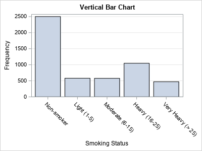
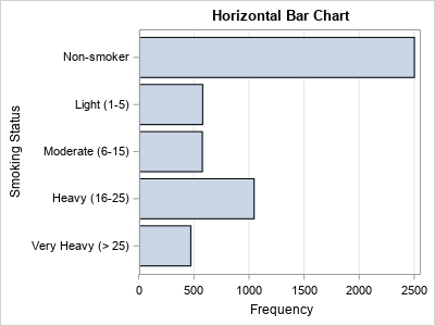
The plots from PROC SGPLOT are displayed; the ones from PROC FREQ are similar. I intentionally made the graphs somewhat small so that the category labels for the vertical bar chart cannot be displayed without rotating or splitting the text labels.
3 advantages to horizontal bar charts
There are a least three advantages to using horizontal bar charts:
- Long labels for the categories are easier to display and read. Whereas the vertical bar chart must use various tricks to display the labels (such as rotating or splitting the text), the horizontal bar chart can display the category labels in a natural, easy-to-read manner. This is seen in the example above.
-
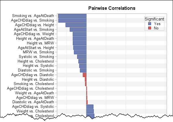 Many categories are easier to display. The previous example has five categories but imagine having 20 or 50 categories. A horizontal bar chart can display the category names in a straightforward manner just by making the chart taller. This is an advantage for graphs on the printed page (in portrait mode) and for an HTML page because it is easy to scroll a web page vertically.
The graph to the right shows a portion of a horizontal bar chart that has 45 categories. Each category is the name of a pair of variables and the bar chart shows the Pearson correlation between the two variables.
Many categories are easier to display. The previous example has five categories but imagine having 20 or 50 categories. A horizontal bar chart can display the category names in a straightforward manner just by making the chart taller. This is an advantage for graphs on the printed page (in portrait mode) and for an HTML page because it is easy to scroll a web page vertically.
The graph to the right shows a portion of a horizontal bar chart that has 45 categories. Each category is the name of a pair of variables and the bar chart shows the Pearson correlation between the two variables.
- Labels for many bars are easier to display without collision. It is common to label a bar with the count or percentage for that bar. For example, think about displaying the Pearson correlation coefficient next to each bar in the previous example. A horizontal chart enables you to display those values in a natural way, whereas a vertical chart of the same data does not have enough horizontal space between bars. There are ways to rotate the text, but, in most cases, the horizontal layout is both simpler to construct and easier to read.
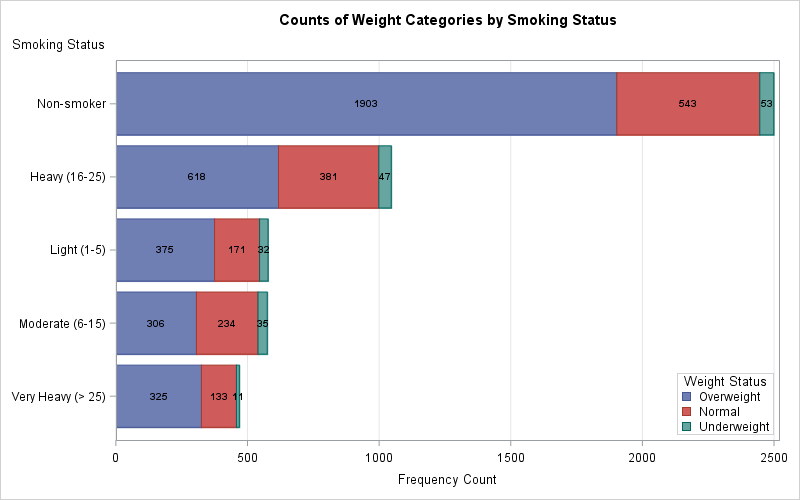
A horizontal layout can also be helpful for labeling each segment in a stacked bar chart. An example is shown below. In practice, it is not always possible to get the labels to fit fully inside the bars, especially for categories that have few counts. However, if you have 10 or more categories, a horizontal bar chart offers a better chance of displaying segment labels inside the bars. You should experiment with both the vertical and horizontal charts to determine which is the better choice.
Summary
SAS offers both vertical and horizontal bar charts. Vertical charts are used more often, but there are advantages to using a horizontal bar chart, especially if you are displaying many categories or categories that have long labels. This article shows how to create a horizontal bar chart and gives some situations in which the horizontal chart is preferable.

7 Comments
Thanks for that. I agree completely, and have used horizontal bar charts to allow display of long labels for some time. This raises two questions for me:
1. Please could the SAS/STAT procedures offer an option to prefer horizontal charts? (I know we can change the graph templates already.)
2. What about scripts such as Japanese which are traditionally written vertically? In this case vertical would be better for labelling but not for many categories.
I don't work in the SAS/STAT group, but I will relay your request. As mentioned in this article, PROC FREQ already does what you ask.
I don't know what to advise about Japanese. There is not one visualization that fits all data and all labels. SAS provides support for changing many attributes of a graph (width, height, font size, bar width, vertical/horizontal orientation,...), so the best I can suggest is that you experiment and choose the combination that best enables the reader to understand the data.
Hi Rick,
Do you have any blog which gives an idea to Fit an fat tailed asset return distribution .Specifically fitting the tail part by SGT (Skewed Genaralised T) distribution.
also how best to simulate from such a distribution?
No, sorry. I have written several articles about MLE estimation of parameters for fitting distributions to data. See "Two ways to compute maximum likelihood estimates in SAS." I do not have any experience working with the SGT, but fitting a five-parameter family will probably require a lot of data. As for simulation, it looks like (via Google) it involves the incomplete beta function or the incomplete gamma function.
Thanks for your reply
Thank you for this article! It not only helped show the usefulness of horizontal bar charts, but gave the last pieces of the puzzle I needed for an ordering scheme to work with proc sgplot. Cheers!
Pingback: Using colors to visualize groups in a bar chart in SAS - The DO Loop