I previously showed how to create a decile calibration plot for a logistic regression model in SAS. A decile calibration plot (or "decile plot," for short) is used in some fields to visualize agreement between the data and a regression model. It can be used to diagnose an incorrectly specified model.
In principle, the decile plot can be applied to any regression model that has a continuous regressor. In this article, I show how to create two decile plots for an ordinary least squares regression model. The first overlays a decile plot on a fit plot, as shown to the right. The second decile plot shows the relationship between the observed and predicted responses.
Although this article shows how to create a decile plot in SAS, I do not necessarily recommend them. In many cases, it is better and simpler to use a loess fit, as I discuss at the end of this article.
A misspecified model
A decile plot can be used to identify an incorrectly specified model. Suppose, for example, that a response variable (Y) depends on an explanatory variable (X) in a nonlinear manner. If you model Y as a linear function of X, then you have specified an incorrect model. The following SAS DATA step simulates a response variable (Y) that depends strongly on a linear effect and weakly on quadratic and cubic effects for X. Because the nonlinear dependence is weak, a traditional fit plot does not indicate that the model is misspecified:
/* Y = b0 + b1*x + b2*x2 + b3*x**3 + error, where b2 and b3 are small */ %let N = 200; /* sample size */ data Have(keep= Y x); call streaminit(1234); /* set the random number seed */ do i = 1 to &N; /* for each observation in the sample */ x = rand("lognormal", 0, 0.5); /* x = explanatory variable */ y = 20 + 5*x - 0.5*(x-3)**3 + /* include weak cubic effect */ rand("Normal", 0, 4); output; end; run; proc reg data=Have; /* Optional: plots=residuals(smooth); */ model y = x; quit; |
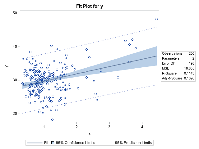
The usual p-values and diagnostic plots (not shown) do not reveal that the model is misspecified. In particular, the fit plot, which shows the observed and predicted response versus the explanatory variable, does not indicate that the model is misspecified. At the end of this article, I discuss how to get PROC REG to overlay additional information about the fit on its graphs.
Overlay a decile plot on a fit plot
This section shows how to overlay a decile plot on the fit plot. The fit plot shows the observed values of the response (Y) for each value of the explanatory variable (X). You can create a decile fit plot as follows:
- Bin the X values into 10 bins by using the deciles of the X variable as cut points. In SAS, you can use PROC RANK for this step.
- For each bin, compute the mean Y value and a confidence interval for the mean. At the same time, compute the mean of each bin, which will be the horizontal plotting position for the bin. In SAS, you can use PROC MEANS for this step.
- Overlay the fit plot with the 10 confidence intervals and mean values for Y. You can use PROC SGPLOT for this step.
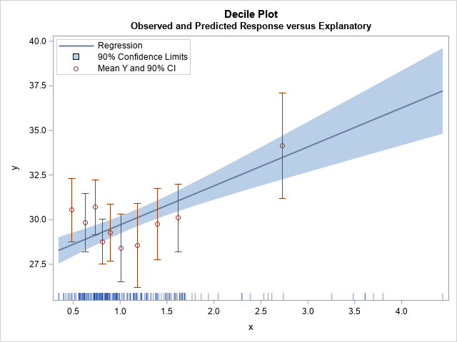
/* 1. Assign each obs to a decile for X */ proc rank data=Have out=Decile groups=10 ties=high; var x; /* variable on which to group */ ranks Decile; /* name of variable to contain groups 0,1,...,k-1 */ run; /* 2. Compute the mean and the empirical proportions (and CI) for each decile */ proc means data=Decile noprint; class Decile; types Decile; var y x; output out=DecileOut mean=YMean XMean lclm=yLower uclm=yUpper; /* only compute limits for Y */ run; /* 3. Create a fit plot and overlay the deciles. */ data All; set Have DecileOut; run; title "Decile Plot"; title2 "Observed and Predicted Response versus Explanatory"; proc sgplot data=All noautolegend; reg x=x y=y / nomarkers CLM alpha=0.1 name="reg"; scatter x=xMean y=YMean / yerrorlower=yLower yerrorupper=yUpper name="obs" legendlabel="Mean Y and 90% CI" markerattrs=GraphData2; fringe x / transparency=0.5; xaxis label="x" values=(0 to 4.5 by 0.5) valueshint; yaxis label="y" offsetmin=0.05; keylegend "reg" "obs" / position=NW location=inside across=1; run; |
The graph is shown at the top of this article. I use the FRINGE statement to display the locations of the X values at the bottom of the plot. The graph indicates that the model might be misspecified. The mean Y values for the first three deciles are all above the predicted value from the model. For the next six deciles, the mean Y values are all below the model's predictions. This kind of systematic deviation from the model can indicate that the model is missing an important component. In this case, we know that the true response is cubic whereas the model is linear.
A decile plot of observed versus predicted response
You can create a fit plot when the model contains a single continuous explanatory variable. If you have multiple explanatory variables, you can assess the model by plotting the observed responses against the predicted responses. You can overlay a decile plot by computing the average observed response for each decile of the predicted response. When you hear someone use the term "decile plot," they are probably referring to this second plot, which is applicable to most regression models.
The SAS program is almost identical to the program in the previous section. The main difference is that you need to create an output data set (FIT) that contains the predicted values (Pred). You then use the Pred variable instead of the X variable throughout the program, as follows:
/* 1. Compute predicted values */ proc reg data=Have noprint; model y = x; output out=Fit Pred=Pred; quit; /* 2. Assign each obs to a decile for Pred */ proc rank data=Fit out=Decile groups=10 ties=high; var Pred; /* variable on which to group */ ranks Decile; /* name of variable to contain groups 0,1,...,k-1 */ run; /* 3. Compute the mean and the empirical proportions (and CI) for each decile */ proc means data=Decile noprint; class Decile; types Decile; var y Pred; output out=DecileOut mean=YMean PredMean lclm=yLower uclm=yUpper; /* only compute limits for Y */ run; /* 4. Create an Observed vs Predicted plot and overlay the deciles. */ data All; set Fit DecileOut; run; title "Decile Plot"; title2 "Observed Response verus Predicted Response"; proc sgplot data=All noautolegend; lineparm x=0 y=0 slope=1 / lineattrs=(color=grey pattern=dash) clip; /* add identity line */ scatter x=PredMean y=YMean / yerrorlower=yLower yerrorupper=yUpper name="obs" legendlabel="Mean Y and 95% CI" markerattrs=GraphData2; fringe Pred; xaxis label="Predicted Response"; yaxis label="Observed Response" offsetmin=0.05; keylegend "obs" / position=NW location=inside across=1; run; |
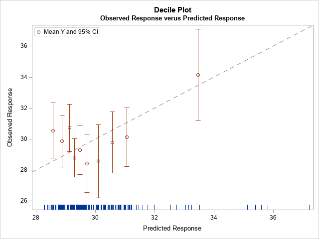
The decile plot includes a diagonal line, which is the line of perfect agreement between the model and the data. In a well-specified model, the 10 empirical means of the deciles should be close to the line, and they should vary randomly above and below the line. The decile plot for the misspecified model shows a systematic trend rather than random variation. For the lower 30% of the predicted values, the observed response is higher (on average) than the predictions. When the predicted values, are in the range [29, 32] (the fourth through ninth deciles) the observed response is lower (on average) than the predictions. Thus, the decile plot indicates that the linear model might be missing an important nonlinear effect.
The loess alternative
A general principle in statistics is that you should not discretize a continuous variable unless absolutely necessary. You can often get better insight by analyzing the continuous variable. In accordance with that principle, this section shows how to identify misspecified models by using a loess smoother rather than by discretizing a continuous variable into deciles.
In addition to the "general principle," a decile plot requires three steps: compute the deciles, compute the means for the deciles, and merge the decile information with the original data so that you can plot it. As I discuss at the end of my previous article, it is often easier to overlay a loess smoother.
The following statements use the LOESS statement in PROC SGPLOT to add a loess smoother to a fit plot. If the loess fit is not approximately linear, it could indicate that the linear model is not appropriate.
title "Linear Regression Fit"; proc sgplot data=Have; reg x=x y=y / clm; /* fit linear model y = b0 + b1*x */ loess x=x y=y / nomarkers; /* use loess fit instead of decile plot */ run; |
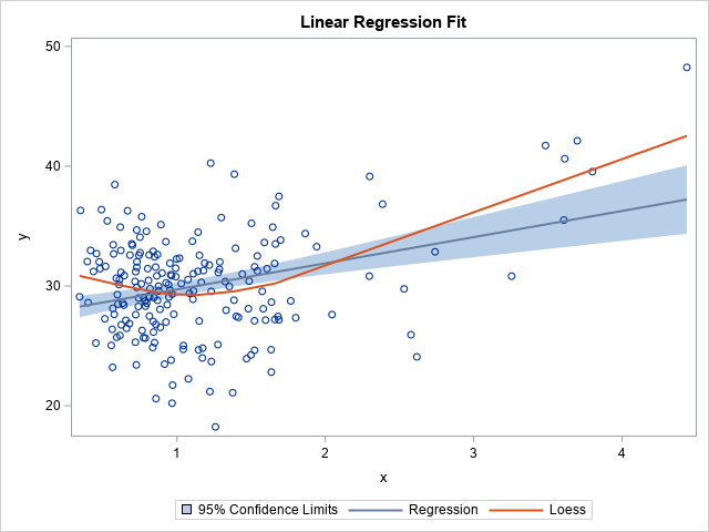
This plot is the continuous analog to the first decile plot. It tells you the same information: For very small and very large values of X, the predicted values are too low. The loess curve suggests that the linear model is lacking an effect.
The previous plot is useful for single-variable regressions. But even if you have multiple regressors, you can add a loess smoother to the "observed versus predicted" plot. If the FIT data set contains the observed and predicted response, you can create the graph as follows:
title "Observed versus Predicted"; proc sgplot data=Fit; loess x=Pred y=y; lineparm x=0 y=0 slope=1 / lineattrs=(color=grey pattern=dash) clip legendlabel="Identity Line"; run; |
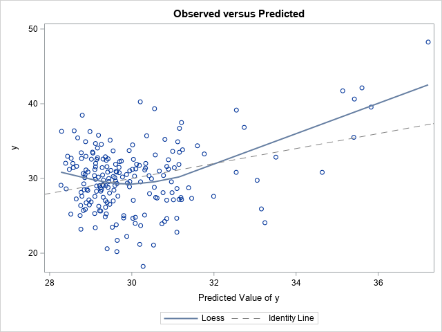
This plot is the continuous analog to the second decile plot. The loess curve indicates that the observed response is higher than predicted for small and large predicted values. When the model predicts values of Y in the range [29.5, 32], the predicted values tend to be smaller than the observed values. This is the same information that the decile plot provides, but the loess curve is easier to use and gives more information because it does not discretize a continuous variable.
Finally, you can add a loess smoother to a residual plot by using an option in PROC REG. In a well-specified model, the residual plot should not show any systematic trends. You can use the PLOTS=RESIDUALS(SMOOTH) options on the PROC REG statement to add a loess smoother to the residual plot, as follows:proc reg data=Have plots=residuals(smooth); model y = x; ods select ResidualPlot; quit; |
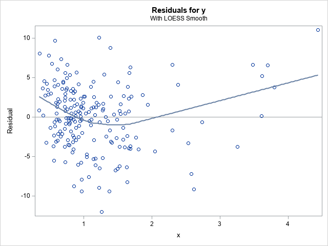
The loess smoother on the residual plot shows that the residuals seem to have a systematic component that is not captured by the linear model. When you see the loess fit, you might be motivated to fit models that are more complex. You can use this option even for models that have multiple explanatory variables.
Summary
In summary, this article shows how to create two decile plots for least-square regression models in SAS. The first decile plot adds 10 empirical means to a fit plot. You can create this plot when you have a single continuous regressor. The second decile plot is applicable to models that have multiple continuous regressors. It adds 10 empirical means to the "observed versus predicted" plot. Lastly, although you can create decile plots in SAS, in many cases it is easier and more informative to use a loess curve to assess the model.

4 Comments
That's really useful. I'll try to add this control scheme with its beautiful visualisation into a pipeline in Build models using the sas code node.
Pingback: Blog posts from 2020 that deserve a second look - The DO Loop
Hi Rick,
This is very useful. I am wondering what is the way to get a statistical comparison (and significance) between the linear and loess regressions in SAS.
Thank you !
KGR
For comparison, I suggest using a goodness-of-fit statistic that you can compute for each model. The simplest would be the mean squared error (MSE) or root-MSE, but you could also use the AIC, AICC, BIC, etc. Some researchers prefer cross-validation because that reduces the bias of evaluating the model on the same data that were used to fit it.