To help visualize regression models, SAS provides the EFFECTPLOT statement in several regression procedures and in PROC PLM, which is a general-purpose procedure for post-fitting analysis of linear models. When scoring and visualizing a model, it is important to use reasonable combinations of the explanatory variables for the visualization. When the explanatory variables are correlated, the standard visualizations might evaluate the model at unreasonable (or even impossible!) combinations of the explanatory variables. This article describes how to generate points in an ellipsoid and score (evaluate) a regression model at those points. The ellipsoid contains typical combinations of the explanatory variables when the explanatory variables are multivariate normal. An example is shown in the graph to the right, which shows the predicted probabilities for a logistic regression model.
This technique can help prevent nonsensical predicted values. For example, in a previous article, I show an example of a quadratic regression surface that appears to predict negative values for a quantity that can never be negative (such as length, mass, or volume). The reason for the negative prediction is that the model is being evaluated at atypical points that are far from the explanatory values in the experiment.
Example: Visualizing the predicted probabilities for a logistic model
Let's look at an example of a regression model for which the regressors are correlated. Suppose you want to predict the gender of the 19 students in the Sashelp.Class data based on their height and weight. (Apologies to my international readers, but the measurements are in pounds and inches.) The following call to PROC LOGISTIC fits a logistic model to the data and uses the EFFECTPLOT statement to create a contour plot of the predicted probability that a student is female:
proc logistic data=Sashelp.Class; model Sex = Height Weight; effectplot contour / ilink; /* contour plot of pred prob */ store out=LogiModel; /* store model for later */ run; |
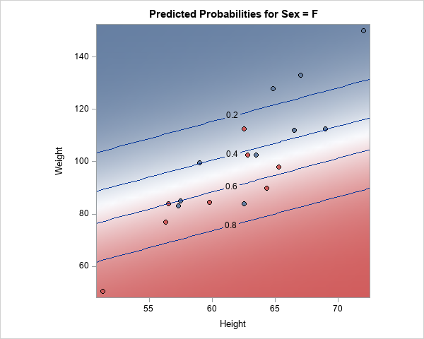
The contour plot shows the predicted probability of being female according to the model. The red regions have a high probability of being female and the blue regions have a low probability. For a given height, lighter students are more likely to be female.
This graph is a great summary of the model. However, because height and weight are correlated, the data values do not fill the rectangular region in the graph. There are no students in the upper-left corner near (height, weight)=(51, 150). Such a student would be severely obese. Similarly, there are no students in the lower-right corner near (height, weight)=(72, 50). Such a student would be severely underweight.
You can graph just the explanatory variables and overlay a 95% prediction ellipse for bivariate normal data, as shown below:
title "Weight versus Height"; proc sgplot data=Sashelp.Class; scatter x=Height y=Weight / jitter transparency=0.25 group=Sex markerattrs=(size=10 symbol=CircleFilled); ellipse x=Height y=Weight; /* 95% prediction ellipse for bivariate normal data */ run; |
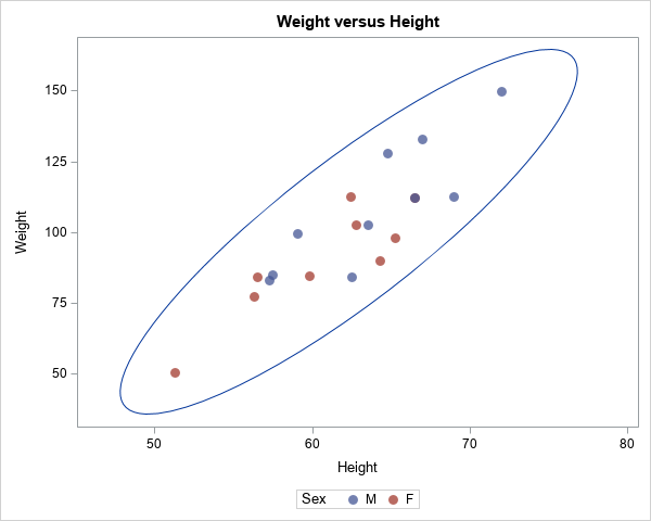
The heights and weights of most students will fall into the prediction ellipse, assuming that the variables are multivariate normal with a mean vector that is close to (62.3, 100), which is the mean of the data.
If you want to score the model at "representative" values of the data, it makes sense to generate points inside the ellipse. The following sections show how to generate a regular grid of values inside the ellipse and how to score the logistic model on those points.
Generate data in an ellipsoid
I can think of several ways to generate a grid of values inside the ellipse, but the easiest way is to use the Mahalanobis distance (MD). The Mahalanobis distance is a metric that accounts for the correlation in data. Accordingly, you can generate a regular grid of points and then keep only the points whose Mahalanobis distance to the mean vector is less than a certain cutoff value. In this section, I choose the cutoff value to be the maximum Mahalanobis distance in the original data. Alternately, you can use probability theory and the fact that the distribution of the squared MD values is asymptotically chi-squared.
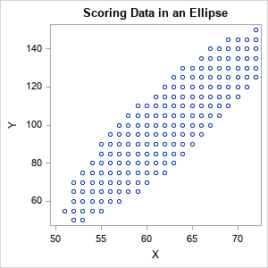
The following SAS/IML program reads the explanatory variables and computes the sample mean and covariance matrix. You can use the MAHALANOBIS function to compute the Mahalanobis distance between each observation and the sample mean. The maximum MD for these data is about 2.23. You can use the ExpandGrid function to generate a regular grid of points, then keep only those points whose MD is less than 2.23. The resulting points are inside an ellipse and represent "typical" values for the variables.
proc iml; varNames = {'Height' 'Weight'}; use Sashelp.Class; read all var varNames into X; close; S = cov(X); m = mean(X); MD_Data = mahalanobis(X, m, S); MaxMD = max(MD_Data); print MaxMD; minX = 50; maxX = 72; /* or use min(X[,1]) and max(X[,1]) */ minY = 50; maxY = 150; /* or use min(X[,2]) and max(X[,2]) */ xRng = minX:maxX; /* step by 1 in X */ yRng = do(minY, maxY, 5); /* step by 5 in Y */ u = ExpandGrid( xRng, yRng ); /* regular grid of points */ MD = mahalanobis(u, m, S); /* MD to center for each point */ u = u[ loc(MD < MaxMD), ]; /* keep only points where MD < cutoff */ ods graphics / width=300px height=300px; call scatter(u[,1], u[,2]); create ScoreIn from u[c=varNames]; /* write score data set */ append from u; close; QUIT; |
Score data in an ellipsoid
You can use PROC PLM to score the logistic model at the points in the ellipsoid. In the earlier call to PROC LOGISTIC, I used the STORE statement to create an item store named LogiModel. The following call to PROC PLM scores the model and uses the ILINK option to output the predicted probabilities. You can use the HEATMAPPARM statement in PROC SGPLOT to visualize the predicted probabilities. So that the color ramp always visualizes probabilities on the interval [0,1], I add two fake observations (0 and 1) to the predicted values.
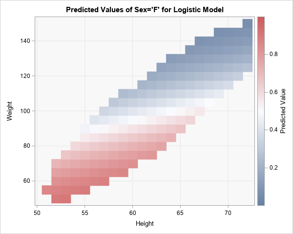
proc PLM restore=LogiModel noprint; score data=ScoreIn out=ScoreOut / ilink; /* predicted probability */ run; data Fake; /* Optional trick: Add 0 and 1 so colorramp shows range [0,1] */ Predicted=0; output; Predicted=1; output; run; data Score; /* concatenate the real and fake data */ set ScoreOut Fake; run; title "Predicted Values of Sex='F' for Logistic Model"; proc sgplot data=Score; styleattrs wallcolor=CxF8F8F8; heatmapparm x=Height y=Weight colorresponse=Predicted; xaxis grid; yaxis grid; run; |
The graph is shown at the top of this article. It shows the predicted probabilities for representative combinations of the height and weight variables. Students whose measurements appear in the lower portion of the ellipse (red) are more likely to be female. Students in the upper portion of the ellipse (blue) are more likely to be male. It is not likely that students have measurements outside the ellipse, so the model is not evaluated outside the ellipse.
Summary
This article shows how you can use the Mahalanobis distance to generate scoring data that are in an ellipsoid that is centered at the sample mean vector. Such data are appropriate for scoring "typical" combinations of variables in data that are approximated multivariate normal. Although the example used a logistic regression model, the idea applies to any model that you want to score. This technique can help to prevent scoring the model at unrealistic values of the explanatory variables.
