During this coronavirus pandemic, there are many COVID-related graphs and curves in the news and on social media. The public, politicians, and pundits scrutinize each day's graphs to determine which communities are winning the fight against coronavirus.
Interspersed among these many graphs is the oft-repeated mantra, "Flatten the curve!" As people debate whether to reopen businesses and schools, you might hear some people claim, "we have flattened the curve," whereas others argue, "we have not yet flattened the curve." But what is THE curve to which people are referring? And when does a flat curve indicate success against the coronavirus pandemic?
This article discusses "flattening the curve" in the context of three graphs:
- A "what if" epidemiological curve.
- The curve of cumulative cases versus time.
- A smoothing curve added to a graph of new cases versus time. Spoiler alert: This is the WRONG curve to flatten! You want this curve to be decreasing, not flat.
Before you read further, I strongly encourage you to watch the two-minute video "What does 'flattening the curve' actually mean?" by the Australian Academy of Science. It might be the best-spent two minutes of your day.
Flattening the "what if" epidemiological curve
In 2007, the US Centers for Disease Control and Prevention (CDC) published a report on pre-pandemic planning guidance, which discussed how "nonpharmaceutical interventions" (NPIs) can mitigate the spread of viral infections. Nonpharmaceutical interventions include isolating infected persons, social distancing, hand hygiene, and more. The report states (p. 28), "NPIs can delay and flatten the epidemic peak.... [Emphasis added.] Delay of the epidemic peak is critically important because it allows additional time for vaccine development and antiviral production."
This is the original meaning of "flatten the curve." It has to do with the graph of new cases versus time. A graph appeared on p. 18, but the following graph is Figure 1 in the updated 2017 guidelines:
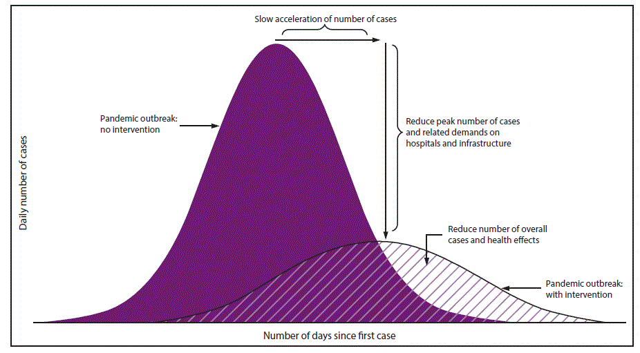
This image represents a "what if" scenario. The purple curve on the left is a hypothetical curve that represents rapid spread. It shows what might happen if the public does NOT adopt public-health measures to slow the spread of the virus. This is "the curve" that we wish to flatten. The smaller curve on the right represents a slower spread. It shows what can happen if society adopts public-health interventions. The peak of the second curve has been delayed (moved to a later date) and reduced (fewer cases). This second curve is the "flattened curve."
Because the curve that we are trying to flatten (the rapid-spread curve) is unobservable, how can we measure success? One measure of success is if the number of daily cases remains less than the capacity of the healthcare system. Another is that the total number of affected persons is less than predicted under the no-intervention model.
If the public adopts measures that mitigate the spread, the observed new-cases-versus-time curve should look more like the slower-spread curve on the right and less like the tall rapid-spread curve on the left. Interestingly, I have heard people complain that the actual numbers of infections, hospitalizations, and deaths due to COVID-19 are lower than initially projected. They argue that these low numbers are evidence that the mathematical models were wrong. The correct conclusion is that the lower numbers are evidence that social distancing and other NPIs helped to slow the spread.
Flattening the curve of cumulative cases versus time
The previous section discusses the new-cases-by-time graph. Another common graph in the media is the cumulative number of confirmed cases. I have written about the relationship between the new-cases-by-time graph and the cumulative-cases-by-time graph. In brief, the slope of the cumulative-cases-by-time graph equals the height of the new-cases-by-time graph.
For the rapid-spread curve, the associated cumulative curve is very steep, then levels out at a large number (the total number of cases). For the slower-spread curve, the associated cumulative curve is not very steep. It climbs gradually and eventually then levels out at a smaller number of total cases.
When you read that some country (such as South Korea, Australia, or New Zealand) has flattened the curve, the curve that usually accompanies the article is the cumulative-cases-by-time graph. A cumulative curve that increases slowly means that the rate of new cases is small. A cumulative curve that has zero slope means that no new cases are being confirmed. This is definitely a good thing!
A hypothetical scenario is shown below. The upper graph shows the cumulative cases. The lower graph shows the new cases on the same time scale. After Day 60, there are very few new cases. Accordingly, the curve of cumulative cases is flat.
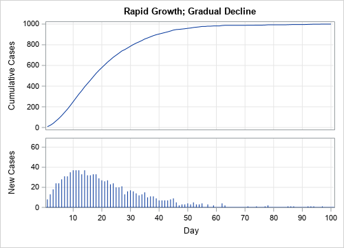
Thus, a cumulative curve that increases slowly and then levels out is analogous to the slower-the-spread epidemiological curve. When the cumulative curve becomes flat, it indicates that new cases are zero or nearly zero.
The wrong curve: Flattening new cases versus time
Unfortunately, not every curve that is flat indicates that conditions are improving. The primary example is the graph of new cases versus time. A constant rate of new cases is not good—although it is certainly better than an increasing rate. To defeat the pandemic, the number of new cases each day should be decreasing. For a new-cases-by-time curve, a downward-sloping curve is the goal, not a flat curve.
The following graph shows new cases by day in the US (downloaded from the New York Times data on 03May2020). I have added a seven-day rolling average to show a smoothed version of the data:
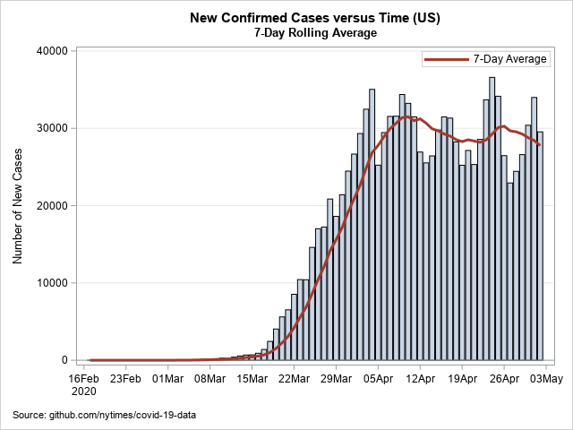
The seven-day average is no longer increasing. It has leveled out. However, this is NOT an example of a "flattened" curve. This graph shows that the average number of new cases was approximately constant (or perhaps slightly declining) for the last three weeks of April. The fact that the curve is approximately horizontal indicates that approximately 28,000 new cases of coronavirus are being confirmed every day.
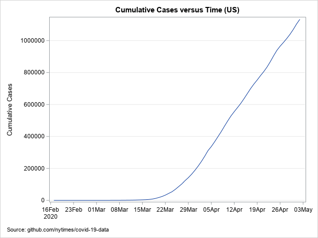
The cumulative graph for the same US data is shown below. The slope of the cumulative curve in April 2020 is approximately 28,000 cases per day. This cumulative curve is not flattening, but healthcare workers and public-health officials are all working to flatten it.
Sometimes graphs do not have well-labeled axes, so be sure to identify which graph you are viewing. For a curve of cumulative cases, flatness is "good": there are very few new cases. For a curve of new cases, a downward-sloping curve is desirable.
Summary
In summary, this article discusses "flattening the curve," which is often used without specifying what "the curve" actually is. In the classic epidemiological model, "the curve" is the hypothetical number of new cases versus time under the assumption that society does not adopt public-health measures to slow the spread. A flattened curve refers to the effect of interventions that delay and reduce the peak number of cases.
You cannot observe a hypothetical curve, but you can use the curve of cumulative cases to assess the spread of the disease. A cumulative curve that increases slowly and flattens out indicates a community that has slowed the spread. So, conveniently, you can apply the phrase "flatten the curve" to the curve of cumulative cases.
Note that you do not want the graph of new cases versus time to be flat. You want that curve to decrease towards zero.
You can download the SAS program used to create graphs in this article.
LEARN MORE | See all Coronavirus dashboard blog posts

3 Comments
Great explanation Rick. And thanks, as always, for sharing your code behind these charts.
Readers might be interested to see the work in our public GitHub repository. First, we have a collaboration with Cleveland Clinic that is centered around projecting the curve of new cases and hospital capacity given different "social distancing" (or NPI) measures. And more recently, we've added code that SAS users can adopt to fetch public COVID-19 data such as what you've used here from the New York Times, the John Hopkins University data, and IMHE.
And I'm going to go watch that Flatten the Curve video right now.
If you click on the link to see the SAS code in this post, one of the first comments you will see is "read code by using
[SAS program], which was written by Chris Hemedinger." Chris posted that program last month, so thank YOU, Chris, for sharing code to read the COVID-19 data.
Thank you for an excellent explanation, Dr Wicklin. I learnt a lot from your article.