Heat maps have many uses. You can use a heat map to visualize correlation matrices, to visualize longitudinal data ("lasagna plots"), and to visualize counts in any two-dimensional table. As of SAS 9.4m3, you can create heat maps in SAS by using the HEATMAP and HEATMAPPARM statements in PROC SGPLOT. Prior to SAS 9.4m3, you could create heat maps by using the Graph Template Language (GTL) in Base SAS or the HeatmapCont and HeatmapDisc functions in SAS/IML software.
I like to emphasize the difference between a continuous heat map and a discrete heat map. In a continuous heat map, each cell is assigned a color from a continuous color ramp and the graph includes a gradient legend that associates colors with numerical values of the continuous response variable. However, sometimes the response has a small number of discrete values such as 'Low', 'Medium', and 'High'. In that case, you can create a discrete heat map, similar to the one shown to the right. A discrete heat map uses a discrete palette of colors (and a discrete legend) to visualize the response variable.
First, this article shows how to use the HEATMAPPARM statement in PROC SGPLOT to create a continuous heat map, which is the default behavior. Next, it shows how to use a SAS format to bin the response variable into ordinal categories. Third, it creates a discrete heat map, shown at right to visualize the binned responses. Binning the response values and using a discrete heat map is especially useful when the response variable spans several orders of magnitude.
Create a continuous heat map
In this article, I use only the HEATMAPPARM statement. The difference between the HEATMAP and the HEATMAPPARM statement is that the HEATMAP statement supports binning the (x, y) values onto a uniform grid. The color in each cell is based on some statistic (frequency, sum, mean,...) that is computed over all the observations in a bin. In contrast, you use the HEATMAPPARM statement when the data are already aggregated onto a uniform grid. For each (x, y) coordinate, you have a single response value that you want to visualize by using color. This is often the case when you use heat maps to visualize tables.
Suppose a store tracks sales of three products ('A', 'B', and 'C') over a 10-week period. You can use a continuous heat map to visualize the quantities sold for each product. Because there are only 10 cells in the horizontal direction, you can optionally use the DISCRETEX option to show all values, as follows:
data Sales; input Product $ @@; do Week = 1 to 10; input QtySold @@; output; end; label QtySold="Quantity Sold"; datalines; A 5 3 2 7 10 8 5 6 9 11 B 4 1 0 2 0 2 2 1 2 2 C 27 15 18 29 40 20 19 25 31 34 ; ods graphics / width=640 height=400px; title "Continuous Heat Map"; title2 "Continuous Color Ramp and Legend"; proc sgplot data=Sales; heatmapparm x=Week y=Product colorresponse=QtySold / outline discretex; text x=Week y=Product text=QtySold / textattrs=(size=12pt) strip; gradlegend; run; |
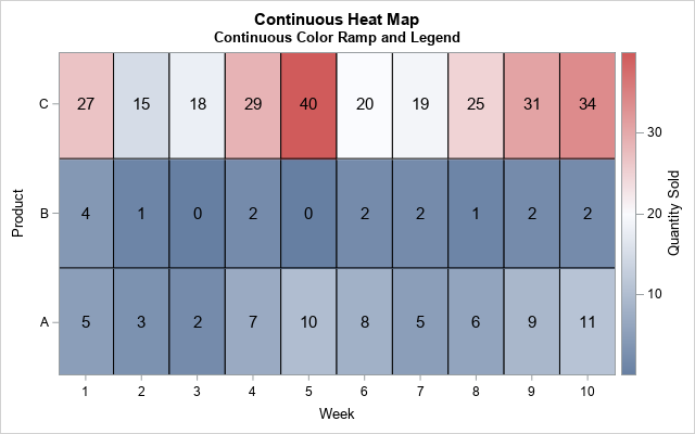
To make the heat map easier to understand, I overlaid the quantities sold for each product and each week. The color of each cell is determined by using a three-color color ramp. The darkest blue corresponds to 0 items sold, the white color corresponds to 20 units sold, and the darkest red corresponds to 40 units sold. The colors for other values are linearly interpolated. A gradient legend to the right shows the association between shades of colors and units sold. You can use the COLORMODEL= option to use a different color ramp.
As I have discussed in other articles, you might not want to use a linear color ramp when the response variable is skewed or contains outliers. In this example, the store sells many more units of product 'C' than 'A' or 'B'. Consequently, most of the cells in the heat map are blue (low) and only a few are white (medium) or red (high). If you bin the counts into meaningful ordinal categories, the low and medium values will be easier to discern.
Use a format to bin the response variable
If your response variable is discrete and consists of a small number of groups, you can use a discrete heat map. Syntactically, you specify a discrete heat map by using the COLORGROUP= option (instead of COLORRESPONSE=) on the HEATMAPPARM statement. Instead of the GRADLEGEND statement, add a regular (discrete) legend by using the KEYLEGEND statement.
Let's create a discrete heat map for the Sales data by binning the QtySold variable. You can use a SAS format to bin a continuous variable into ordinal categories. The following call to PROC FORMAT bins the data into five categories by using the cut points 3, 7, 12, and 20.
By default, the SGPLOT procedure will use the data colors in the current style to assign colors to groups, such as blue, red, green, brown, and purple. However, when the categories are ordinal, you might want to use a sequential or diverging color scheme to assign colors to group, similar to what the gradient color ramp provides. You can use the STYLEATTRS statement to assign colors to groups. The following is an initial attempt to create a discrete heat map. However, as you will see, the program contains a logical error:
proc format; value SoldFmt /* bin into five groups */ low -< 3 = "Almost None" 3 -< 7 = "Few" 7 -< 12 = "Moderate" 12 -< 20 = "Many" 20 - high = "Most"; run; title "Discrete Heat Map"; title2 "Discrete Color Palette and Legend"; /* Attempt to use STYLEATTRS to define discrete colors. Does not work because default group order is "data order" */ proc sgplot data=Sales; format QtySold SoldFmt.; /* use a format to bin the response variable */ styleattrs datacolors=(ModerateBlue VeryLightBlue CXF8F8F8 VeryLightRed ModerateRed); heatmapparm x=Week y=Product colorgroup=QtySold / outline discretex; keylegend; run; |
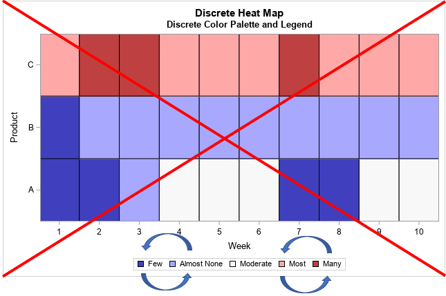
The heat map is shown, but it does not reflect the ordinal nature of the counts. I intentionally constructed the example so that the groups appear in the legend "out of order." The "Few" category appears before the "Almost None" category, and the "Most" category appears before the "Many" category. The STYLEATTRS statement correctly assigned colors to the groups, but the groups do not appear in fewest-to-most order.
This problem occurs because the order of the groups (and, therefore, their colors) is determined by the order in which they appear in the data set. There are several solutions to this problem, including sorting the data and adding fake observations to the data set. However, the best solution is to explicitly create a mapping between group values and colors. This is called a "discrete attribute map." A discrete attribute map enables you to associate colors (and other attributes) to groups, regardless of how the groups are sorted or used.
Use a discrete attribute map to associate colors to groups
If you encounter this "legend order" problem, a discrete attribute map is the most robust solution. The "map" is simply a data set that assigns attributes to each formatted value of the response variable. The PROC SGPLOT documentation for discrete attribute maps provides details about the names of variables in the data set.
For the heat map, the important attribute is the FILLCOLOR attribute of each cell. Thus, you need to create a data set that has five rows and two variables. The name of the primary columns must be Value and FillColor. You can hard-code the formatted values or you can use the PUT function to format the raw values, as shown in the following program. (I like the second option; it works even if you change the strings in PROC FORMAT.) You also might want to define the ID variable and the Show variables. The ID variable is optional if the data set defines only one attribute map. If you set Show="AttrMap", the legend will show all of the possible values in the legend, even if the data set does not contain all the groups.
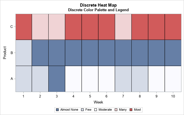
The following DATA step defines a discrete attribute map. Use the DATTRMAP= option on the PROC SGPLOT statement to use the mapping, as follows:
data Order; /* create discrete attribute map */ length Value $11 FillColor $15; input raw FillColor; Value = put(raw, SoldFmt.); /* use format to assign values */ retain ID 'SortOrder' /* name of map */ Show 'AttrMap'; /* always show all groups in legend */ datalines; 0 ModerateBlue 3 VeryLightBlue 7 CXF8F8F8 12 VeryLightRed 20 ModerateRed ; proc sgplot data=Sales dattrmap=Order; /* use discrete attribute map */ format QtySold SoldFmt.; heatmapparm x=Week y=Product colorgroup=QtySold / outline attrid=SortOrder; keylegend; /* will use the order in attribute map */ run; |
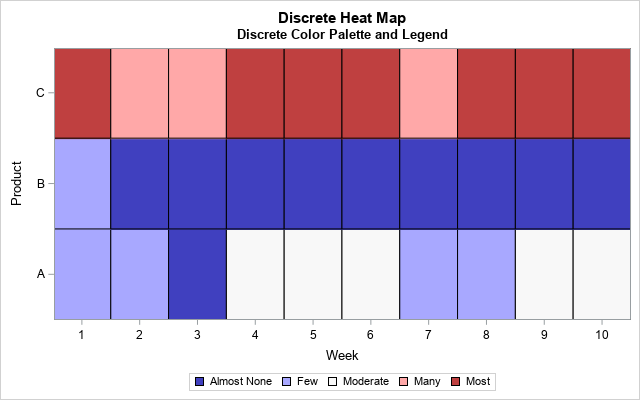
Success! The heat map uses the custom blue-white-red color ramp for the groups. The order of the items in the legend (and their attributes) are determined by the discrete attribute map. No matter what order the groups appear in the data, the legend will show the items in the correct ordinal order, which is least to greatest.
For more information about legend order and discrete attribute maps, see Warren Kuhfeld's article "Legend order and group attributes."
In summary, this article shows how to use the HEATMAPPARM statement in PROC SGPLOT to create heat maps. Use the HEATMAPPARM statement when the (x, y) values are discrete and pre-summarized. By default, the HEATMAPPARM statement creates a continuous heat map and the GRADLEGEND statement displays a gradient legend. If the response variable is discrete, use the COLORGROUP= option on the HEATMAPPARM statement and use the KEYLEGEND statement to add a discrete legend. Remember that the order of the groups is determined by the order in which the groups appear in the data, but you can define a discrete attribute map to ensure that the groups appear in a specified order.

4 Comments
Thanks for all your examples, very helpful.
Is there any way to vary the cell sizes in heatmap? sort of like a tile plot, but using the same control we have over axes in the heatmap approach.
Consider as an example a heatmap of state-by-state trade, where cell value is average value and cell size proportional to the states.
All cells in a heat map are the same size. However, a bubble plot has the features you describe.
How would I get a Heatmap when I already have a table ready, meaning I don't have to use the datalines statement)?
The best place to ask SAS programming questions is the SAS Support Communities.
I assume you have data in a matrix form such as a covariance or correlation matrix. You can use the HEATMAPCONT function in SAS/IML to create a heat map.